Adventure Planning With the First WinUI DateTimePicker

Summarize with AI:
Need a WinUI single component for picking datetime? Come meet the first DateTimePicker component on the WinUI market now. See for yourself how beautiful and easy to use it is and the capabilities it offers.
Hola, amigos! It’s me. It is also time for planning more and more adventures. In this train of thought, you all know that a plan can contain a lot of things, yet it cannot go without a date and a time. If you are not in the mood for a vacation and still have a lot of work to do before that, just think about all the tools and apps you use in your every(work)day life. New appointments, new meetings, new product backlog items … 😵
Does the UI of these pop up right away? In my mind it does, and all I can see is their most important and difficult to choose components—the pickers for their start/end date and time. Sometimes, these UIs could even have a single thing that combines the components for making that challenging choice—i.e., a datetime picker.
What if you need to implement an app that has to offer a single component for picking date and time? And to make that task a bit more ambitious—what if this app needs to be a WinUI app?
Do not worry! We are here to help. Pardon me, the first datetime picker on the WinUI market is here to help. Please, greet the newest addition of the young and wild Telerik UI for WinUI family—the RadDateTimePicker!
Starting Is Hard, But Not This Time
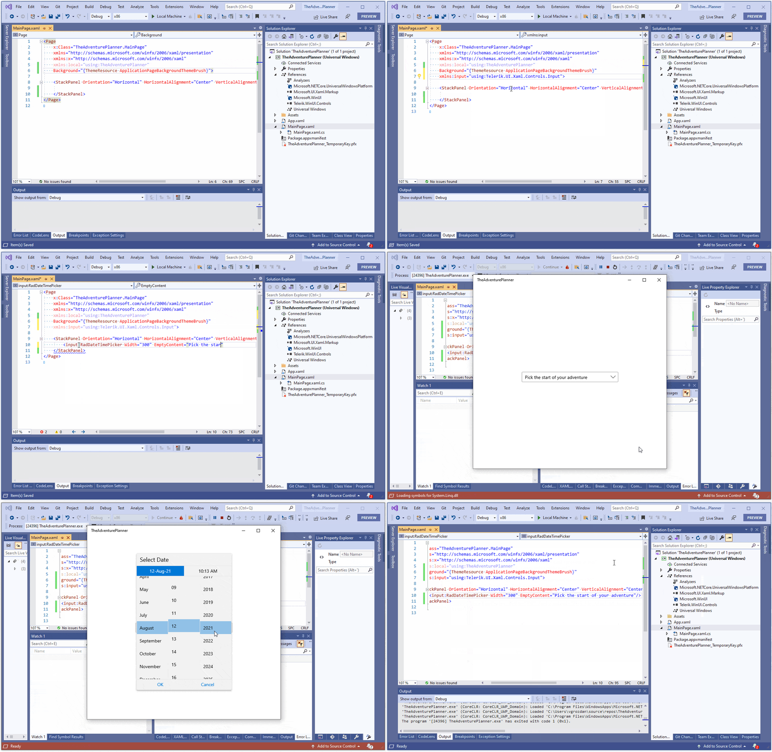
Getting started with the RadDateTimePicker is as easy as can be once you have a WinUI project set up. You only need a RadDateTimePicker tag in XAML, a reference to the Telerik.WinUI.Controls.dll and, of course, an alias pointing to its namespace—the Telerik.UI.Xaml.Controls.Input one—xmlns:input="using:Telerik.UI.Xaml.Controls.Input". This does not mean that you cannot achieve it in code-behind as well. Follow my lead:

I told you—easy-peasy (🍋 squeezy).
Here is the ready-to-copy one-line DateTimePicker code snippet of the above GIF:
<input:RadDateTimePicker Width="300" EmptyContent="Pick the start of your adventure"/>Moving on to the goodies that the Telerik UI for WinUI’s DateTimePicker offers. ⏬
What’s in the Box?
Now that we saw how beautiful and easy to use our picker is, let us see what it offers.
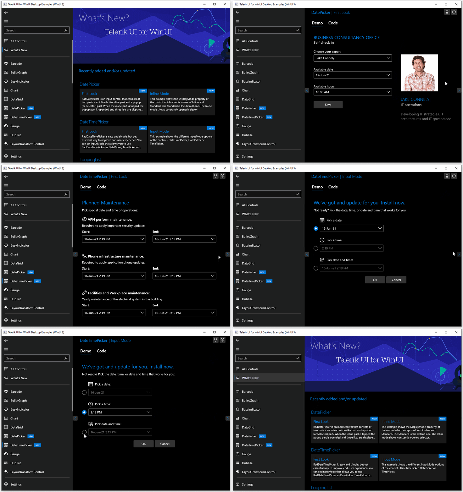
My favorite feature is the ability to transform this component into a date or time only picker. How? By using the InputMode property (accepted values: DatePicker, TimePicker, DateTimePicker).
Speaking of modes, there is another capability responsible for transforming the visualization of the almighty DateTimePicker. Its DisplayMode property controls whether the picker will be displayed inline, or in the standard way – with its button part and the drop down.
Other goodies include configuring the interval for the selectable options, changing the order of the date/time elements (or hiding some) and of course—limiting the allowed min and max values. In the previous section, you also saw how I used the EmptyContent property to personalize my picker when no value is yet selected.
Hey, I will not list it all, so be sure to check out the help documentation for the full list of its capabilities.
Greatest Example of Usage
As the name of this section suggests, I will give you a living and working example of usage of our newest WinUI component. For this purpose, I am lifting the curtain on one of our still brightest stars—the RadScheduler. 🌟 If this is the first time you’ve heard that Telerik UI for WinUI offers a scheduling component, I will not get mad (just a little sad 😔). But I will sure poke you to read this amazing blog post and get familiar with it.
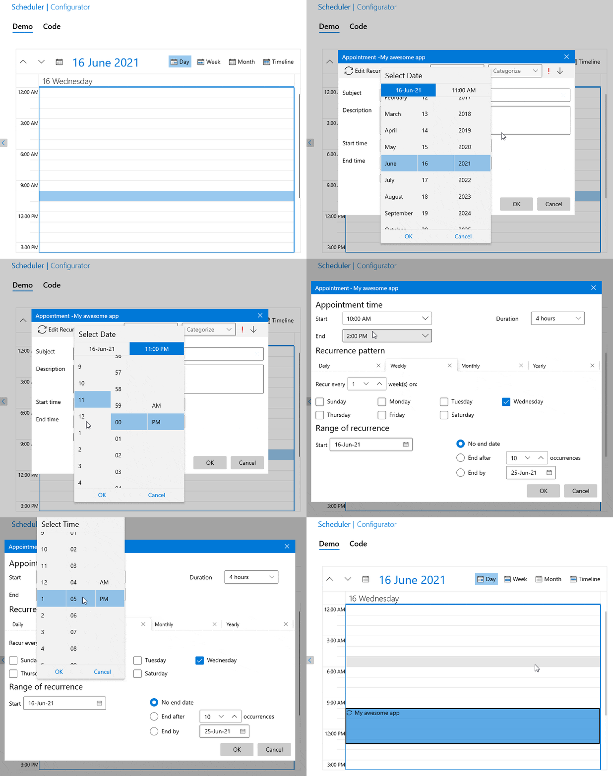
The RadScheduler for WinUI provides dialogs for creating/modifying/deleting appointments. Previously, the EditAppointmentDialog and the EditRecurrenceDialog used two separate components for picking date and time. Guess what!? They both now use a single one for this purpose—yes, the RadDateTimePicker!
If you are wondering what an EditAppointmentDialog or EditRecurrenceDialog is—the first one is shown when an appointment is about to be created or edited, and the second, when a recurrence of an appointment is about to perform the same.
Do you want to see it in action? Yes? Okay!

Lovely. Now, let’s get down to business. 🎵 No, not Tiësto’s. UI for WinUI’s. Oops, pickers.
DateTimePicker Catwalk
Welcome to this tiny (yet glamy 💖) DateTimePicker fashion show! I have a real treat for you today! In just a few moments you will get a chance to see some of the latest additions to the Telerik WinUI examples’ exclusive collection.

Wondering where I got that app from or how to get and install it? Head over to the WinUI Examples Application help article. Go, go, go. 🏃
Finale
Okay, just a few lines before you go.
First and foremost—thank you for honoring me with the most precious thing—your time to read this blog. I hope it left you eager to explore not only the date time pickers, but also all the other bits of the Telerik UI for WinUI 0.3.0 Release.
When you do, please take a minute to drop your thoughts in the comment section below or share your suggestions in our feedback portal. You can also get in touch by email at TelerikWinUI@progress.com, or also use the Telerik Forums in case you need any technical assistance with our products.
“Life is a blank canvas, and you need to throw all the paint on it you can.” Go on and paint your next adventure with the latest:

Viktoria Grozdancheva
Viktoria is a Senior Front-end Developer with 5+ years of experience designing and building modern UI for desktop and mobile platforms on Microsoft/Telerik technology stacks. Her spare time is dedicated to friends and family and discovering new pieces of the world. Find her on Twitter and LinkedIn.
