What’s New in WinUI 1.0

Announcing Telerik UI for WinUI 1.0—the latest WinUI release is live today.
In this release you will find Windows App SDK 1.0 support with the latest windows styles, new Button controls, plus new features for DataGrid, Map, BusyIndicator and Document Processing libraries.
Windows App SDK 1.0 Support and Updated Styles
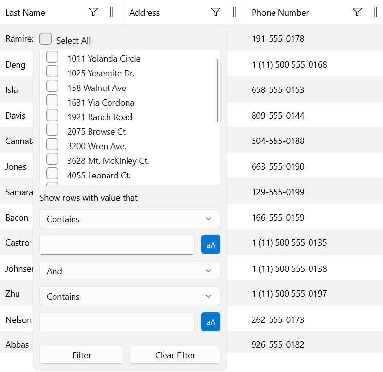
The latest stable version of Windows App SDK 1.0 was announced by Microsoft back in November, and we immediately released support for it in Telerik UI for WinUI v. 0.7. After that moment, were focused on updating the visual appearance of our components and restyled them in the same manner as seen in Windows App SDK 1.0, using the latest Windows styles. You can install our examples application from the Telerik UI for WinUI Examples web page and check out the latest look and feel! 😊
Buttons
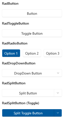
Surprise!! 🎉 Introducing RadButtons for WinUI—this is set of buttons that we will be extending in the future. Every button provides the standard set features for its type plus additional customization options and functionalities (like CommandTarget support). This is the current list of RadButtons:
- RadButton
- RadDropDownButton
- RadSplitButton
- RadToggleButton
- RadRadioButton
Hope they will be useful. For more details, check out the Buttons section in our help documentation.

Map: Smooth Zooming (Breaking Change)

RadMap now supports smooth zooming—in the past it was possible to zoom only by integer values. Now we are introducing new Zoom property of type double that will allow to you zoom more precisely.
Important Breaking Change: The ZoomLevel property has been removed with introduction of the new Zoom property.
We have also added the option to modify the zoom step of mouse-wheel zooming and of the slider in the UI—check out the ZoomStep property. For more details, check out the Zooming article in the RadMap documentation.
DataGrid: Group Panel Position

Our DataGrid now provides another option for the group panel position—it can be placed on the top inline. This new setting adds look and feel similar to the Telerik WPF GridView and provides a more convenient way to operate with grouping settings of a control in a desktop environment.
Important Change: This is now the default setting for the group panel position in the desktop version of the controls.
For more details, you can check the Grouping section from the DataGrid documentation.
MaskedInput: Separate Mask Controls (Breaking Change)
A couple of releases ago, we released MaskedInput control (if you missed it, check this great blog post about the component). With this release, we are making an important breaking change, splitting the control into separate mask controls. Here is the list of the new masked input controls:
- RadMaskedTextInput
- RadMaskedDateTimeInput
- RadMaskedTimeSpanInput
- RadMaskedNumericInput
- RadMaskedIPInput
- RadMaskedEmailInput
- RadMaskedRegexInput
For your convenience, we have prepared a Migration from RadMaskedInput article for more details on the exact changes. Please contact us if you have any difficulties when migrating to the new control—we will be glad to help!
SpreadProcessing: Conditional Formatting
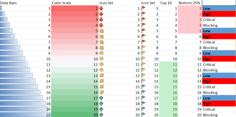
This feature gives you the ability to format the cells depending on their value. There are multiple conditional formatting rules that are supported and can be used for this. You can apply various formatting options like changing fill and font and even create more complex rules with data bars, color scales and icon sets. You can see some examples in the screenshot below.
Spreadsheet and SpreadProcessing: Notes Support
Notes are used for making notes or annotations about the data in a specific cell. You can easily work with Notes via the UI. You can add, remove, edit, resize, show or hide the Notes. This can be done from the button in the review tab or from the context menu.
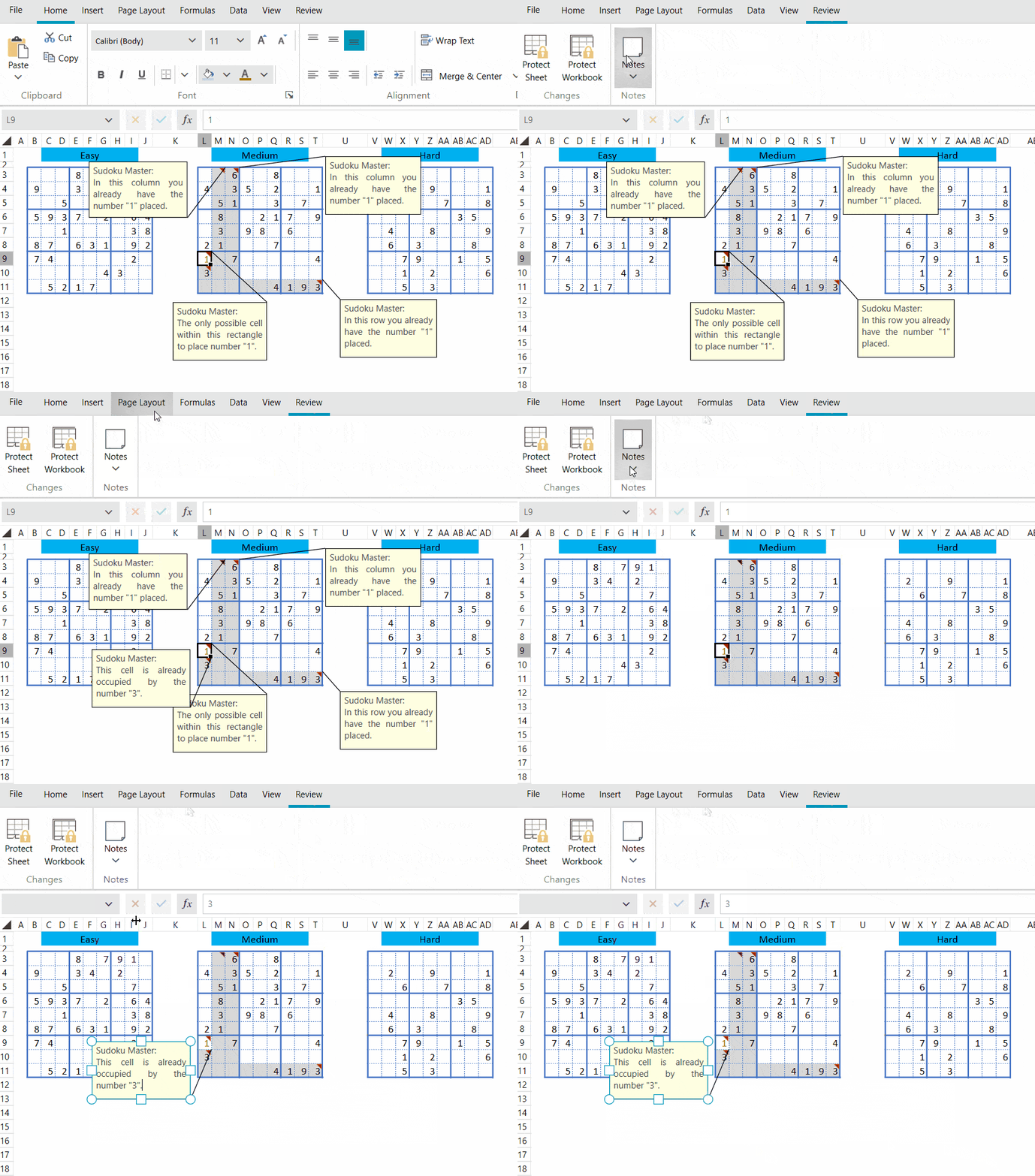
You can work with Notes in the code behind as well. Detailed information is available here: Notes.
WordsProcessing: Nested Mail Merge
This functionality allows you to perform mail merge with complex business objects. For example, your business object can contain a list of other objects and this functionality allows you to use the underlying objects when performing mail merge. In this case, a special field syntax with custom field modifiers (for example: GroupStart/GroupEnd) is used. More information about this feature is available here: Mail Merge.

Other Features
- BusyIndicator: Added OverlayBackground property
- DataGrid: DataTable support (link)
- WordsProcessing: Support for Table.Alignment when exporting to PDF
- WordsProcessing: Add support for height of a table row when exporting to PDF
- WordsProcessing: Export VerticalAlignment property of the table cells to PDF
- WordsProcessing – DocxFormatProvider: Add support for hyperlinks on images
Check Out the Detailed Release Notes
We have a lot more! To get an overview of all the latest features and improvements we’ve made, check out the release notes:
Telerik UI for WinUI (Release Notes)
Sign Up for the Webinar
To see the new release in action, please join us on the Telerik R1 2022 webinar, on Wednesday, February 2, 2022, from 11:00 am ET – 1 pm ET.
Join Us on Twitch
Join the live demo sessions on Twitch to see the newly released components and features in action and get ideas on how to use them in your projects. Chat with the team and get your questions answered on the spot! The new WPF release will be covered on Monday, January 24 at 10:00 am ET.
Share Your Feedback
- Get in touch by email – drop us a line, for anything related to product or just to say hi, at TelerikWinUI@progress.com
- Feedback Portal – share any feature request (or bug reports) that you might have
- Telerik Forums – if you need any technical assistance with product let us know and we will help
Get the Bits
Don’t wait—try out the latest:
In case you missed it, here are some of the updates from our previous release.

