
Getting Started With Kendo UI Mobile in AppBuilder
Summarize with AI:
So - you're ready to build a mobile app. Maybe you've heard of Kendo UI Mobile (and thus, you stumbled across this post), but you feel a growing sense of New Framework Dread™. It can feel a bit daunting when it comes to learning any framework - what does it offer? What are its dependencies? How do I find help? Mastering a framework can take time, but – as we'll see in this post – getting up and running with Kendo UI Mobile won't take you much time at all.
If you're new to mobile web frameworks, don't panic. While no two frameworks are exactly alike, most offer abstractions to help with some of the complicated aspects including things like client-side routing, views, UI widgets, models (and often two-way binding between models and views) and more. If you don’t know what some of these things are, don’t worry - that’s why we’re here! Kendo UI Mobile has a lot to offer in these categories so let's dive in.
AppBuilder & Kendo UI Mobile Project Template
One easy way to get started is to create a new AppBuilder project using the Kendo UI Mobile project template. When you create a new AppBuilder project, choose the "Kendo UI Mobile" option:
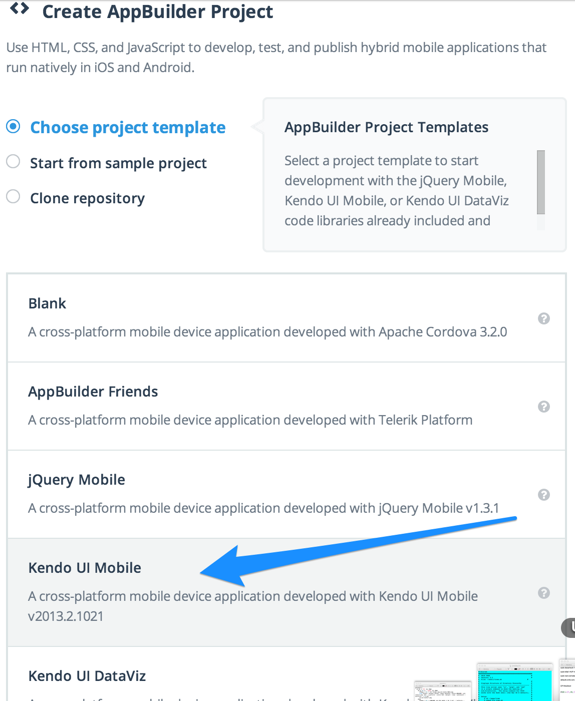
This project template will give you a small sample app - which you can promptly remove any (or all) of the default boilerplate code that you don't need. The boilerplate gives us a great place to start peeking at Kendo UI Mobile features, though, so we'll leave it in place.
The Kendo UI Mobile Application
When we create a project using the Kendo UI Mobile template, we'll see something similar to this in our project navigator:
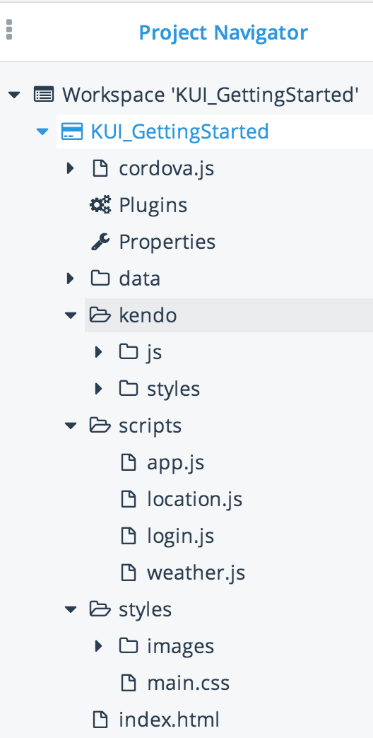
The app.js is one of the JavaScript files generated for us by the Kendo UI Mobile project template. It happens to hold the “entry” point for when our JavaScript code begins to deviceready event.
Curious about
devicereadyand other Cordova events? Check this post out.
If we open up the app.js file, we'll notice this line in it (around line 10):
app.application = new kendo.mobile.Application(document.body, { layout: "tabstrip-layout"});
This is an important starting
So what's up with the arguments passed to the kendo.mobile.Application constructor function? The first argument – document.body – is optional (since it's the default), but it indicates the element used as the "Pane" to group the views for the app. The second argument is an options argument that can be used to customize the configuration of the app instance. In our case, we're telling Kendo UI Mobile to use the layout element with the id of tabstrip-layout (which we'll see in a moment). The options object argument can also be used to indicate what the initial view should be, the default transition effect as you navigate between views and more.
Our First View
A Kendo UI Mobile View is an abstraction around the content you want displayed on the screen at one time. Really, you can think of a view in a Kendo UI Mobile app like you may think of a data-role
view
index.html
<!--Home-->
<div id="tabstrip-home"
data-role="view"
data-title="Home">
<div class="view-content">
<h1>Welcome!</h1>
<a id="skin-change" data-role="button" data-click="app.changeSkin">Flat</a>
<p>
Telerik AppBuilder™ enables you to build cross-platform device applications regardless of your
development platform by combining the convenience of a local development toolset with the
power and flexibility of the cloud.
</p>
<div class="img"></div>
</div>
</div>
What's In A View?
Our home view is div element. The data-role="view" attribute/value is how Kendo UI Mobile knows it should be treated as a view. The data-title attribute allows us to set a title for the view which can be displayed in our layout (more on that in a sec). Kendo UI has data binding capabilities which let us easily wire up data from our model – or even behavior (e.g. - a function defined in our app.js file) – to our view. In the above a tag, where we have data-click attribute binding the click event of the link to invoke the app.changeSkin method.
Wondering how it knows what
app.changeSkinis? Ourappobject is globally available, since it's attached to thewindow. You can also use thedata-modelattribute to specify a view model as the context of any methods/properties you bind. We'll see more on that later.
Layouts, For the Win
So, I mentioned a moment ago that we can use the data-title value of our view(s) in our layout - but what's a layout? A layout enables you to share headers and/or footers between views. This means you won't cry tears of anguish from being forced to duplicate header and footer content in multiple views. Much like the view is a DOM element with data-role of "view", a layout has data-role of "layout":
<!--Layout-->
    <div data-role="layout" data-id="tabstrip-layout">

        <!--Header-->
        <div data-role="header">
            <div data-role="navbar">
                <span data-role="view-title"></span>
            </div>
        </div>

        <!--Footer-->
        <div data-role="footer">
            <div data-role="tabstrip">
                <a href="#tabstrip-home" data-icon="home">Home</a>
                <a href="#tabstrip-login" data-icon="contacts">Login</a>
                <a href="#tabstrip-location" data-icon="search">Location</a>
                <a href="#tabstrip-weather" data-icon="globe">Weather</a>
            </div>
        </div>
    </div>
Inside our layout, we have two div
data-roles of "header" and "footer" (you're not required to have both a header and footer, just provide whatever you need). Notice that in the layout's header, we have span element data-role="view-title"
Our layout's data-id is "app.js sets our mobile app's default layout in this line of code (note the layout property on the options object ):
app.application = new kendo.mobile.Application(document.body, { layout: "tabstrip-layout"});
We could have just as easily set the layout for our home view in our markup by adding data-layout attribute to our view:
<!--Home-->
<div id="tabstrip-home"
data-role="view"
data-layout="tabstrip-layout">
data-title="Home">
<div class="view-content">
<h1>Welcome!</h1>
<a id="skin-change" data-role="button" data-click="app.changeSkin">Flat</a>
<p>
Telerik AppBuilder™ enables you to build cross-platform device applications regardless of your
development platform by combining the convenience of a local development toolset with the
power and flexibility of the cloud.
</p>
<div class="img"></div>
</div>
</div>
Kendo UI Mobile doesn't limit you to just one layout. Individual views can override the default application layout by specifying data-layout attribute in the view (and setting data-layout="" can remove the layout for a view altogether).
Navigation Between Views
Our app would be tragically boring with only one view – and this sample app doesn't disappoint there. A glance at the index.html file reveals a total of four views - Home, Login, div from our layout's footer:
<!--Footer-->
<div data-role="footer">
    <div data-role="tabstrip">
        <a href="#tabstrip-home" data-icon="home">Home</a>
        <a href="#tabstrip-login" data-icon="contacts">Login</a>
        <a href="#tabstrip-location" data-icon="search">Location</a>
        <a href="#tabstrip-weather" data-icon="globe">Weather</a>
    </div>
</div>
We're using anchor tags, and setting the href attribute value equal to the view's id – that's it! Kendo UI Mobile handles intercepting the click event and swapping out the views in question.
View Transitions
Kendo UI Mobile allows us to control how the transition between views is handled. If you want to add a transition – for example, a slide effect – between views, there are a couple of ways to make it happen.
Default Transition
When you create the Kendo UI Mobile app instance, you can pass in a default transition as one of the options:
// Adds a slide transition between views (defaults to slide left)
app.application = new kendo.mobile.Application(document.body, { layout: "tabstrip-layout", transition: "slide" });
Specifying a View-Specific Transition
You can also override any default transitions by providing a data-transition atttibute value on your view:
<!--Home-->
<div id="tabstrip-home"
data-role="view"
data-transition="overlay">
data-title="Home">
<div class="view-content">
<h1>Welcome!</h1>
<a id="skin-change" data-role="button" data-click="app.changeSkin">Flat</a>
<p>
Telerik AppBuilder™ enables you to build cross-platform device applications regardless of your
development platform by combining the convenience of a local development toolset with the
power and flexibility of the cloud.
</p>
<div class="img"></div>
</div>
</div>
Specifying a Navigation-Specific Transition
You can also specify the transition on the link being used to navigate. For instance, the following example is using a fade transition:
<a href="#tabstrip-home" data-transition="fade" data-icon="home">Home</a>
Transition Types
Kendo UI Mobile supports slide, overlay, fade and zoom transitions. You can specify the direction for overlay transitions (down, left, up and right), and slide transitions (left, right) - both default to left. For example, to reverse the slide direction when navigating between two views, the link navigating back to the original view could look like this:
<a href="#tabstrip-home" data-transition="slide:left reverse" data-icon="home">Home</a>
You can see a few of these transition effects in the Kendo UI Mobile demos.
What About "External Views"?
If you're like me, then you might cringe at the thought of cramming all of your views into one mammoth HTML file. Don't worry - it's pretty easy to pull in external views. In the below example, I've moved our "login" view into its own file (login.html) and I've updated the navigation link in our footer to refer to the file name of the view, instead of the id. Thankfully, Kendo UI Mobile is smart enough to make a request for the view when it sees we're referring to an actual file:
<!--Footer-->
<div data-role="footer">
    <div data-role="tabstrip">
        <a href="#tabstrip-home" data-icon="home" data-transition="slide:left reverse">Home</a>
        <a href="login.html" data-icon="contacts">Login</a>
        <a href="#tabstrip-location" data-icon="search">Location</a>
        <a href="#tabstrip-weather" data-icon="globe">Weather</a>
    </div>
</div>
If the "Login" link above is clicked, Kendo UI Mobile will fetch the view via an AJAX call the first time and display it. Even though your view is in a separate file, it won’t cause the entire screen to reload when it’s fetched. From there, any other clicks on the "Login" link won't require yet another round-trip to the server, since we already loaded the view once.
Data Binding
If you've ever used a framework that supports declarative two-way bindings, you know how much of a time saver (and boilerplate-remover) it can be! Kendo UI Mobile supports this kind of behavior, letting you keep a "view model" (in this case, an instance of ObservableObject) in sync with associated markup. Changes in the UI will cause the view model to update, as well as programmatic changes to the view model will result in the UI updating.
Confused as to why people call this "declarative" two-way binding? In this case, the "declarative" part of the equation means that we're setting the bindings up in our markup through the use of
data-attributes, as opposed to imperatively in JavaScript. The “two-way” part of the phrase means what we described above - that a model and view are kept in sync with each other. Any changes to one is immediately reflected in the other. For more on Kendo UI & MVVM in general, read Getting Started with Kendo UI and MVVM
Let's take a look at the Login view in this sample app:
<!--Login-->
<div id="tabstrip-login"
  data-role="view"
  data-title="Login"
  data-model="app.loginService.viewModel">
  <div class="view-content">
    <div class="logo"></div>
    <h3 data-bind="invisible: isLoggedIn">Enter Your Credentials:</h3>
    <h1 class="welcome" data-bind="visible: isLoggedIn">Welcome, <span data-bind="text: username"></span>!
    </h1>
    <div class="buttonArea">
      <input type="submit" id="logout" data-role="button" data-bind="click: onLogout, visible: isLoggedIn" class="login-button" value="Logout" />
    </div>
    <form data-bind="events: { keyup: checkEnter }">
      <ul data-role="listview" data-style="inset" data-bind="invisible: isLoggedIn">
        <li>
          <label>
          Username
          <input type="text" data-bind="value: username" />
          </label>
        </li>
        <li>
          <label>
          Password
          <input type="password" data-bind="value: password" />
          </label>
        </li>
      </ul>
      <div class="buttonArea">
        <input type="submit" id="login" data-role="button" data-bind="click: onLogin, invisible: isLoggedIn" class="login-button" value="Login" />
      </div>
    </form>
  </div>
</div>
Our Login view makes use of the data-model attribute, specifying app.loginService.viewModel as the context for the bindings that will be set in the view. Notice, for example, the h3 element:
<h3 data-bind="invisible: isLoggedIn">Enter Your Credentials:</h3>
In our data-bind attribute, we're binding whether or not the element should be invisible to the isLoggedIn property of the view model. Now this element can be hidden or shown simply by setting isLoggedIn to true or false.
Now let's look further down at the input controls on the Login form:
<li>
   <label>
     Username
     <input type="text" data-bind="value: username" />
   </label>
</li>
<li>
  <label>
    Password
    <input type="password" data-bind="value: password" />
  </label>
</li>
The value of these text input controls has been bound to the username and password properties of the view model. Changing the value in the text box will update the view model, and changing the value in the view model will update the text box.
Data binding can do more than keep values in sync and affect visibility of elements, and you can bind more than one property on elements. Our login button is bound to invoke the onLogin method when clicked, and its visibility is bound to the isLoggedIn view model property just like our h3 was:
<input type="submit" id="login" data-role="button" data-bind="click: onLogin, invisible: isLoggedIn" class="login-button" value="Login" />
"But, Jim, where is the view model this view is bound to?!" You can look at the
login.jsfile in our sample app to see it. In a nutshell, it creates an instance of a Kendo UIObservableObject- which is what Kendo UI expects it to be when it's used as adata-modelfor a view.
Binding Lists
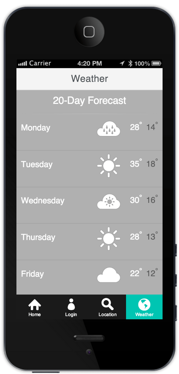
Ok great - but what about binding lists of data, and not just single values? Our Weather view has a good example of this:
<!--Weather-->
<div id="tabstrip-weather"
    data-role="view"
    data-title="Weather"
    data-model="app.weatherService.viewModel">

    <div class="weather">
        <p class="weather-title">20-Day Forecast</p>
        <div class="separator">
            <div class="dark"></div>
            <div class="light"></div>
        </div>
        <ul class="forecast-list"
            data-role="listview"
            data-bind="source: weatherDataSource"
            data-template="weather-forecast-template">
        </ul>
    </div>
</div>
You can see our Weather view has a data-model of app.weatherService.viewModel. In addition, the ul element is being turned into a Kendo UI listview via data-role="listview". A Kendo UI listview can bind to a data source (and automatically update if data in the data source changes), which we're doing with data-bind="source: weatherDataSource". Last, but not least, we specify that we need to use a template to render each item we get from the data source by setting the data-template attribute to "weather-forecast-template" (you can see the weather-forecast-template in the index.html file). Now our UI is ready to bind to a list of forecast data....but what does the JavaScript look like?
(function (global) {
    var WeatherViewModel,
        app = global.app = global.app || {};

    WeatherViewModel = kendo.data.ObservableObject.extend({
        weatherDataSource: null,

        init: function () {
            var that = this,
                dataSource;

            kendo.data.ObservableObject.fn.init.apply(that, []);

            dataSource = new kendo.data.DataSource({
                transport: {
                    read: {
                        url: "data/weather.json",
                        dataType: "json"
                    }
                }
            });

            that.set("weatherDataSource", dataSource);
        }
    });

    app.weatherService = {
        viewModel: new WeatherViewModel()
    };
})(window);
In the above JavaScript, you can see our WeatherViewModel will be an instance of a Kendo UI ObservableObject. In the init method of our observable, we're creating a Kendo UI DataSource and pointing the data source at our sample weather data contained in data/weather.json. We're also using the ObservableObject's set method to set the weatherDataSource property on our observable, so that any changes to the data source will be observable by the view we're binding this to. Between the declarative bindings in our markup, tying the view to this view model, and the weather data source itself retrieving our weather data, we've created a view that will update if any changes occur with fairly minimal effort:
Widgets
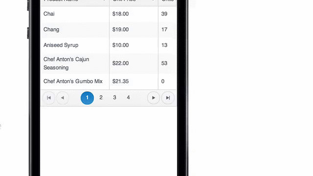
While View, Layouts and Transitions are helpful when it comes to managing UI concerns, they don't go as far as we need them to when it comes to very specific types of UI functionality. That's where widgets come in. A Kendo UI Mobile widget takes a specific concern (like scrolling, or buttons, for example) and gives you a very functional (not to mention pleasant-to-look-at) experience out-of-the-box, that you can further customize to fit your needs. The listview used on our Weather view is just one example – it provides a simple way to display a list of data, bind to a data source and more. The tab strip we're using in the footer of the sample app to navigate between views is another example of a Kendo UI Mobile widget. But it doesn't stop there. Widgets covering things like form controls, scolling, split views (on tablets, for example), drawers as well as more complex grids and schedulers all exist:
Grid Widget Example
Scheduler Widget Example
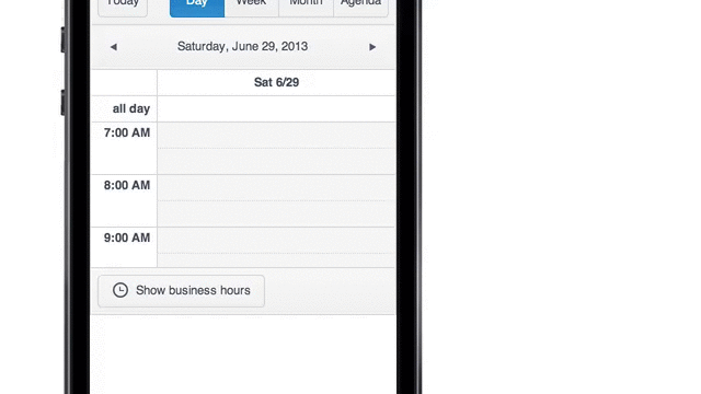
Check out the Kendo UI Mobile widgets demos for more.
Themes
Kendo UI provides some basic theming out-of-the-box by giving you both options of a native look-and-feel for supported devices, or a flat theme which you can use for a consistent look and feel across devices. However - just consider that the appetizer. The Kendo UI Mobile Theme Builder gives you an easy-to-use interface to customize themes for any (or all) target platforms, letting you import existing CSS as a starting point (if you've already customized it some) and download the resulting CSS when you're ready.
For example, let's say we have a mobile app that's targeting iOS, Android and Blackberry, but we'd like to customize the theme colors for our tab strip icons on Android devices. Here's what we start with in the theme builder:
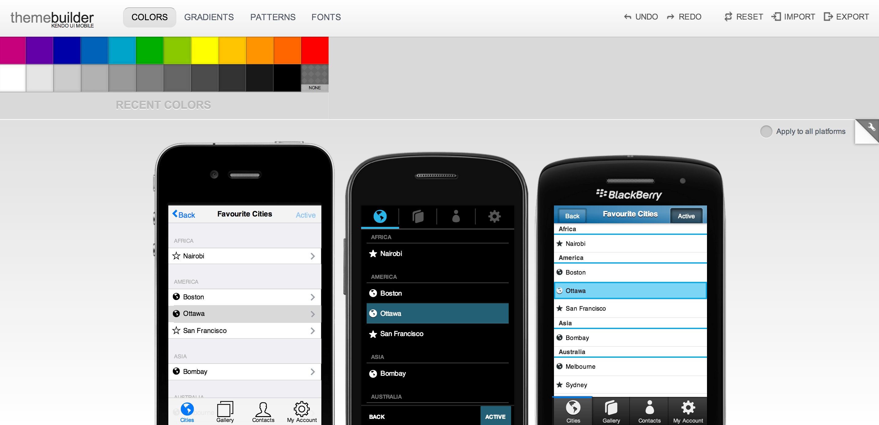
First - pick (and edit, if you want) a color:
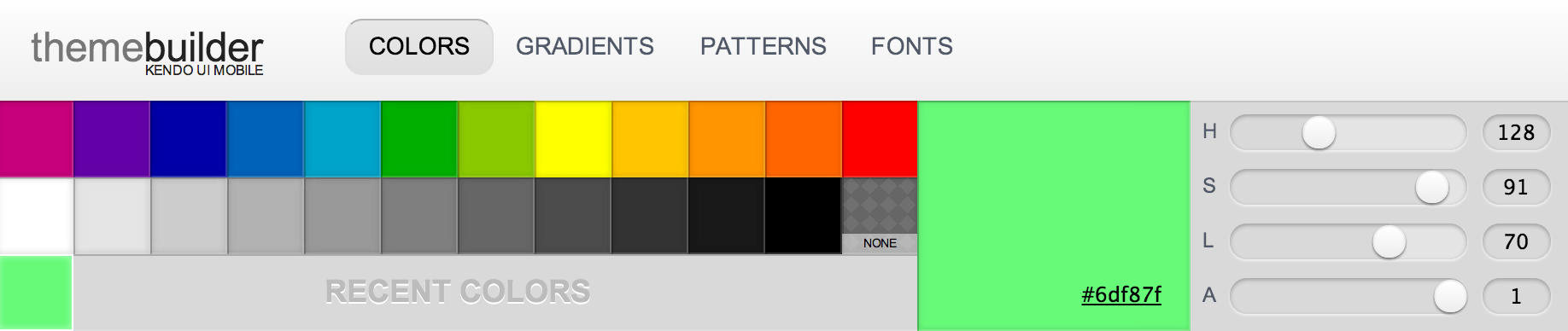
You'll notice that any colors you've picked or edited will show in the "Recent Colors" row just above the mobile devices. So if we wanted to take the color above and set it as the color for active tab strip icons on Android, you click on the color square, drag it to the element you want affected and drop it:
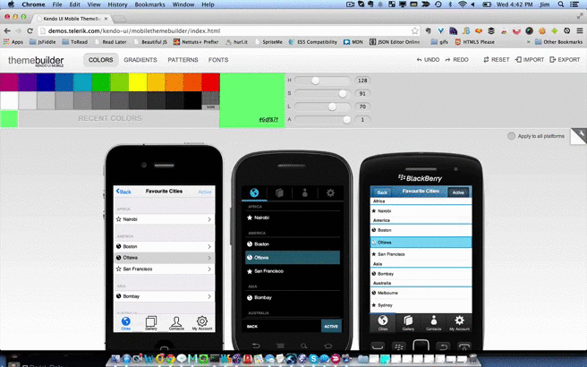
Once you've made all the changes you need, you can export the CSS - either copying it to place in your own file(s), or download a file containing it:

For all the developers who consider themselves "tragic accidents"" when it comes to design (that would be me), having a tool like this can make you immediately productive in customizing the look of your app!
Where to Go From Here
We've covered a lot of material in this post, yet you've only glimpsed a small part of what Kendo UI Mobile can do for you as you use it in tandem with AppBuilder to create mobile apps. I highly recommend checking out these links if you want to dive deeper:
Jim Cowart
Jim Cowart is an architect, developer, open source author, and overall web/hybrid mobile development geek. He is an active speaker and writer, with a passion for elevating developer knowledge of patterns and helpful frameworks.