Drag and Drop with the KendoReact Sortable Component

Summarize with AI:
Drag-and-drop interfaces allow for easy user interactions. Learn how the KendoReact Sortable component lets you add this function in a snap.
In modern web applications, one intuitive way to handle user interaction is through drag-and-drop interfaces. Drag-and-drop provides a tactile and visually intuitive method for users to manage elements, rearrange content or input data swiftly and efficiently.

The Progress KendoReact library offers a versatile Sortable component that provides a sortable drag-and-drop functionality for elements within a list.
In this article, we’ll explore the implementation of the KendoReact Sortable component using three distinct examples: a general implementation, a version with disabled items and a version that displays how the component emits details for many different drag-and-drop events.
The KendoReact Sortable Component
The KendoReact Sortable component, distributed through the kendo-react-sortable npm package, allows elements within a collection to be rearranged via drag and drop. This component is particularly useful for tasks like reordering lists, managing a set of interactive cards or even creating prioritization features in task management applications.
We’ll begin by setting up a basic sortable list similar to the example shown in the KendoReact documentation. We’ll start by importing the necessary modules and defining some initial styles for our items:
import { Sortable } from "@progress/kendo-react-sortable";

const getBaseItemStyle = (isActive) => ({
  height: 70,
  lineHeight: "68px",
  fontSize: "16px",
  textAlign: "center",
  outline: "none",
  border: "1px solid",
  cursor: "move",
  display: "block",
  width: 200,
  background: isActive ? "#27aceb" : "#bfe7f9",
  color: isActive ? "#fff" : "#1494d0",
  borderColor: isActive ? "#27aceb" : "#fff",
});

const SortableItem = (props) => {
  const { attributes, dataItem, forwardRef, isActive, style } = props;
  return (
    <div
      ref={forwardRef}
      {...attributes}
      style={{
        ...getBaseItemStyle(isActive),
        ...style,
      }}
    >
      {dataItem.text}
    </div>
  );
};

const App = () => {
  // ...
};
The SortableItem component represents a single item component intended to be interactive and visually indicative of its ability to be rearranged.

In our App component, we’ll initialize a state with an array of item objects, each containing an id and text. This state will manage the items displayed in the sortable list. We’ll have the App component render the Sortable component, configuring it to use the state data for its operations. The itemUI prop specifies the SortableItem component to render each item, so that they are displayed according to the defined styles and behaviors.
import { Sortable } from "@progress/kendo-react-sortable";

const getBaseItemStyle = (isActive) => ({
  /* ... */
});

const SortableItem = (props) => {
  // ...
};

const App = () => {
  const [data, setData] = React.useState([
    {
      id: 1,
      text: "item1",
    },
    {
      id: 2,
      text: "item2",
    },
    {
      id: 3,
      text: "item3",
    },
  ]);

  return (
    <div className="container-fluid">
      <Sortable idField={"id"} data={data} itemUI={SortableItem} />
    </div>
  );
};
At this moment, the Sortable component will render a list of items based on the state data.

Though our list of items is being rendered, dragging functionality would not work until we add an onDragOver prop to the Sortable component that updates the component state data whenever a drag is initiated and completed.
import { Sortable } from "@progress/kendo-react-sortable";

const getBaseItemStyle = (isActive) => ({
  /* ... */
});

const SortableItem = (props) => {
  // ...
};

const App = () => {
  const [data, setData] = React.useState([
    /* ... */
  ]);

  const onDragOver = (event) => {
    setData(event.newState);
  };

  return (
    <div className="container-fluid">
      <Sortable
        // ...
        onDragOver={onDragOver}
      />
    </div>
  );
};
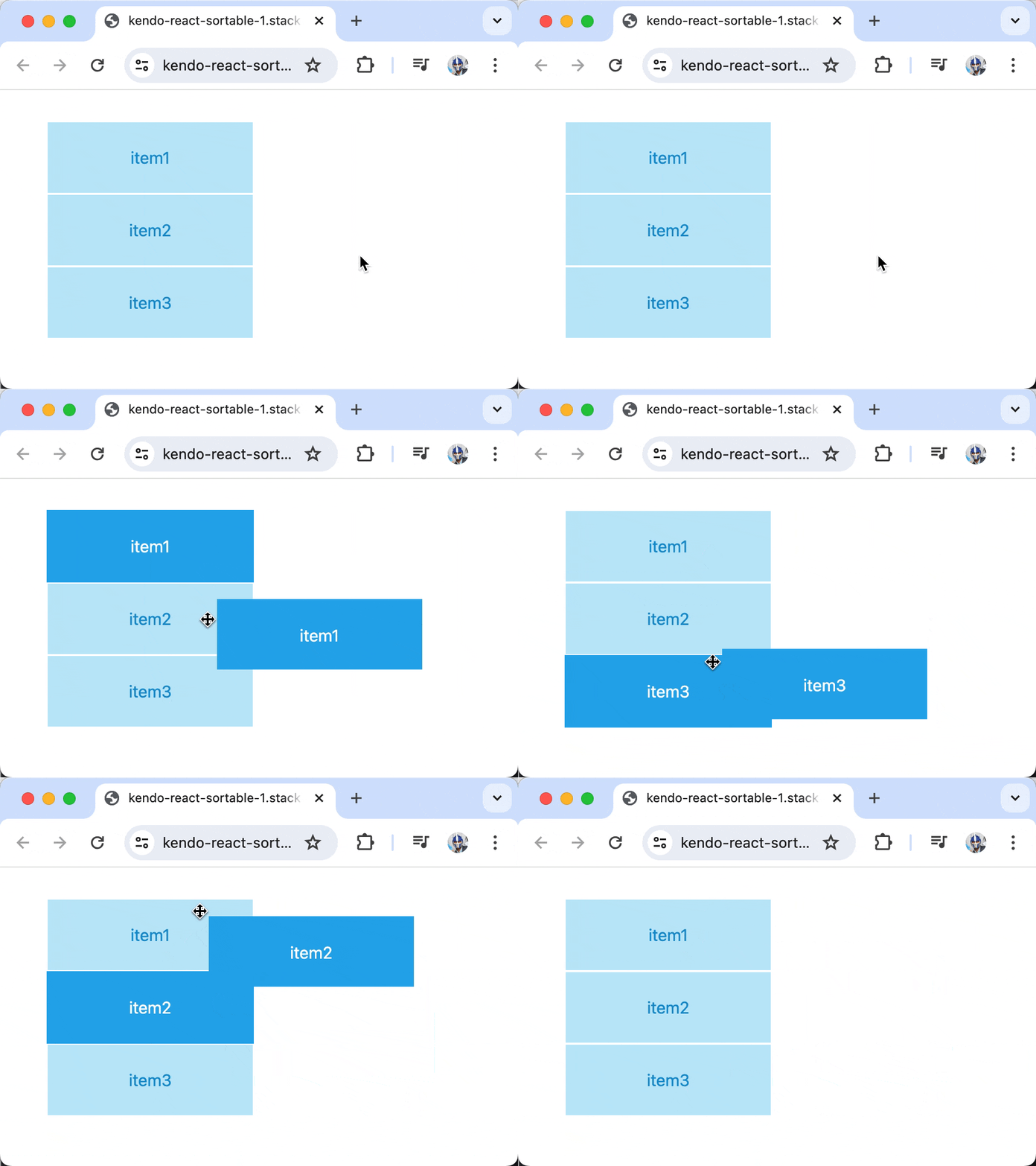
Now, when items are dragged over each other, the onDragOver event updates the state to reflect the new order, enabling full drag-and-drop functionality!

Disabling Items
The KendoReact Sortable component allows for selectively disabling items within a sortable list by using the disabledField prop. This prop accepts the name of a field in the item object, which determines if the item should be disabled. To disable an item, we can set the field name (in our case, disabled) to true for certain items in the data array. This marks the item as non-interactive, meaning it cannot be dragged but still remains visible within the list.
import { Sortable } from "@progress/kendo-react-sortable";

const getBaseItemStyle = (isActive) => ({
  /* ... */
});

const SortableItem = (props) => {
  // ...
};

const App = () => {
  const [data, setData] = React.useState([
    // ...,
    {
      id: 3,
      text: "item3",
      disabled: true,
    },
  ]);

  return (
    <div className="container-fluid">
      <Sortable
        // ...
        disabledField={"disabled"}
      />
    </div>
  );
};
To visually distinguish disabled items from those that are interactive, we can modify the getBaseItemStyle() function to incorporate styles that signify an item’s disabled state. These styles would include changes in cursor type, reduced opacity and the disabling of pointer events to prevent interaction.
import { Sortable } from "@progress/kendo-react-sortable";

const getBaseItemStyle = (isDisabled, isActive) => ({
  // ...
  cursor: isDisabled ? "default" : "move",
  opacity: isDisabled ? 0.6 : 1.0,
  pointerEvents: isDisabled ? "none" : "initial",
  boxShadow: isDisabled ? "none" : "initial",
  // ...
});
const SortableItem = (props) => {
  const { isDisabled, attributes, dataItem, forwardRef, isActive, style } =
    props;
  return (
    <div
      ref={forwardRef}
      {...attributes}
      style={{
        ...getBaseItemStyle(isDisabled, isActive),
        ...style,
      }}
    >
      {dataItem.text}
    </div>
  );
};

const App = () => {
  // ...
};
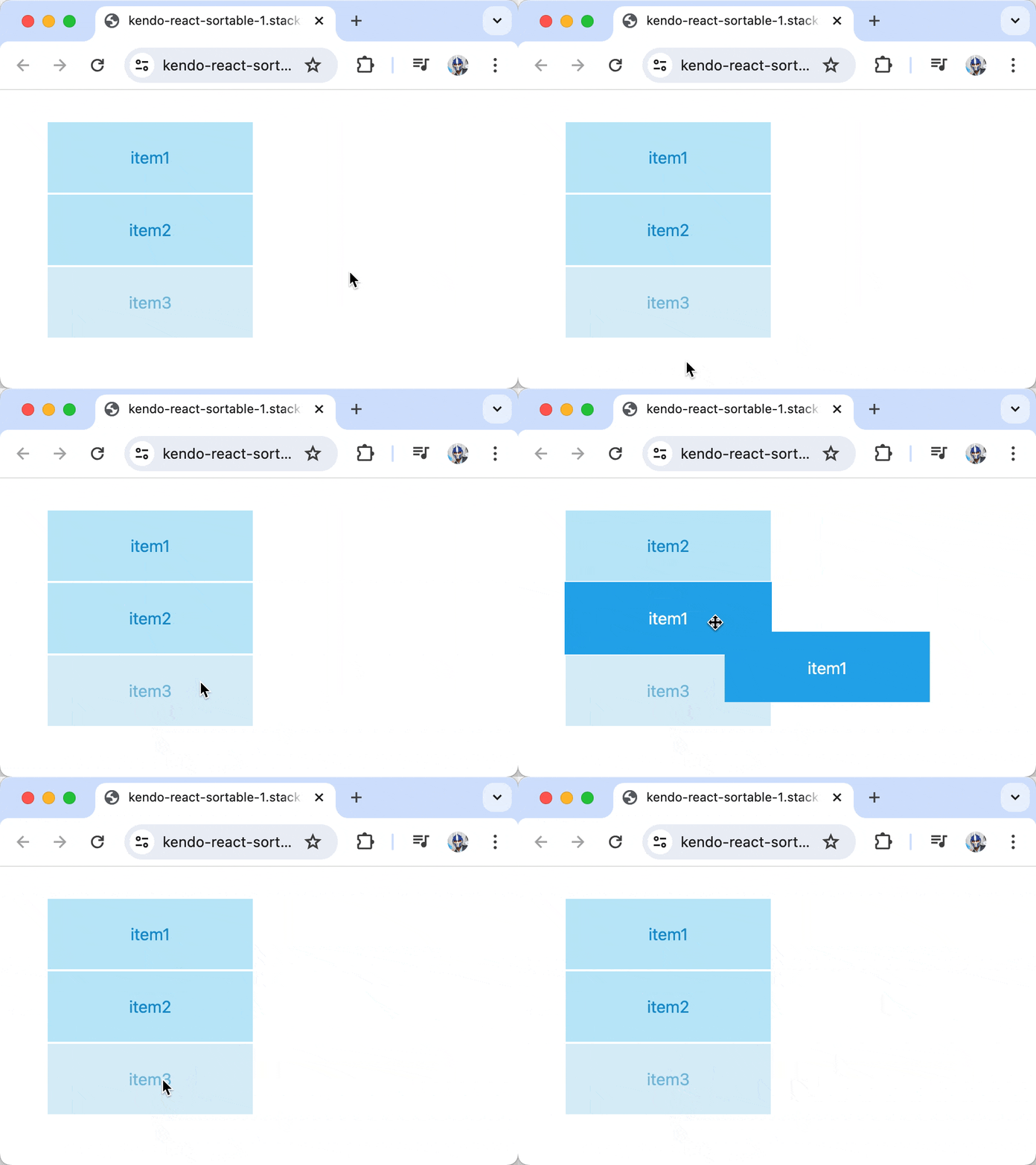
With these changes, we’ve effectively configured one item, specifically the item with the text item3, to be disabled.

Events
The KendoReact Sortable component generates a variety of events that we can handle, which allows us to tailor the component’s behavior to our specific requirements. To see this in action, we can log the event object that’s emitted to the console when the onDragOver() function is triggered.
import { Sortable } from "@progress/kendo-react-sortable";

const getBaseItemStyle = (isDisabled, isActive) => ({
  /* ... */
});

const SortableItem = (props) => {
  // ...
};

const App = () => {
  const [data, setData] = React.useState([
    /* ... */
  ]);

  const onDragOver = (event) => {
    console.log("onDragOver", event);
    setData(event.newState);
  };

  return (
    <div className="container-fluid">
      <Sortable
        // ...
        onDragOver={onDragOver}
      />
    </div>
  );
};
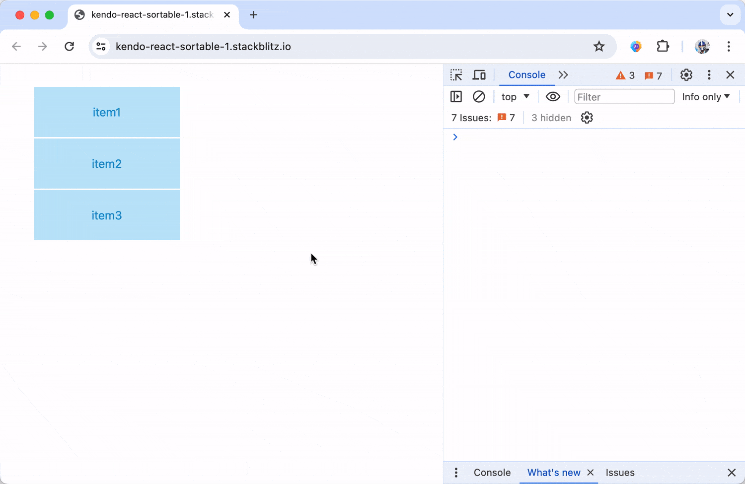
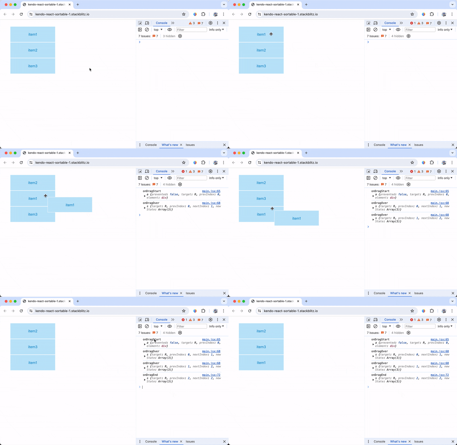
When dragging items across the list, we’ll be able to see information about the item’s previous and new index position, as well as what the rearranged shape of data becomes.

onDragOver() isn’t the only event that gets triggered. The Sortable component also responds to events like onDragStart() and onDragEnd().
import { Sortable } from "@progress/kendo-react-sortable";

const getBaseItemStyle = (isDisabled, isActive) => ({
  /* ... */
});

const SortableItem = (props) => {
  // ...
};

const App = () => {
  const [data, setData] = React.useState([
    /* ... */
  ]);

  const onDragStart = (event) => {
    console.log("onDragStart", event);
  };

  const onDragOver = (event) => {
    console.log("onDragOver", event);
    setData(event.newState);
  };

  const onDragEnd = (event) => {
    console.log("onDragEnd", event);
  };

  return (
    <div className="container-fluid">
      <Sortable
        // ...
        onDragStart={onDragStart}
        onDragOver={onDragOver}
        onDragEnd={onDragEnd}
      />
    </div>
  );
};
With this setup, we can monitor all phases of the drag-and-drop process, providing insights into user interactions and the ability to adjust behaviors dynamically during the start, during and after the drag operation.

Wrap-up
In conclusion, the KendoReact Sortable component offers developers a powerful tool for enhancing React applications with intuitive drag-and-drop functionality. Whether you need to reorder lists, manage interactive cards or implement prioritization features in your applications, this component provides the flexibility and customization options to meet these drag-and-drop requirements.
For more details and advanced configurations (like nested items!), be sure to check out the official component documentation.
And if you haven’t already, give KendoReact a try, free for 30 days.

Hassan Djirdeh
Hassan is a senior frontend engineer and has helped build large production applications at-scale at organizations like Doordash, Instacart and Shopify. Hassan is also a published author and course instructor where he’s helped thousands of students learn in-depth frontend engineering skills like React, Vue, TypeScript, and GraphQL.

