
Building Interactive Dialogs in KendoReact

Check out the KendoReact Dialog, which can provide your users an interaction without disrupting their workflow. Learn how to implement it into your React app.
Dialogs are essential components in modern web applications. They provide users with a focused interface for important interactions without disrupting their workflow. Whether confirming an action, collecting user input or displaying additional information, dialogs help streamline user interactions while maintaining context.
In this article, we’ll explore the React Dialog component from Progress KendoReact, its key features and how to integrate it into a React application.
The KendoReact Dialog package is available for free with its full functionality as part of KendoReact Free—an initiative to make a limited set of React components freely accessible, with no obligations attached!
Dialogs & Modals
In modern web application development, dialogs and modals serve as critical interface elements that temporarily interrupt the user’s workflow to focus attention on specific content or actions. These overlay components appear above the main content, creating a visual hierarchy that indicates their importance.
Dialogs and modals differ from standard page navigation in that they maintain the context of the underlying page while requiring the user to interact with the presented content before returning to the main interface. This contextual preservation is valuable when users need to:
- Complete form submissions without navigating away from their current view.
- Confirm essential actions such as deletions or permanent changes.
- View additional information or details that supplement the main content.
- Etc.
Well-designed dialogs often improve user experience by reducing cognitive load—users remain oriented within the application while addressing specific tasks or reviewing important information.
The KendoReact Dialog component
The KendoReact Dialog is part of a React UI library that provides native React components. The KendoReact Dialog component is distributed through the @progress/kendo-react-dialogs npm package and can be imported directly.
npm install @progress/kendo-react-dialogs
Once installed, we can import the Dialog component into our React application:
import { Dialog } from "@progress/kendo-react-dialogs";
Here’s a simple example that demonstrates the basic usage of the KendoReact Dialog component:
import * as React from "react";
import { Dialog } from "@progress/kendo-react-dialogs";
const App = () => {
return (
<div>
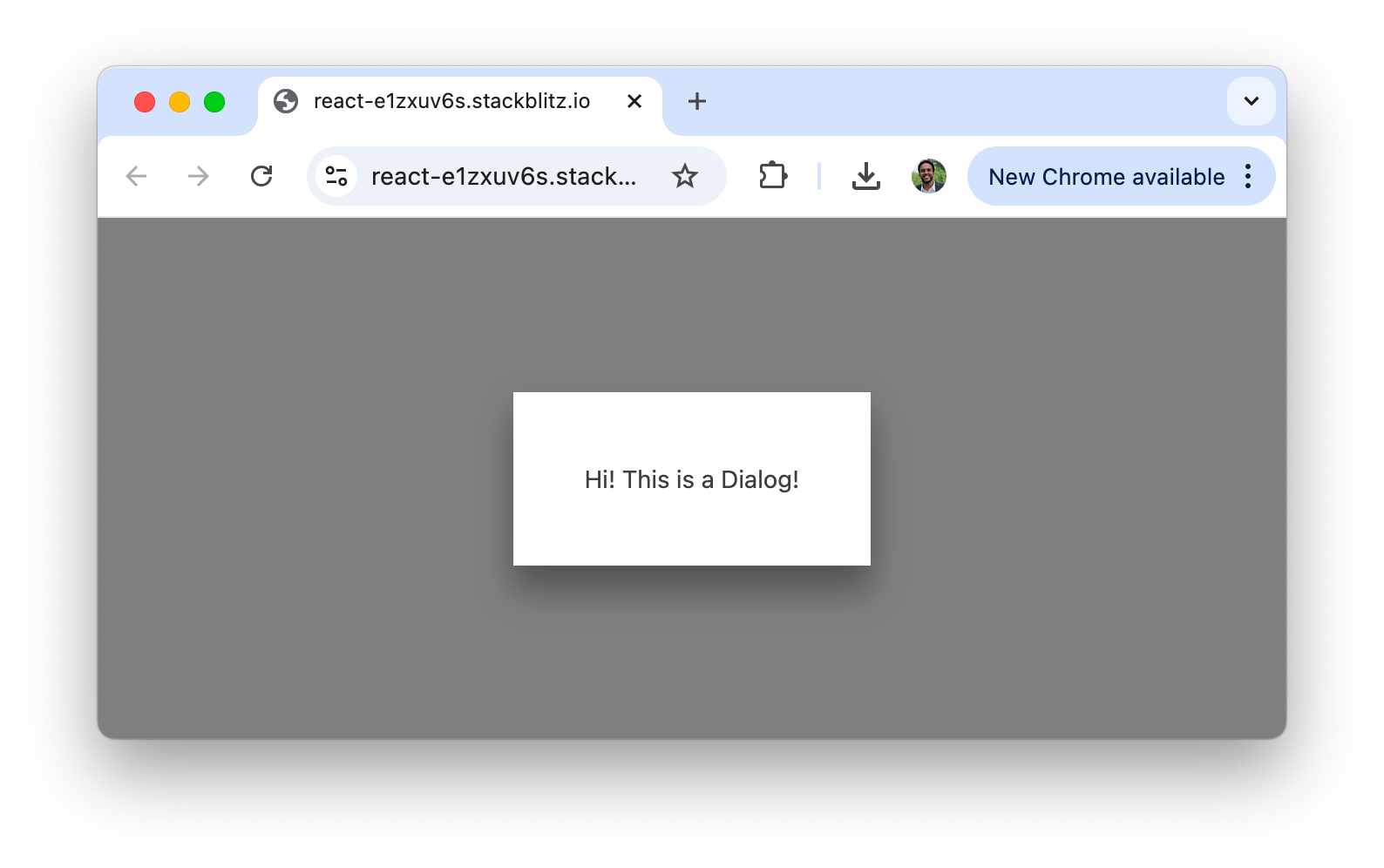
<Dialog>
<p>Hi! This is a Dialog!</p>
</Dialog>
</div>
);
};
export default App;
In the above example, we’ve created a simple dialog that renders a message inside the Dialog component. By default, the dialog appears as a modal overlay, so users focus on the presented content before interacting with other elements on the page.
In the following sections, we’ll explore additional features that the KendoReact Dialog component supports.
Title
The <Dialog /> component provides options for displaying and customizing titles with the use of the title property:
import * as React from "react";
import { Dialog } from "@progress/kendo-react-dialogs";
const App = () => {
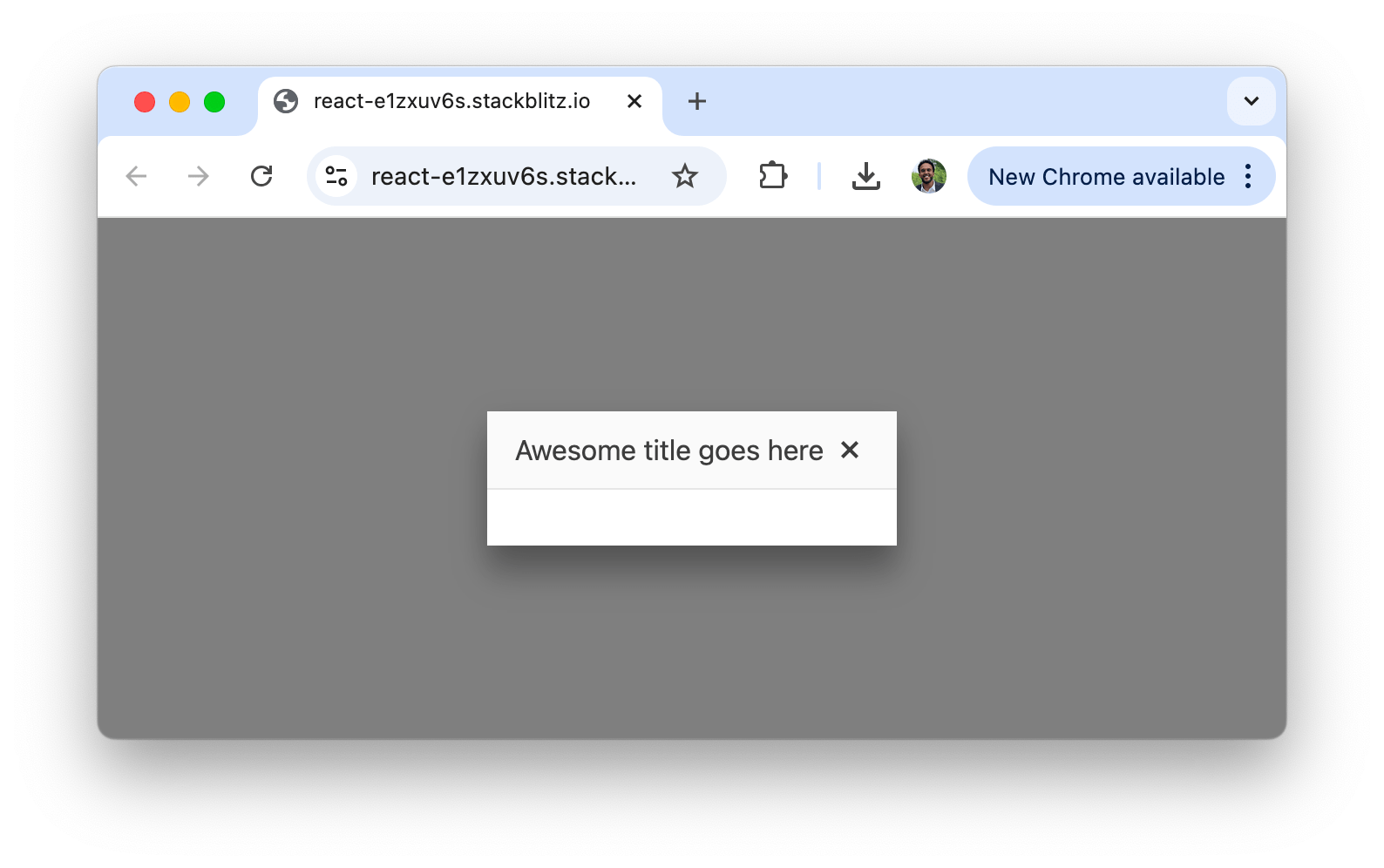
return <Dialog title="Awesome title goes here" />;
};
export default App;
The above renders a simple Dialog with the title of "Awesome title goes here".
For more complex title requirements, we can pass components, functions or HTML elements to create custom title bars:
import * as React from "react";
import { Dialog } from "@progress/kendo-react-dialogs";
import { SvgIcon } from "@progress/kendo-react-common";
import { printIcon } from "@progress/kendo-svg-icons";
const CustomTitleBar = () => {
return (
<div
className="custom-title"
style={{ fontSize: "18px", lineHeight: "1.3em" }}
>
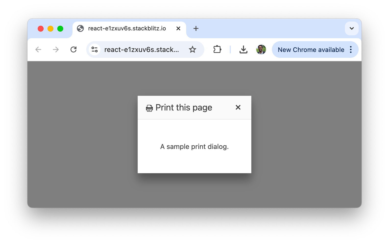
<SvgIcon icon={printIcon} /> Print this page
</div>
);
};
const App = () => {
return (
<Dialog title={<CustomTitleBar />}>
<p style={{ margin: "30px", textAlign: "center" }}>
A sample print dialog.
</p>
</Dialog>
);
};
export default App;
In the above example, we’ve created a custom title with an icon, providing a more intuitive interface for a print dialog. Users will see the print icon followed by the text "Print this page" in the dialog’s title area when viewing this dialog.
Visibility
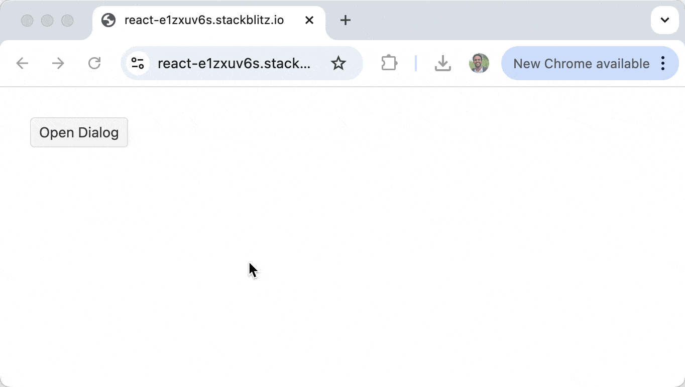
Controlling the visibility of dialog components is important for creating an interactive user experience. The Dialog component is visible by default, but we can control its visibility using simple state variables:
import * as React from "react";
import { Dialog, DialogActionsBar } from "@progress/kendo-react-dialogs";
import { Button } from "@progress/kendo-react-buttons";

const App = () => {
  const [visible, setVisible] = React.useState(false);

  const toggleDialog = () => {
    setVisible(!visible);
  };

  return (
    <div>
      <Button type="button" onClick={toggleDialog} id="open-dialog">
        Open Dialog
      </Button>
      {visible && (
        <Dialog title={"Please confirm"} onClose={toggleDialog}>
          <p style={{ margin: "25px", textAlign: "center" }}>
            Are you sure you want to continue?
          </p>
          <DialogActionsBar>
            <Button type="button" onClick={toggleDialog}>
              No
            </Button>
            <Button type="button" onClick={toggleDialog}>
              Yes
            </Button>
          </DialogActionsBar>
        </Dialog>
      )}
    </div>
  );
};

export default App;
In the above example, we use the visible state to control whether the Dialog is rendered in the DOM. Clicking the “Open Dialog” button will toggle the visibility of the dialog by changing the state value.
The dialog also includes an onClose handler that calls the same toggleDialog() function when the user clicks the close button (X) in the dialog’s title bar.
When running this example, the dialog will initially be hidden. Clicking the “Open Dialog” button will make it appear, and clicking either the “No” or “Yes” buttons or the Close button in the title bar will hide it again. This conditional rendering approach is a standard pattern in React applications for managing the display of modal components.
Note that in the above code example, we used the React DialogActionsBar component from the Dialog package to add and customize action buttons. The layout property of the DialogActionsBar component allows for control over the positioning of the Dialog action buttons with the default being the stretched layout.
Dimensions
The Dialog component allows us to customize its dimensions for different content requirements. We can specify the width and height of the dialog using the width and height properties:
import * as React from "react";
import { Dialog, DialogActionsBar } from "@progress/kendo-react-dialogs";
import { Button } from "@progress/kendo-react-buttons";
const App = () => {
const [visible, setVisible] = React.useState(false);
const toggleDialog = () => {
setVisible(!visible);
};
return (
<div>
<Button type="button" onClick={toggleDialog} id="open-dialog">
Open Dialog
</Button>
{visible && (
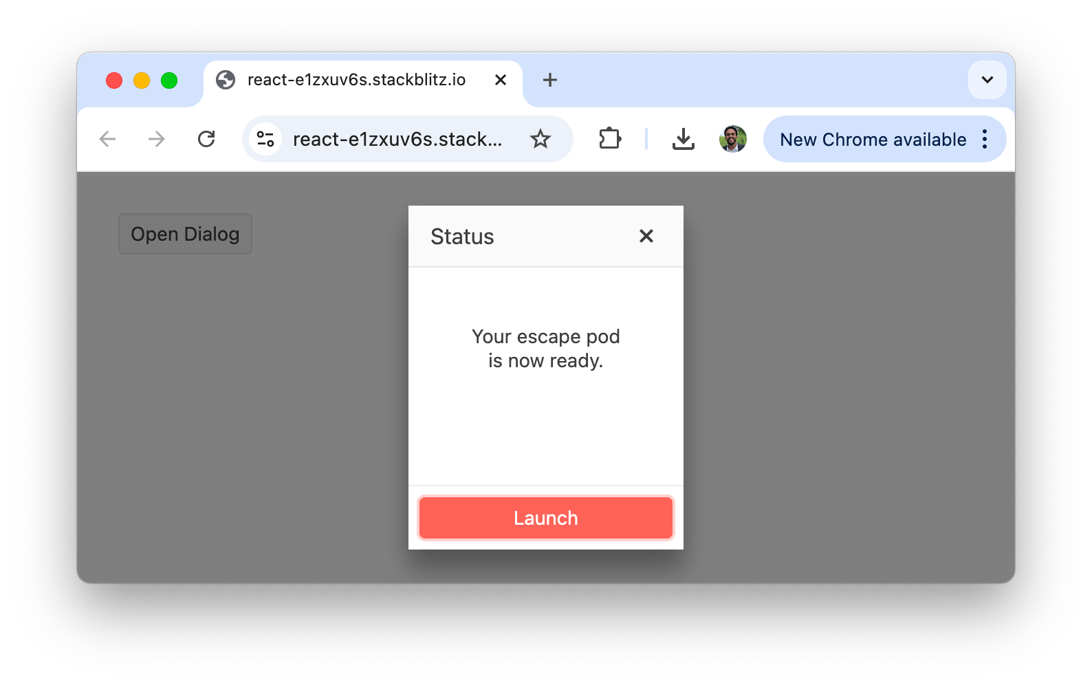
<Dialog
title={"Status"}
onClose={toggleDialog}
width={200}
height={250}
>
<p style={{ margin: "25px", textAlign: "center" }}>
Your escape pod is now ready.
</p>
<DialogActionsBar>
<Button themeColor={"primary"} onClick={toggleDialog}>
Launch
</Button>
</DialogActionsBar>
</Dialog>
)}
</div>
);
};
export default App;
In this example, we’ve created a dialog with specific dimensions (200px width, 250px height) smaller than the examples we’ve seen earlier in this article.
KendoReact
KendoReact offers a robust suite of UI components for React applications, covering everything from essential building blocks like Buttons and Dialogs to advanced, highly specialized components like Charts and Data Grids.
This diverse ecosystem of components—from form elements (Inputs, Checkboxes and Dropdowns) to utility and animation components (Ripple, Loader and Tooltip)—enables developers to build professional-grade applications with a consistent design language. Whether you need simple UI elements or more utility-focused components, KendoReact offers smooth integration and a polished user experience across your application.
For more details, check out the official documentation for the KendoReact library.
Wrap-up
Dialogs are essential for capturing user input and displaying important information in modern web applications. The KendoReact Dialog component offers a simple yet flexible approach to implementing dialogs in React applications, with support for title configurations, visibility control mechanisms, action button layouts and dimensional specifications.
For more details, be sure to check out the official Dialog component documentation!
And to try it out for yourself, install KendoReact Free now. It’s completely free to use in production without having to go through any forms.

Hassan Djirdeh
Hassan is a senior frontend engineer and has helped build large production applications at-scale at organizations like Doordash, Instacart and Shopify. Hassan is also a published author and course instructor where he’s helped thousands of students learn in-depth frontend engineering skills like React, Vue, TypeScript, and GraphQL.
Related Posts
Comments
All articles
Topics
Web Mobile DesktopDesktop
Design
Productivity
People

Latest Stories
in Your Inbox
Subscribe to be the first to get our expert-written articles and tutorials for developers!
All fields are required