
Interactive UI Elements—Exploring KendoReact Button Component Ecosystem

Summarize with AI:
Probably the first interactive element you’ll be including in your app is a button. Let’s take a look at the KendoReact button components.
Buttons are fundamental building blocks in modern web applications. They are the primary interactive elements that enable users to trigger actions, submit forms and navigate different views. Whether a simple action like saving data or a complex operation like initiating a workflow, buttons provide users with a clear, recognizable way to interact with an application.
In this article, we’ll explore the React Button components available in the React UI library from Progress KendoReact, their key features and how to integrate them into a React application.
As of March 2025, some components from the KendoReact Buttons package are now free with their full functionality, along with more than 50 other essential React components! This is part of an initiative to make a select set of KendoReact components freely accessible without obligations. Check out the Get Started with KendoReact Free documentation for more details.
Button Types in Modern Web Applications
In modern web development, buttons come in various types and styles, each serving different purposes in a user interface. From standard buttons that trigger immediate actions to more complex variants like dropdown buttons that provide multiple options, the right button type can enhance the user experience by making interactions more intuitive.
Buttons differ from hyperlinks in that they are designed specifically for executing actions rather than navigation. Well-designed buttons can improve user experience by:
- Providing clear visual cues for interactive elements
- Offering immediate feedback through visual states (such as hover, active, disabled)
- Creating a hierarchy among available actions
- Grouping related functionality in a coherent way
Components from the KendoReact Buttons package provide comprehensive options for implementing various button types in our React applications, from simple action buttons to more complex interactive elements.
The KendoReact Buttons Package
The KendoReact Buttons package is a collection of customizable, responsive and interactive UI components that we can use to trigger actions or display content in our React apps. Components are distributed through the @progress/kendo-react-buttons npm package.
npm install @progress/kendo-react-buttons
Once installed, we can import components like the standard <Button /> component into our React application:
import { Button } from "@progress/kendo-react-buttons";
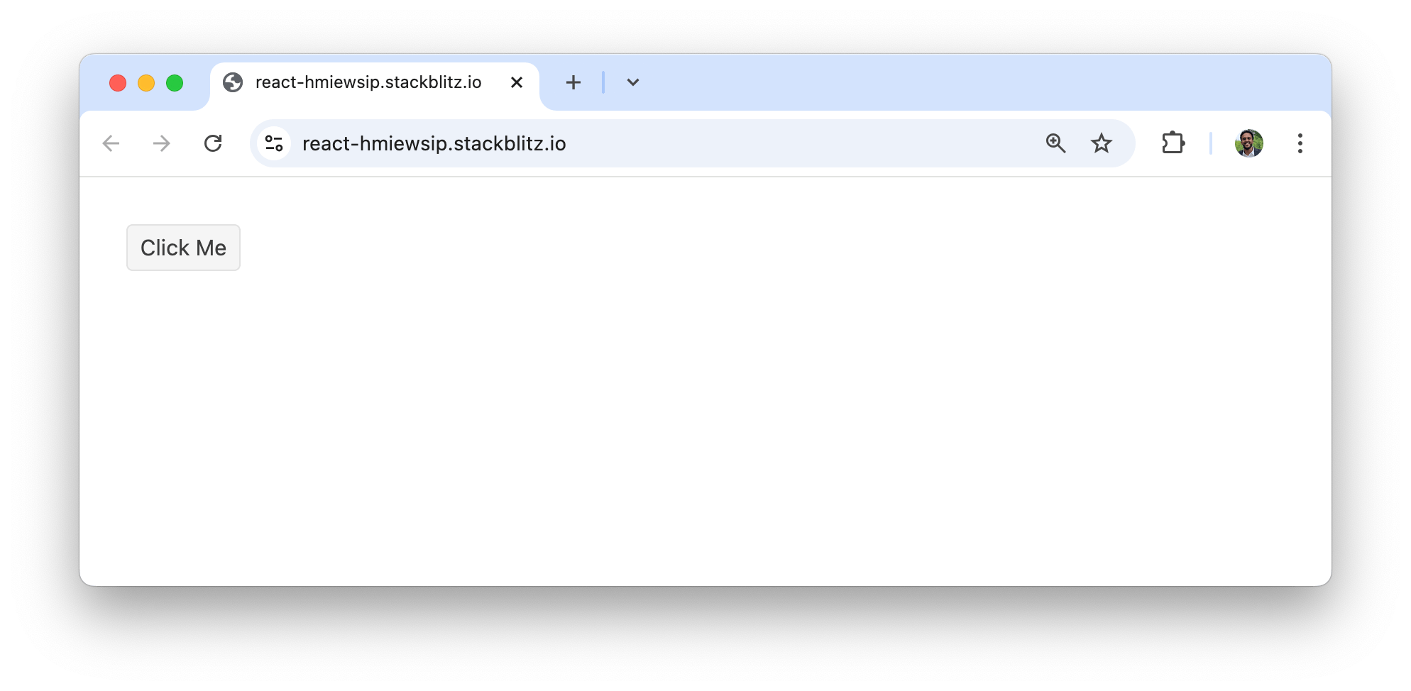
Here’s a simple example that demonstrates the basic usage of the KendoReact <Button /> component:
import * as React from "react";
import { Button } from "@progress/kendo-react-buttons";

const App = () => {
  return (
    <div>
      <Button type="button">Click Me</Button>
    </div>
  );
};

export default App;
In the above example, we’ve created a simple button that renders with the text “Click Me.” By default, the button appears with the standard styling, so users can quickly identify it as an interactive element.
In the following sections, we’ll explore the various styles and features that the KendoReact Button components offer.
Standard Button Variations
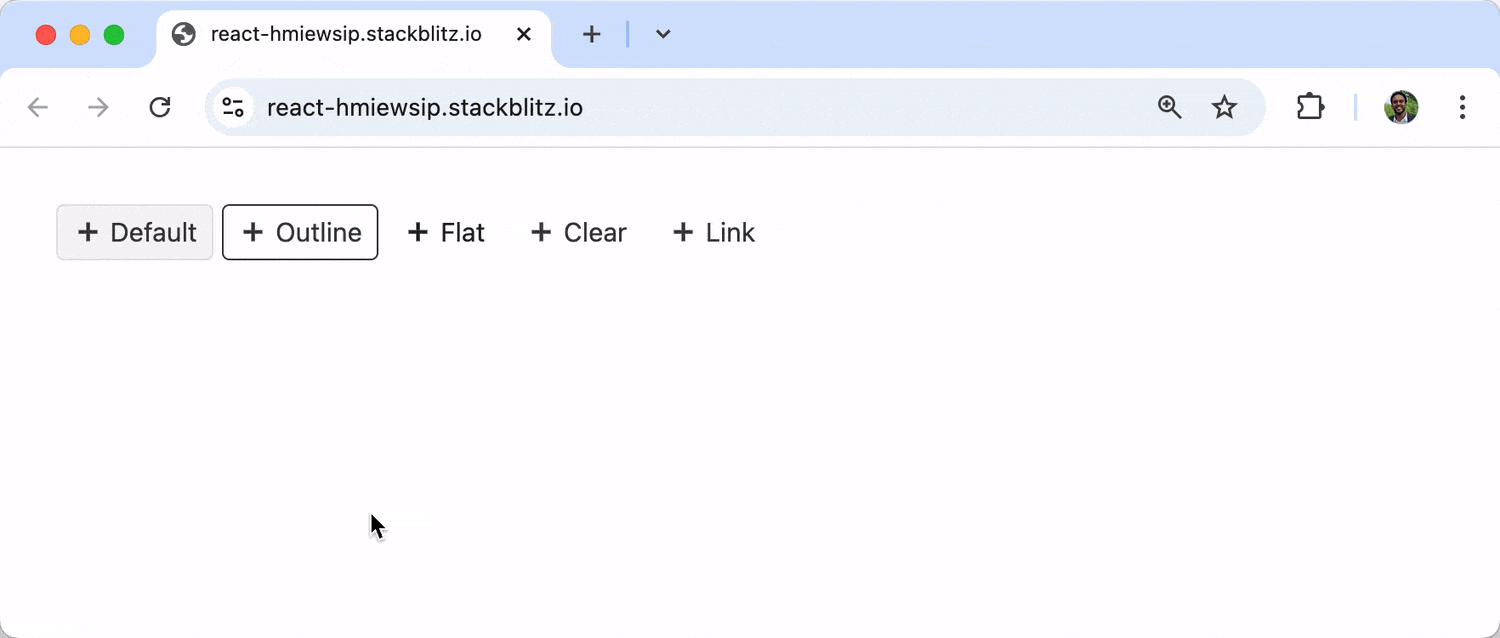
Fill Mode
The KendoReact Button component provides several styling options through the fillMode property, allowing us to create buttons that fit different design requirements and contexts.
import * as React from "react";
import { Button } from "@progress/kendo-react-buttons";
import { plusIcon } from "@progress/kendo-svg-icons";

const App = () => {
  return (
    <div>
      <Button svgIcon={plusIcon} type="button">
        Default
      </Button>

      <Button svgIcon={plusIcon} type="button" fillMode={"outline"}>
        Outline
      </Button>

      <Button svgIcon={plusIcon} type="button" fillMode={"flat"}>
        Flat
      </Button>

      <Button svgIcon={plusIcon} type="button" fillMode={"clear"}>
        Clear
      </Button>

      <Button svgIcon={plusIcon} type="button" fillMode={"link"}>
        Link
      </Button>
    </div>
  );
};

export default App;
In the above example, we’ve created five buttons with different fill modes:
- Default: Has a solid background with a border
- Outline: Has a transparent background with a visible border
- Flat: Has a solid background without a border
- Clear: Has a transparent background without a border
- Link: Appears like a hyperlink
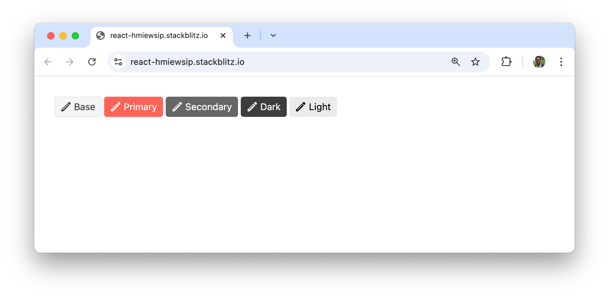
Theme Colors
The KendoReact Button component also supports different theme colors through the themeColor property:
import * as React from "react";
import { Button } from "@progress/kendo-react-buttons";
import { pencilIcon } from "@progress/kendo-svg-icons";

const App = () => {
  return (
    <div>
      <Button svgIcon={pencilIcon} type="button" themeColor={"base"}>
        Base
      </Button>

      <Button svgIcon={pencilIcon} type="button" themeColor={"primary"}>
        Primary
      </Button>

      <Button svgIcon={pencilIcon} type="button" themeColor={"secondary"}>
        Secondary
      </Button>

      <Button svgIcon={pencilIcon} type="button" themeColor={"dark"}>
        Dark
      </Button>

      <Button svgIcon={pencilIcon} type="button" themeColor={"light"}>
        Light
      </Button>
    </div>
  );
};

export default App;
The theme colors allow us to create a visual hierarchy among button actions, making it easier for users to identify primary and secondary actions. And there are variety of other theme colors—see the API or the demo in the docs.
Icons
The KendoReact Button component supports include icons with the svgIcon property:
import * as React from "react";
import { Button } from "@progress/kendo-react-buttons";
import { heartIcon } from "@progress/kendo-svg-icons";

const App = () => {
  return (
    <div>
      <Button svgIcon={heartIcon} type="button" />

      {/* Icon with text */}
      <Button svgIcon={heartIcon} type="button">
        Like
      </Button>
    </div>
  );
};

export default App;
In the above example, we display buttons with the heart icon from the @progress/kendo-svg-icons library.
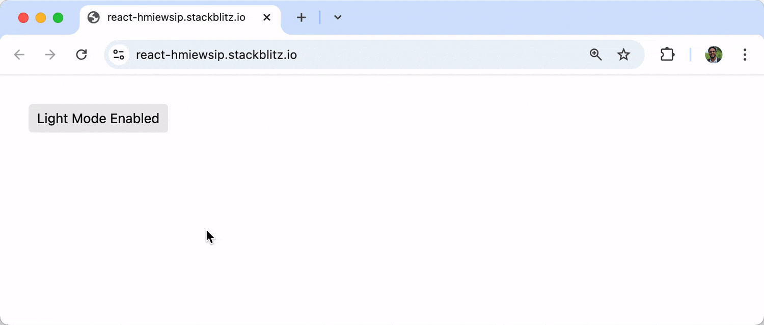
Toggleable Buttons
The KendoReact Button component also supports a toggleable state, which is useful for actions that can be turned on and off:
import * as React from "react";
import { Button } from "@progress/kendo-react-buttons";

const App = () => {
  const [isDarkMode, setIsDarkMode] = React.useState(false);

  return (
    <div>
      <Button
        togglable={true}
        selected={isDarkMode}
        onClick={() => setIsDarkMode(!isDarkMode)}
        themeColor={isDarkMode ? "dark" : "light"}
      >
        {isDarkMode ? "Dark Mode Enabled" : "Light Mode Enabled"}
      </Button>
    </div>
  );
};

export default App;
In the above example, we’ve created a toggleable button that switches between light and dark modes. The button’s appearance changes based on the selected state, providing visual feedback to the user.
Floating Action Buttons
Floating Action Buttons in KendoReact are a special type of button that represents the primary or most common action in an application. They typically appear as circular buttons that float above the interface, making them easily accessible regardless of where the user is on the page.
The KendoReact FloatingActionButton component is also distributed through the @progress/kendo-react-buttons npm package:
import * as React from "react";
import { FloatingActionButton } from "@progress/kendo-react-buttons";
import { plusIcon } from "@progress/kendo-svg-icons";

const App = () => {
  return (
    <div>
      <FloatingActionButton svgIcon={plusIcon} />
    </div>
  );
};

export default App;
The FloatingActionButton can be positioned anywhere in our application using CSS positioning but, by default, is often positioned in the bottom-right corner.
The KendoReact FloatingActionButton is free to use as part of the KendoReact Free library.
SplitButton
The KendoReact SplitButton is a premium component that combines a standard button with a dropdown menu. It allows users to execute a default action by clicking the main button area or choosing a set of related actions from the dropdown.
The KendoReact SplitButton component is also distributed through the @progress/kendo-react-buttons npm package:
import * as React from "react";
import { SplitButton } from "@progress/kendo-react-buttons";
import {
  clipboardHtmlIcon,
  clipboardTextIcon,
} from "@progress/kendo-svg-icons";

const App = () => {
  const items = [
    {
      text: "Keep Text Only",
      svgIcon: clipboardTextIcon,
    },
    {
      text: "Paste as HTML",
      svgIcon: clipboardHtmlIcon,
    },
    {
      text: "Paste Markdown",
      svgIcon: clipboardHtmlIcon,
    },
    {
      text: "Set Default Paste",
    },
  ];

  const handleClick = () => {
    console.log("Default paste action executed");
  };

  const handleItemClick = (event) => {
    console.log(`Selected option: ${event.item.text}`);
  };

  return (
    <div>
      <SplitButton
        text="Paste"
        items={items}
        onClick={handleClick}
        onItemClick={handleItemClick}
      />
    </div>
  );
};

export default App;
In this example, we’ve created a split button for paste operations. Clicking the main button area executes the default paste action, while clicking the dropdown arrow reveals additional paste options.
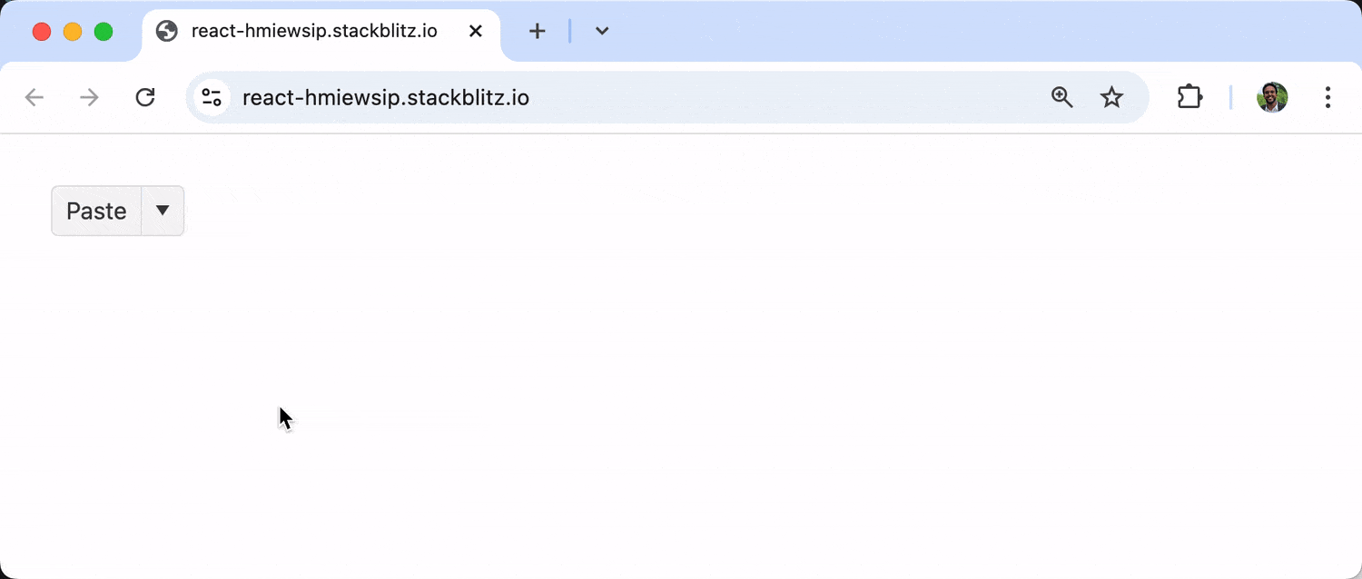
The KendoReact SplitButton is part of KendoReact premium.
DropDownButton
The KendoReact DropDownButton is another premium component that displays a popup list with action items. Unlike the SplitButton, the DropDownButton doesn’t have a separate default action area; clicking anywhere on the button opens the dropdown menu.
import * as React from "react";
import { DropDownButton } from "@progress/kendo-react-buttons";

const App = () => {
  const items = [
    "My Profile",
    "Friend Requests",
    "Account Settings",
    "Support",
    "Log Out",
  ];

  const handleItemClick = (event) => {
    console.log(`Selected option: ${event.item.text}`);
  };

  return (
    <div>
      <DropDownButton
        text="User Settings"
        items={items}
        onItemClick={handleItemClick}
      />
    </div>
  );
};

export default App;
In the above example, we’ve created a dropdown button for user settings. Clicking the button opens a dropdown with various user-related options.
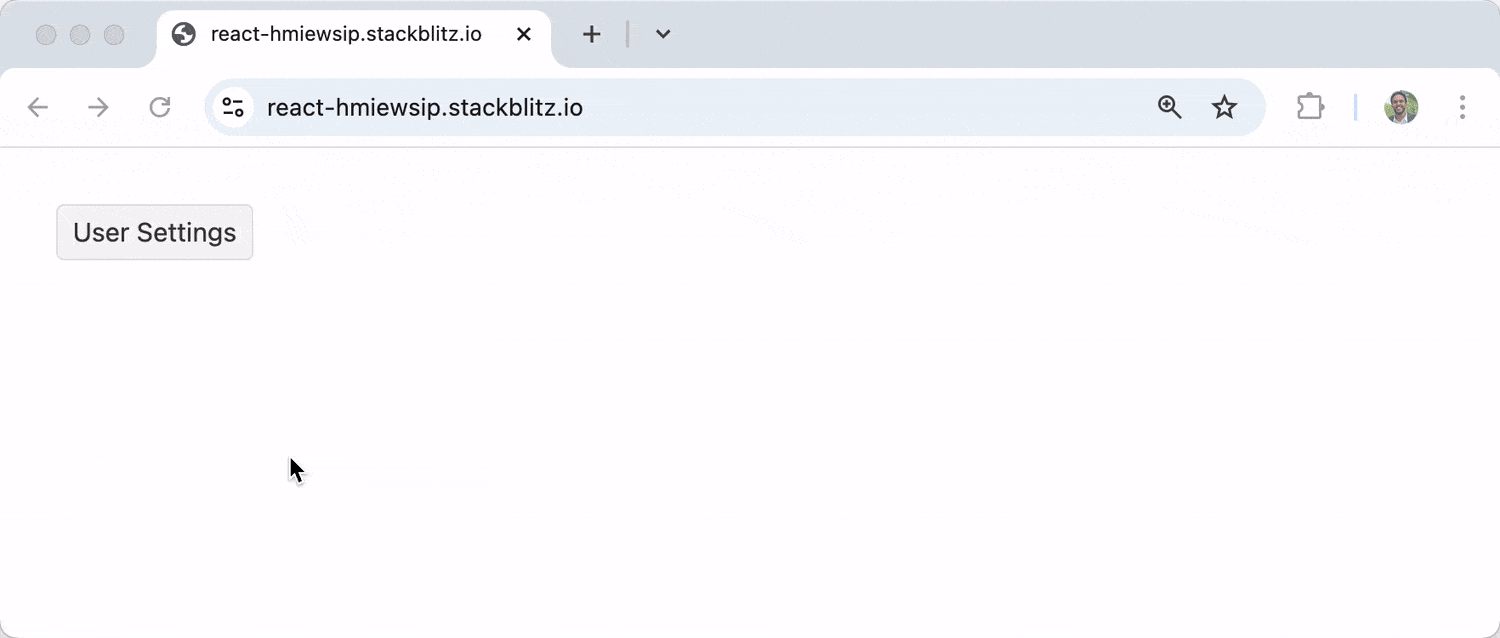
The KendoReact DropDownButton is part of KendoReact premium.
Like other KendoReact button components, the SplitButton and DropDownButton support different fill modes and theme colors. And the React ButtonGroup component is a nice feature for grouping buttons.
Wrap-up
Buttons are essential interactive elements in modern web applications, enabling users to trigger actions and make choices. While we’ve explored several key components from the KendoReact Buttons package in this article, the library offers even more options, including ButtonGroup, Toolbar, Chip and ChipList—be sure to check the official documentation to discover all the components available for creating intuitive, visually appealing user interfaces.
Check out KendoReact for yourself:

Hassan Djirdeh
Hassan is a senior frontend engineer and has helped build large production applications at-scale at organizations like Doordash, Instacart and Shopify. Hassan is also a published author and course instructor where he’s helped thousands of students learn in-depth frontend engineering skills like React, Vue, TypeScript, and GraphQL.
Related Posts
Comments
All articles
Topics
Web MobileMobile
Desktop
Design
Productivity
People
