
Adding Context to Your UI with KendoReact Tooltips

Summarize with AI:
Let’s explore the KendoReact Tooltip, which can provide hints to your users on hover. See how to integrate it into a React application with different customization options.
Tooltips are small popup elements that provide additional information when a user hovers over, focuses on or interacts with a specific element. They are widely used in web applications to enhance the user experience by displaying helpful hints, descriptions, or instructions related to UI elements.
In this article, we’ll explore the React Tooltip component from Progress KendoReact, its features and how to integrate it into a React application with different customization options.
The React Tooltip component package is available for free with its full functionality as part of KendoReact Free—an initiative to make a limited set of React components freely accessible, with no obligations attached!
The KendoReact Tooltip Component
The KendoReact Tooltip component is part of a React UI library, which provides native components for the React ecosystem. The KendoReact Tooltip component is distributed through the @progress/kendo-react-tooltip npm package and can be imported directly.
npm install @progress/kendo-react-tooltip
Once installed, we can import the Tooltip component into our React application:
import { Tooltip } from "@progress/kendo-react-tooltip";
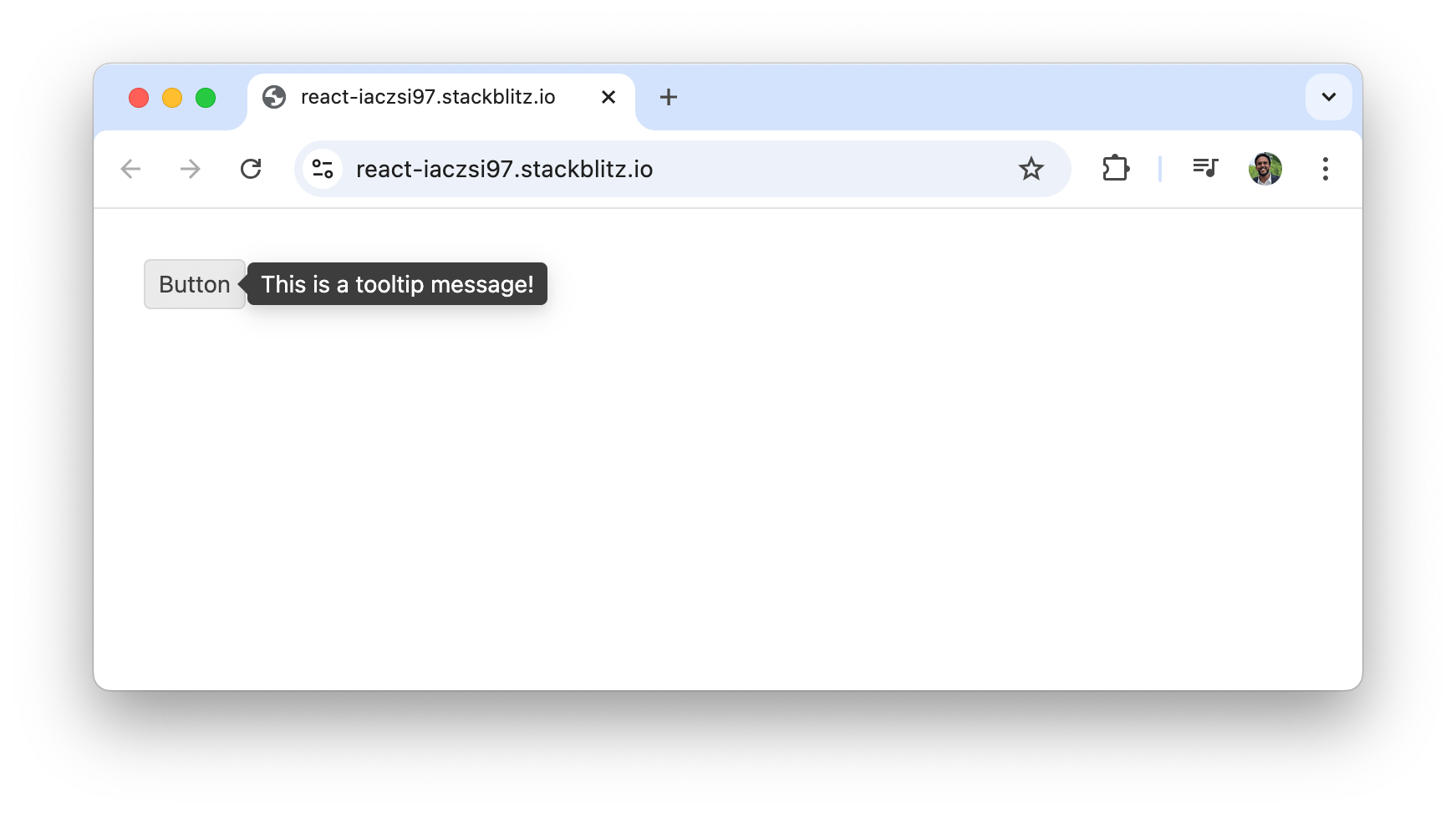
Here’s a simple example that demonstrates the basic usage of the KendoReact Tooltip component by wrapping a button inside it:
import * as React from "react";
import { Tooltip } from "@progress/kendo-react-tooltip";
import { Button } from "@progress/kendo-react-buttons";

const App = () => {
  return (
    <Tooltip anchorElement="target" position="right" parentTitle>
      <Button title="This is a tooltip message!">Button</Button>
    </Tooltip>
  );
};

export default App;
Above, the Tooltip component wraps around a Button element, attaching the tooltip to the child element using anchorElement="target". And position="right" positions the tooltip to the right of the target element.
When running the above example, we’ll notice a small tooltip message that states, "This is a tooltip message!" is shown when the button is hovered on.
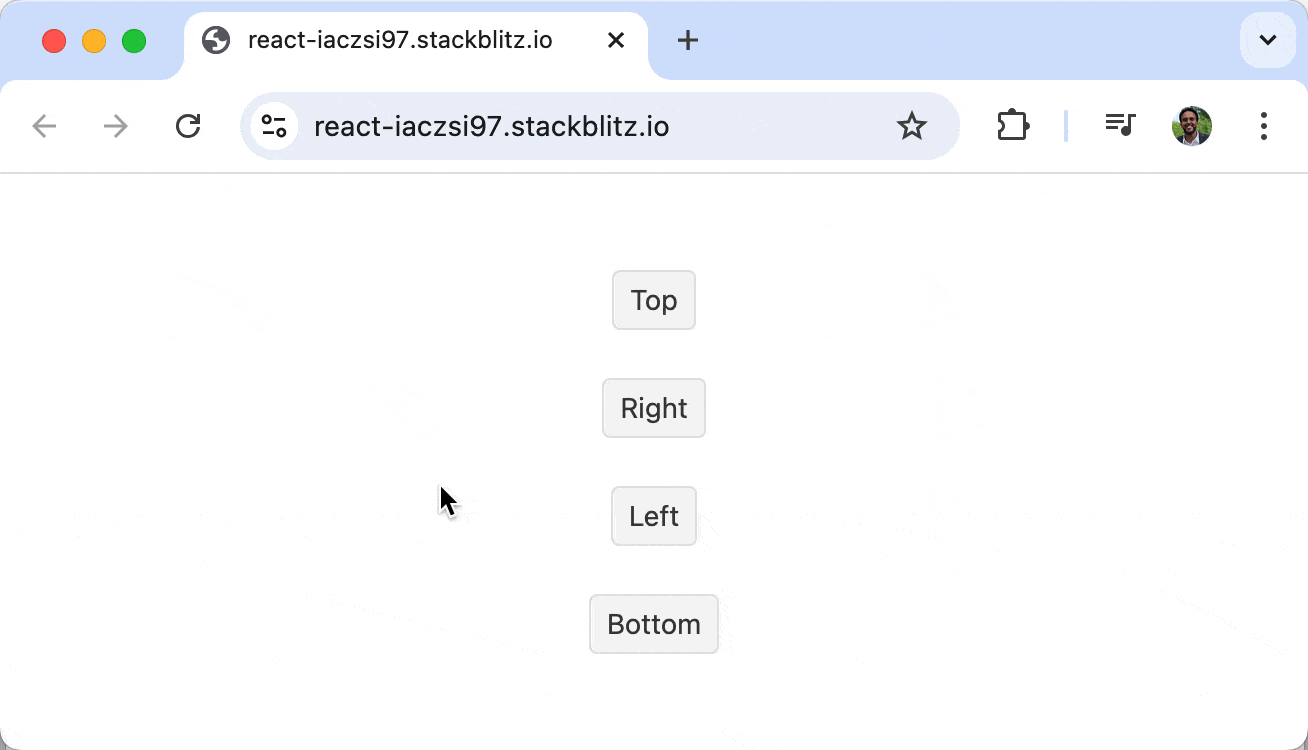
Positioning
The position property allows us to adjust the tooltip’s position. The available values are top, bottom, left and right.
import * as React from "react";
import { Tooltip } from "@progress/kendo-react-tooltip";
import { Button } from "@progress/kendo-react-buttons";

const App = () => {
  return (
    <div>
      <Tooltip anchorElement="target" position="top" parentTitle>
        <Button title="Tooltip on top">Top</Button>
      </Tooltip>
      <Tooltip anchorElement="target" position="bottom" parentTitle>
        <Button title="Tooltip on bottom">Bottom</Button>
      </Tooltip>
      <Tooltip anchorElement="target" position="left" parentTitle>
        <Button title="Tooltip on left">Left</Button>
      </Tooltip>
      <Tooltip anchorElement="target" position="right" parentTitle>
        <Button title="Tooltip on right">Right</Button>
      </Tooltip>
    </div>
  );
};

export default App;
In the above example, different tooltip positions are specified with the help of the position prop. Each button is wrapped inside a Tooltip component with a unique position value (top, bottom, left, right). We’ll notice each tooltip appear in the respective direction when hovering over the buttons.
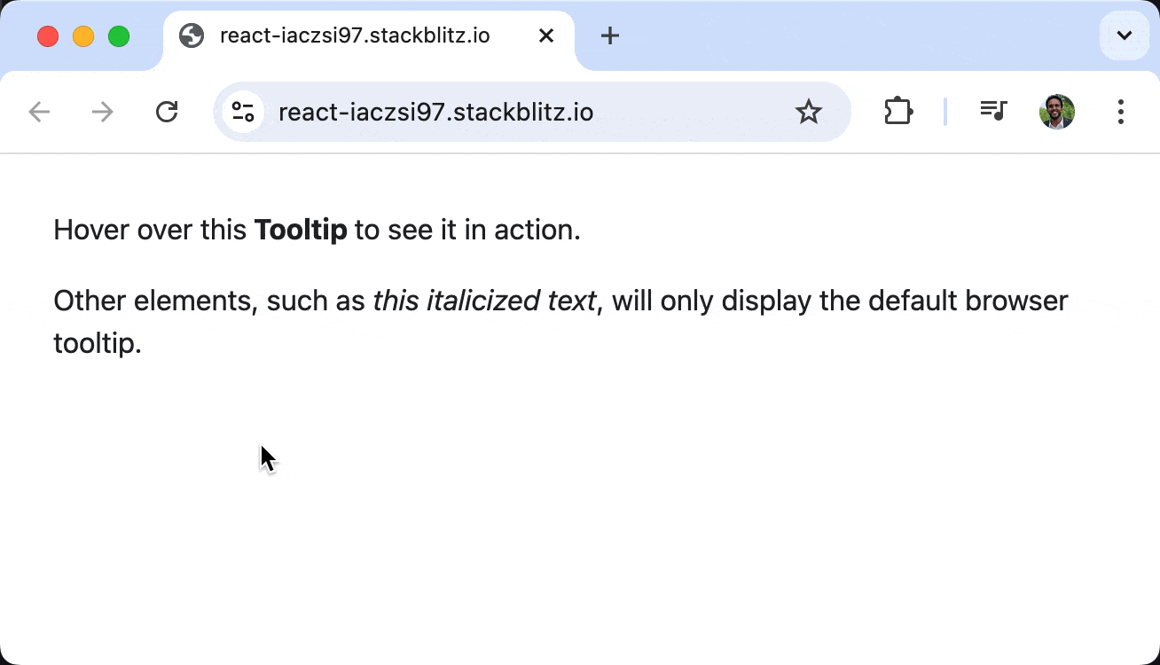
Anchor Elements
We can target specific elements to display a tooltip using the filter property, allowing tooltips to appear only on designated elements. For example, we can have tooltips appear only on <strong> elements:
import * as React from "react";
import { Tooltip } from "@progress/kendo-react-tooltip";

const App = () => {
  const filterElements = (element) => element.tagName === "STRONG";

  return (
    <Tooltip filter={filterElements} anchorElement="target" parentTitle>
      <div>
        <p>
          Hover over this
          <strong title="KendoReact Tooltip"> Tooltip </strong>
          to see it in action.
        </p>
        <p>
          Other elements, such as
          <em title="Default browser tooltip"> this italicized text</em>, will only
          display the default browser tooltip.
        </p>
      </div>
    </Tooltip>
  );
};

export default App;
The filter property above sets tooltips to only appear when hovering over <strong> elements. The tooltip will not display for any other elements, even if they have a title attribute. This technique allows us to control which elements receive tooltips.
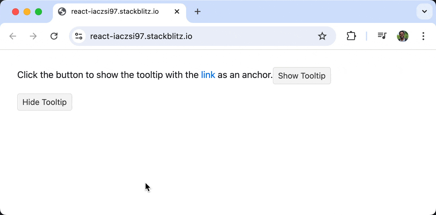
Controlled Mode
By default, tooltips appear on hover. However, we can programmatically control their visibility using the open and targetElement properties. This is useful when we want the tooltip to appear only on specific user actions like button clicks.
import * as React from "react";
import { Tooltip } from "@progress/kendo-react-tooltip";
import { Button } from "@progress/kendo-react-buttons";

const App = () => {
  const wrapper = React.useRef(null);
  const firstElement = React.useRef(null);
  const secondElement = React.useRef(null);
  const [open, setOpen] = React.useState(false);
  const [targetElement, setTargetElement] = React.useState(null);

  const showTooltip = (element) => {
    setOpen(true);
    setTargetElement(element.current);
  };

  return (
    <Tooltip
      anchorElement="target"
      open={open}
      targetElement={targetElement}
      appendTo={wrapper.current}
    >
      <div ref={wrapper}>
        <p>
          Click the button to show the tooltip with
          <a ref={firstElement} href="#" title="Tooltip for first link">
            {" "}
            first link
          </a> as an anchor.
          <Button onClick={() => showTooltip(firstElement)}>
            Show Tooltip
          </Button>
        </p>
        <p>
          Click the button to show the tooltip with
          <a ref={secondElement} href="#" title="Tooltip for second link">
            {" "}
            second link
          </a> as an anchor.
          <Button onClick={() => showTooltip(secondElement)}>
            Show Tooltip
          </Button>
        </p>
        <Button
          onClick={() => {
            setOpen(false);
            setTargetElement(null);
          }}
        >
          Hide Tooltip
        </Button>
      </div>
    </Tooltip>
  );
};

export default App;
In the above example, the useRef hook references the button element that triggers the tooltip, and the useState hook manages the tooltip’s visibility. When the "Show Tooltip" button is clicked, the open state is set to true, and the targetElement is assigned to the button reference, making the tooltip appear. Conversely, clicking "Hide Tooltip" resets open to false, hiding the tooltip.
Customization
KendoReact’s Tooltip provides a lot of flexibility. However, there may be times when we want to reuse specific functionality across our application. For example, we might wish all tooltips to be represented by a ? icon that users can hover over for additional information.
We can achieve this by creating a reusable TooltipWrapper component that consistently renders tooltips throughout the application. This component can accept a tooltip message as a prop and display a standardized tooltip when hovered over.
Here’s a pseudo-example of how we can implement something like this:
/* TooltipWrapper.css */
.tooltip-icon {
  display: inline-flex;
  align-items: center;
  justify-content: center;
  width: 16px;
  height: 16px;
  font-size: 10px;
  font-weight: bold;
  color: #fff;
  background-color: #000;
  border-radius: 50%;
  text-align: center;
  cursor: help;
  margin-left: 4px;
  vertical-align: middle;
  line-height: 16px;
}
import * as React from "react";
import { Tooltip } from "@progress/kendo-react-tooltip";
import "./TooltipWrapper.css";
const TooltipWrapper = ({ message }) => {
return (
<Tooltip anchorElement="target" position="top">
<span title={message} className="tooltip-icon">
?
</span>
</Tooltip>
);
};
const App = () => {
return (
<div>
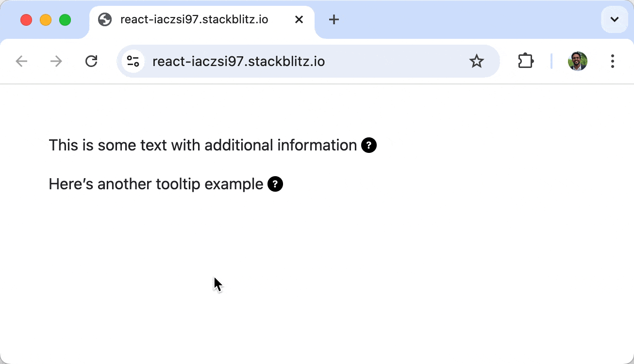
<p>
This is some text with additional information
<TooltipWrapper message="This is a helpful tooltip message!" />.
</p>
<p>
Here’s another tooltip example
<TooltipWrapper message="Another informative tooltip!" />.
</p>
</div>
);
};
export default App;
The <TooltipWrapper /> component above encapsulates the KendoReact <Tooltip /> logic and provides consistency across the application. The tooltip is triggered when hovering over a ? icon, a universal indicator for additional information. The message prop allows customization of the tooltip text without modifying the component structure.
Tooltips in other KendoReact Components
Tooltips in KendoReact are not limited to buttons and standalone elements—they also extend to other more sophisticated components like those in the React Charts library. The Charts library offers extensive data visualization charts and series and within the context of tooltips, KendoReact Charts support three types of tooltips:
- Series Tooltip – Displays information when hovering over a specific data point.
- Shared Tooltip – Shows a tooltip for the hovered category, helping users compare multiple data points.
- Crosshair Tooltip – Appears on the chart axes to indicate exact values.
We can enable the Series Tooltip in the KendoReact Chart component by using the ChartTooltip component globally or configure individual series with the ChartSeriesItemTooltip component. Below is one example of demonstrating how to configure the Series Tooltip for a particular chart:
import * as React from "react";
import {
Chart,
ChartTooltip,
ChartSeries,
ChartSeriesItem,
ChartSeriesItemTooltip,
} from "@progress/kendo-react-charts";
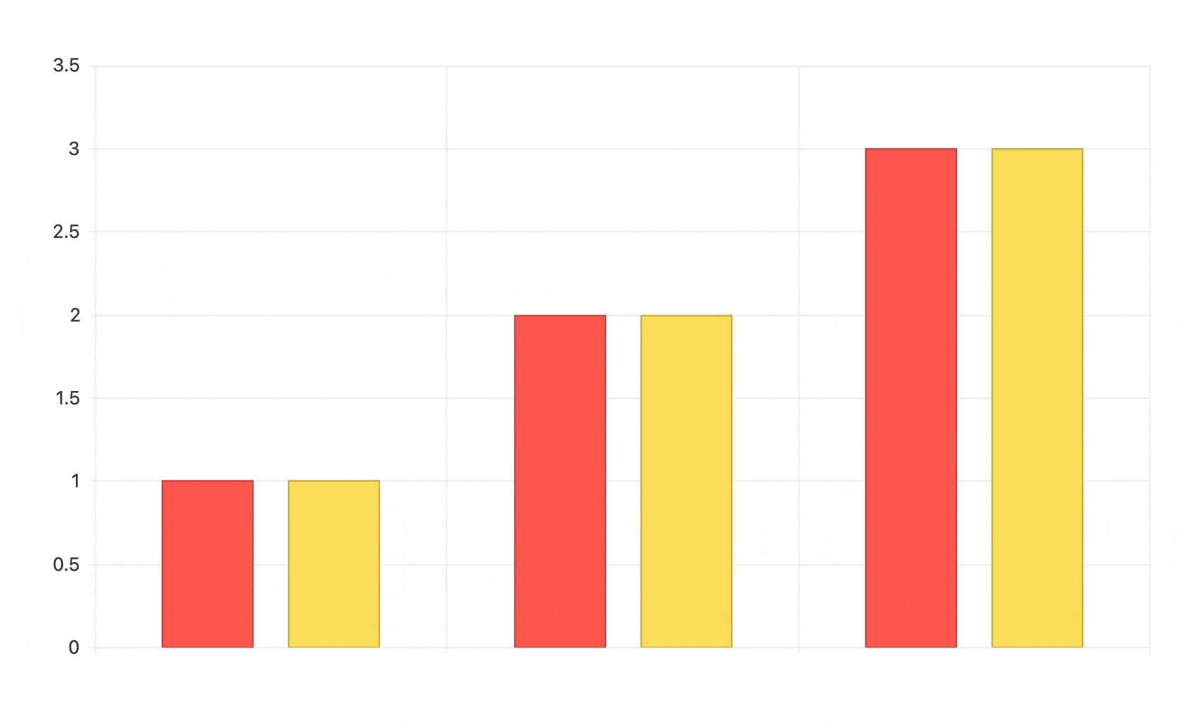
const seriesData = [1, 2, 3];
const ChartContainer = () => (
<Chart>
<ChartTooltip />
<ChartSeries>
<ChartSeriesItem data={seriesData} />
<ChartSeriesItem data={seriesData}>
<ChartSeriesItemTooltip background="green" />
</ChartSeriesItem>
</ChartSeries>
</Chart>
);
export default ChartContainer;
In the above example, the <ChartTooltip /> helps provide insights about each data point, making it easier to understand trends, compare values and make data-driven decisions at a glance.
The KendoReact Chart library helps deliver powerful data visualization components to create interactive and visually appealing charts within React applications. For more details, check out the official documentation for the Charts library.
Wrap-up
Tooltips enhance user experience by providing contextual information without cluttering the UI. They help users understand features, navigate applications, and improve accessibility. The KendoReact Tooltip component offers a flexible and customizable way to add tooltips to React applications, supporting various positioning options, anchor elements, controlled modes and more.
For more details, be sure to check out the official Tooltip documentation!
And to try this out for yourself, install KendoReact Free now. It’s completely free to use in production without having to go through any forms.

Hassan Djirdeh
Hassan is a senior frontend engineer and has helped build large production applications at-scale at organizations like Doordash, Instacart and Shopify. Hassan is also a published author and course instructor where he’s helped thousands of students learn in-depth frontend engineering skills like React, Vue, TypeScript, and GraphQL.
Related Posts
Comments
All articles
Topics
Web MobileMobile
Desktop
Design
Productivity
People
