
Customizing the New ReconnectModal Component in Blazor 10

Summarize with AI:
Learn how to customize the reconnection modal dialog for users of your Blazor app with the ReconnectionModal component, introduced in .NET 10.
.NET 10 has arrived with a lot of new features for its main development technologies. Blazor is no exception, and several features have been added that make the platform increasingly robust and customizable year after year for creating web applications.
One of these features is the addition of a customizable reconnection modal dialog, which we will discuss in depth in this article.
Understanding the New ReconnectionModal Component of Blazor
Before .NET 10, when there were disconnection events in a Blazor application, a modal was displayed with information to the user about the reconnection status. However, the modal was not very easy to customize and caused Content Security Policy issues and injected styles.
This completely changes in .NET 10, with the incorporation of a component called ReconnectModal, consisting of a Razor file for layout, a styles file to define the design and a JS code file to utilize the logic. Among these three files, you can customize the reconnection component as much as you want, as we will see next.
A new event components-reconnect-state-changed has also been added to detect reconnection status changes, as well as a new reconnection status called retrying, which you can use to show a different design after a first reconnection attempt.
General Structure of the ReconnectionModal Component
The file ReconnectModal.razor contains the layout for the reconnection dialog component. The first line with a tag script loads the file ReconnectModal.razor.js that enables interactivity in the component. This file js can be left as is, as the logic in the file covers everything necessary for managing the reconnection dialog, including interaction buttons:
<script type="module" src="@Assets["Components/Layout/ReconnectModal.razor.js"]"></script>
In the previous tag, the expression @Assets allows resolving the path of a static resource that will be used in the component, commonly with the same name as the component.
Next, we find an element dialog that is used to show reconnection information to the user. In this element, we must leave the id components-reconnect-modal, as it will be used internally by the framework to display the reconnection message to the user.
<dialog id="components-reconnect-modal" data-nosnippet>
    ...
</dialog>
Within the dialog tag, we define the layout that we can modify as much as we want, as long as we limit ourselves to using code HTML + CSS + JS, due to the fact that this dialog must be displayed when the circuit is down.
Additionally, you should take care to reuse the classes and ids used in Blazor reconnection tracking, which are defined in the css file:
components-reconnect-showcomponents-reconnect-hidecomponents-reconnect-retryingcomponents-reconnect-failedcomponents-reconnect-rejected
The previous classes are set or unset directly by Blazor when different connection status changes occur. Furthermore, in the ReconnectModal.razor.js file, the event components-reconnect-state-changed is used, which indicates when there is a change in reconnection status, carrying out the display, hiding, reloading or necessary processing according to that status:
// Set up event handlers
const reconnectModal = document.getElementById("components-reconnect-modal");
reconnectModal.addEventListener("components-reconnect-state-changed", handleReconnectStateChanged);
...

function handleReconnectStateChanged(event) {
    if (event.detail.state === "show") {
        reconnectModal.showModal();
    } else if (event.detail.state === "hide") {
        reconnectModal.close();
    } else if (event.detail.state === "failed") {
        document.addEventListener("visibilitychange", retryWhenDocumentBecomesVisible);
    } else if (event.detail.state === "rejected") {
        location.reload();
    }
}
...
Returning to ReconnectModal.razor, the div with the class components-reconnect-container serves to define the graphical appearance of the container, and you can modify it or even remove it if you do not need it.
The same can be done with the classes defined in ReconnectModal.razor.css, such as components-reconnect-first-attempt-visible, components-reconnect-repeated-attempt-visible, etc., although to make the most of the code you can reuse them if you wish.
Modifying the Loader of the ReconnectModal Component
In the file ReconnectModal.razor, we can see an div with the class components-rejoining-animation, which allows showing an animation to the user. If you want to modify it, you can use some premade animation from websites like Pure CSS Loaders, or you can write your own CSS animations as we will do next.
For my example, in ReconnectModal.razor, I will change the tag with the class components-rejoining-animation along with its content to this:
<div class="reconnect-progress components-reconnect-first-attempt-visible">
    <div class="progress-bar"></div>
</div>
<div class="reconnect-progress components-reconnect-repeated-attempt-visible">
    <div class="progress-bar"></div>
</div>
Next, in ReconnectModal.razor.css, I replace the selector .components-rejoining-animation along with its descendant and structural selectors with this:
.reconnect-progress {
    position: absolute;
    bottom: 0;
    left: 0;
    width: 100%;
    height: 4px;
    background: #e2e8f0;
    overflow: hidden;
}

.progress-bar {
    height: 100%;
    width: 30%;
    background: linear-gradient(90deg, #3b82f6 0%, #8b5cf6 50%, #3b82f6 100%);
    background-size: 200% 100%;
    animation: progressMove 1.5s ease-in-out infinite;
    border-radius: 2px;
}

@keyframes progressMove {
    0% {
        transform: translateX(-100%);
        background-position: 0% 50%;
    }

    50% {
        background-position: 100% 50%;
    }

    100% {
        transform: translateX(400%);
        background-position: 0% 50%;
    }
}
These few lines of code completely change the appearance of the loader to a more modern and professional style:
Now, let’s see how to change the modal container.
Modifying the Modal Container
In the previous section, you saw that the modal’s previous size has become smaller because we removed space from the animation. To solve this, we can modify the modal properties through the class components-reconnect-container. To achieve this, we will go to the CSS file and modify the selector’s content as follows:
.components-reconnect-container {
    padding: 2.5rem 2rem 2rem;
    display: flex;
    flex-direction: column;
    align-items: center;
    gap: 1.5rem;
}
This way, when viewing the dialog, we will see more space. You can modify the class as much as you want to meet your needs:
Let’s continue improving the dialog by styling more visual elements.
Adding a Pulse Element
To make the dialog take better shape, we can add a set of div and svg tags to show different content according to the reconnection status. We can do this within the div with the class components-reconnect-container:
...
<div class="components-reconnect-container">
    <div class="reconnect-icon-container">
        <div class="reconnect-pulse-ring"></div>
        <div class="reconnect-pulse-ring delay-1"></div>
        <div class="reconnect-pulse-ring delay-2"></div>
        <svg class="reconnect-icon" viewBox="0 0 24 24" fill="none" xmlns="http://www.w3.org/2000/svg">
            <path class="icon-path" d="M12 2C6.48 2 2 6.48 2 12s4.48 10 10 10 10-4.48 10-10S17.52 2 12 2zm-2 15l-5-5 1.41-1.41L10 14.17l7.59-7.59L19 8l-9 9z" fill="currentColor" />
        </svg>
        <svg class="reconnect-icon-error" viewBox="0 0 24 24" fill="none" xmlns="http://www.w3.org/2000/svg">
            <path d="M12 2C6.48 2 2 6.48 2 12s4.48 10 10 10 10-4.48 10-10S17.52 2 12 2zm1 15h-2v-2h2v2zm0-4h-2V7h2v6z" fill="currentColor" />
        </svg>
        <svg class="reconnect-icon-pause" viewBox="0 0 24 24" fill="none" xmlns="http://www.w3.org/2000/svg">
            <path d="M12 2C6.48 2 2 6.48 2 12s4.48 10 10 10 10-4.48 10-10S17.52 2 12 2zm-1 14H9V8h2v8zm4 0h-2V8h2v8z" fill="currentColor" />
        </svg>
    </div>
</div>
...
In the css file, we must control when each element will appear by reusing the selectors for the connection states, as shown below:
/* Icon container */
.reconnect-icon-container {
    position: relative;
    width: 100px;
    height: 100px;
    display: flex;
    align-items: center;
    justify-content: center;
}

.reconnect-icon,
.reconnect-icon-error,
.reconnect-icon-pause {
    width: 48px;
    height: 48px;
    color: #3b82f6;
    z-index: 10;
    animation: iconPulse 2s ease-in-out infinite;
}

.reconnect-icon-error,
.reconnect-icon-pause {
    display: none;
}

#components-reconnect-modal.components-reconnect-failed .reconnect-icon,
#components-reconnect-modal.components-reconnect-resume-failed .reconnect-icon {
    display: none;
}

#components-reconnect-modal.components-reconnect-failed .reconnect-icon-error,
#components-reconnect-modal.components-reconnect-resume-failed .reconnect-icon-error {
    display: block;
    color: #ef4444;
    animation: iconShake 0.5s ease-in-out;
}

#components-reconnect-modal.components-reconnect-paused .reconnect-icon {
    display: none;
}

#components-reconnect-modal.components-reconnect-paused .reconnect-icon-pause {
    display: block;
    color: #f59e0b;
    animation: none;
}

@keyframes iconPulse {
    0%, 100% {
        transform: scale(1);
    }

    50% {
        transform: scale(1.1);
    }
}

@keyframes iconShake {
    0%, 100% {
        transform: translateX(0);
    }

    20% {
        transform: translateX(-8px);
    }

    40% {
        transform: translateX(8px);
    }

    60% {
        transform: translateX(-4px);
    }

    80% {
        transform: translateX(4px);
    }
}

/* Pulse rings */
.reconnect-pulse-ring {
    position: absolute;
    width: 100%;
    height: 100%;
    border-radius: 50%;
    border: 3px solid #3b82f6;
    opacity: 0;
    animation: pulseRing 2s cubic-bezier(0, 0.5, 0.5, 1) infinite;
}

    .reconnect-pulse-ring.delay-1 {
        animation-delay: 0.4s;
    }

    .reconnect-pulse-ring.delay-2 {
        animation-delay: 0.8s;
    }

#components-reconnect-modal.components-reconnect-failed .reconnect-pulse-ring,
#components-reconnect-modal.components-reconnect-resume-failed .reconnect-pulse-ring,
#components-reconnect-modal.components-reconnect-paused .reconnect-pulse-ring {
    animation: none;
    display: none;
}

@keyframes pulseRing {
    0% {
        transform: scale(0.5);
        opacity: 0;
    }

    20% {
        opacity: 0.8;
    }

    100% {
        transform: scale(1.2);
        opacity: 0;
    }
}
The above code allows for a pulse effect that, along with the changes we will make later, will look phenomenal:
Now, let’s see how to modify the content of the reconnection modal.
Modifying the Reconnection Modal Content
As I mentioned earlier, something that is recommended when modifying the ReconnectModal component is to reuse the template classes.
One way to do this is to use them on existing elements or by creating new tags and assigning them classes like components-reconnect-first-attempt-visible, components-reconnect-repeated-attempt-visible, etc. Here you can take the opportunity to add additional classes that you can style and animate according to your site’s or brand’s design:
<div class="reconnect-content">
<h2 class="reconnect-title components-reconnect-first-attempt-visible">
Reconnecting...
</h2>
<p class="reconnect-subtitle components-reconnect-first-attempt-visible">
Restoring connection to the server
</p>
<h2 class="reconnect-title components-reconnect-repeated-attempt-visible">
Retrying connection
</h2>
<p class="reconnect-subtitle components-reconnect-repeated-attempt-visible">
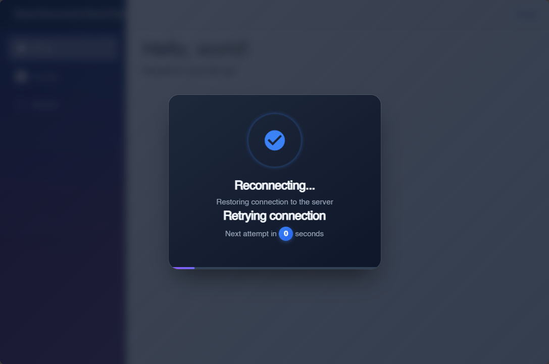
Next attempt in <span id="components-seconds-to-next-attempt" class="countdown-badge"></span> seconds
</p>
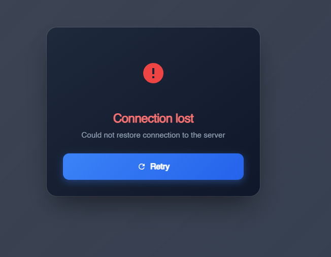
<h2 class="reconnect-title error components-reconnect-failed-visible">
Connection lost
</h2>
<p class="reconnect-subtitle components-reconnect-failed-visible">
Could not restore connection to the server
</p>
<h2 class="reconnect-title warning components-pause-visible">
Session paused
</h2>
<p class="reconnect-subtitle components-pause-visible">
The server has temporarily paused the session
</p>
<h2 class="reconnect-title error components-resume-failed-visible">
Resume failed
</h2>
<p class="reconnect-subtitle components-resume-failed-visible">
Could not resume the session. Please reload the page.
</p>
</div>
In the previous code, we follow the same logic of the template to show different messages according to the connection status. Additionally, we can also take advantage of separating the buttons into a new section, as in the following example:
<div class="reconnect-actions">
    <button id="components-reconnect-button" class="btn-primary components-reconnect-failed-visible">
        <svg viewBox="0 0 24 24" width="18" height="18" fill="currentColor">
            <path d="M17.65 6.35C16.2 4.9 14.21 4 12 4c-4.42 0-7.99 3.58-7.99 8s3.57 8 7.99 8c3.73 0 6.84-2.55 7.73-6h-2.08c-.82 2.33-3.04 4-5.65 4-3.31 0-6-2.69-6-6s2.69-6 6-6c1.66 0 3.14.69 4.22 1.78L13 11h7V4l-2.35 2.35z"/>
        </svg>
        Retry
    </button>
    <button id="components-resume-button" class="btn-primary components-pause-visible">
        <svg viewBox="0 0 24 24" width="18" height="18" fill="currentColor">
            <path d="M8 5v14l11-7z"/>
        </svg>
        Resume
    </button>
</div>
Finally, we can modify and add styles to enhance the visual appearance:
...
#components-reconnect-modal {
    background: linear-gradient(145deg, #1e293b 0%, #0f172a 100%);
    width: 20rem;
    margin: 20vh auto;
    padding: 2rem;
    border: 0;
    border-radius: 0.5rem;
    box-shadow: 0 25px 50px -12px rgba(0, 0, 0, 0.5), 0 0 0 1px rgba(255, 255, 255, 0.1);
    opacity: 0;
    transition: display 0.5s allow-discrete, overlay 0.5s allow-discrete;
    animation: components-reconnect-modal-fadeOutOpacity 0.5s both;

    &[open] {
        animation: components-reconnect-modal-slideUp 1.5s cubic-bezier(.05, .89, .25, 1.02) 0.3s, components-reconnect-modal-fadeInOpacity 0.5s ease-in-out 0.3s;
        animation-fill-mode: both;
    }
}
...
/* Content */
.reconnect-content {
    text-align: center;
}

/* Titles */
.reconnect-title {
    margin: 0 0 0.5rem;
    font-size: 1.5rem;
    font-weight: 700;
    color: #f1f5f9;
    letter-spacing: -0.02em;
}

    .reconnect-title.error {
        color: #f87171;
    }

    .reconnect-title.warning {
        color: #fbbf24;
    }

.reconnect-subtitle {
    margin: 0;
    font-size: 0.95rem;
    color: #94a3b8;
    line-height: 1.5;
}

/* Progress */
.reconnect-progress {
    background: #334155;
}

/* Badge */
.countdown-badge {
    display: inline-flex;
    align-items: center;
    justify-content: center;
    min-width: 28px;
    height: 28px;
    padding: 0 8px;
    background: linear-gradient(135deg, #3b82f6 0%, #2563eb 100%);
    color: white;
    font-weight: 700;
    font-size: 0.875rem;
    border-radius: 14px;
    box-shadow: 0 2px 8px rgba(0, 0, 0, 0.6);
}

/* Actions */
.reconnect-actions {
    display: flex;
    gap: 0.75rem;
    width: 100%;
}

.btn-primary {
    flex: 1;
    display: none;
    align-items: center;
    justify-content: center;
    gap: 0.5rem;
    padding: 0.875rem 1.5rem;
    border: none;
    border-radius: 12px;
    font-size: 1rem;
    font-weight: 600;
    cursor: pointer;
    transition: all 0.2s ease;
    background: linear-gradient(135deg, #3b82f6 0%, #2563eb 100%);
    color: white;
    box-shadow: 0 4px 14px rgba(59, 130, 246, 0.4);
}

#components-reconnect-modal.components-reconnect-failed .btn-primary.components-reconnect-failed-visible,
#components-reconnect-modal.components-reconnect-paused .btn-primary.components-pause-visible {
    display: inline-flex;
}

.btn-primary:hover {
    transform: translateY(-2px);
    box-shadow: 0 6px 20px rgba(59, 130, 246, 0.5);
    background: linear-gradient(135deg, #2563eb 0%, #1d4ed8 100%);
}

.btn-primary:active {
    transform: translateY(0);
    box-shadow: 0 2px 8px rgba(59, 130, 246, 0.4);
}
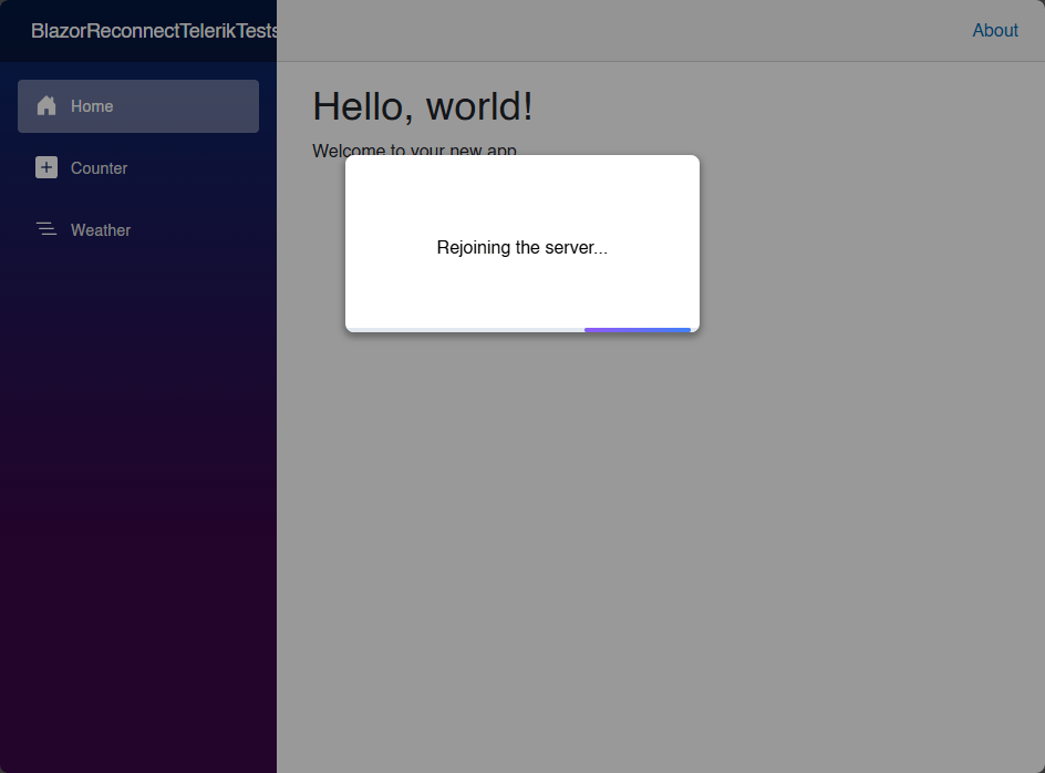
With the applied changes, we will have a new and improved dialog that shows the different connection states. In the following image, you can see the dialog when a connection is retried for the first time:
Next, I will show you the rendered dialog when subsequent connection retries are made after the first one:
Finally, after the connection attempts have failed, you can see the dialog displaying buttons according to the actions the user can take, such as trying to reconnect the application again:
With the above, we have finished customizing the connection modal correctly.
Conclusion
Throughout this article, you have learned more in depth about the ReconnectionModal component, which shows how to implement reconnection state handling in Blazor. Additionally, we have turned the default template into a visually elegant modern dialog. I encourage you to create your own version of the dialog to adapt it to your own applications.

Héctor Pérez
Héctor Pérez is a Microsoft MVP with more than 10 years of experience in software development. He is an independent consultant, working with business and government clients to achieve their goals. Additionally, he is an author of books and an instructor at El Camino Dev and Devs School.
Related Posts
Comments
All articles
Topics
Web MobileMobile
Desktop
Design
Productivity
People
