
Building an Ecommerce Operational Dashboard in React
 by
by 
Summarize with AI:
We will be constructing an Operational Dashboard in React for an ecommerce store, utilizing a number of charts and components from KendoReact.
A dashboard is only as good as the information it portrays which helps solve a specific need. There are four main types of dashboards:
- Strategic: Help guide long term company strategy, often high-level
- Operational: Look at current performance, guiding alignment to the company’s KPIs
- Analytical: Contains large amounts of data used by analysts
- Tactical: Used to analyze and monitor a process
In this article we will be constructing an operational dashboard in React for an ecommerce store, utilizing a number of React charts and components from KendoReact. We will begin by discussing our needs, move into the design and planning phase, and then discuss the actual code to implement it.
Full source code of this project can be found here.
Dashboard Must Solve a Real Need
Imagine an ecommerce store named “The Wonderful World Of Camping” (TWWOC). It specializes in gear, clothing and tools related to, you guessed it, camping! Our company goals are as follows:
- Be Financially Sustainable: Without revenue, our ecommerce store will struggle to succeed. This is a bootstrapped business without VC funding, so revenue is especially important.
- Provide Quick Delivery: Always aim to keep Pending Deliveries low. When a customer orders an item, shipment should be as quick as possible.
- Foster Community Engagement: This is done by allowing customers to leave their feedback and reviews of the products we sell.
- Give Excellent Support: A customer should receive quick, helpful, and friendly support at all times.
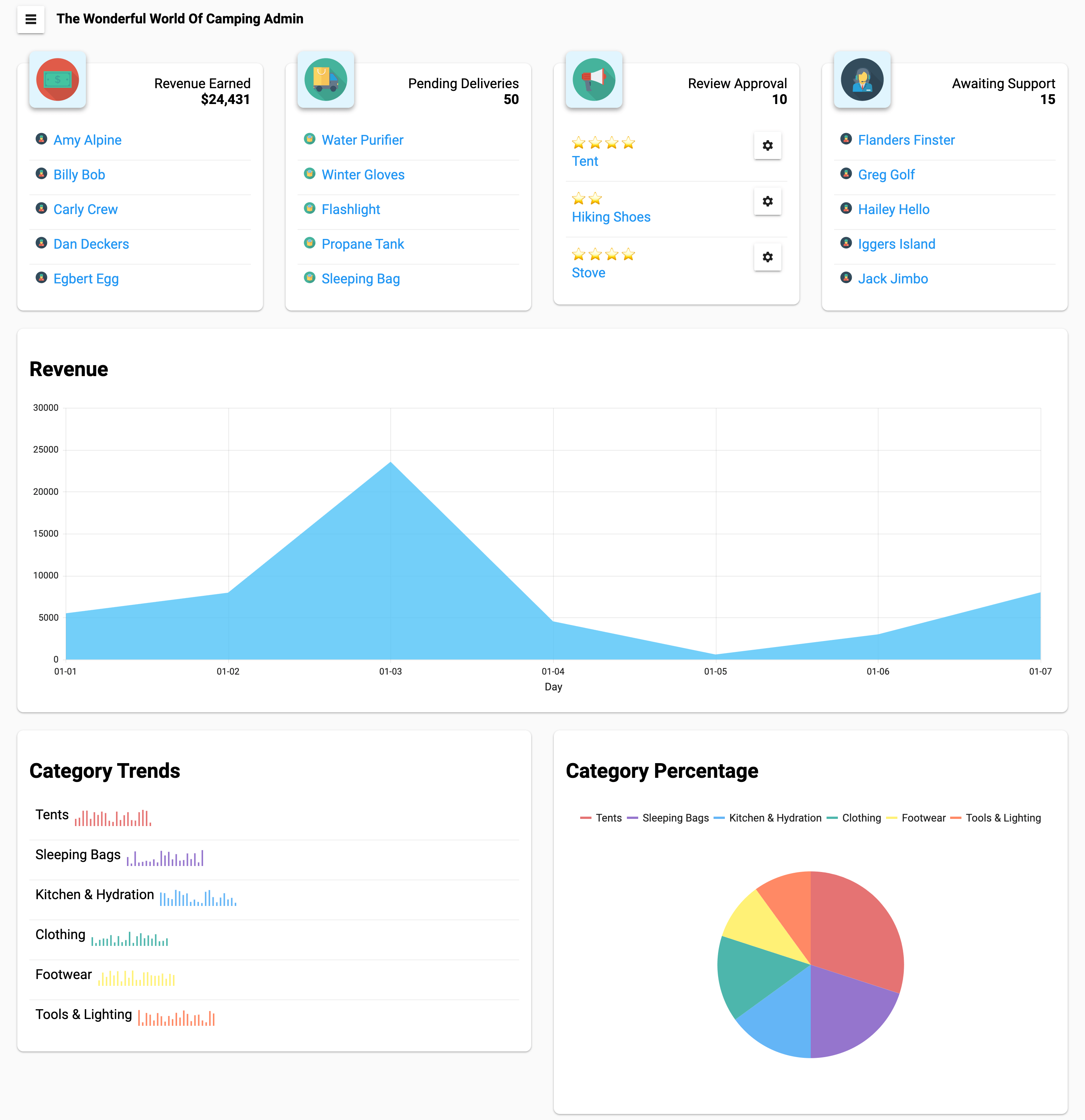
These four goals align with the four sections shown at the top of the dashboard. They display quick insights relating to our goals, providing quick-links to resolve pending items.
Underneath the stat boxes, we will display a trending revenue graph along with a geo chart and category pie chart below. These will help our company understand the pulse of the business, where our customers are coming from, and what categories of items interest them the most.
Installing Material Theme and Bootstrap
We will be using KendoReact’s Material Theme. Their website has excellent installation instructions, but in short the steps are:
- Add package
@progress/kendo-theme-material - Import precompiled CSS into project
import "@progress/kendo-theme-material/dist/all.css"; - Add Roboto font to project:
<link rel="stylesheet" href="https://fonts.googleapis.com/css?family=Roboto:300,400,500,700" /> - Use Roboto font in CSS
body { font-family: Roboto, sans-serif; }
I have also installed the @progress/kendo-react-ripple package, and have wrapped the Ripple component around the entire admin dashboard to give buttons a ripple effect.
Using Bootstrap’s Rows and Columns
Bootstrap provides an excellent layout with rows and columns. Even though we are using a material theme, it doesn’t mean we can’t import just the layout portion from Bootstrap to take advantage of it.
To utilize the layout we need to execute yarn add bootstrap, and can then include the import at the top of the App.js file: import "bootstrap/dist/bootstrap-grid.min.css";.
Defining Our Layout
By using Bootstrap’s layout, we can divide the admin up into a series of rows and columns. To help understand how our dashboard is structured, I have included an old-school hand drawn sketch:

Psuedo-code isn’t only for portraying programming logic in English language! Here is some psuedo-JSX of what our app will look like, without the mess of divs, classes, props, and the additional logic to map data into our app.
<Container>
  <Nav />

  <Main>
    <Row>
      <Column>
        <StatBox />
      </Column>
      <Column>
        <StatBox />
      </Column>
      <Column>
        <StatBox />
      </Column>
      <Column>
        <StatBox />
      </Column>
    </Row>

    <Row>
      <Column>
        <RevenueChart />
      </Column>
    </Row>

    <Row>
      <Column>
        <RevenueMap />
      </Column>
      <Column>
        <CategoryPieChart />
      </Column>
    </Row>
  </Main>
</Container>
Stat Boxes
The first piece of information our dashboard contains are the four stat boxes which map back to our company’s goals, containing quick-links for the team to easily resolve issues.
I have chosen to make this a component, allowing it to be re-used without duplicating the code. It receives the image (icon) displayed in the top left, the heading text and value, along with any children to be rendered below the stat.
const StatBox = ({ img, text, value, children }) => (
  <div className="col-sm-12 col-md-6 col-lg-3 mt-4">
    <div className="card shadow-1">
      <div className="row">
        <div className="col-4">
          <div className="card shadow-2 stat-box-icon">
            <img src={img} alt={text} style={{ maxHeight: "100%" }} />
          </div>
        </div>

        <div className="col-8 text-right">
          <span className="block">{text}</span>
          <span className="block">
            <strong>{value}</strong>
          </span>
        </div>
      </div>

      <div className="row mt-4">
        <div className="col">{children}</div>
      </div>
    </div>
  </div>
);
Without showing the code for all four stat boxes (which all look fairly similar), the first stat box is used like:
<StatBox img="/money.svg" text="Revenue Earned" value="$24,431">
  <ul>
    {customers.map(customer => (
      <li key={customer.id}>
        <a href="#">
          <img
            src="/customer.svg"
            alt="customer"
            style={{ width: "1rem", marginRight: "0.5rem" }}
          />
          {customer.name}
        </a>
      </li>
    ))}
  </ul>
</StatBox>
The ul and its children are what get passed as the children prop to our StatBox component.
Review Dialog
KendoReact provides an easy to use Dialog component. We will be using the Dialog component to allow our team to quickly Approve or Deny product reviews.
The first step is to import the proper components (after installing the package):
import { Dialog, DialogActionsBar } from "@progress/kendo-react-dialogs";
We must choose when the Dialog component is displayed, and we can control this within component level state. When a review is clicked, we will place that review into state, which will later be used to control whether or not the dialog is currently visible. I will only be showing the relevant parts of our dashboard to keep the example concise:
export default function App() {
  const [activeReview, setActiveReview] = React.useState(null);

  return (
    <div className="container-fluid">
      {/* other components */}
      <StatBox img="/megaphone.svg" text="Review Approval" value="10">
        <ul>
          {reviews.map(review => (
            <li key={review.id}>
              <Button
                onClick={() => {
                  // Place the review into state to trigger the dialog being shown
                  setActiveReview({ ...review });
                }}
                icon="cog"
                style={{ float: "right" }}
              />
              {[...Array(review.stars).keys()].map(star => (
                <span key={star} role="img" aria-label="star">
                  ⭐️
                </span>
              ))}
              <br />
              <a href="#">{review.product}</a>
            </li>
          ))}
        </ul>
      </StatBox>
      {/* other components */}
    </div>
  );
}
The activeReview now either contains null if there is no active review, or it contains the review which should be displayed in the dialog. We can control this by first looking to see if activeReview has a value, and if it does, we can render the Review component which contains the dialog.
export default function App() {
  const [activeReview, setActiveReview] = React.useState(null);

  return (
    <div className="container-fluid">
      {/* other components */}
      {activeReview && (
        <Review
          review={activeReview}
          triggerClose={() => {
            setActiveReview(null);
          }}
        />
      )}
      {/* other components */}
    </div>
  );
}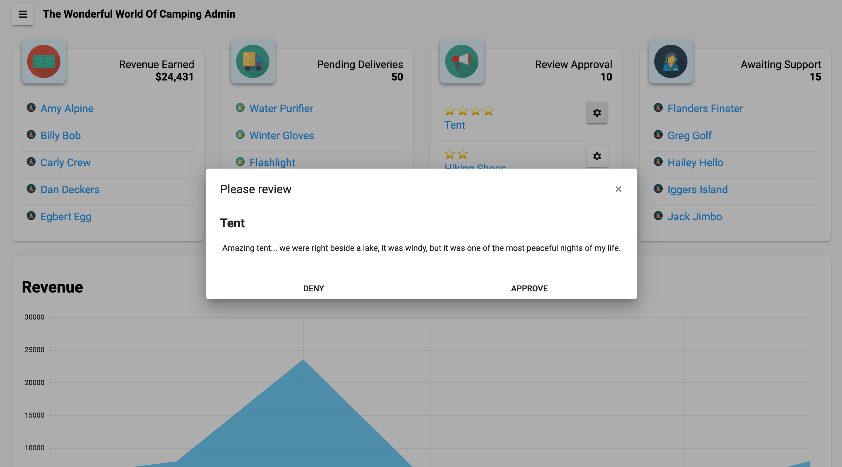
The Review component has the job of displaying the dialog, along with controlling what happens when the user clicks to either approve or deny the review. In your application, this is where you would make an HTTP call to the server to save the data, where in our case we simply use alert to display a message to the user.
const Review = ({ review, triggerClose }) => (
  <Dialog title={"Please review"} onClose={triggerClose}>
    <h2>{review.product}</h2>
    <p>{review.text}</p>
    <DialogActionsBar>
      <Button
        onClick={() => {
          alert("denied");
          triggerClose();
        }}
      >
        Deny
      </Button>
      <Button
        onClick={() => {
          alert("approved");
          triggerClose();
        }}
      >
        Approve
      </Button>
    </DialogActionsBar>
  </Dialog>
);
Revenue Chart
Everyone loves charts! As the saying goes, a picture is worth a thousand words. A chart can portray much more information than simply listing some numbers in a table. We will be using an Area Chart from the KendoReact library.
There are a number of packages that must be installed prior to using the Chart component: yarn add @progress/kendo-drawing @progress/kendo-react-intl @progress/kendo-react-charts hammerjs.
We can import them with:
import "hammerjs";
import {
  Chart,
  ChartLegend,
  ChartTooltip,
  ChartSeries,
  ChartSeriesItem,
  ChartCategoryAxis,
  ChartCategoryAxisItem
} from "@progress/kendo-react-charts";
The Chart component wraps around the rest of the chart, mainly comprised of the ChartCategoryAxis (the X values on the bottom of the chart), and the ChartSeries component, which provides the data to chart, from which we get our chart’s Y axis values.
const RevenueChart = () => (
  <>
    <h2>Revenue</h2>
    <Chart>
      <ChartTooltip />
      <ChartCategoryAxis>
        <ChartCategoryAxisItem
          categories={sales.map(({ day }) => day)}
          title={{ text: "Day" }}
        />
      </ChartCategoryAxis>
      <ChartSeries>
        <ChartSeriesItem
          type="area"
          data={sales.map(({ value }) => value)}
          color="#4FC3F7"
        />
      </ChartSeries>
    </Chart>
  </>
);
Category Trends
Sparklines are an amazing way to add inline, visual data to your dashboard, conveying more information than a simple label or number without taking up any extra space. Thankfully, the Sparkline component from KendoReact is incredibly easy to use. It’s nothing more than passing an array of numbers, a type, and optionally you can change which colors are displayed.
Below we are creating a list of the product categories we sell, with a column (think bar chart) Sparkline showing three weeks of trending sales data alongside the category label. We are able to convey a ton of information in very little space.
const CategorySparklines = () => (
  <>
    <h2>Category Trends</h2>

    <ul>
      {categories.map(({ category, recent }, index) => (
        <li key={category}>
          {category}{" "}
          <Sparkline
            data={recent}
            seriesColors={[colors[index]]}
            type="column"
          />
        </li>
      ))}
    </ul>
  </>
);
Category Pie Chart
The final chart used in this React dashboard is a Pie Chart from KendoReact. It will display a breakdown of the product categories we sell, and how much each category makes up in terms of the percentage of all sales.
The data used in the chart looks like:
const categories = [
  { category: "Tents", value: 30 },
  { category: "Sleeping Bags", value: 20 },
  { category: "Kitchen & Hydration", value: 15 },
  { category: "Clothing", value: 15 },
  { category: "Footwear", value: 10 },
  { category: "Tools & Lighting", value: 10 }
];

const colors = [
  "#E57373",
  "#9575CD",
  "#64B5F6",
  "#4DB6AC",
  "#FFF176",
  "#FF8A65",
  "#90A4AE"
];
We can use this data to create a great looking pie chart with just a little over ten lines of code:
const CategoryPieChart = () => (
  <>
    <h2>Category Percentage</h2>

    <Chart seriesColors={colors}>
      <ChartLegend position="top" />
      <ChartTooltip />
      <ChartSeries>
        <ChartSeriesItem
          type="pie"
          data={categories}
          field="value"
          categoryField="category"
        />
      </ChartSeries>
    </Chart>
  </>
);
Conclusion
In this article we have moved from the planning stages of a dashboard in React, all the way through its implementation. It is very important to remember that dashboards must solve actual problems. Having too much information may make the dashboard overwhelming, while not having enough, or having the incorrect information, can render it ineffective. For another example of building a dashboard in React, Eric Bishard has written a wonderful article on building a sales dashboard in React.
Icons used in this demo were created by Darius Dan.