Building a Fully-Featured Form Component in React: KendoReact Form Example

Summarize with AI:
Looking to build a form component in React? It can get complicated, but there are tools we can use to make life easier. Read on for an example of how to build React forms with KendoReact, which easily takes care of the tedious aspects of React forms.
Creating forms in React apps can be quite tricky. You have to deal with state management, validating user input, displaying error messages, styling, and so on, so things can get complicated fast.
One tool that we can use to make our life easier is KendoReact Form. It provides two components, Form and Field, that help us build fully-featured forms quickly. Also, it's really small (just 5KB), and it doesn't have any other dependencies, so integrating it into our apps is very straightforward.
In this article, we'll use KendoReact's Form and Field components to build forms that validate user input in different ways (required fields, email addresses, etc.), display the appropriate error messages, and have a stylish and consistent look-and-feel.
Getting Started
To get started using KendoReact Form, you only need to install a single package, @progress/kendo-react-form. For the apps in this article, we're going to be installing a few more dependencies that provide advanced widgets and features:
npm install --save \

  @progress/kendo-drawing \

  @progress/kendo-react-buttons \

  @progress/kendo-react-dropdowns \

  @progress/kendo-react-form \

  @progress/kendo-react-inputs \

  @progress/kendo-react-intl
Also not strictly necessary, but we'll be installing @progress/kendo-theme-material to use the KendoReact Material Theme, because it looks really cool. 😎
Creating a Basic Form
To get started, we are going to build a basic form using KendoReact's Form and Field components, and native HTML input elements, to keep dependencies to a minimum.
Form is the component that wraps our whole form, and manages all state for us. We'll need to pass it a render prop where we'll render the contents of our form.
Field is the component that is in charge of rendering each form field. It takes name and label props as expected, but more importantly it takes a component prop where we'll specify which React component needs to be rendered for this field. In our example we're passing a component called NativeInput that simply renders a native input wrapped in a label. Field will call our NativeInput component with props such as label and value, and callbacks for onChange, onBlur, and onFocus. We need to make sure that all those callbacks get passed to our native input for things to work correctly.
We'll also render a native submit button element, which will only be enabled when Form tells us that it's ok to submit the form.
Here's what that code looks like:
import React from "react";
import { Form, Field } from "@progress/kendo-react-form";
import "@progress/kendo-theme-material/dist/all.css";

const NativeInput = ({ label, value, onChange, onBlur, onFocus }) => (
  <label className="k-form-field">
    <span>{label}</span>
    <input
      className="k-textbox"
      value={value}
      onChange={onChange}
      onBlur={onBlur}
      onFocus={onFocus}
    />
  </label>
);

const App = () => {
  const handleSubmit = data => alert(JSON.stringify(data, null, 2));

  return (
    <Form
      onSubmit={handleSubmit}
      render={({ allowSubmit, onSubmit }) => (
        <form onSubmit={onSubmit} className="k-form">
          <fieldset>
            <legend>Sign up</legend>
            <div>
              <Field
                name="firstName"
                label="First name"
                component={NativeInput}
              />
            </div>
            <div>
              <Field
                name="lastName"
                label="Last name"
                component={NativeInput}
              />
            </div>
          </fieldset>
          <button
            type="submit"
            className="k-button"
            disabled={!allowSubmit}
          >
            Submit
          </button>
        </form>
      )}
    />
  );
};

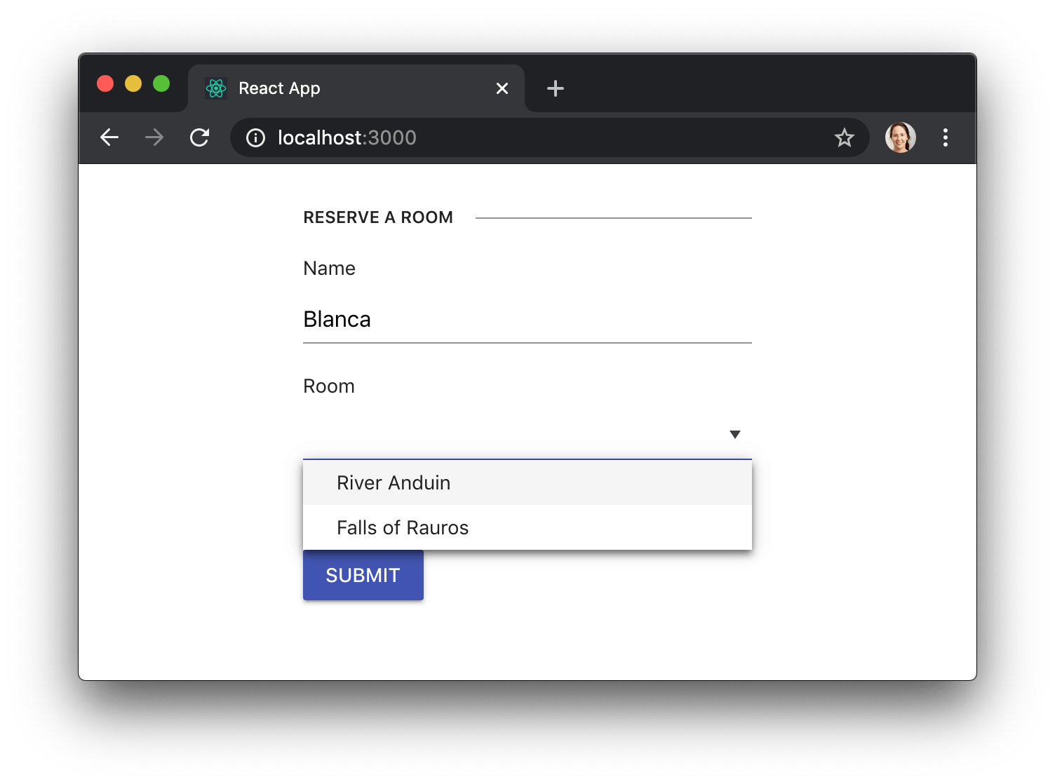
We're not limited to native HTML controls, though. We can use KendoReact components too, if we need a more advanced widget such as a DropDownList:
import React from "react";
import { Form, Field } from "@progress/kendo-react-form";
import { Input } from "@progress/kendo-react-inputs";
import { DropDownList } from "@progress/kendo-react-dropdowns";
import { Button } from "@progress/kendo-react-buttons";
import "@progress/kendo-theme-material/dist/all.css";

import { rooms } from "./rooms";

const App = () => {
  // ...
  return (
    <Form
      onSubmit={handleSubmit}
      render={({ allowSubmit, onSubmit }) => (
        <form onSubmit={onSubmit} className="k-form">
          <fieldset>
            <legend>Make a reservation</legend>
            <div>
              <Field
                name="firstName"
                label="First name"
                component={Input}
              />
            </div>
            <div>
              <Field
                name="lastName"
                label="Last name"
                component={Input}
              />
            </div>
            <div>
              <Field
                name="room"
                label="Room"
                component={DropDownList}
                data={rooms}
              />
            </div>
          </fieldset>
          <Button
            type="submit"
            primary={true}
            disabled={!allowSubmit}
          >
            Submit
          </Button>
        </form>
      )}
    />
  );
};

Validating User Input
When using KendoReact form components we can pass a validator prop to Field with whatever custom validation function we need. That function needs to return a validation message if the value is invalid, or something falsy if the value is valid. In our example, we'll be validating an email address with a naive regular expression.
One other thing that will come in handy in this example is the fact that Field lets us know whether the user has interacted with the field with a few different props. We need this because we don't want to show an error message for a field if the user hasn't even had a chance to enter a value. The props that Field gives us are:
visitedindicates that the user interacted with the field at some point (i.e. itsonFocuscallback was triggered)touchedindicates that the user finished interacting with the field (i.e. itsonBlurcallback was triggered)modifiedindicates that the user changed the value of the field (i.e. itsonChangecallback was called).
So here's how we'd deal with a more complex validation scenario:
.png?sfvrsn=6b94fd90_0)
See how we only render validationMessage when the modified prop is true? That way the message will only get displayed at the right time.
Advanced Styling
KendoReact also allows us to customize the styles of our forms, while maintaining a consistent and professional look.
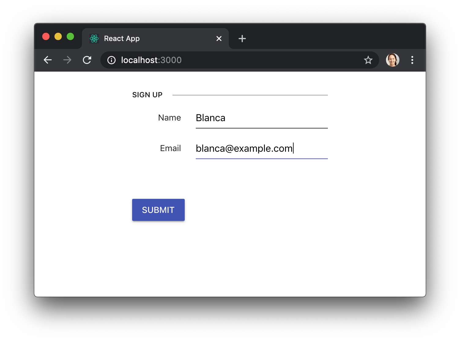
For example, we can make our fields render their labels inline by replacing the k-form class with k-form-inline:
const App = () => {
  // ...
  return (
    <Form
      onSubmit={handleSubmit}
      render={({ allowSubmit, onSubmit }) => (
        <form onSubmit={onSubmit} className="k-form-inline">
          {/* ... */}
        </form>
      )}
    />
  );
};

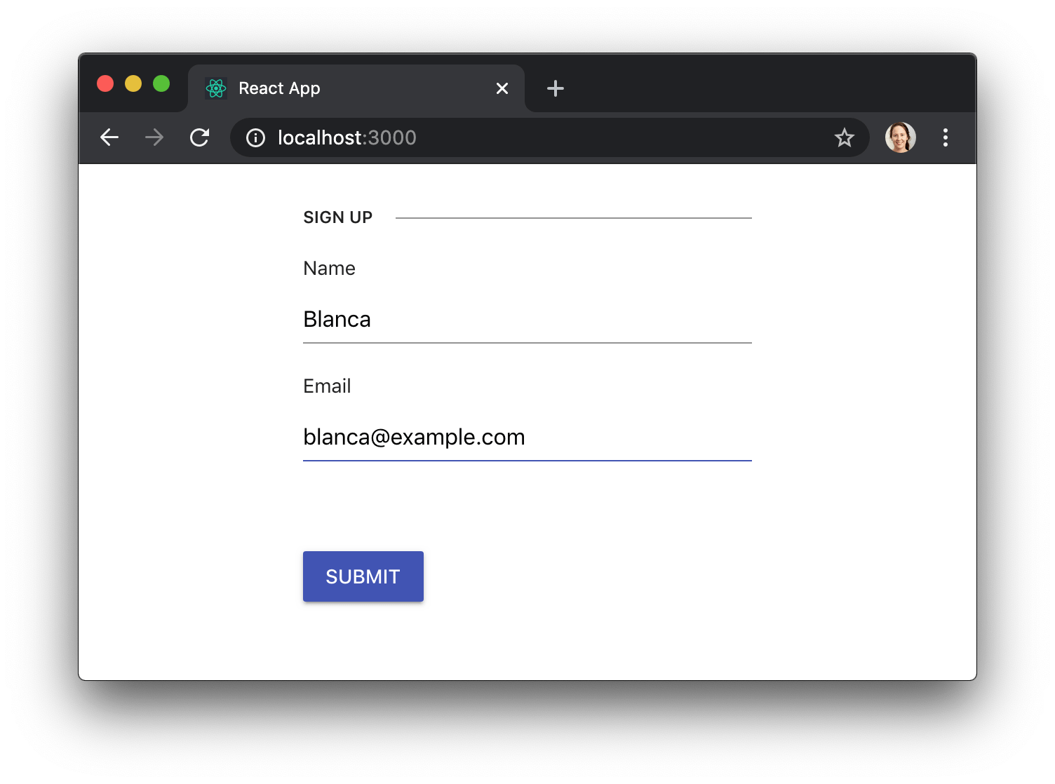
We can also let the user know that a field is required by adding a span with the class k-required, or provide additional information by adding a span with the class k-field-info. In the following example we'll be passing the props required and fieldInfo to Field, so that it forwards them to our CustomInput component, which will then use them to render the necessary field information.
const requiredValidator = value => !!value ? "" : "Please fill out this field.";
const CustomInput = ({
    label,
    value,
    fieldRequired,
    fieldInfo,
    validationMessage,
    modified,
    onChange,
    onBlur,
    onFocus,
    ...others
}) => (
        <label className="k-form-field">
            <span>
                {label}
                {fieldRequired && <span className="k-required">*</span>}
                {fieldInfo && <span className="k-field-info">{fieldInfo}</span>}
            </span>
            <Input
                value={value}
                onChange={onChange}
                onBlur={onBlur}
                onFocus={onFocus}
                {...others}
            />
            {modified && validationMessage && (
                <div className="error">{validationMessage}</div>
            )}
        </label>
    );
const App = () => {
    // ...
    return (
        <Form
            onSubmit={handleSubmit}
            render={({ allowSubmit, onSubmit }) => (
                <form onSubmit={onSubmit} className="k-form">
                    <fieldset>
                        <legend>Sign up</legend>
                        <div>
                            <Field
                                name="name"
                                label="Name"
                                component={CustomInput}
                                fieldRequired={true}
                                validator={requiredValidator}
                            />
                        </div>
                        <div>
                            <Field
                                name="nickname"
                                label="Nickname"
                                component={CustomInput}
                                fieldInfo="optional"
                            />
                        </div>
                    </fieldset>
                    {/* ... */}
                </form>
            )}
        />
    );
};
You can find out more tricks in the KendoReact docs for Styling the Appearance of Forms.
Conclusion
KendoReact Form takes care of the tedious aspects of building forms, so that you can focus on the business logic. It gives you enough flexibility so that you can configure everything the way you need, but it provides a consistent user experience, so that your app feels super polished. 💅

Blanca Mendizábal Perelló
Blanca is a full-stack software developer, currently focused on JavaScript and modern frontend technologies such as React. Blanca can be reached at her blog https://groundberry.github.io/ or @blanca_mendi on Twitter.
