Blazor Basics: Working with Blazor Layouts

Summarize with AI:
Learn about layouts in Blazor—how they define a set of Blazor components that are rendered to display the structure of a web app—and how to create reusable layouts.
In this article of the Blazor Basics series, we will learn about Blazor layouts and how to implement reusable layout components.
You can access the code used in this example on GitHub.
What Is a Blazor Layout?
A layout defines a set of Blazor components that are rendered to display the structure of a web app.
Let’s take a look at a Blazor Server application created using the default Blazor Server project template in Visual Studio 2022.
The MainLayout component in the Shared folder looks like this:
@inherits LayoutComponentBase

<PageTitle>BlazorLayouts</PageTitle>

<div class="page">
    <div class="sidebar">
        <NavMenu />
    </div>

    <main>
        <div class="top-row px-4">
            <a href="https://docs.microsoft.com/aspnet/" target="_blank">About</a>
        </div>

        <article class="content px-4">
            @Body
        </article>
    </main>
</div>
It uses the @inherits directive to specify that it inherits from the LayoutComponentBase type. It is what makes a regular Blazor component a layout component.
We can have whatever content in the layout that we need to build the structure for the web application. In this case, we have a few divs that organize an application menu by referencing the NavMenu component.
To display the page-specific content of the component that uses the MainLayout, we use the @Body property, a RenderFragment, of the LayoutComponentBase base type.
We reference the MainLayout component in the App component.
<Router AppAssembly="@typeof(App).Assembly">
    <Found Context="routeData">
        <RouteView RouteData="@routeData" DefaultLayout="@typeof(MainLayout)" />
        <FocusOnNavigate RouteData="@routeData" Selector="h1" />
    </Found>
    <NotFound>
        <PageTitle>Not found</PageTitle>
        <LayoutView Layout="@typeof(MainLayout)">
            <p role="alert">Sorry, there's nothing at this address.</p>
        </LayoutView>
    </NotFound>
</Router>
As you can see, the MainLayout component is used as the layout for the NotFound case, as well as the default layout for the Found case of the Blazor router.
The alternative to using layout components is to duplicate the structure of the website for each component or to reference the components, such as the NavMenu component on every page. Doing so would lead to unnecessary re-rendering and isn’t a great developer experience.
Blazor layouts make reusing layouts more approachable. For most web applications, it makes sense to have a MainLayout that defines the structure for the main part of the application.
But what if we want a part of the application to look different? For example, when you have a members-only area within a public-facing website?
Creating an Additional Layout Component
First of all, we create a new MemberLayout component within the Shared folder of the Blazor application and add the following content:
@inherits LayoutComponentBase

<PageTitle>Members</PageTitle>

<div style="background-color: lightcoral; min-height: 100dvh; padding: 20px;">
    <main>@Body</main>
</div>
As mentioned in the previous section of this article, we need to inherit from the LayoutComponentBase type to turn a regular Blazor component into a layout component.
Next, we use the PageTitle component to set the title of the website to Members. We don’t need a menu or a header for the member part of the web application.
Instead, we use the main HTML component and use the Body property of the LayoutComponentBase type as its child. It is the placeholder that will be replaced with the content of the specific Blazor page using this layout.
We use some CSS to make the background distinguishable from the regular MainLayout component.
Using a Specific Layout for a Single Component
The simplest but most specific way to assign a layout to a page component is by using the @layout directive.
We create a new folder, /Members, within the /Pages folder of the Blazor web application and create a MembersPage component inside this folder.
The component uses the following code:
@layout MemberLayout
@page "/members"
<h3>Members Overview</h3>
<p>This page is exclusively for members of this service.</p>
<a href="/">← Back</a>
As stated above, we use the @layout directive to specify the MemberLayout for this page. We also use the @page directive to turn the component into a page by registering it with the Blazor router and providing a URL.
The rest of the code defines the page content. In this case, we use a page title using an h3 tag and some text using the paragraph element. Next, we add an anchor that allows the user to navigate back to the Index page.
To make the MembersPage accessible for the user, we add a link to the members section to the NavMenu component referenced in the MainLayout component like this:
<div class="nav-item px-3">
    <NavLink class="nav-link" href="members">
        <span class="oi oi-list-rich" aria-hidden="true"></span> Members
    </NavLink>
</div>
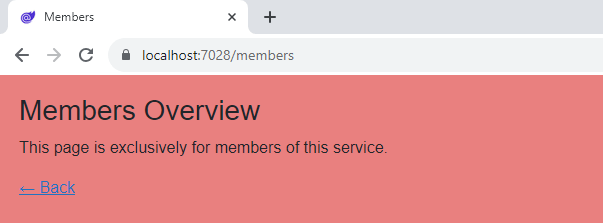
When we start the application and navigate to the member’s page, we see a completely different layout.

Using a Specific Layout for Multiple Components
We learned that we can define a default layout that is used in case no other layout for the page component is defined.
We also learned that we can use the @layout directive on a page to make this specific page using another layout.
But what if we have multiple pages in the members section of the web app? Do we need to have the @layout directive on each page?
Luckily, Blazor provides a more developer-friendly option.
We extract the @layout MemberLayout definition from the MembersPage component into a _Imports.razor file within the same folder.
Now, every page component inside the /Members folder will use the definitions from inside the _Imports.razor file. Therefore, the MemberLaoyut will be applied to all page components inside the /Members folder.
Nested Layout Components
We can also define nested layout components. For example, we can define the MemberLayout to inherit from the LayoutComponentBase type but also use the MainLayout as its base component by using the @layout directive.
A sample definition for such an implementation of the MemberLayout layout component would look like this:
@inherits LayoutComponentBase
@layout MainLayout

<h1>Admin</h1>
@Body
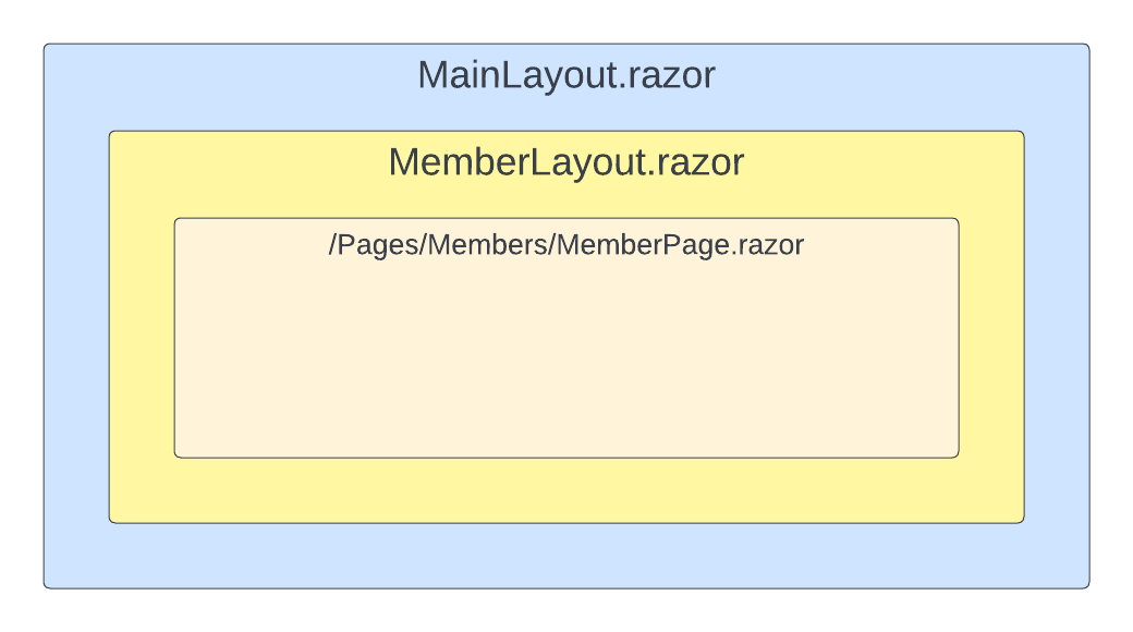
Whenever we use the MemberLayout component, it will render the page content inside the MemberLayout component (where we put the @Body definition). The whole code will then be put where the @Body definition is inside the MainLayout component.
Nested components allow us to build a layout tree similar to regular Blazor components. The following image visualizes the example shown above.

An ideal use case for nested layout components could be our member’s section. For example, we want to add a secondary menu only visible to logged-in members.
Conclusion
Layout components are an important part of Blazor web applications. They provide us with the option to reuse layouts across different pages.
They also make sure that, for example, footer components aren’t rendered with every page navigation.
We can assign a layout component to a specific page component using the @layout directive, or a whole folder containing multiple pages using an _Import.razor file containing the @layout directive.
You can access the code used in this example on GitHub.
If you want to learn more about Blazor development, you can watch my free Blazor Crash Course on YouTube. And stay tuned to the Telerik blog for more Blazor Basics.

Claudio Bernasconi
Claudio Bernasconi is a passionate software engineer and content creator writing articles and running a .NET developer YouTube channel. He has more than 10 years of experience as a .NET developer and loves sharing his knowledge about Blazor and other .NET topics with the community.

