Angular Basics: The Angular Navigation Bar

Summarize with AI:
A NavBar is an HTML element for your main and sub navigation elements. What makes a real navigation bar is the theming—and dozens of UX frameworks make this easy. Let’s see a few!

I hate CSS. I remember when the jQuery UI framework was first becoming popular. I always wondered why more people did not use it. This was one of the first UI frameworks, and it made things easy-ish.
I do not want to think about modeling the same CSS components over and over in my apps. I want to focus on my app UX, the functionality and the logic. The first thing every app developer has to think about is the Navigation Toolbar, also known as Toolbar,
NavBar, AppBar and TopNav. I don’t want to write it a thousand times. I want it to be easy, and I want it to stick.
Basic CSS

In basic CSS/SCSS, we can create a “sticky” navbar that emulates Angular Material like so:
app.component.html
<div class="nav">
  Navbar
</div>
app.component.scss
.nav {
  position: sticky;
  top: 0;
  width: 100%;
  background-color: #3f51b5;
  color: #fff;
  display: flex;
  padding: 0 16px;
  align-items: center;
  height: 56px;
  font: 500 20px/32px Roboto, "Helvetica Neue", sans-serif;
}
I copied the font and color scheme of the Indigo Pink Material Theme. The most important piece to this is the position: sticky; . This tells the navbar to slowly disappear as you scroll. You will also see the position: fixed; attribute to make it immovable in general. Sometimes the navigation will be in a <div>, <nav> or <header> HTML tag.
If you do not need other components like a calendar, modal or themed button, I highly recommend basic CSS. But we are here to talk about Angular.
Bootstrap

There are three ways you can use Bootstrap inside your Angular component.
- Install it manually from https://getbootstrap.com/
- Install
ng-bootstrapfrom https://ng-bootstrap.github.io/ - Install
ngx-bootstrapfrom https://valor-software.com/ngx-bootstrap/
Bootstrap uses basic classes to style the navbar. There is not a Toolbar or Navbar component. You would do something like this:
<nav class="navbar navbar-expand-lg navbar-light bg-light">
  <div class="container-fluid">
    <a class="navbar-brand" href="#">Navbar</a>
  </div>
</nav>
This is great, but again, not the Angular way.
Nebular

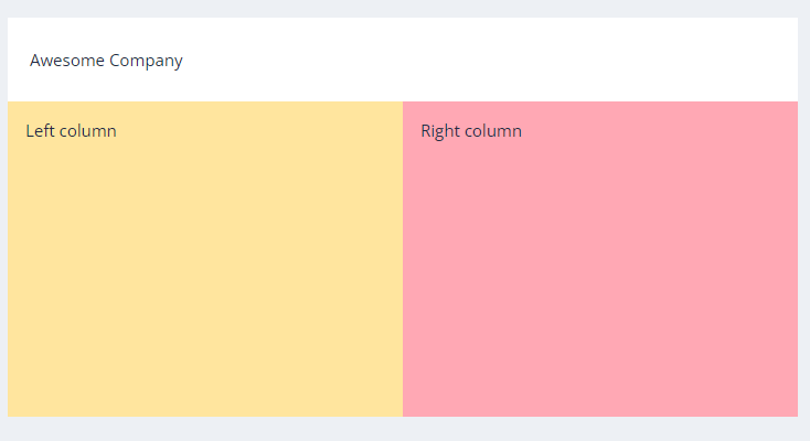
Nebular is one of the most beautiful UI frameworks for Angular. They do not have a top nav component, but for a reason. They look at the entire layout as components. The equivalent NavBar component would be the nb-layout-header component.
<nb-layout>
 <nb-layout-header>My Navbar</nb-layout-header>
...
 <nb-layout-footer></nb-layout-footer>
 <nb-layout-column></nb-layout-column>
 <nb-sidebar></nb-sidebar>
</nb-layout>
Prime NG
I don’t believe Prime NG is made for websites. It does not support Angular Universal. I think everyone should know this so they don’t realize too late this after they have done the work.
That being said, Prime NG can produce enterprise components like Charts, Org Charts, Captchas and even Terminals out of the box. It literally has everything but a NavBar component. However, you could easily use the Menubar or the Toolbar components in its place. After all, you’re probably building an application, not a website.

Material Design
The Angular Material Toolbar is by far the most popular. Material Design 3 is also in beta, so Angular will be the first framework to get it.

To use it, install Angular Material, and use the following easy code:
<mat-toolbar>
    <span>My Application</span>
</mat-toolbar>
That’s it! You can add menus or any other Material Design component just by importing the module, and customizing the basic html.
Kendo UI for Angular

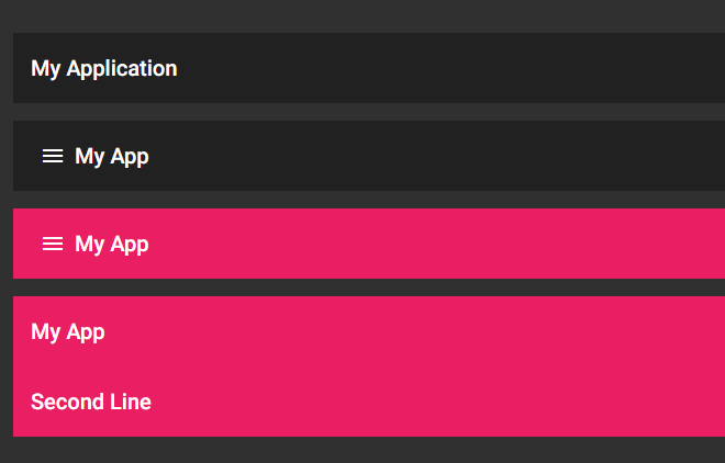
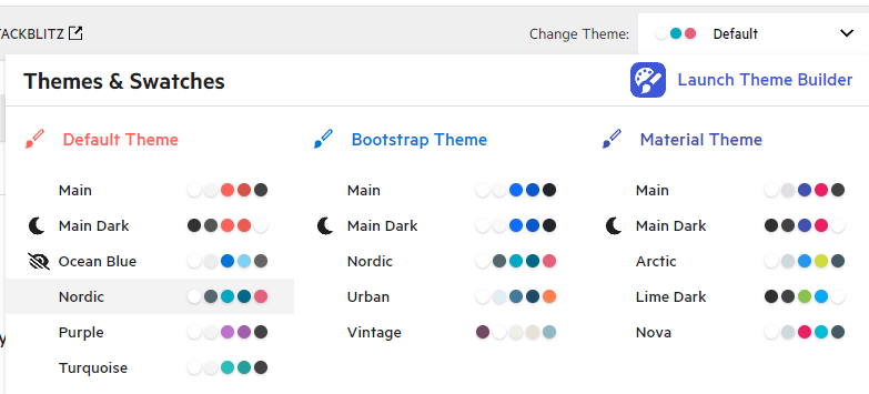
The Kendo UI for Angular AppBar component works just like the Angular Material component. However, there are hundreds of themes built-in (light and dark), responsive design elements, easily positioned elements and
globalization.

You can pretty much easily build your own theme, a Bootstrap theme or a Material Theme without learning those pesky material theming mixins. In addition, Kendo UI for Angular makes it easy for you to design the layout of the AppBar, configuring the sections of content just how you want them.
The value of Kendo UI for Angular AppBar really shines when you consider it is part of the entire Kendo UI for Angular library. This component set is designed so that you have one source for consistently designed and accessible components. There is no need to learn multiple APIs—this library should have all you need. In the case that you need to use components from Angular Material, Kendo UI for Angular’s components will work perfectly side-by-side with them.
The Easy Way
I am a big fan of the easy way. A NavBar is really just an HTML element where you put your main and sub navigation elements. You can also position it to be immovable. What makes a real navigation bar is the theming.
There are dozens of UX frameworks out there that make this easy, and they all have their different ways of displaying the navigation elements. Let’s not reinvent the wheel, and let’s build something beautiful.

Jonathan Gamble
Jonathan Gamble has been an avid web programmer for more than 20 years. He has been building web applications as a hobby since he was 16 years old, and he received a post-bachelor’s in Computer Science from Oregon State. His real passions are language learning and playing rock piano, but he never gets away from coding. Read more from him at https://code.build/.

