3 Ways to Select Dates in Angular Forms using Kendo UI Date Input Components

Summarize with AI:
In this article, we’ll look at three different ways of selecting dates in your Angular app, using different Date Input components by Kendo UI.
Note: Need this info for Vue, not Angular? We've got another guide for you right here.
In terms of growth, JavaScript has skyrocketed to becoming one of the most popular programming languages. Accompanying that growth is a huge list of frameworks and libraries looking to ease the subtle pain of development.
Creating an application from scratch has never been an easy task — it requires a lot of time, work, patience and skill. Thus, utilizing one of these many libraries/frameworks can speed up development and make life a bit better. Of these countless libraries and frameworks, Kendo UI stands out as a library that possesses components that can be used to build out full-blown applications.
Kendo UI is a library used for building applications at a faster pace. It provides UI components for libraries like jQuery, Angular, React and Vue, and it comes packed with over 20 components for creating charts, data tables and drag-and-drop pages. The library is easily customizable and provides a set of themes for Material UI, Bootstrap, etc.
Kendo UI components are distributed as multiple npm packages, so there’s no fear of bloating your application with unnecessary components and increasing your build bundle. It offers components for managing large data sets and for easy data visualization.
We all know how difficult it is to create input elements that allow users to enter dates. It’s been more than 20 years, and browsers still haven’t provided a unified approach to selecting dates. There was a bit of hope when Chrome introduced the date input type, but it wasn’t adopted by other browser types, so no one is confidently creating an input of type date in their markup.
Some of the many Kendo UI components are the Date Input components. We’ll be looking at three different variations of the Date Input components and how to use them within forms. Installing the Date Inputs package in your Angular application will give you access to several other components like the DatePicker, Calendar, TimePicker, etc. In this article, we’ll see how we can work with these components in our Angular application.
To follow this tutorial, a basic understanding of Angular is required. Also, ensure you have Node installed on your personal computer. If you have no prior knowledge of Angular, kindly follow the official tutorial here and download Node for your PC here if you haven’t already.
We’ll be using these tools to build our application:
Initializing Application and Installing Dependencies
To get started, we will use the CLI (command line interface) provided by the Angular team to initialize our project.
First, install the CLI by running npm install -g @angular/cli. npm is a package manager used for installing packages. It will be available on your PC if you have Node installed; if not, download Node here.
To create a new Angular project using the CLI, open a terminal and run:
ng new kendo-dates --style=scssThis command is used to initialize a new Angular project; the project will be using SCSS as the pre-processor.
Next, run the following command in the root folder of the project to install dependencies:
ng add @progress/kendo-angular-dateinputs
Open a terminal inside the project folder and start the application by running ng serve. If you open your browser and visit the link http://localhost:4200, you should see the screenshot below if everything went well.
DatePicker Component
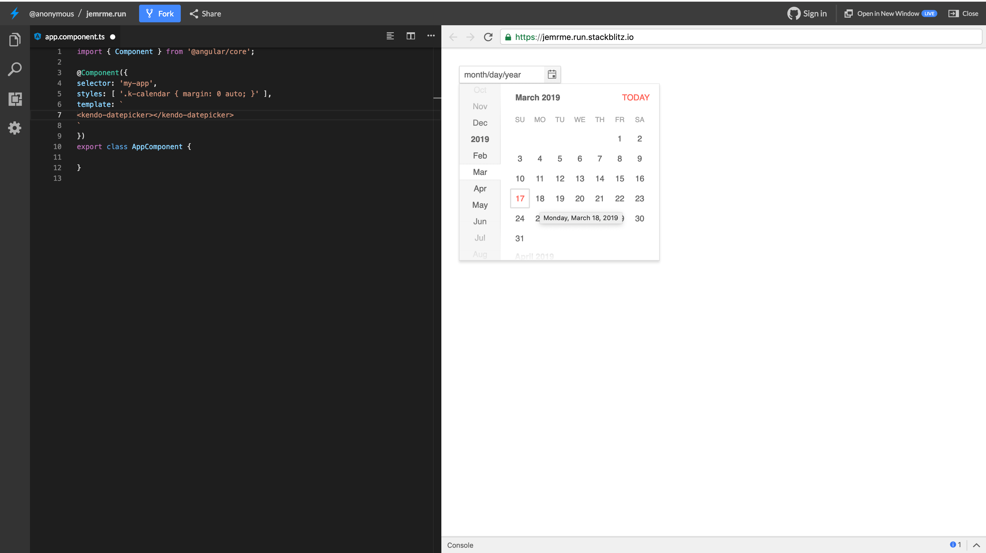
The Kendo UI Angular DatePicker component is useful for selecting dates within forms. It combines the functionalities of the DateInput and Calendar components. This component supports date ranges, accessibility, keyboard navigation, date formatting, etc. To get started with the DatePicker component, open the app.component.html file within your project and replace the contents with the snippet below:
<kendo-datepicker></kendo-datepicker>This will render a simple Kendo UI DatePicker. If you navigate to http://localhost:4200, you should see the date picker in full flow.
The DatePicker isn’t really useful to us in its default state. We want to be able to pass date values to the component and also get a user’s selection in the component. The DatePicker component supports using bindings — you can pass a date value to the component’s value binding, and the component will display the bound date.
Update the app.component.ts file to create a new property to be bound to the DatePicker component. Open the file and create a property called today:
    // src/app/app.component.ts

    import { Component } from '@angular/core';
    @Component({
      selector: 'app-root',
      templateUrl: './app.component.html',
      styleUrls: ['./app.component.scss'],
    })
    export class AppComponent {
      today = new Date()
    }
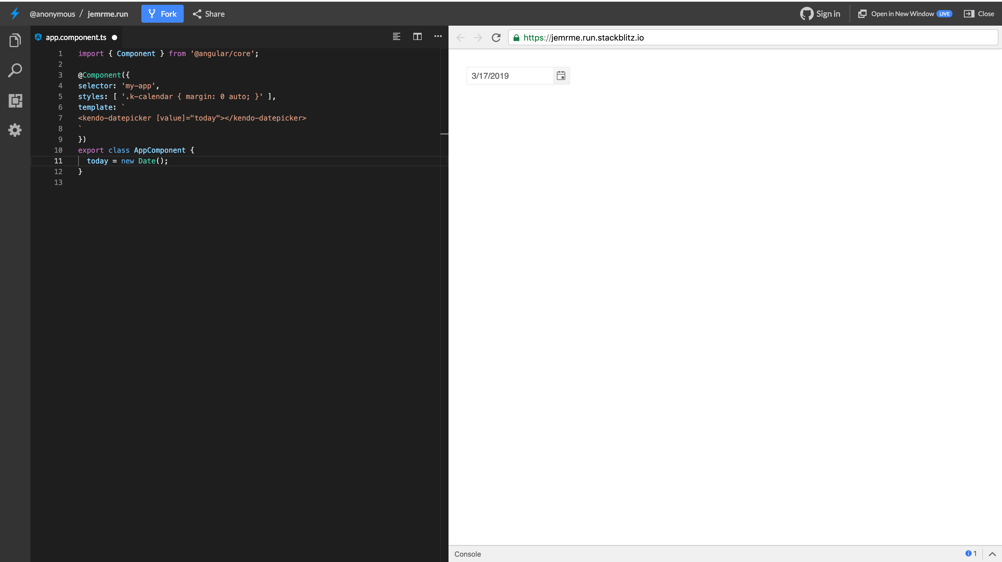
Then, update the template file to use the today value on the DatePicker component. Open the app.component.html file and update it to add a value binding to the DatePicker:
<kendo-datepicker [value]="date"></kendo-datepicker>
If you check the browser, you’ll see that the view is updated with the current date on the component.
With this update, we can pass values from the component file to the template, but a user’s entry won’t be updated because we used one-way binding. To pass values from component to the view and vice versa, we’ll have to update the value binding.
Update the app.component.html file to use two-way binding:
<kendo-datepicker [(value)]="today"></kendo-datepicker>
We can also use Reactive Forms with the DatePicker component. You can simply create a FormGroup and assign the today property to a FormControl. Update the app.component.html file to be similar to the snippet below:
    // app.component.html
    <form [formGroup]="form" (submit)="onSubmit()">
      <kendo-datepicker formControlName="today"></kendo-datepicker>
      <button type="submit">log</button>
    </form>
In the snippet above, we’re using the Reactive Forms approach by creating a FormGroup to manage FormControls. This model-driven approach will ensure that values are synced between the view and component.
Update the app.component.ts file to create the form group property:
    import { Component } from '@angular/core';
    import {FormControl, FormGroup} from '@angular/forms';
    @Component({
      selector: 'app-root',
      templateUrl: './app.component.html',
      styleUrls: ['./app.component.scss'],
    })
    export class AppComponent {
      today = new Date();
      form = new FormGroup({
        today: new FormControl(this.today)
      })
      onSubmit(){
        console.log(this.form.value)
      }
    }
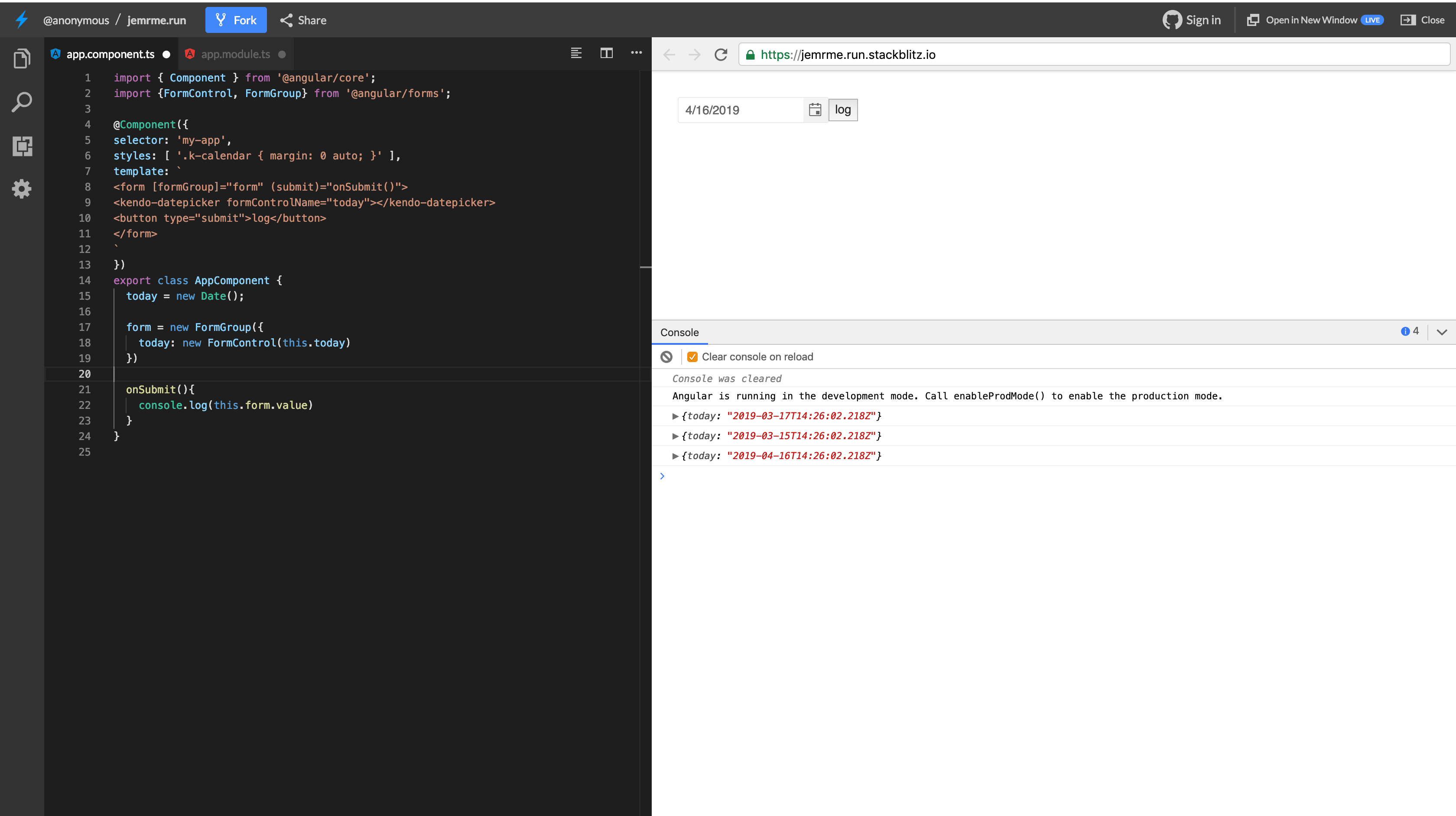
After this update, you can click the submit button after updating the DatePicker to log the updated values to the console.
Formatting Dates
Using the format binding, you can specify a display format for the date selected by the user. You can find the supported formats here. To format the date, update the component to sport a format binding and provide it with any of the supported formats.
In the app.component.ts file, we’ll pick one of the supported formats to use on the component. Open the file and create a property called format:
    import { Component } from '@angular/core';
    import {FormControl, FormGroup} from '@angular/forms';
    @Component({
      selector: 'app-root',
      templateUrl: './app.component.html',
      styleUrls: ['./app.component.scss'],
    })
    export class AppComponent {
      format = "EEEE, MMMM d, y";
      ...
    }
Then update the template to use the format on the DatePicker component:
    <form [formGroup]="form" (submit)="onSubmit()">
      <kendo-datepicker formControlName="today" [format]="format"></kendo-datepicker>
      <button type="submit">log</button>
    </form>
The display on the input element will now be updated to display the date in the following format:
Sunday, March 17, 2019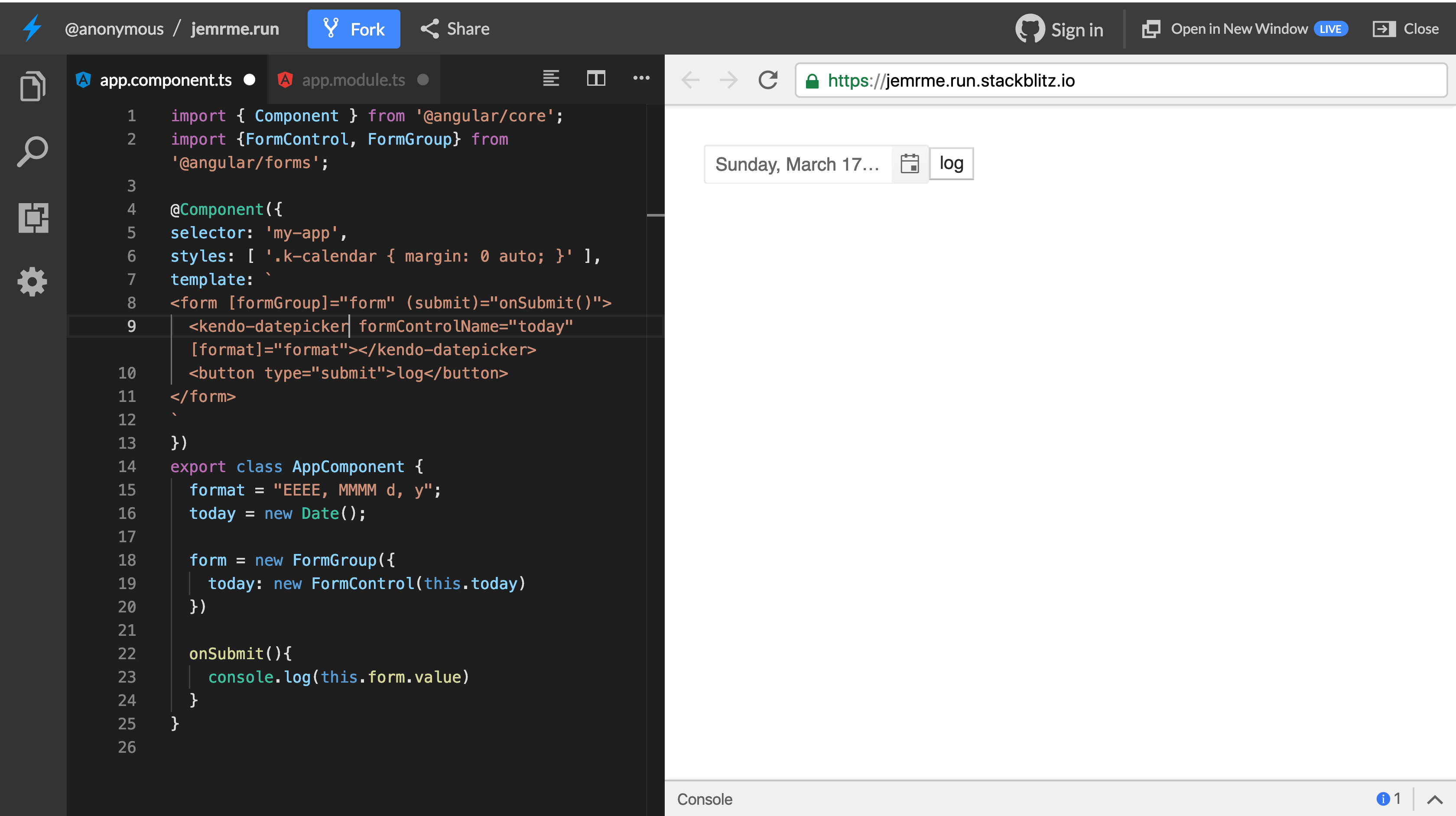
The component can take other bindings to make the input disabled or read-only. You can also simplify the view of the extended calendar by removing the quick navigation. To achieve this, add the following binding to the date picker component:
[navigation]="false"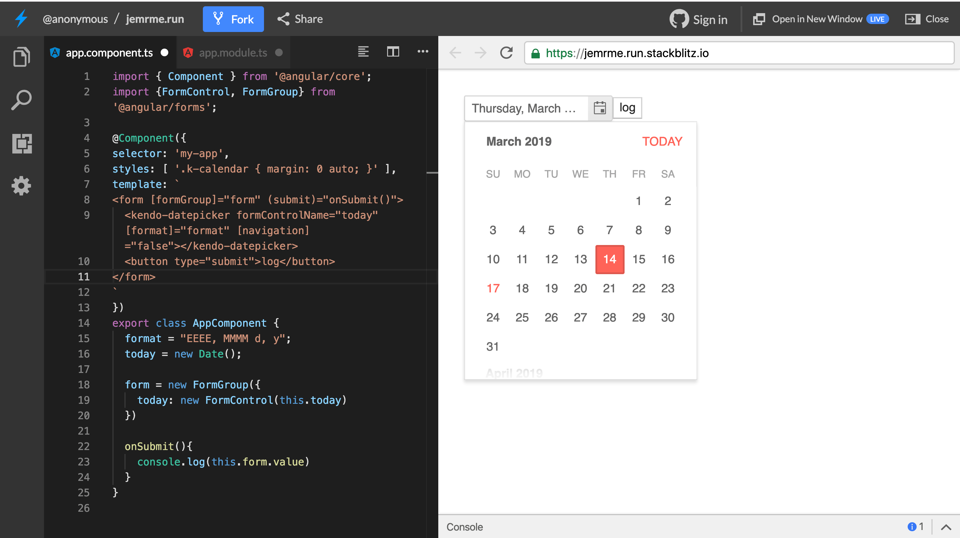
The DatePicker now sports a simplified view. Next, we’ll look at the DateRange component that can be used for selecting a range of dates. You can read more about the DatePicker component in the official documentation here.
DateRange Component
The DateRange component is useful for visualizing the selection of start and end dates. Usually, you’d have two input elements to get the start and end dates but the DateRange component combines both elements to provide a visually pleasing date selector.
Open the app.component.html file and update it to render the DateRange component. You can comment out the DatePicker component if you like:
    <kendo-daterange>
      <label>
        <span class="label">Start</span>
        <kendo-dateinput kendoDateRangeStartInput [(value)]="range.start"></kendo-dateinput>
      </label>
      <label>
        <span class="label">End</span>
        <kendo-dateinput kendoDateRangeEndInput [(value)]="range.end"></kendo-dateinput>
      </label>
    </kendo-daterange>
The DateRange component leverages the DateInput component by passing two attributes kendoDateRangeStartInput and kendoDateRangeEndInput on the start and end elements. These attributes are used to describe the start and end elements — this aids the DateRange component in computing the values.
Update the app.component.ts file to create a range property being used in the template:
    import { Component } from '@angular/core';
    import {FormControl, FormGroup} from '@angular/forms';
    @Component({
      selector: 'app-root',
      templateUrl: './app.component.html',
      styleUrls: ['./app.component.scss'],
    })
    export class AppComponent {
      ...
      range = { start: null, end: null };
    }
After this update, when you navigate to http://localhost:4200, you can see the DateRange component and it should be similar to the screenshot below:
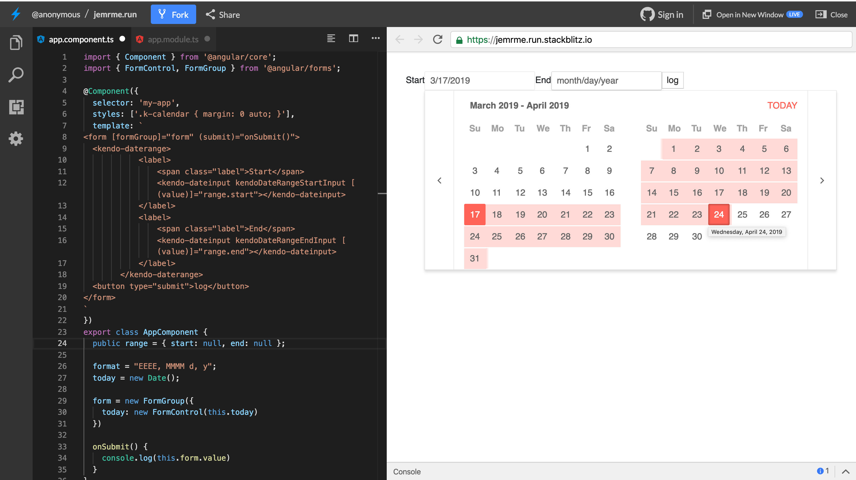
You can also handle the auto-correction of date values to prevent a user from entering a start date that is greater than the end date, and vice versa. The DateRange component takes an autoCorrectOn attribute that determines when the component will handle the auto-correction.
There are three possible values to be provided to the autoCorrectOn attribute:
blur: the auto correct will run after the user clicks focus away from the input element.change: this will run as the value changes.none: autocorrect will not run at all.
Update the template file to add the autoCorrectOn directive on the DateInput component:
    <kendo-daterange>
      <label>
        <span class="label">Start</span>
        <kendo-dateinput kendoDateRangeStartInput [(value)]="range.start" autoCorrectOn="blur"></kendo-dateinput>
      </label>
      <label>
        <span class="label">End</span>
        <kendo-dateinput kendoDateRangeEndInput [(value)]="range.end" autoCorrectOn="blur"></kendo-dateinput>
      </label>
    </kendo-daterange>
The updates will be on both start and end DateInput components. Now if you attempt to manually enter a start date lower than the end date, it’ll default the end date to the start date. You can read more on the DateRange component in the official documentation here.
Calendar Component
The Calendar component is a simple component for rendering a calendar in an application. Alongside that, it features other functionality for date, date range selection and the ability to work with forms. Even though the Calendar component is featured in the DateRange component and the DatePicker component, it still has the ability to function on its own.
Again, update the app.component.html file to render the calendar to the component. Copy the snippet below into the file:
<kendo-calendar></kendo-calendar>
It’s as simple as that. This renders a slick calendar view with a quick navigator on the left: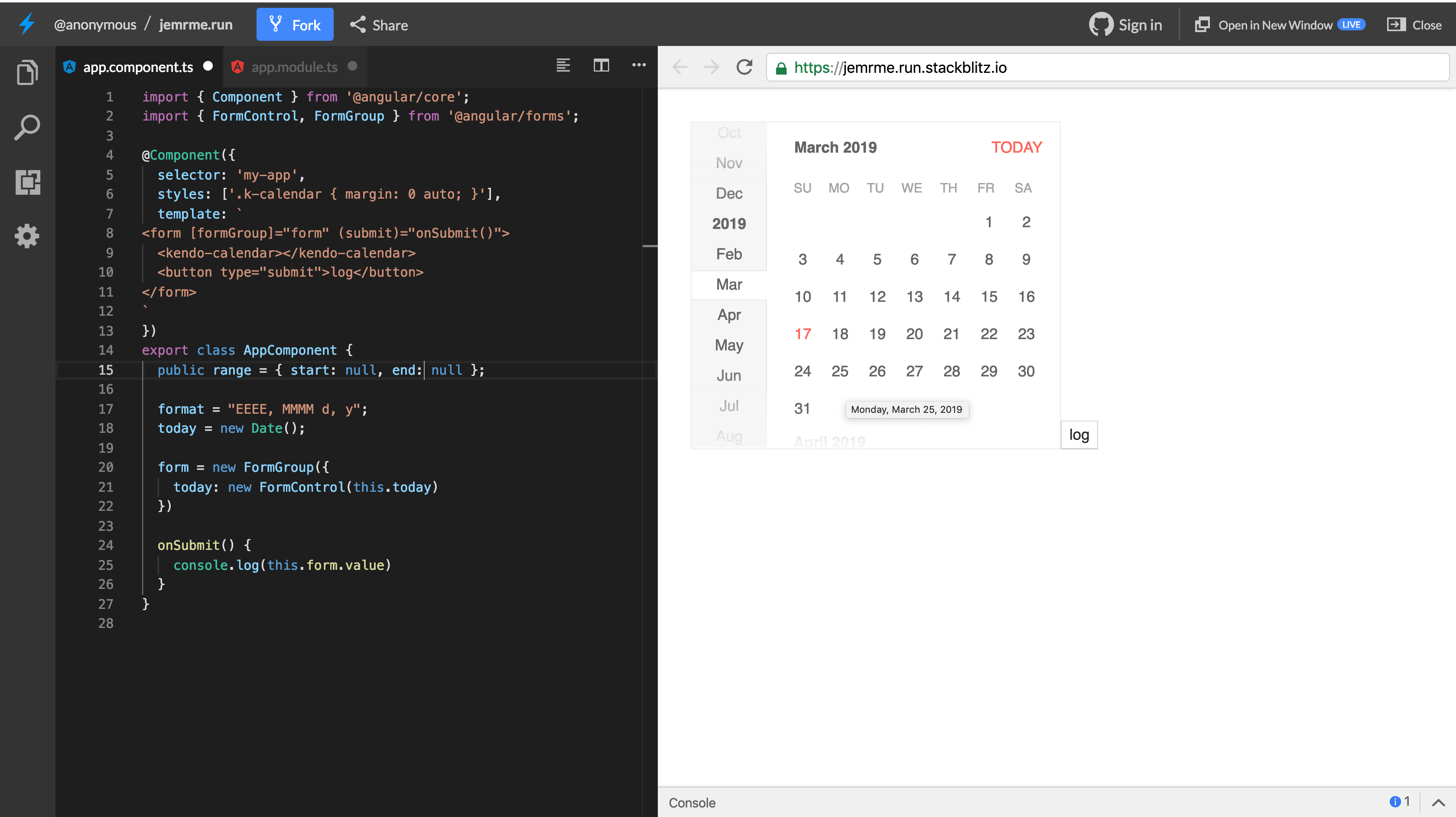
To get the values from the Calendar component, we can use two-way binding to attach and get the value from the component. Update the component to take a value binding:
<kendo-calendar [(value)]="today"></kendo-calendar>
With this update, whenever the calendar is updated, the new value will be attached to the today property in the template and the component. The Calendar component can also be used in combination with FormGroups and FormControl to handle user input.
The component supports max and min dates, which means you can make only a range of dates available for user selection. To achieve this, we’ll update the Calendar component to attach the max and min bindings. Open the app.component.html file to make this update:
<kendo-calendar [(value)]="today" [min]="min" [max]="max"></kendo-calendar>
Then we’ll update the component file to create the min and max properties:
    import { Component } from '@angular/core';
    import {FormControl, FormGroup} from '@angular/forms';
    @Component({
      selector: 'app-root',
      templateUrl: './app.component.html',
      styleUrls: ['./app.component.scss'],
    })
    export class AppComponent {
      ...
      min: Date = new Date();
      max: Date = new Date(new Date().setDate(this.min.getDate() + 5));
    }
The min date is the current day and the max property is five days from the current day. If you visit the application in the browser, you’ll see that dates other than the selected range have been hidden and can’t be selected.
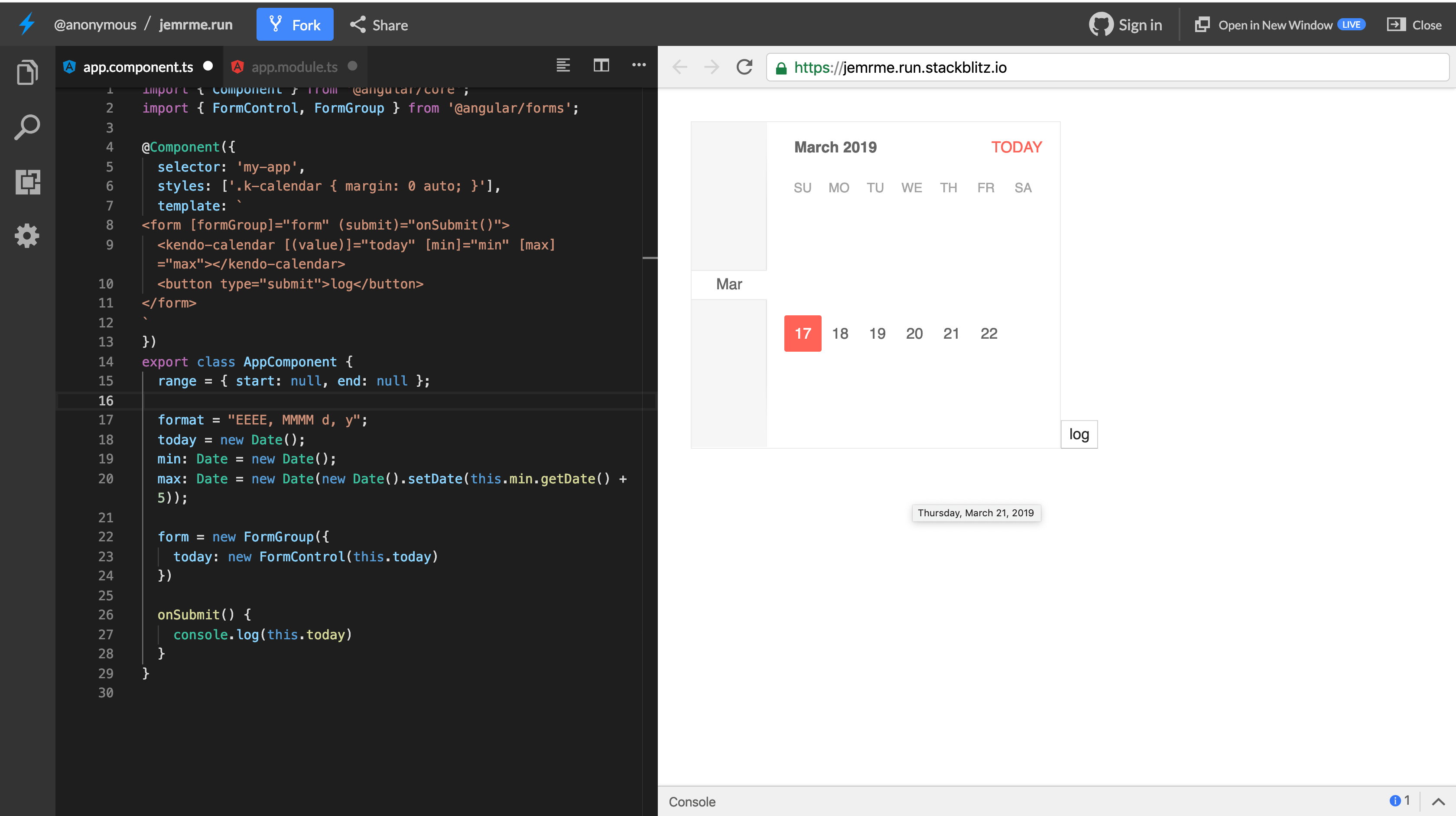
The quick navigation of the component can be hidden by setting [navigation]="false" on the component. You can view some of the other features of the calendar component in the official documentation here.
Conclusion
Kendo UI provides several components that are useful for handling dates in an Angular application, and we’ve been able to look at some of these components. We’ve seen how to pass values to the DatePicker component. We also saw how to use the Calendar component within forms using FormGroup and FormControl. Finally, we utilized the DateRange component when selecting a date range. You can visit the documentation on the Date Input components here.

Christian Nwamba
Chris Nwamba is a Senior Developer Advocate at AWS focusing on AWS Amplify. He is also a teacher with years of experience building products and communities.
