Kendo UI for jQuery
What's New R3 2022
What's New HistoryAll Components: Improved Accessibility
As part of our constant effort to provide full accessibility, we have made updates for compliance with the a11y spec for AA WCAG compliance. VPAT document available upon request.
See the jQuery Accessibility documentation

jQuery PivotGrid v2 Enhancement: Local Data Binding
Earlier this year, we released the first iteration of the jQuery PivotGrid v2 with the fundamental set of features to help get you started. We will continue to release features until it has the full set you would expect in a pivot grid. With this release, we have added the ability to bind to local data. You can now choose from remote OLPA and local data sources when creating your data views.
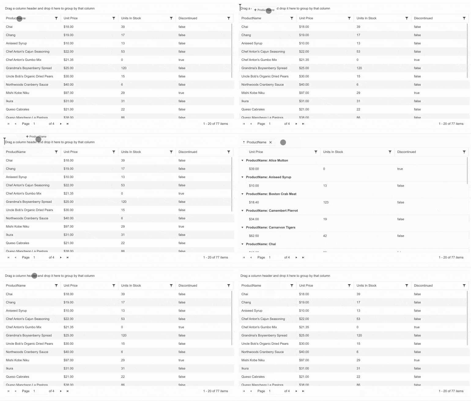
jQuery Data Grid Enhancement: Hide Currently Grouped Column
By default, the jQuery Data Grid will display the columns associated with the fields by which the data is currently grouped. For scenarios where this is not ideal, there is a configuration option to hide grouped columns.
See the jQuery Hide Grouped Column demo

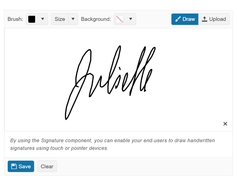
New jQuery Component: Signature
The jQuery Signature component enables your users to upload their signature for documents that require them to sign it. The component can embed the signature into documents or export signatures as images.
See the jQuery Signature component demo

New jQuery Theme: Microsoft Fluent Design System
With R3 2022, we are excited to announce that the new Fluent theme is officially available for all Telerik and Kendo UI libraries and their web UI components! Just like our other themes, the new Fluent theme follows the guidelines of the official Fluent Design System to let users immediately style all components with the Fluent Design System just by including the new theme.
To see the Fluent Theme, open the jQuery Data Grid demo and select the Fluent theme

New Component: jQuery DropDownButton
Instead of executing an action, the jQuery DropDownButton displays a list of actions the user can choose from. These can be simple text, rich text, icons, images or a mix of all these.
See the jQuery DropDownButton demo
New jQuery Data Grid Enhancement: Disable Column Menu on a Per-Column Basis
To give you more control over the interactivity in the jQuery Data Grid, we have added a configuration option to disable the column menu for individual columns.
New Component: jQuery SplitButton
The jQuery SplitButton component combines the functionality of a button with that of a dropdown element. It allows users to either click on the primary button and run its default behavior or to open the drop-down popup and choose from a list of additional actions.
See the jQuery SplitButton demo

All Components: Improved Accessibility and Accessibility Demos
The Kendo UI for jQuery is constantly working to keep the components compliant with the latest accessibility standards. This release improves compliance for Section 508, WCAG 2.1 and WAI-ARIA standards across all our jQuery UI components. Full details can be found in the release notes.
The team has also published accessibility-specific demos that can be used to test any of our jQuery UI components with screen readers and other software used to test accessibility. As a result, accessibility testing is made easier.
See jQuery accessibility documentation

Multiple Components: Fire `onChange` Event Only When Row Select and Deselect are Performed
This change gives you more control and concerns scenarios when using the select functionality of components such as the Data Grid, Calendar, ListView, and Gantt. The ‘onChange event’ will fire only when a row is selected or unselected. This behavior is opposed to the event firing anytime interaction occurs.
Kendo UI for jQuery - R3 2022
- All Components: Improved Accessibility
- jQuery PivotGrid v2 Enhancement: Local Data Binding
- jQuery Data Grid Enhancement: Hide Currently Grouped Column
- New jQuery Component: Signature
- New jQuery Theme: Microsoft Fluent Design System
- New Component: jQuery DropDownButton
- New jQuery Data Grid Enhancement: Disable Column Menu on a Per-Column Basis
- New Component: jQuery SplitButton
- All Components: Improved Accessibility and Accessibility Demos
- Multiple Components: Fire `onChange` Event Only When Row Select and Deselect are Performed


