
Telerik UI for ASP.NET Core
What's New R2 2022
What's New HistoryNew UI for ASP.NET Core CircularProgressBar
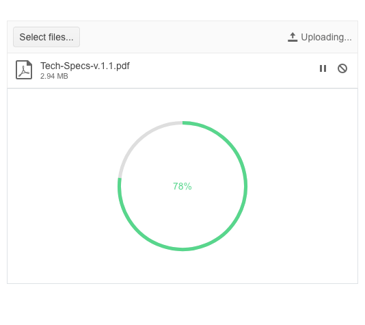
In addition to the existing linear ProgressBar component, with this release we’re adding an ASP.NET Core CircularProgressBar. The new component allows developers to visualize the progress of a particular process as a circle. The CircularProgressBar comes with the following set of features:
- Support for finite and infinite modes
- Center template allows you to display custom text or HTML in the circle’s center
- Colors feature allows rendering of different colors depending on the indicator’s value
See the UI for ASP.NET Core CircularProgressBar demo.
New Dark Theme Available in ASP.NET Core Docs & Demos
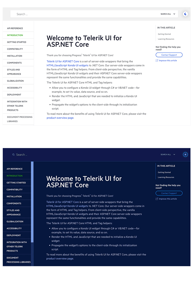
With the R2 2022 release, we are happy to introduce the new Dark mode in the Telerik UI for ASP.NET Core documentation and demo sites. The Dark theme has become a favorite style for many as it reduces eye strain and ensures good color contrast and improved accessibility. You can now easily switch between light and dark themes and browse through the resources in your preferred mode.
UI for ASP.NET Core Visual Studio Code Productivity Tools
The growing usage of Visual Studio Code among the dev community inspired us to introduce the Telerik Visual Studio Code Extension for ASP.NET Core about a year ago. We have since been adding new features and templates to it with the goal of helping ASP.NET Core developers set up and build apps faster. Today, the initially simple project wizard has been upgraded to Progress® Telerik® UI for ASP.NET Core Productivity Tools—a unified extension within Visual Studio Code that includes handy developer features for fast UI component reference, configuration and usage.
Learn more about the UI for ASP.NET Core productivity tools in Visual Studio Code.

UI for ASP.NET Core Scaffolder in Visual Studio Code
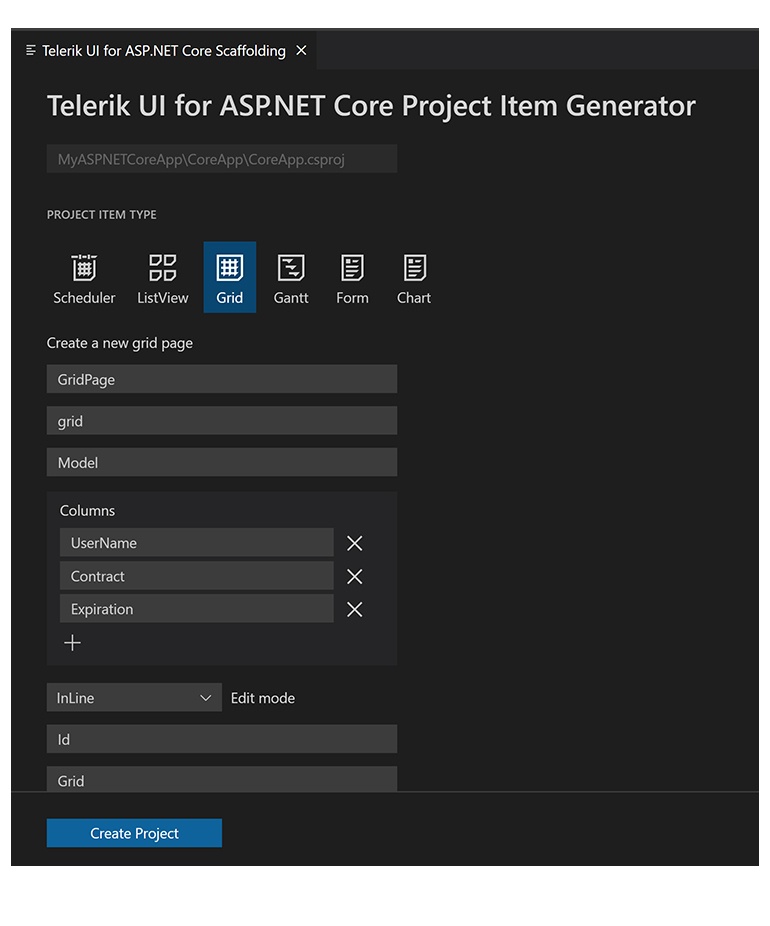
On the list of most-wanted features for the VS Code productivity tools, the scaffolder was the headliner. You can take advantage of the scaffolders immediately and start scaffolding the most loved Telerik UI for ASP.NET Core data-bound components: the Data Grid, Chart, Form, ListView, Editor, TreeList, and Scheduler. The Visual Studio Code scaffolder will prompt you for the input of the controller and model names and will allow you to configure multiple component-specific properties. For example, if you scaffold a new page with the Telerik UI for ASP.NET Core Data Grid, you will be able to set its sorting, filtering, grouping, column resizing, and more properties
UI for ASP.NET Core Code Snippets in VS Code
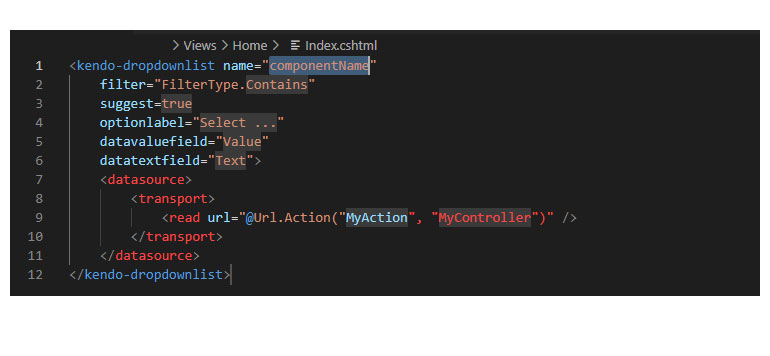
Another productivity feature in the extension is the addition of code snippets for fast UI component reference and configuration. You can now take advantage of dozens of code snippets that can be easily invoked in the IDE by typing “tc” (short for Telerik ASP.NET Core) or directly the name of the component you need to plug in. For example, typing “grid” or just “gr” will conveniently show a dropdown with the available snippet templates you can insert into your code. Then, using a tab sequence, you can fill out the component properties, options, model and controller actions.
With this first release, we shipped code snippets for the majority of the Telerik UI for ASP.NET Core components—the Data Grid, Autocomplete, Date and Time Pickers, Form, Textbox, Upload, Window and more. The good news is that the snippets are now available for both flavors of the UI components—HTML and TAG Helpers. Our goal is to continue this effort and deliver 100% coverage for the snippets over the next couple of product releases.
See all available UI for ASP.NET Core snippets in Visual Studio Code.
Multiple New ASP.NET Core ColorPickers
As the features and complexity of the existing ColorPicker component grew over time, we needed to simplify them and provide granular functionality in several standalone color picker UI components. You can now take advantage of a specific color picker, depending on your use case:
- ColorPalette – renders a predefined list of palettes
- ColorGradient – when you need to show just a gradient view
- FlatColorPicker – in cases you need a simplified ColorPicker without a popup
New UI for ASP.NET Core FlatColorPicker
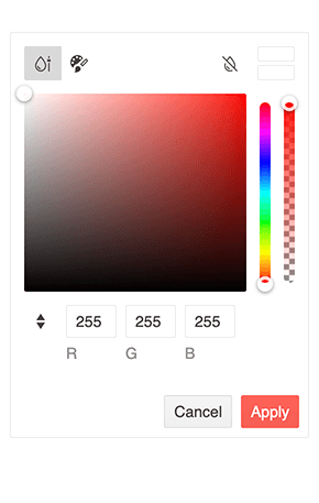
The UI for ASP.NET Core FlatColorPicker is a powerful color editing tool that includes both a Palette and a Gradient view. The component features a header and footer, containing various buttons for switching between views, applying, previewing, reverting or canceling changes. While it resembles the ColorPicker component, the FlatColorPicker comes in a simpler form without the typical popup.
See the UI for ASP.NET Core FlatColorPicker demo.
New UI for ASP.NET Core ColorPalette
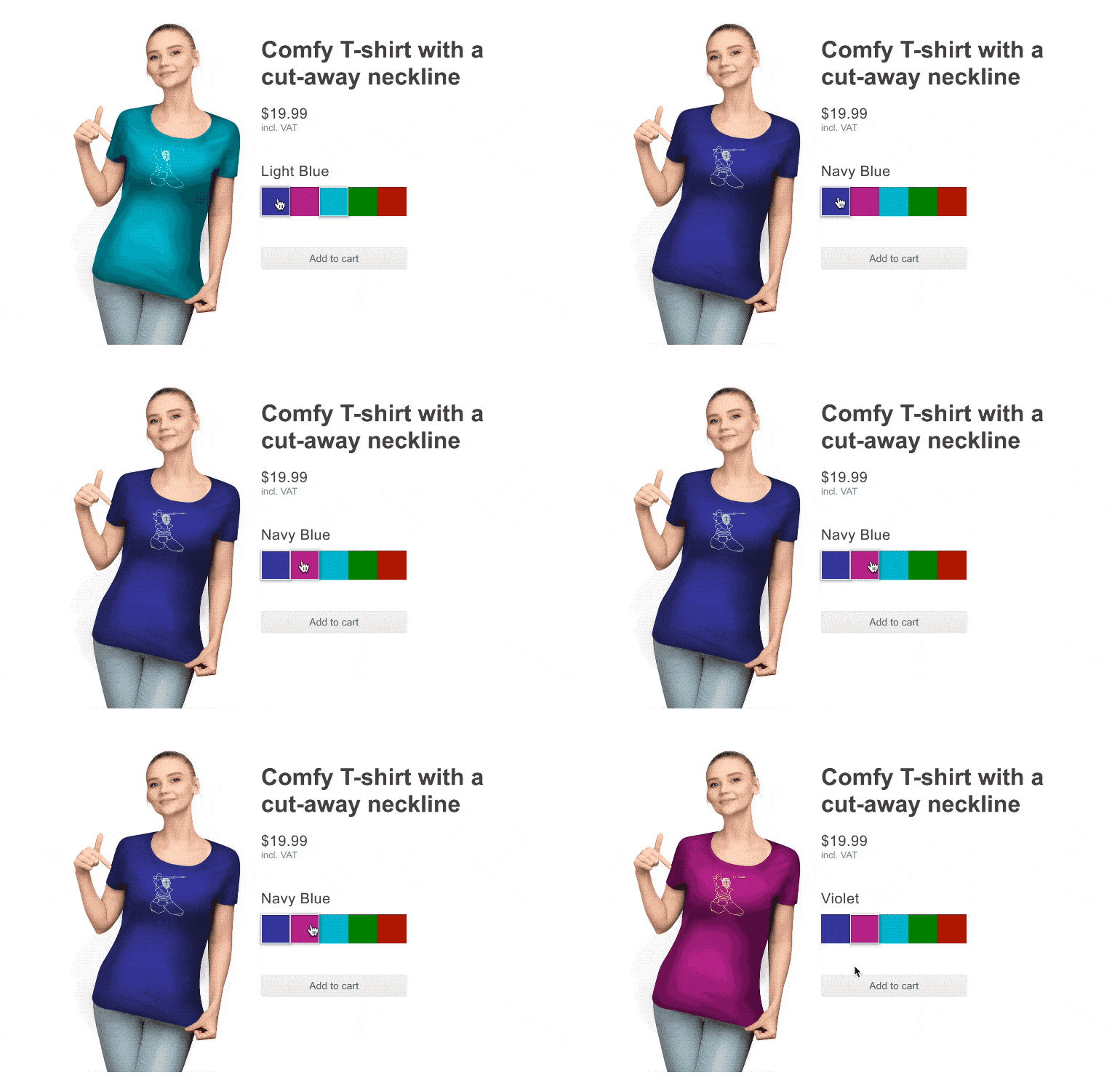
The ColorPalette for ASP.NET Core provides a set of predefined color sets and the flexibility to define your own set of colors (any valid CSS color). The ColorPalette is accessible by all screen readers, has built-in keyboard support and complies with WAI-ARIA, Section 508 and WCAG 2.1.
See the UI for ASP.NET Core ColorPalette demo.
New UI for ASP.NET Core ColorGradient
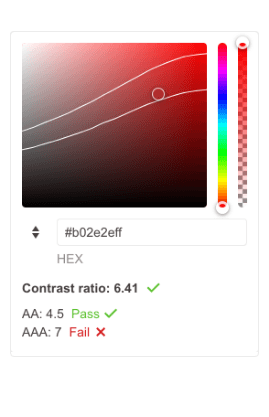
The new standalone ColorGradient UI component gives users a way to select a color via a visual gradient. The ASP.NET Core ColorGradient includes a hue and alpha slider along with manual HEX and RGB inputs. The component also comes with a contrast tool that analyzes the contrast ratio between two colors and helps users select accessible color combinations that meet the WCAG standards. Just like the rest of the UI for ASP.NET Core controls, the Color Gradient has built-in support for keyboard navigation.
See the UI for ASP.NET Core ColorGradient demo.
TAGHelper Improvements in Docs & Demos
Based on your feedback, we are significantly improving the TagHelper code examples and documentation, so that you can easily reference them in your work. The effort will continue throughout 2022, but you can already take advantage of the easy switch between the HTML and TAG Helper views in the component demos.
Additionally, we are expanding the available TagHelper code snippets in both the component demos and documentation. With the current release, we managed to improve the examples in over 30 UI for ASP.NET Core components and multiple documentation articles—DropDownList, DateTimePicker, Editor, TreeView and more. As promised, this effort will continue for a few more releases until we have complete parity between the HTML and TagHelpers examples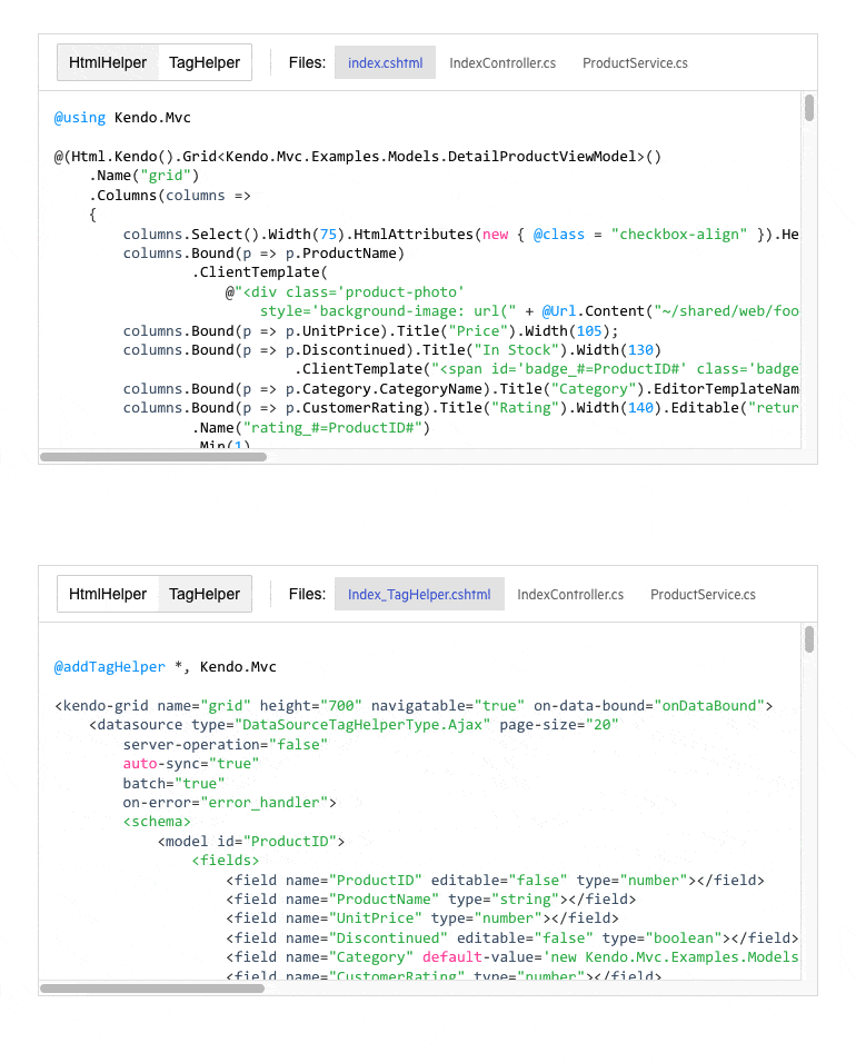
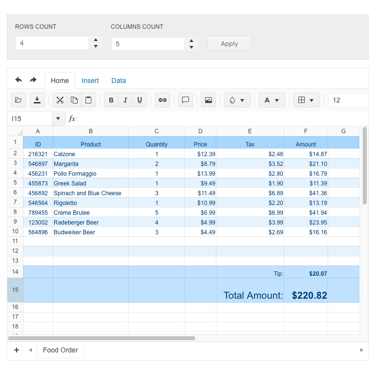
ASP.NET Core Spreadsheet Feature: Dynamic Change of Size
The ASP.NET Core Spreadsheet UI component now has the capability to change the number of its rows and columns and increase its size after loading. When enabled, the new Resize method automatically resizes the sheet on pasting data larger than the current sheet size can fit. The resize functionality also allows flexible behavior when adding and deleting columns and rows from the toolbar.
See a demo of how the Telerik UI ASP.NET Core Spreadsheet resizes.
.NET 7 Preview 5 Compatibility
As a leading provider of UI components for ASP.NET Core, we are glad to announce that the Telerik UI for ASP.NET Core suite is compatible with .NET 7 Preview 5.

UI for ASP.NET Core Accessibility Improvements
In addition to releasing the high-contrast Ocean Blue theme, in R2 2022 we have further improved the components’ accessibility compliance levels and documentation. The Telerik UI for ASP.NET Core library is undergoing an accessibility review using the industry-standard testing process. In the latest release, we have addressed and improved multiple items and will continue this effort throughout the year.

UI for ASP.NET Core: Updated VPAT Document
We have updated our existing Voluntary Product Accessibility Template (VPAT) for Telerik UI for ASP.NET Core to the latest version and according to the latest accessibility improvements that have been made to our UI components.
The VPAT document is available upon request. Feel free to reach out to our support team or one of our sales reps to get a hold of the latest version.
New Event in ASP.NET Core TreeView Component
In R2 2022, we’ve added a LoadCompleted event to the UI for ASP.NET Core TreeView component. It allows you to trigger certain operations or define custom logic only when the complete set of data is loaded.
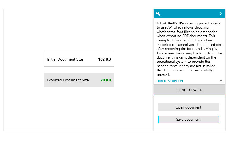
New Document Processing Features for ASP.NET Core Apps
With the R2 2022 release, we are delivering something new for those of you who are using Telerik Document Processing within your ASP.NET Core apps. In the latest distribution package, you will find several of the most-wanted items from our Feedback Portal, including:
- Insertion and deletion of comments for SpreadProcessing
- Implementing cell reference to whole columns for SpreadProcessing
- Support for Type 3 fonts in PdfProcessing
Menu Security Trimming
The UI for ASP.NET Core Menu component was enhanced with a much-requested feature related to hiding menu items from unauthorized access. The feature can be enabled through a single property called SecurityTrimming, but also relies heavily on ASP.NET Core Authorization.
Telerik UI for ASP.NET Core - R2 2022
- New UI for ASP.NET Core CircularProgressBar
- New Dark Theme Available in ASP.NET Core Docs & Demos
- UI for ASP.NET Core Visual Studio Code Productivity Tools
- UI for ASP.NET Core Scaffolder in Visual Studio Code
- UI for ASP.NET Core Code Snippets in VS Code
- Multiple New ASP.NET Core ColorPickers
- New UI for ASP.NET Core FlatColorPicker
- New UI for ASP.NET Core ColorPalette
- New UI for ASP.NET Core ColorGradient
- TAGHelper Improvements in Docs & Demos
- ASP.NET Core Spreadsheet Feature: Dynamic Change of Size
- .NET 7 Preview 5 Compatibility
- UI for ASP.NET Core Accessibility Improvements
- UI for ASP.NET Core: Updated VPAT Document
- New Event in ASP.NET Core TreeView Component
- New Document Processing Features for ASP.NET Core Apps
- Menu Security Trimming
New features & Roadmap
Have a feature request?
Post your feedback via the ASP.NET Core UserVoice portal or the Public forums
What's new across all Telerik products?

Next Steps
See Telerik UI for ASP.NET Core in action and check out how much it can do out-of-the-box.
Check out the offers. Purchase an individual suite, or treat yourself to one of our bundles.
Try Telerik UI for ASP.NET Core with dedicated technical support.


