
Telerik UI for ASP.NET Core
What's New R3 2021
What's New HistorySupport for Visual Studio 2022 and .NET 6
As a leading provider of ASP.NET Core components, we are glad to announce that the Telerik UI for ASP.NET Core suite is compatible with .NET 6 and Visual Studio 2022. You can dive into seamless development with our web components, create new projects using our project templates & built-in layouts and take advantage of the extensive Telerik libraries.

New ASP.NET Core Component: OrgChart
Use the new Telerik UI for ASP.NET Core OrgChart component to effortlessly create rich and interactive organizational charts. Take advantage of the multiple features it comes with, such as grouping, load on demand, templates, keyboard navigation and more.

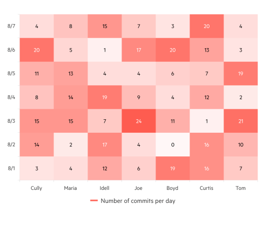
New ASP.NET Core Component: HeatMap
Display a multitude of values in a two-dimensional chart using the Telerik UI for ASP.NET Core HeatMap Chart component. Take advantage of built-in crosshair and tooltip functionalities to enable users to obtain additional information about any value of interest.
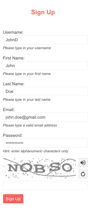
New ASP.NET Core Component: Captcha
The new Telerik UI for ASP.NET Core Captcha is a smart verification component that can be used in any application to prevent automated spam. It features a read out loud option, built-in validation, RTL support and out-of-the-box keyboard navigation.
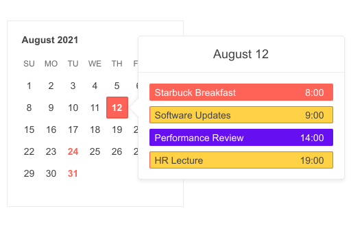
New ASP.NET Core Component: Popover
We have introduced a Popover component for ASP.NET Core that displays information when a user hovers or clicks on an anchor. It can be easily customized through templates or themes and is best used in item-heavy and card-layout projects, such as online shops, schedulers and booking applications.
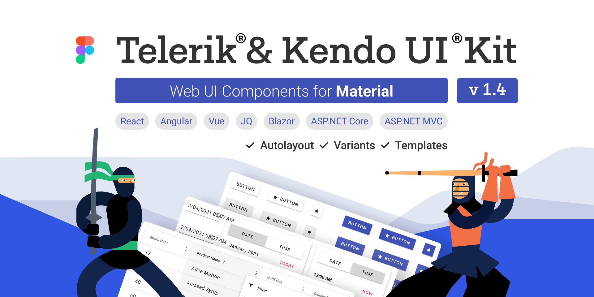
New Telerik UI Kits for Figma
Have you ever wanted to speak the same language as your designers? With the Telerik UI Kits for Figma this will no longer be a problem!
The Telerik UI Kits for Figma are design files created to make the collaboration between application developers and designers easier. As of today, each UI kit provides a precise visual representation of the top 30 Telerik UI for ASP.NET Core components, including Grid, Scheduler, Input etc. The Kits portfolio will be growing continually to provide full coverage for all UI components in the suite. We offer three Design Kits for Figma, one for each of the three main themes: Telerik UI Kit Default, Bootstrap and Material.
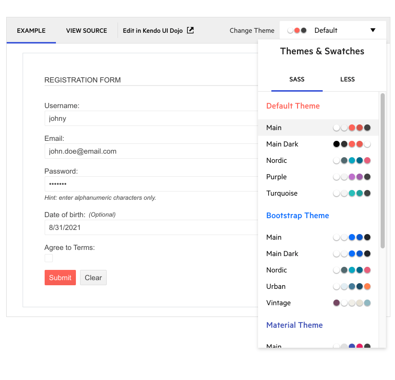
New Theming Enhancement: Improved Themes and Swatches Picker for All UI Component Demos
With this release we decided to make it even easier to style UI components and preview different appearances in a matter of seconds. Check out any component demo to explore the new look of the Themes and Swatches dropdown menu and find your favorite color combinations, some of which include Default (Main, Nordic, Purple, etc.), Bootstrap (Main, Urban, Vintage) and Material (Arctic, Fuchsia, Lime Dark).
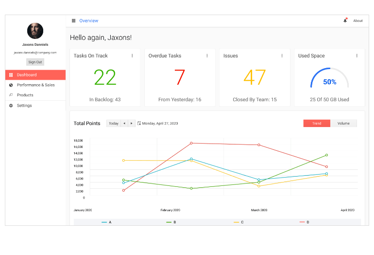
New Admin Dashboard Sample Application & Project Template
The Admin Dashboard demo application showcases a full-stack .NET application built entirely with Telerik UI for ASP.NET Core components in a Razor Pages scenario and using Telerik TagHelpers. In the demo application, you can see many of the UI components in action, including the DataGrid, Card, Chart, Tile Layout, Drawer, Calendar, Form and more. The app also demonstrates globalization and localization, keyboard navigation, authorization, validation and many other valuable features. Make sure to check it out on our ASP.NET Core demos page or test it out in Visual Studio using the project template. You can easily reuse the layout and components and bind them to your own data.
New Grid Enhancement: Alignment of Cell Values
The DataGrid component allows you to align values within the columns, column headers and footers to the left, right or center in order to structure your data in the best possible way.
New: Support for Bootstrap 5
Following the announcement of Bootstrap 5 earlier this summer we worked to ensure that we can accommodate various preferences for its support. If you would like to be compatible with the latest updates, make sure to use the bootstrap-main swatch. In case you wish to continue using the previous versions you can reference Bootstrap-3 and Bootstrap-4 respectively.

New Form Enhancements: Hidden Fields, Built-in TextBox and TextArea and Tag Helpers
The ASP.NET Core Form component has several enhancements, including: built-in TextBox and TextArea for both short and long text input, html and tag helpers for easier implementation and hidden fields for cases when you need to hide information irrelevant to the users, such as ID numbers.
New Pager Feature: Improved Accessibility
The Pager component can now be navigated not only with the PageUp and PageDown keys, but also by using the arrows, home and end, tab, enter, escape and shift keys. To see the keyboard navigation in action, visit the Pager UI component demo or try it out in combination with the Telerik UI for ASP.NET Core DataGrid.

New Visual Studio Project Configuration Wizard for ASP.NET Core
Start up Visual Studio to explore the new Project Configuration Wizard for ASP.NET Core with easy setup of themes, RTL support, global resources and many more.
New Features in Telerik Document Processing
For those of you using Telerik Document Processing within their ASP.NET Core apps, R3 2021 brings a few new updates! In the latest distribution package, you will find several of the top community-requested items, such as:
- PdfProcessing: Handle import of documents with invalid cross-reference table offsets
- SpreadStreamProcessing & SpreadProcessing: Support for XLSM
- WordsProcessing: Introduce a way to replace text with other document elements and more!
New Convert Project Wizard for ASP.NET Core Update
With this release, we are adding some exciting enhancements to the VS Wizard. It now supports Razor Pages projects, .NET 5 and .NET 6 latest preview. Make sure to check it out and take advantage of its updates!
Telerik UI for ASP.NET Core - R3 2021
- Support for Visual Studio 2022 and .NET 6
- New ASP.NET Core Component: OrgChart
- New ASP.NET Core Component: HeatMap
- New ASP.NET Core Component: Captcha
- New ASP.NET Core Component: Popover
- New Telerik UI Kits for Figma
- New Theming Enhancement: Improved Themes and Swatches Picker for All UI Component Demos
- New Admin Dashboard Sample Application & Project Template
- New Grid Enhancement: Alignment of Cell Values
- New: Support for Bootstrap 5
- New Form Enhancements: Hidden Fields, Built-in TextBox and TextArea and Tag Helpers
- New Pager Feature: Improved Accessibility
- New Visual Studio Project Configuration Wizard for ASP.NET Core
- New Features in Telerik Document Processing
- New Convert Project Wizard for ASP.NET Core Update
New features & Roadmap
Have a feature request?
Post your feedback via the ASP.NET Core UserVoice portal or the Public forums
What's new across all Telerik products?

Next Steps
See Telerik UI for ASP.NET Core in action and check out how much it can do out-of-the-box.
Check out the offers. Purchase an individual suite, or treat yourself to one of our bundles.
Try Telerik UI for ASP.NET Core with dedicated technical support.


