
Telerik UI for ASP.NET Core
What's New R1 2022
What's New HistorySupport for .NET 6 and Visual Studio 2022
As a leading provider of ASP.NET Core UI components, we are glad to announce that the Telerik UI for ASP.NET Core suite is compatible with .NET 6 and Visual Studio 2022 since Nov 2021, shortly after they were released by Microsoft. You can dive into seamless development with our web components, create new projects using our project templates & built-in layouts and take advantage of the extensive Telerik UI libraries.

New ASP.NET Core Component: Avatar
Thanks to the new Avatar UI component, you can now easily add a graphical representation of a profile or an online avatar with initials, custom icons and images.
See the ASP.NET Core Avatar component demo.
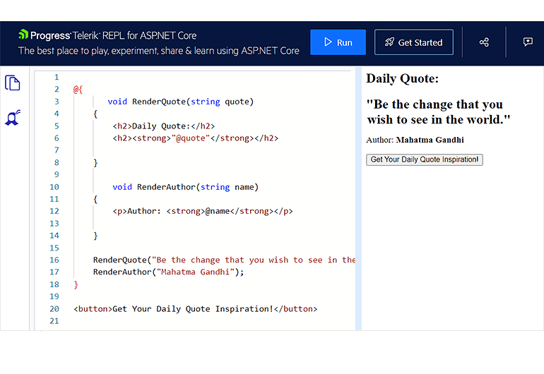
Telerik REPL for ASP.NET Core Playground
A couple of months ago, we announced the launch of a new cool browser-based playground Telerik REPL for ASP.NET Core (REPL as Read–Eval–Print-Loop) for creating, saving, running and sharing server-side code snippets The REPL code-runner also provides seamless integration with the Telerik UI components and let you test and customize them effortlessly in the browser without any additional setup and configuration.
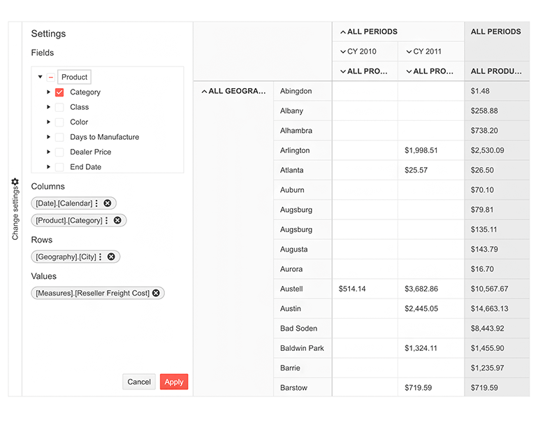
New and Improved ASP.NET Core Component: PivotGrid
The new PivotGridv2 was built from the ground up and has an updated design to ensure the performance and user experience are as good as they can be. At the time of its initial release, the PivotGridv2 may have fewer features and less functionality than the original PivotGrid. The plan is that with the next few releases, we’ll continue to expand its functionality until it reaches full parity with the original component. If you’re already using the existing PivotGrid, nothing will change with this update. We will keep both components side by side until we see evidence that most users have migrated to the new PivotGridv2.
See demo of the new and improved PivotGrid v2 component.
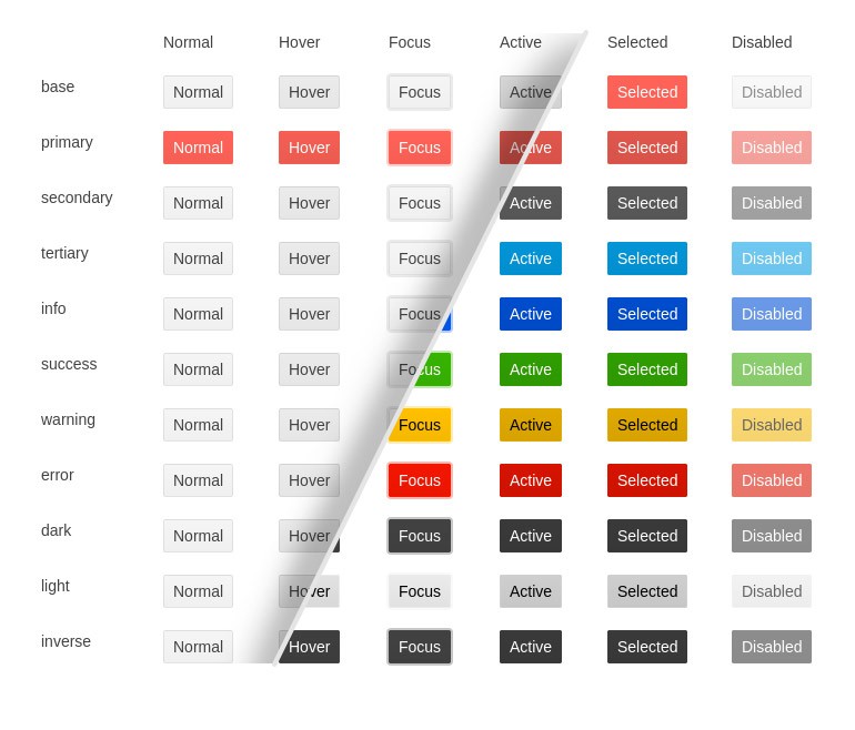
New Theme Rendering Options for ASP.NET Core Components
Based on your feedback related to themes customizations and design language trends, we started addressing various aspects and theme improvements. R1 2022 delivers updates for the Button, Input, DateInput, DropDown and ColorPicker components with a set of common options that will help define the colors, size and shape of individual components. Throughout 2022, we will be introducing enhancements to the way individual components work with themes to make it easier to use your own design system.
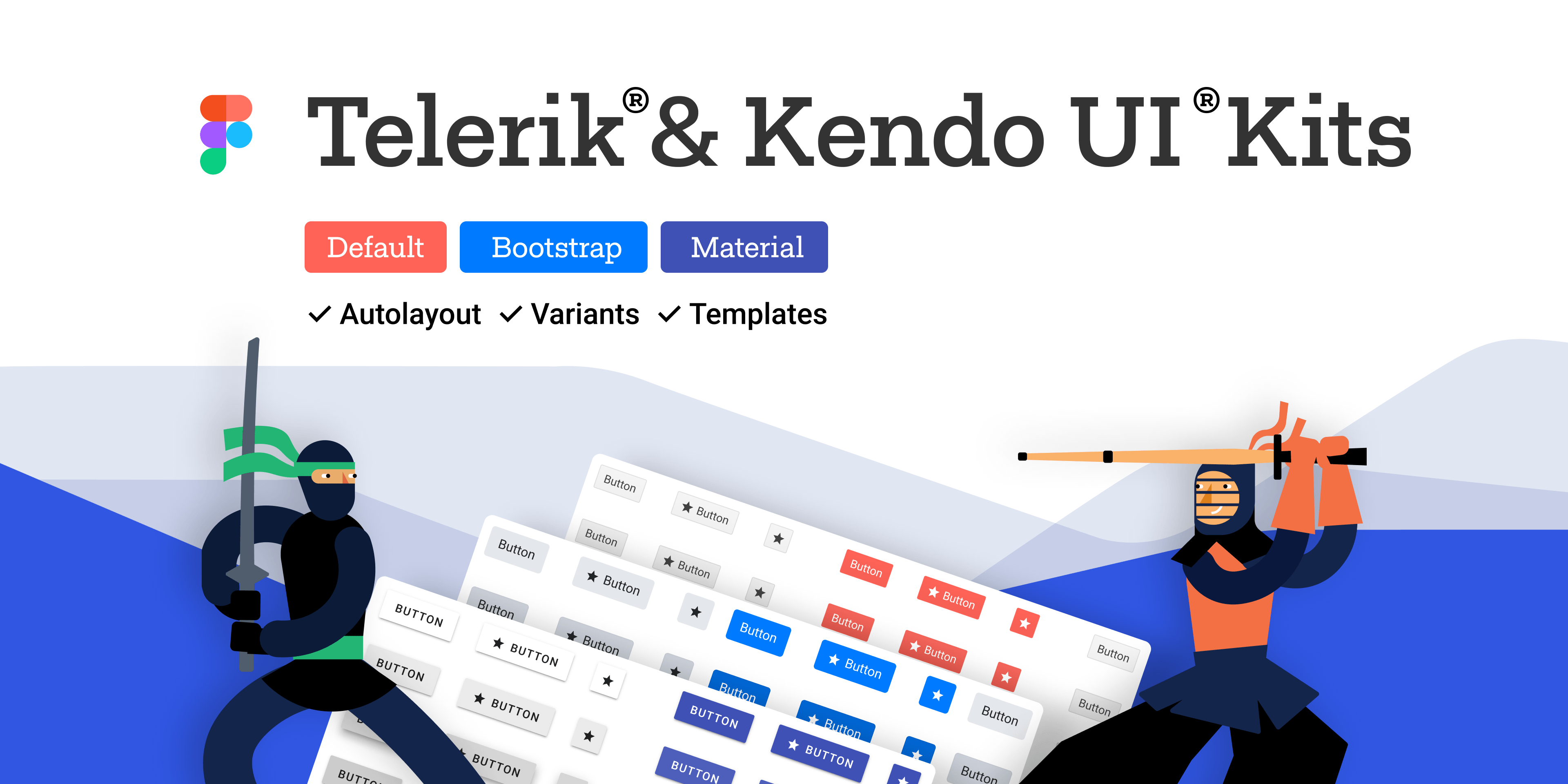
Telerik & Kendo UI Kits for Figma v1.7
We officially introduced the Telerik and Kendo UI Kits for Figma a few months back with the goal to help improve the collaboration between designers and developers using Telerik and Kendo UI components. We expanded the initial set of UI components and with R1 2022 we are introducing nearly 100% coverage of Figma assets for Telerik and Kendo UI components with the only exception of charts.
Multiple New Data Grid Enhancements
In R1 2022, we gave lots of love to the UI for ASP.NET Core Grid. You can enjoy the following new features:
- Grid Multi-Column Sorting via CTRL + Click
- Fit All Columns Width to Content
- Grid Rows Drag & Drop
- Support for Non-String Fields in Grid’s Search Panel
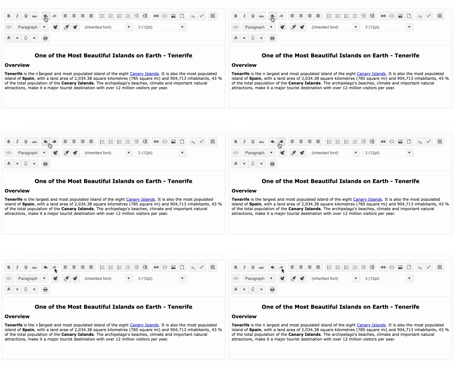
New Editor Enhancement: Undo and Redo
The Editor UI component for ASP.NET Core has been enriched with built-in Undo and Redo commands, further enhancing the component’s capabilities.
Visual Studio and Visual Studio Code Extensions
Telerik UI for ASP.NET Core brings a refreshed and improved Visual Studio Code extension! You can enjoy the updated UX, configure the .NET framework version (including .NET 6.0), and set project themes plus color swatches with a couple of clicks at project creation.
The Visual Studio Extension for Telerik UI for ASP.NET Core now allows you to set color swatches (in addition to the existing themes configurations) with a couple of clicks at project creation and includes Admin Dashboard project template.

Telerik Document Processing
In the latest Telerik Document Processing distribution package for ASP.NET Core, you will find several new document processing features:
- Conditional formatting for SpreadProcessing: Allows adding rules used during cells visualization and applies formatting depending on their values.
- Notes for SpreadProcessing: The user will be able to add and export notes by a specific author.
- Nested MailMerge for WordsProcessing: Where each merge field can contain a list of elements that should be displayed in the merged document.
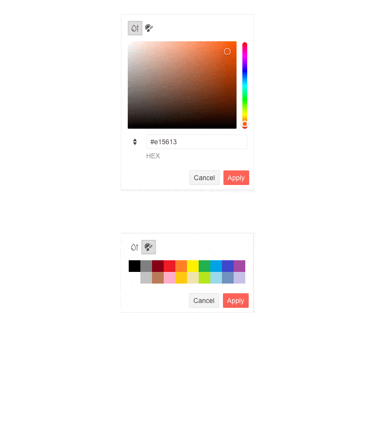
New Enhancements: ASP.NET Core ColorPicker
The Telerik UI for ASP.NET Core ColorPicker component has undergone an exciting rendering change, it now has Color Gradient and Pallete Views, supports both RGB & HEX formats and allows the configuration of the color contrast ratio between two colors. Explore the new features of the component in this demo!
Telerik UI for ASP.NET Core Responsive Panel
We introduced the option to plug the Responsive Panel UI component using Html.Kendo().ResponsivePanel() configuration to complete the support for referencing Telerik components in ASP.NET Core apps using both HTML and TAG helpers.
Shared Data Source with the ScrollView Component
The ScrollView UI Component can now accept DataSource Name as a string in its .DataSource configuration method and be referenced to an external data source.
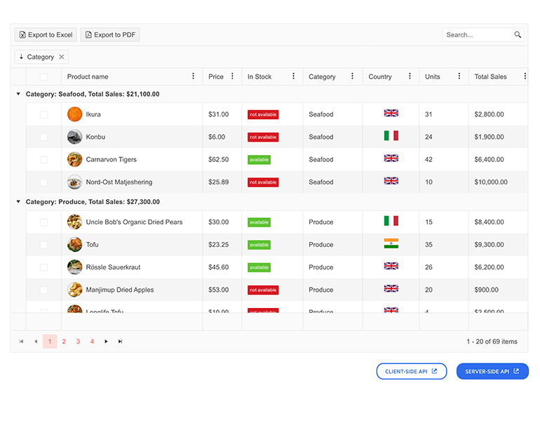
Easy Access to Client and Server-side APIs
No more going back and forth to find the client and server APIs. You can now go to any Telerik UI for ASP.NET Core demo and access the APIs from the links below the showcased component!
Check out the updates in the DataGrid demo.
Modernization of the PanelBar Component Rendering
The Telerik PanelBar component has undergone some minor changes, which are most noticeable when all content is expanded. The expand/collapse arrow on the panel has been changed to a chevron, and the rendering and class changes make child items stand out more.

Telerik UI for ASP.NET Core - R1 2022
- Support for .NET 6 and Visual Studio 2022
- New ASP.NET Core Component: Avatar
- Telerik REPL for ASP.NET Core Playground
- New and Improved ASP.NET Core Component: PivotGrid
- New Theme Rendering Options for ASP.NET Core Components
- Telerik & Kendo UI Kits for Figma v1.7
- Multiple New Data Grid Enhancements
- New Editor Enhancement: Undo and Redo
- Visual Studio and Visual Studio Code Extensions
- Telerik Document Processing
- New Enhancements: ASP.NET Core ColorPicker
- Telerik UI for ASP.NET Core Responsive Panel
- Shared Data Source with the ScrollView Component
- Easy Access to Client and Server-side APIs
- Modernization of the PanelBar Component Rendering
New features & Roadmap
Have a feature request?
Post your feedback via the ASP.NET Core UserVoice portal or the Public forums
What's new across all Telerik products?

Next Steps
See Telerik UI for ASP.NET Core in action and check out how much it can do out-of-the-box.
Check out the offers. Purchase an individual suite, or treat yourself to one of our bundles.
Try Telerik UI for ASP.NET Core with dedicated technical support.


