Getting Started Overview
This tutorial will walk you through creating a RadPanelBar (Accordion) and shows how to:
-
Use the RadPanelBar Item Builder to build a multi-level panel bar.
-
Apply a skin to the panel bar to change its look & feel.
-
Add a template to a panel bar item.
-
Set RadPanelBar properties.
Creating a panel bar using the RadPanelBar Item Builder
-
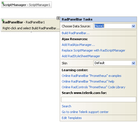
Drag a RadPanelBar component from the toolbox onto your Web page. The RadPanelBar Smart Tag should appear automatically:
-
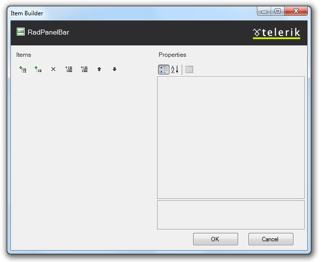
On the Smart Tag, choose Build RadPanelBar. The RadPanelBar Item Builder appears:
-
Click the Add root item button (
 ) to add a root item to your panel bar.
 -
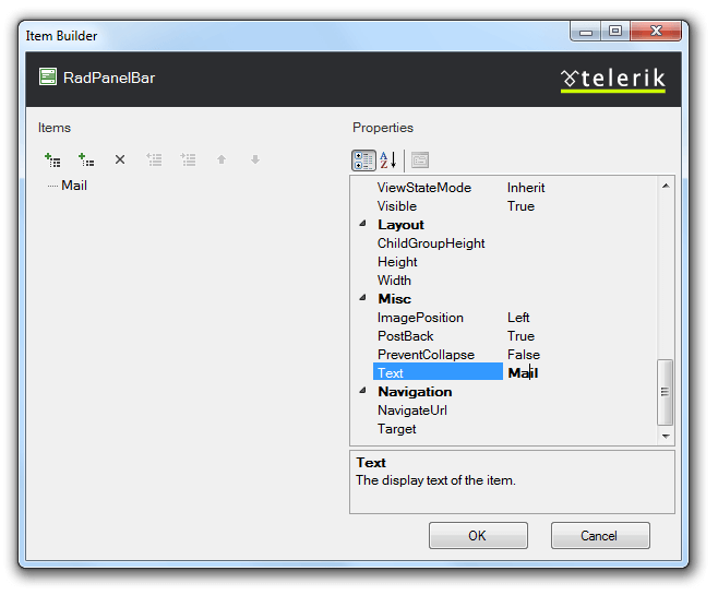
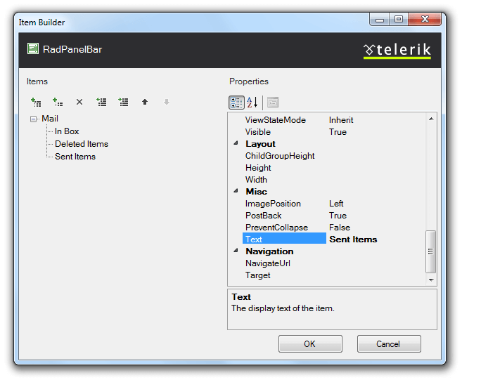
Set its Text property to "Mail".
-
With the "Mail" item selected, click the Add child item button (
 ) to add a child to your root item.
- Select the child item and set its Text property to "In Box".
-
Select the "Mail" item again, and click the Add child item button twice to add two more child items.
-
Set the Text property of the first of these to "Deleted Items".
-
Set the Text property of the second of these to "Sent Items".
-
-
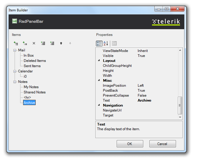
Click the Add root item button to add another root item. Set its Text property to "Calendar".
-
With the "Calendar" item selected, click the Add child item button to add a child item. Set its Text property to an empty string.
-
Click the Add root item button again to add a third root item. Set its Text property to "Notes".
-
Select the "Notes" item and click the Add child item button four times to add four child items.
-
Set the Text property of the first child item to "My Notes".
-
Set the Text property of the second child item "Shared Notes".
-
Set the Text property of the third child item to
<hr>and set its IsSeparator property to True. -
Set the Text property of the fourth child item to "Archive".
-
-
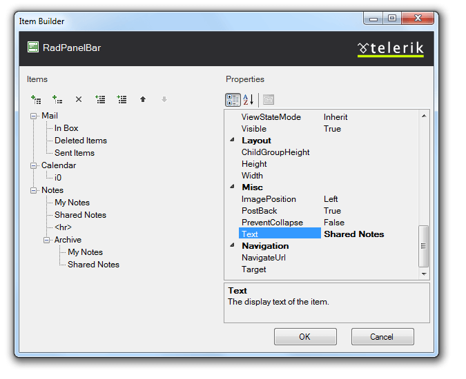
Select the "Archive" child item. With the Archive button selected, click the Add child item button twice to give the child item two child items of its own.
-
Set the Text property of the first child item to "My Notes"
-
Set the Text property of the second child item to "Shared Notes".
-
-
Click OK to confirm and exit.
-
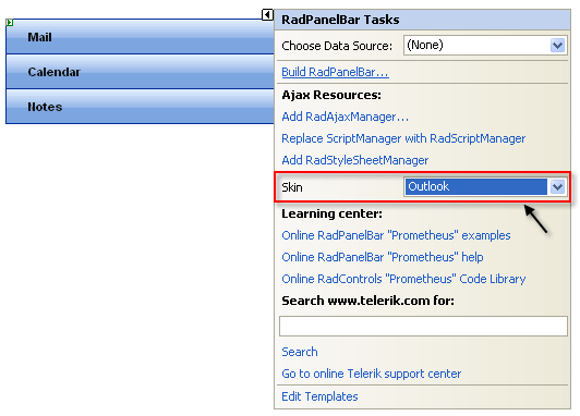
Back in the RadPanelBar Smart Tag, use the Skin drop-down to change the skin for the RadPanelBar to "Outlook". The appearance of the RadPanelBar in the designer changes to reflect the new skin:
-
In the RadPanelBar Smart Tag, click the Edit Templates link.
-
The Smart Tag switches to template editing mode. From the Display drop-down, select the template for the child item of the "Calendar" item:

-
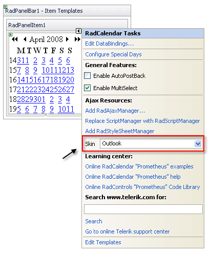
Drag a RadCalendar control from the toolbox onto the Template Design Surface. Set its Skin property to "Outlook" to match the panel bar:
-
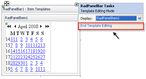
Click on the RadPanelBar Smart Tag anchor to display its Smart Tag again, and choose End Template Editing:
-
Right click on the RadPanelBar, and from its context menu, choose Properties.
-
In the Behavior section of the properties pane:
-
Expand the ExpandAnimation property and set the Type to "InOutBounce". This introduces an animated effect when items are expanded.
-
Set the ExpandMode property to "SingleExpandedItem". This specifies that only one item can be expanded at a time.
-
-
Run the application. Click on the panel bar items to expand them. Note the animated effect. When you expand the "Calendar" item, the template displays:
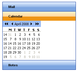
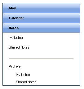
When you click the Notes item, the second level of items appears. You can then click on the "Archive" item to display the third level of items:
