Area Chart
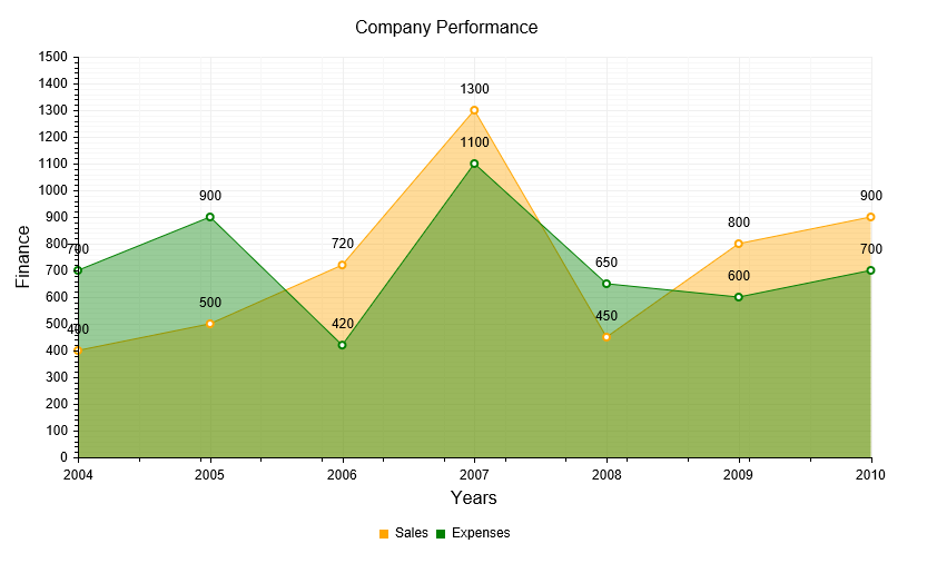
An Area chart, as part of the ASP.NET AJAX Chart, shows the data as continuous lines that pass through points defined by their items' values. The portion of the graph beneath the lines is filled with a particular color for every series. As Figure 1 shows, colors in an Area chart can be useful for emphasizing changes in values from several sets of similar data. A colored background will clearly visualize the differences.
An Area chart emphasizes the volume of money, data or any other unit that the given series has encompassed. When backgrounds are semi-transparent, it lets the user clearly see where different sets of data overlap.
The sample in Figure 1 (which is generated by the code in Example 1) shows sales data — the expenses and revenue generated by the sales effort. For example, such a chart could easily let management see where/when there are issues and the company's sales are not meeting performance goals.
Figure 1: A basic Area chart. Example 1 shows the markup used to create it.

As of Q1 2014, you can use spline curves and step-like progression to render an AreaSeries. This can provide more suitable visualization according to the type of data that is explored.
Vertical Area Chart
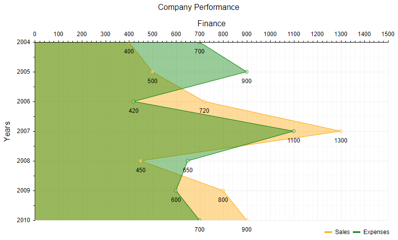
Starting from R3 2023, the Area Chart can be displayed vertically. To enable this orientation, use the VerticalAreaSeries in your chart configuration instead of the standard AreaSeries. This change will render the chart with a vertical x-axis, providing you with more versatile charting options.

Test it out in our Vertical Area Chart live demo.
Customizing an Area Chart
The following list shows the most common areas and elements of the Area chart that you can modify. To explore the full list of options, start from the Visual Structure of the RadHtmlChart Control’s Tag Hierarchy help article.
-
The fill color of each series is controlled via the BackgroundColor property of the AreaSeries > Appearance > FillStyle inner tag.
-
The width of the line in each series is controlled via the Width property of the AreaSeries > LineAppearance tag.
-
The name that is shown in the legend is set via the
Nameproperty of the series. You can hide the series from the legend either by omitting it, or by setting theVisibleInLegendproperty tofalse. -
The position of each item on the y-axis is controlled by its Y property of the CategorySeriesItem and each CategorySeriesItem is placed with regard to one AxisItem on the x-axis.
-
Each item can have a label and a tooltip that follow the common pattern defined in the DataFormatString property of the LabelsAppearance and TooltipsAppearance sections of the series.The format string uses the Y of the item. You can create more complex content via the ClientTemplate of the tooltips and labels.
-
The markers are fully customizable — the type, background color, size, border's width and color can be controlled respectively through MarkersType, BackgroundColor, Size, BorderWidth and BorderColor properties, exposed by the AreaSeries > MarkersAppearance tag.
-
The axes are also fully customizable — the y-axis automatically adjusts the scale to accommodate the data that comes in, and for finer tuning, there are numerous properties that can change each aspect.
-
Directly in the axis tag you can use the tag's properties to control color, major and minor tick types and sizes, minimal and maximal values for the y-axis (plus a step size) whereas the x-axis requires a set of items to match the number of CategorySeriesItems the series have. This tag is also the place where the crossing value with the other axis can be set (the index of an item for an item axis) and whether the axis will be reversed.
-
The inner tags of the axis tag can control the major and minor grid lines in terms of color and size and the labels can have a DataFormatString, position and visibility set through each inner tag's properties.
-
-
If some values are missing (i.e., they are null/Nothing) from the series data, you can have the chart work around this by setting the MissingValues property of the series to the desired behavior: interpolate, missing or gap.
-
The title, background colors and legend are controlled via the inner properties of the RadHtmlChart control and are common for all charts.You can find more information in the Server-side API and in the Element structure articles.
Not all properties are necessary. The RadHtmlChart will match the axes to the values if you do not declare explicit values, steps and tick properties (although the Items for axes that need them are necessary).
The Example that Creates Figure 1
Example 1: The code that creates the chart from Figure 1. It shows a simple comparison between the sales and the expenses of a company.
<telerik:RadHtmlChart runat="server" ID="AreaChart" Width="800" Height="500" Transitions="true">
	<ChartTitle Text="Company Performance">
		<Appearance Align="Center" Position="Top" />
	</ChartTitle>
	<Legend>
		<Appearance Position="Bottom" />
	</Legend>
	<PlotArea>
		<XAxis AxisCrossingValue="0" Color="Black" MajorTickType="Outside" MinorTickType="Outside"
			>
			<TitleAppearance Text="Years" />
			<MajorGridLines Color="#EFEFEF" Width="1" />
			<MinorGridLines Color="#F7F7F7" Width="1" />
			<Items>
				<telerik:AxisItem LabelText="2004" />
				<telerik:AxisItem LabelText="2005" />
				<telerik:AxisItem LabelText="2006" />
				<telerik:AxisItem LabelText="2007" />
				<telerik:AxisItem LabelText="2008" />
				<telerik:AxisItem LabelText="2009" />
				<telerik:AxisItem LabelText="2010" />
			</Items>
			<TitleAppearance Position="Center" Text="Years" />
		</XAxis>
		<YAxis Color="Black" MajorTickType="Outside" MinorTickType="Outside"
			 MaxValue="1500" Step="100">
			<MajorGridLines Color="#EFEFEF" Width="1" />
			<MinorGridLines Color="#F7F7F7" Width="1" />
			<TitleAppearance Position="Center" Text="Finance" />
		</YAxis>
		<Series>
			<telerik:AreaSeries Name="Sales" MissingValues="Gap">
				<Appearance>
					<FillStyle BackgroundColor="Orange" />
				</Appearance>
				<LabelsAppearance Position="Above" />
				<MarkersAppearance MarkersType="Circle" BackgroundColor="White" />
				<TooltipsAppearance BackgroundColor="White" />
				<SeriesItems>
					<telerik:CategorySeriesItem Y="400" />
					<telerik:CategorySeriesItem Y="500" />
					<telerik:CategorySeriesItem Y="720" />
					<telerik:CategorySeriesItem Y="1300" />
					<telerik:CategorySeriesItem Y="450" />
					<telerik:CategorySeriesItem Y="800" />
					<telerik:CategorySeriesItem Y="900" />
				</SeriesItems>
			</telerik:AreaSeries>
			<telerik:AreaSeries Name="Expenses" MissingValues="Gap">
				<Appearance>
					<FillStyle BackgroundColor="Green" />
				</Appearance>
				<LabelsAppearance Position="Above" />
				<MarkersAppearance MarkersType="Circle" BackgroundColor="White" />
				<TooltipsAppearance BackgroundColor="White" />
				<SeriesItems>
					<telerik:CategorySeriesItem Y="700" />
					<telerik:CategorySeriesItem Y="900" />
					<telerik:CategorySeriesItem Y="420" />
					<telerik:CategorySeriesItem Y="1100" />
					<telerik:CategorySeriesItem Y="650" />
					<telerik:CategorySeriesItem Y="600" />
					<telerik:CategorySeriesItem Y="700" />
				</SeriesItems>
			</telerik:AreaSeries>
		</Series>
	</PlotArea>
</telerik:RadHtmlChart>