.NET MAUI DataGrid AI Smart Assistant Styling
The .NET MAUI DataGrid control allows you to customize the appearance of the AI Smart Assistant feature to match your application's design requirements. You can modify various visual aspects of the AI Smart Assistant panel, including colors, fonts, and layout.
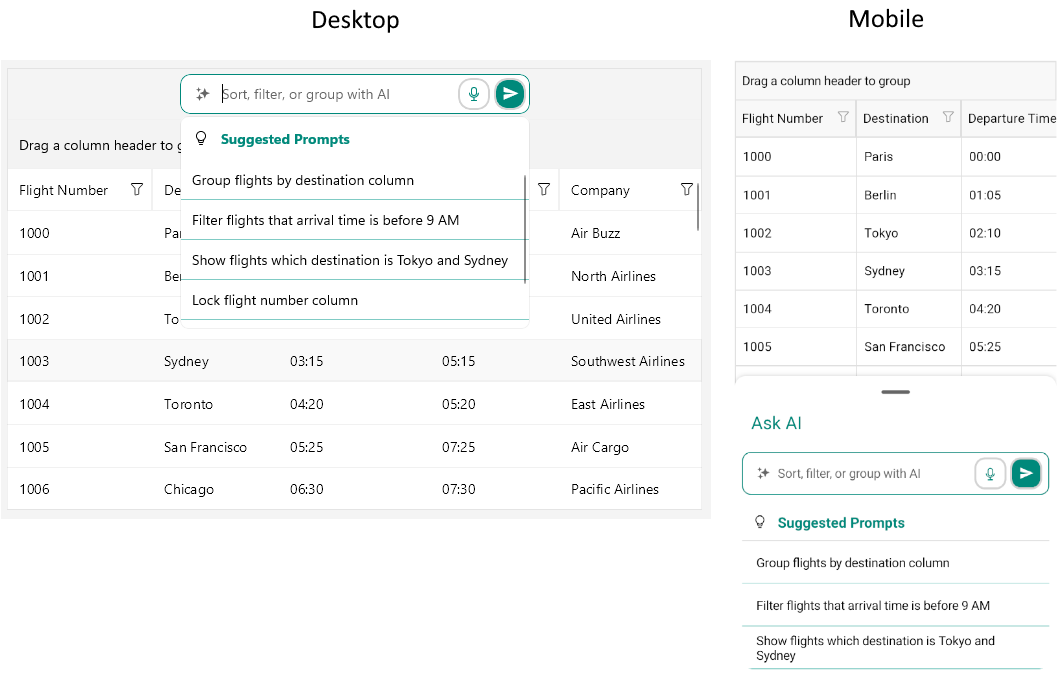
AI Smart Assistant styling in the .NET MAUI DataGrid
Style the AI Smart Assistant Input
You can customize the appearance of the AI Smart Assistant panel by using the PromptInputStyle property. The property is of type Style with a target type of Telerik.Maui.Controls.DataGrid.DataGridAIPromptInput.
By default, the AI Smart Assistant input includes a Speech-to-Text button that allows users to input prompts using voice commands. You can customize the appearance of this button by using the SpeechToTextButtonStyle (Style with a target type of Telerik.Maui.Controls.RadSpeechToTextButton) property.
The available properties for the PromptInputStyle are described below:
BackgroundColor(Color)—Specifies the background color of the AI Smart Assistant input.BorderColor(Color)—Specifies the border color around the AI Smart Assistant input.BorderBrush(Brush)—Specifies the border brush around the AI Smart Assistant input.BorderThickness(Thickness)—Specifies the border thickness around the AI Smart Assistant input.CornerRadius(Thickness)—Specifies the corner radius of the border around the AI Smart Assistant input.TextInputStyle(Stylewith target type ofTelerik.Maui.Controls.RadTextInput)—Specifies the style of the text input field within the AI Smart Assistant input.ClearButtonStyle(Stylewith target type ofTelerik.Maui.Controls.RadTemplatedButton)—Specifies the style of the clear button within the AI Smart Assistant input.SendButtonStyle(Stylewith target type ofTelerik.Maui.Controls.RadTemplatedButton)—Specifies the style of the send button within the AI Smart Assistant input.- On WinUI, the Speech-to-Text button is not displayed by default. To enable it, set the
IsSpeechToTextButtonVisibleproperty toTrue.
Here is an example of how to style the AI Smart Assistant input:
<Style x:Key="PromptInputStyle" TargetType="telerik:DataGridAIPromptInput">
    <Setter Property="BackgroundColor" Value="White" />
    <Setter Property="BorderBrush" Value="#00897B" />
    <Setter Property="BorderThickness" Value="1" />
    <Setter Property="CornerRadius" Value="10" />
    <Setter Property="VisualStateManager.VisualStateGroups">
        <Setter.Value>
            <VisualStateGroupList>
                <VisualStateGroup Name="CommonStates">
                    <VisualState Name="Normal" />
                    <VisualState Name="PointerOver">
                        <VisualState.Setters>
                            <Setter Property="BorderBrush" Value="#9900897B" />
                            <Setter Property="BackgroundColor" Value="White" />
                        </VisualState.Setters>
                    </VisualState>
                    <VisualState Name="Focused">
                        <VisualState.Setters>
                            <Setter Property="BorderBrush" Value="#00897B" />
                            <Setter Property="BackgroundColor" Value="White" />
                        </VisualState.Setters>
                    </VisualState>
                </VisualStateGroup>
            </VisualStateGroupList>
        </Setter.Value>
    </Setter>
    <Setter Property="IsSpeechToTextButtonVisible" Value="{x:Null}" />
    <Setter Property="SpeechToTextButtonStyle">
        <Setter.Value>
            <Style TargetType="telerik:RadSpeechToTextButton">
                <Setter Property="SpeechRecognizerCreator" Value="{x:Static common:SpeechRecognizerProvider.SpeechRecognizerCreator}" />
                <Setter Property="CornerRadius" Value="12" />
                <Setter Property="VerticalTextAlignment" Value="Center" />
                <Setter Property="HorizontalTextAlignment" Value="Center" />
                <Setter Property="TextColor" Value="#00897B" />
                <Setter Property="BackgroundColor" Value="Transparent" />
                <Setter Property="BorderBrush" Value="LightGray" />
                <Setter Property="BorderThickness" Value="2" />
                <Setter Property="VisualStateManager.VisualStateGroups">
                    <VisualStateGroupList>
                        <VisualStateGroup Name="CommonStates">
                            <VisualState Name="Normal" />
                            <VisualState Name="Pressed">
                                <VisualState.Setters>
                                    <Setter Property="TextColor" Value="#9900897B" />
                                    <Setter Property="BackgroundColor" Value="#E8F5F4" />
                                </VisualState.Setters>
                            </VisualState>
                            <VisualState Name="FocusedPressed">
                                <VisualState.Setters>
                                    <Setter Property="TextColor" Value="#9900897B" />
                                    <Setter Property="BackgroundColor" Value="#E8F5F4" />
                                </VisualState.Setters>
                            </VisualState>
                            <VisualState Name="Listening">
                                <VisualState.Setters>
                                    <Setter Property="Content" Value="{x:Static telerik:TelerikFont.IconStopRecording}" />
                                    <Setter Property="TextColor" Value="#000000" />
                                    <Setter Property="BackgroundColor" Value="#00897B" />
                                </VisualState.Setters>
                            </VisualState>
                            <VisualState Name="ListeningPressed">
                                <VisualState.Setters>
                                    <Setter Property="Content" Value="{x:Static telerik:TelerikFont.IconStopRecording}" />
                                    <Setter Property="TextColor" Value="#9900897B" />
                                    <Setter Property="BackgroundColor" Value="#E8F5F4" />
                                </VisualState.Setters>
                            </VisualState>
                            <VisualState Name="Error">
                                <VisualState.Setters>
                                    <Setter Property="TextColor" Value="#FF0000" />
                                    <Setter Property="BackgroundColor" Value="Transparent" />
                                </VisualState.Setters>
                            </VisualState>
                            <VisualState Name="Disabled">
                                <VisualState.Setters>
                                    <Setter Property="BackgroundColor" Value="#6100897B" />
                                </VisualState.Setters>
                            </VisualState>
                        </VisualStateGroup>
                    </VisualStateGroupList>
                </Setter>
            </Style>
        </Setter.Value>
    </Setter>
    <Setter Property="SendButtonStyle">
        <Setter.Value>
            <Style TargetType="telerik:RadTemplatedButton">
                <Setter Property="CornerRadius" Value="12" />
                <Setter Property="VerticalTextAlignment" Value="Center" />
                <Setter Property="HorizontalTextAlignment" Value="Center" />
                <Setter Property="TextColor" Value="#FFFFFF" />
                <Setter Property="Background" Value="#00897B" />
                <Setter Property="BorderBrush" Value="LightGray" />
                <Setter Property="BorderThickness" Value="2" />
                <Setter Property="VisualStateManager.VisualStateGroups">
                    <VisualStateGroupList>
                        <VisualStateGroup Name="CommonStates">
                            <VisualState Name="Normal" />
                            <VisualState Name="MouseOver">
                                <VisualState.Setters>
                                    <Setter Property="Background" Value="#CC00897B" />
                                    <Setter Property="TextColor" Value="#FFFFFF" />
                                </VisualState.Setters>
                            </VisualState>
                            <VisualState Name="Focused">
                                <VisualState.Setters>
                                    <Setter Property="Background" Value="#00897B" />
                                    <Setter Property="TextColor" Value="#FFFFFF" />
                                </VisualState.Setters>
                            </VisualState>
                            <VisualState Name="FocusedMouseOver">
                                <VisualState.Setters>
                                    <Setter Property="Background" Value="#CC00897B" />
                                    <Setter Property="TextColor" Value="#FFFFFF" />
                                </VisualState.Setters>
                            </VisualState>
                            <VisualState Name="Pressed">
                                <VisualState.Setters>
                                    <Setter Property="Background" Value="#9900897B" />
                                    <Setter Property="TextColor" Value="#E8F5F4" />
                                </VisualState.Setters>
                            </VisualState>
                            <VisualState Name="FocusedPressed">
                                <VisualState.Setters>
                                    <Setter Property="Background" Value="#9900897B" />
                                    <Setter Property="TextColor" Value="#E8F5F4" />
                                </VisualState.Setters>
                            </VisualState>
                            <VisualState Name="Disabled">
                                <VisualState.Setters>
                                    <Setter Property="BackgroundColor" Value="#6100897B" />
                                    <Setter Property="TextColor" Value="#FFFFFF" />
                                </VisualState.Setters>
                            </VisualState>
                        </VisualStateGroup>
                    </VisualStateGroupList>
                </Setter>
            </Style>
        </Setter.Value>
    </Setter>
</Style>
Style the SegmentedControl
You can customize the SegmentedControl used to switch between the Search and AI Assistant views by using the SegmentedControlStyle property. The property is of type Style with a target type of Telerik.Maui.Controls.RadSegmentedControl.
Style the SearchView
Style the SearchView by using the SearchViewStyle property. The property is of type Style with a target type of Telerik.Maui.Controls.DataGrid.DataGridAISearchView.
Style the SuggestionsView
You can customize the appearance of the SuggestionsView that displays the suggested and recent prompts by using the SuggestionsViewStyle property. The property is of type Style with a target type of Telerik.Maui.Controls.DataGrid.DataGridAISuggestionsView.
The available properties for the SuggestionsViewStyle are described below:
BackgroundColor(Color)—Specifies the background color of the dropdown with the suggestions.BorderColor(Color)—Specifies the border color around the dropdown with the suggestions.BorderBrush(Brush)—Specifies the border brush around the dropdown with the suggestions.BorderThickness(Thickness)—Specifies the border thickness around the dropdown with the suggestions.CornerRadius(Thickness)—Specifies the corner radius of the border around the dropdown with the suggestions.SuggestedPromptsLabelStyle(Stylewith target type ofLabel)—Specifies the style of the label for the suggested prompts section.RecentPromptsLabelStyle(Stylewith target type ofLabel)—Specifies the style of the label for the recent prompts section.SuggestedPromptsIconStyle(Stylewith target type ofLabel)—Specifies the style of the icon for the suggested prompts.RecentPromptsIconStyle(Stylewith target type ofLabel)—Specifies the style of the icon for the recent prompts.SuggestedPromptsCollectionViewStyle(Stylewith target type ofTelerik.Maui.Controls.RadCollectionView)—Specifies the style of the collection view that displays the suggested prompts.RecentPromptsCollectionViewStyle(Stylewith target type ofTelerik.Maui.Controls.RadCollectionView)—Specifies the style of the collection view that displays the recent prompts.SeparatorStyle(Stylewith target type ofRectangle)—Specifies the style of the separator between the suggested and recent prompts sections.
Here is an example of how to style the SuggestionsView:
<Style x:Key="SuggestionViewStyle" TargetType="telerik:DataGridAISuggestionsView">
    <Setter Property="SeparatorStyle">
        <Setter.Value>
            <Style TargetType="Rectangle">
                <Setter Property="BackgroundColor" Value="#80CBC4" />
            </Style>
        </Setter.Value>
    </Setter>
    <Setter Property="SuggestedPromptsLabelStyle">
        <Setter.Value>
            <Style TargetType="Label">
                <Setter Property="TextColor" Value="#00897B" />
            </Style>
        </Setter.Value>
    </Setter>
    <Setter Property="SuggestedPromptsIconStyle">
        <Setter.Value>
            <Style TargetType="Label">
            </Style>
        </Setter.Value>
    </Setter>
    <Setter Property="SuggestedPromptsCollectionViewStyle">
        <Setter.Value>
            <Style TargetType="telerik:RadCollectionView">
                <Setter Property="ItemViewStyle">
                    <Setter.Value>
                        <Style TargetType="telerik:RadCollectionViewItemView">
                            <Setter Property="BorderColor" Value="#80CBC4" />
                            <Setter Property="BorderThickness" Value="0, 0, 0, 1" />
                            <Setter Property="CornerRadius" Value="0" />
                            <Setter Property="VisualStateManager.VisualStateGroups">
                                <VisualStateGroupList>
                                    <VisualStateGroup Name="CommonStates">
                                        <VisualState Name="Normal" />
                                        <VisualState Name="MouseOver">
                                            <VisualState.Setters>
                                                <Setter Property="BackgroundColor" Value="#D6EEEC" />
                                            </VisualState.Setters>
                                        </VisualState>
                                        <VisualState Name="Selected">
                                            <VisualState.Setters>
                                                <Setter Property="BackgroundColor" Value="#C4E6E3" />
                                            </VisualState.Setters>
                                        </VisualState>
                                    </VisualStateGroup>
                                </VisualStateGroupList>
                            </Setter>
                        </Style>
                    </Setter.Value>
                </Setter>
            </Style>
        </Setter.Value>
    </Setter>
</Style>
Style the Floating Action Button (Mobile)
You can customize the appearance of the floating action button that opens the AI Smart Assistant panel on mobile by using the FloatingActionButtonStyle property. The property is of type Style with a target type of Telerik.Maui.Controls.DataGrid.DataGridFloatingActionButton.
The DataGridFloatingActionButton inherits from the RadTemplatedButton. All styling properties and visual states available for the RadTemplatedButton can be applied to the floating action button.
For more information about styling the RadTemplatedButton, refer to the Styling article, for available visual states—Visual States article.
Here is an example of how to style the floating action button:
<Style x:Key="DataGridAIFloatingActionButtonStyle" TargetType="telerik:DataGridAIFloatingActionButton">
    <Setter Property="CornerRadius" Value="12" />
    <Setter Property="VerticalTextAlignment" Value="Center" />
    <Setter Property="HorizontalTextAlignment" Value="Center" />
    <Setter Property="TextColor" Value="White" />
    <Setter Property="Background" Value="#00897B" />
    <Setter Property="VisualStateManager.VisualStateGroups">
        <Setter.Value>
            <VisualStateGroupList>
                <VisualStateGroup Name="CommonStates">
                    <VisualState Name="Normal">
                        <VisualState.Setters>
                            <Setter Property="Background" Value="#00897B" />
                            <Setter Property="TextColor" Value="#FFFFFF" />
                        </VisualState.Setters>
                    </VisualState>
                    <VisualState Name="Focused">
                        <VisualState.Setters>
                            <Setter Property="Background" Value="#00897B" />
                            <Setter Property="TextColor" Value="#FFFFFF" />
                        </VisualState.Setters>
                    </VisualState>
                    <VisualState Name="Pressed">
                        <VisualState.Setters>
                            <Setter Property="Background" Value="#006459" />
                            <Setter Property="TextColor" Value="#E8F5F4" />
                        </VisualState.Setters>
                    </VisualState>
                    <VisualState Name="FocusedPressed">
                        <VisualState.Setters>
                            <Setter Property="Background" Value="#006459" />
                            <Setter Property="TextColor" Value="#E8F5F4" />
                        </VisualState.Setters>
                    </VisualState>
                    <VisualState Name="Disabled">
                        <VisualState.Setters>
                            <Setter Property="Background" Value="#416460" />
                            <Setter Property="TextColor" Value="#E8F5F4" />
                        </VisualState.Setters>
                    </VisualState>
                </VisualStateGroup>
            </VisualStateGroupList>
        </Setter.Value>
    </Setter>
</Style>
Style the BottomSheet (Mobile)
You can customize the appearance of the BottomSheet that contains the AI Smart Assistant panel and the suggestions on mobile by using the following properties:
BottomSheetContentHeaderLabelStyle(Stylewith target type ofLabel)—Specifies the style of the header label in the BottomSheet.BottomSheetContentStyle(Stylewith target type ofTelerik.Maui.Controls.BottomSheet.BottomSheetContentView)—Specifies the style of the content of the BottomSheet.
The available properties for the BottomSheetContentStyle are:
BackgroundColor(Color)—Specifies the background color of the BottomSheetContent.BorderColor(Color)—Specifies the border color around the BottomSheetContent.BorderBrush(Brush)—Specifies the border brush around the BottomSheetContent.BorderThickness(Thickness)—Specifies the border thickness around the BottomSheetContent.CornerRadius(Thickness)—Specifies the corner radius of the border around the BottomSheetContent.
Here is an example of how to style the BottomSheet header label:
<Style x:Key="BottomSheetContentHeaderLabelStyle" TargetType="Label">
    <Setter Property="TextColor" Value="#00897B" />
    <Setter Property="VerticalOptions" Value="Center" />
    <Setter Property="Margin" Value="10" />
</Style>
Here is an example of how to style the BottomSheet content:
<Style x:Key="BottomSheetContentStyle" TargetType="telerik:BottomSheetContentView">
    <Setter Property="BackgroundColor" Value="#D6EEEC" />
    <Setter Property="BorderColor" Value="#00897B" />
    <Setter Property="BorderThickness" Value="1" />
</Style>
The DataGrid AI Smart Assistant examples in the SDKBrowser Demo Application use a Telerik-hosted AI service for demonstration purposes only. You have to configure your own AI service for the AI Smart Assistant to work in your application. How to do that is described in the Getting Started with the AI Smart Assistant article.
For a runnable example demonstrating the configuration options, see the SDKBrowser Demo Application and go to the DataGrid > AI Smart Assistant category.