.NET MAUI DataGrid Load On Demand Styling
The DataGrid exposes several mechanisms for styling the load-on-demand functionality, which you can use according to the LoadOnDemandMode you have chosen.
Style the Loading Indicator in Automatic Mode
Style the Default Loading Indicator
A loading indicator is visualized when data is loaded on demand automatically. The indicator is a RadBusyIndicator, so to style its appearance, use an implicit style with TargetType set to telerik:RadBusyIndicator:
<Style TargetType="telerik:RadBusyIndicator">
    <Setter Property="AnimationContentWidthRequest" Value="80" />
    <Setter Property="AnimationContentHeightRequest" Value="100" />
    <Setter Property="AnimationContentColor" Value="LightBlue" />
    <Setter Property="AnimationType" Value="Animation5" />
    <Setter Property="BackgroundColor" Value="LightCoral" />
</Style>
Define Custom Loading Template
The LoadOnDemandAutoTemplate (DataTemplate) property allows you to define a custom template for the loading indicator when the LoadOnDemandMode is set to Automatic.
- Define the custom template in XAML:
<DataTemplate x:Key="CustomLoadOnDemandAutoTemplate">
    <Grid IsVisible="{Binding IsDataLoading}" BackgroundColor="#E0F2F1" Padding="8, 0" HeightRequest="32">
        <Label Text="Auto-loading items..." TextColor="#00796B" FontAttributes="Bold" VerticalTextAlignment="Center"/>
    </Grid>
</DataTemplate>- Set the template to the
LoadOnDemandAutoTemplateproperty of the DataGrid:
<telerik:RadDataGrid x:Name="dataGrid"
                     ItemsSource="{Binding Items}"
                     LoadOnDemand="dataGrid_LoadOnDemand"
                     LoadOnDemandMode="Automatic"
                     LoadOnDemandAutoTemplate="{StaticResource CustomLoadOnDemandAutoTemplate}"
                     LoadOnDemandBufferItemsCount="{Binding Source={x:Reference slider}, Path=Value}"/>
For DataGrid LoadOnDemand AutoTemplate example, refer to the SDKBrowser Demo application and go to the DataGrid > LoadOnDemand category.
Style the Loading Indicator in Manual Mode
Style the LoadMore Row
Use the LoadOnDemandRowStyle property to style the appearance of the row that contains the Load More button when the LoadOnDemandMode is Manual.
- The custom style is of type
Stylewith target typeDataGridLoadOnDemandRowAppearance:
<Style TargetType="telerik:DataGridLoadOnDemandRowAppearance" x:Key="CustomDataGridLoadOnDemandRowStyle">
    <Setter Property="BackgroundColor" Value="#E0F2F1"/>
    <Setter Property="IndicatorAnimationColor" Value="#00796B"/>
    <Setter Property="IndicatorAnimationType" Value="Animation5"/>
    <Setter Property="HorizontalTextAlignment" Value="Center"/>
    <Setter Property="VerticalTextAlignment" Value="Center"/>
    <Setter Property="OverlayOpacity" Value="0.5"/>
    <Setter Property="Text" Value="LOAD MORE"/>
    <Setter Property="TextFontAttributes" Value="Bold"/>
    <Setter Property="TextFontSize" Value="14"/>
    <Setter Property="TextColor" Value="#00796B"/>
</Style>- Set the style to the
LoadOnDemandRowStyleproperty of the DataGrid:
<telerik:RadDataGrid x:Name="dataGrid"
                     ItemsSource="{Binding Items}"
                     LoadOnDemand="dataGrid_LoadOnDemand"
                     LoadOnDemandMode="Manual"
                     LoadOnDemandRowStyle="{StaticResource CustomDataGridLoadOnDemandRowStyle}"/>
The following image shows the row appearance after setting the LoadOnDemandRowStyle property:
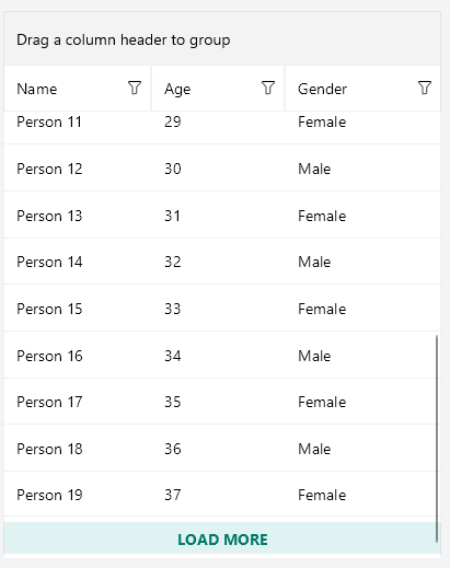
For DataGrid LoadMore Row styling example, refer to the SDKBrowser Demo application and go to the DataGrid > LoadOnDemand category.
Customize the LoadMore RowTemplate
Use the LoadOnDemandRowTemplate property to set the template of the row that contains the Load More button when the LoadOnDemandMode is Manual.
- The following example demonstrates a custom
DataTemplate:
<DataTemplate x:Key="CustomLoadOnDemandRowTemplate">
    <telerik:RadBorder IsEnabled="{Binding IsDataLoading, Converter={StaticResource InvertedBooleanConverter}}"
                       BorderBrush="#00897B" BorderThickness="1" CornerRadius="16" HeightRequest="32" Margin="12">
        <telerik:RadBorder.Triggers>
            <Trigger TargetType="telerik:RadBorder" Property="IsEnabled" Value="False">
                <Setter Property="Opacity" Value="0.38" />
            </Trigger>
        </telerik:RadBorder.Triggers>
        <Label Text="Load more items" TextColor="#00897B" HorizontalOptions="Center" VerticalOptions="Center" />
    </telerik:RadBorder>
</DataTemplate>- Set the template to the
LoadOnDemandRowTemplateproperty of the DataGrid:
<telerik:RadDataGrid x:Name="dataGrid"
                     ItemsSource="{Binding Items}"
                     LoadOnDemand="dataGrid_LoadOnDemand"
                     LoadOnDemandMode="Manual"
                     LoadOnDemandRowTemplate="{StaticResource CustomLoadOnDemandRowTemplate}"/>
The following image shows the row appearance after setting the LoadOnDemandRowTemplate property:
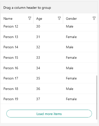
For DataGrid LoadMore Template example, refer to the SDKBrowser Demo application and go to the DataGrid > LoadOnDemand category.