.NET MAUI Calendar Day Styling
Use the .NET MAUI Calendar day styling API to customize both the day-of-week headers in the month view and the individual day cells. Choose DayNameLabelStyle when you want one style for all day names, and use DayStyleSelector when different days need different styles.
Style the Day Names in the Month View
Use DayNameLabelStyle (Style with target type Label) to apply the same appearance to all day names in the month view. This property affects the day headers only. It does not style the individual date cells.
The following example shows how to style the day names:
- Define the Calendar
<telerik:RadCalendar DayNameLabelStyle="{StaticResource DayNameLabelStyle}" />- Define the Day Name Style
<Style TargetType="Label" x:Key="DayNameLabelStyle">
    <Setter Property="TextColor" Value="#8660C5" />
    <Setter Property="FontSize" Value="16" />
</Style>
For a runnable example that styles Calendar day names, see the SDKBrowser Demo Application and go to Calendar > Styling.
Style Individual Day Cells with a Style Selector
Use DayStyleSelector when you need to apply different styles to different days in the month view. This approach is useful when you want to highlight weekends, special dates, unavailable days, or other dates that match custom rules.
The DayStyleSelector property is of type CalendarStyleSelector and selects the style for each day cell in the month view.
The following example shows how to style day cells with DayStyleSelector:
- Define the Calendar
<telerik:RadCalendar DisplayMode="Month" DayStyleSelector="{StaticResource DayStyleSelector}" />- Define the Styles in the Page Resources
<ContentView.Resources>
    <local:CustomCalendarStyleSelector x:Key="DayStyleSelector">
        <local:CustomCalendarStyleSelector.CustomSelectedLabelStyle>
            <Style TargetType="telerik:CalendarBorderLabel">
                <Setter Property="TextColor" Value="#04A2AA" />
                <Setter Property="FontAttributes" Value="Italic" />
                <Setter Property="BorderThickness" Value="0" />
                <Setter Property="BorderBackgroundColor" Value="#9AD9DD" />
            </Style>
        </local:CustomCalendarStyleSelector.CustomSelectedLabelStyle>
        <local:CustomCalendarStyleSelector.CustomSelectedMouseOverLabelStyle>
            <Style TargetType="telerik:CalendarBorderLabel">
                <Setter Property="BorderBackgroundColor" Value="#B3E3E5" />
            </Style>
        </local:CustomCalendarStyleSelector.CustomSelectedMouseOverLabelStyle>
        <local:CustomCalendarStyleSelector.CustomOutOfScopeLabelStyle>
            <Style TargetType="telerik:CalendarLabel">
                <Setter Property="TextColor" Value="#6104A2AA" />
            </Style>
        </local:CustomCalendarStyleSelector.CustomOutOfScopeLabelStyle>
        <local:CustomCalendarStyleSelector.CustomNormalLabelStyle>
            <Style TargetType="telerik:CalendarLabel">
                <Setter Property="TextColor" Value="#04A2AA" />
            </Style>
        </local:CustomCalendarStyleSelector.CustomNormalLabelStyle>
        <local:CustomCalendarStyleSelector.SundayLabelStyle>
            <Style TargetType="telerik:CalendarBorderLabel">
                <Setter Property="TextColor" Value="#FF9040" />
                <Setter Property="HorizontalTextAlignment" Value="Center" />
            </Style>
        </local:CustomCalendarStyleSelector.SundayLabelStyle>
        <local:CustomCalendarStyleSelector.SundayMouseOverLabelStyle>
            <Style TargetType="telerik:CalendarBorderLabel">
                <Setter Property="BorderBackgroundColor" Value="#FFE8D8" />
            </Style>
        </local:CustomCalendarStyleSelector.SundayMouseOverLabelStyle>
        <local:CustomCalendarStyleSelector.SundaySelectedLabelStyle>
            <Style TargetType="telerik:CalendarBorderLabel">
                <Setter Property="BorderBackgroundColor" Value="#FFDDC5" />
            </Style>
        </local:CustomCalendarStyleSelector.SundaySelectedLabelStyle>
        <local:CustomCalendarStyleSelector.SundaySelectedMouseOverLabelStyle>
            <Style TargetType="telerik:CalendarBorderLabel" />
        </local:CustomCalendarStyleSelector.SundaySelectedMouseOverLabelStyle>
    </local:CustomCalendarStyleSelector>
</ContentView.Resources>- Add the
CustomStyleSelectorClass
public class CustomCalendarStyleSelector : CalendarStyleSelector
{
    private Style customNormalLabelStyle;
    private Style customOutOfScopeLabelStyle;
    private Style customSelectedLabelStyle;
    private Style customSelectedMouseOverLabelStyle;
    private Style sundayMouseOverLabelStyle;
    private Style sundaySelectedLabelStyle;
    private Style sundaySelectedMouseOverLabelStyle;

    public override Style SelectStyle(object item, BindableObject container)
    {
        var node = (CalendarNode)item;
        var calendar = (RadCalendar)node.Calendar;
        bool isToday = node.IsToday;
        bool isSunday = calendar.DisplayMode == CalendarDisplayMode.Month && node.Date.Value.DayOfWeek == DayOfWeek.Sunday;
        bool isMouseOver = node.IsMouseOver;

        if (node.IsSelected)
        {
            return isMouseOver
                ? isSunday ? this.SundaySelectedMouseOverLabelStyle : this.CustomSelectedMouseOverLabelStyle
                : isSunday ? this.SundaySelectedLabelStyle : this.CustomSelectedLabelStyle;
        }

        if (isMouseOver)
        {
            return isSunday ? this.SundayMouseOverLabelStyle : base.SelectStyle(item, container);
        }

        if (isToday || !node.IsEnabled)
        {
            return base.SelectStyle(item, container);
        }

        if (node.IsOutOfScope)
        {
            return this.CustomOutOfScopeLabelStyle;
        }

        return isSunday ? this.SundayLabelStyle : this.CustomNormalLabelStyle;
    }

    public Style CustomNormalLabelStyle
    {
        get => customNormalLabelStyle;
        set
        {
            customNormalLabelStyle = value;
            customNormalLabelStyle.BasedOn = this.NormalLabelStyle;
        }
    }

    public Style CustomOutOfScopeLabelStyle
    {
        get => customOutOfScopeLabelStyle;
        set
        {
            customOutOfScopeLabelStyle = value;
            customOutOfScopeLabelStyle.BasedOn = this.OutOfScopeLabelStyle;
        }
    }

    public Style CustomSelectedLabelStyle
    {
        get => customSelectedLabelStyle;
        set
        {
            customSelectedLabelStyle = value;
            customSelectedLabelStyle.BasedOn = this.SelectedBorderStyle;
        }
    }

    public Style CustomSelectedMouseOverLabelStyle
    {
        get => customSelectedMouseOverLabelStyle;
        set
        {
            customSelectedMouseOverLabelStyle = value;
            customSelectedMouseOverLabelStyle.BasedOn = this.CustomSelectedLabelStyle;
        }
    }

    public Style SundayLabelStyle { get; set; }

    public Style SundayMouseOverLabelStyle
    {
        get => sundayMouseOverLabelStyle;
        set
        {
            sundayMouseOverLabelStyle = value;
            sundayMouseOverLabelStyle.BasedOn = this.SundayLabelStyle;
        }
    }

    public Style SundaySelectedLabelStyle
    {
        get => sundaySelectedLabelStyle;
        set
        {
            sundaySelectedLabelStyle = value;
            sundaySelectedLabelStyle.BasedOn = this.SundayLabelStyle;
        }
    }

    public Style SundaySelectedMouseOverLabelStyle
    {
        get => sundaySelectedMouseOverLabelStyle;
        set
        {
            sundaySelectedMouseOverLabelStyle = value;
            sundaySelectedMouseOverLabelStyle.BasedOn = this.SundayMouseOverLabelStyle;
        }
    }
}
The following image shows a Calendar month view with different styles applied to individual day cells:
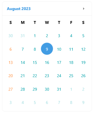
For a runnable example that styles individual Calendar day cells, see the SDKBrowser Demo Application and go to Calendar > Style Selector.