Why Digital Products Should Always Solicit Feedback and Bug Reports From Users

Summarize with AI:
When building a digital product that is going to have tons of traffic and user activity, user feedback and bug reporting is critical to the product’s success and survival. In this post, we’re going to look at how companies like Home Depot, Burger King and others solicit feedback and what we can learn from their methods.
In UX design, there is no such thing as a closed loop. Even after launch, someone is working behind the scenes to keep websites and apps in good working order. It’s the only way to ensure that the great digital product you developed remains great.
While you can handle general upkeep like software updates, broken link monitoring and debugging internally, it’s beneficial to gather input from users as well.
A/B testing, heatmap tracking and user testing are all ways in which you can gather feedback related to specific features or problem areas you want to improve. But how do you identify what the underlying issues or bugs are in the first place?
In this post, I’m going to share some examples that demonstrate how popular websites and mobile apps are soliciting feedback from users. I’ll also suggest some best practices for configuring a feedback and bug reporting system for your own digital products.
How to Ask Your Users to Submit Feedback and Bug Reports
If you’re building a user-first product, then there should be a feature in it that gathers technical feedback. Let’s look at some ways to implement this:
Tip 1: Users Shouldn’t Need to Be Technical Experts to Provide Feedback
As I looked around the web today, I realized that many websites and apps aren’t asking their users for feedback. Granted, the vast majority of them have a contact page and form. That’s not what contact forms are for though—especially for larger operations that have different teams devoted to handling different types of messages.
There’s another problem with asking for feedback about a website or app with an open-ended field: Resolution.
What if you or your team goes to look up the issue, but it looks fine on your end? Or you can’t figure out what’s being described? How much back-and-forth can your organization devote to researching the issue and working it out with the end user? What’s more, will the user be willing to participate in a resolution process that takes numerous exchanges?
While a contact form might be the simplest way to gather feedback, you’re going to get simple input in return.
There’s a better way to solicit feedback from users that’s technical in nature without scaring them off. Let’s look at The Weather Channel app example to see how it’s done:
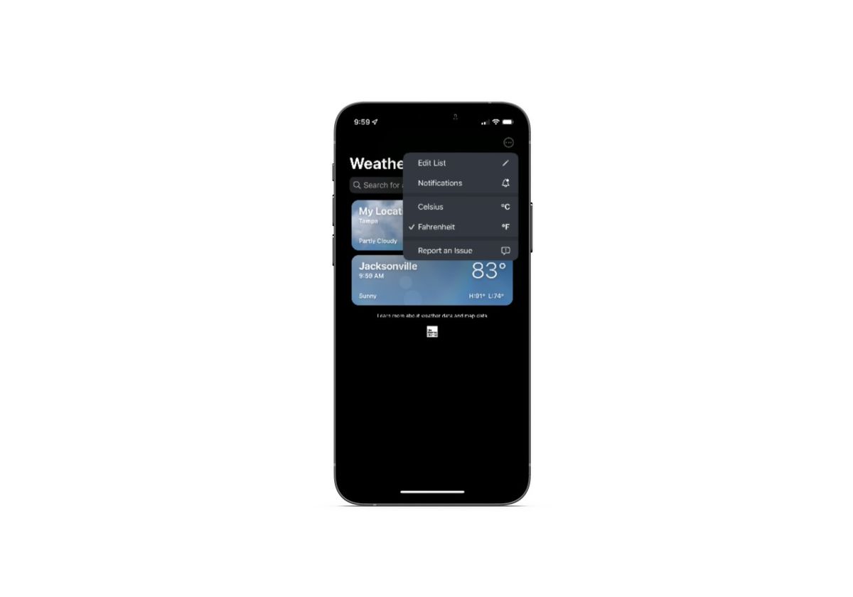
Users will find a Report an Issue option from the settings dropdown in the top-right corner of the app. It appears that the primary purpose of the issue reporting tool is to provide users with better weather reporting.
In the next screen, they’re asked a variety of questions related to the accuracy of their weather report:
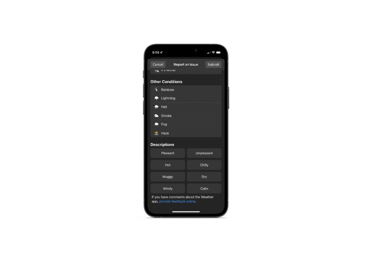
If users scroll to the very bottom of the page, they’ll find a link that says “provide feedback online.”
It’s not ideal to move mobile app users over to the browser, so I wouldn’t recommend implementing your bug reporting system this way. That said, the feedback form is a good example to follow:
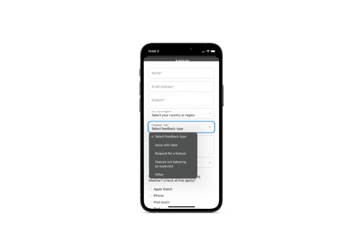
The form is very detailed and yet does a great job of simplifying a technical request. In addition to designating a feedback type, users are asked to provide information on the specific website feature where the error occurred and on which device they were using when it happened.
Tip 2: Make the Feedback Form Easy to Find
Many apps and websites don’t ask for feedback or bug reports. When they do, they’re often tucked away under a Contact or Settings page which requires numerous clicks to find.
Encountering a broken feature, dead-end link or other technical issue on a website or app is no fun. The last thing you want to do is make finding the feedback form feel like an Easter egg hunt.
There are a number of ways to add a feedback component without burying it in your information architecture:
On a website, add a feedback link to the main navigation or footer links—and have the feedback form waiting for them on that next page.
In an app, add a feedback link to the settings section of links—and, again, have the feedback form ready to go as soon as they click it.
Another option—on websites, in particular—is to attach a sticky feedback widget to the side or bottom corner of the page as Home Depot does:
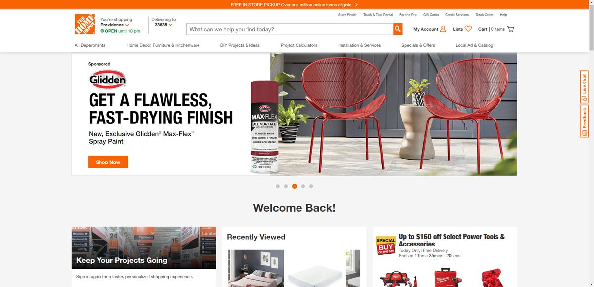
The Feedback (and Live Chat) button is vertically affixed to the side of the page. It’s colorful enough to catch the attention of visitors, but small enough not to get in the way of their shopping experience.
While this is an effective design for the desktop experience, you can see how it might feel cumbersome on mobile. I think it would be okay if there were just one button. However, having two buttons occupy that right rail might be too much. That’s likely why Home Depot only has a Live Chat button on its mobile website:
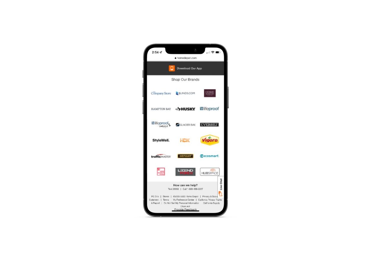
There is a “Provide Feedback” button available on the mobile site, but it’s hard to find. It’s the very last element at the bottom of the page and it’s a plain text link.
While the design of the mobile feedback button isn’t great, the form is:
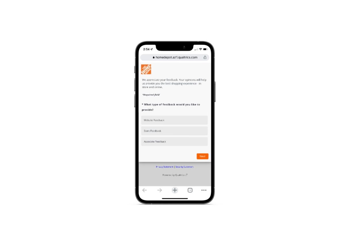
Immediately after clicking the feedback widget or link on the website, Home Depot opens a popup. It’s a short questionnaire that asks the user to select where they experienced the issue, rate their experience on the page, explain their issue, and so on.
One of the benefits of using an ever-present feedback widget is that users will be able to provide input on the current page they’re on. They won’t need to sort through navigation links to find the feedback form and then try to recall which page it happened on, what the feature was or what the issue looked like.
If accuracy in reporting is important to you, keep this in mind as you design your feedback UI element.
Tip 3: Don’t Ask for Unnecessary Info
You know how it is with forms. If you ask your users to input any information that’s irrelevant to their goal, many of them just won’t fill it out.
The same thing is going to happen with your feedback form.
Now, I think that collecting positive feedback about a website or brand is valuable. However, there’s a time and a place for it. When a user has just encountered an issue and has actively sought out a means to give you feedback, that’s probably not a good time to ask them to rate their experience or how likely they are to recommend it to a friend.
See’s Candies, for instance, is one of those websites that puts its Feedback widget right out in the open. It even has a dedicated category to website-related feedback:
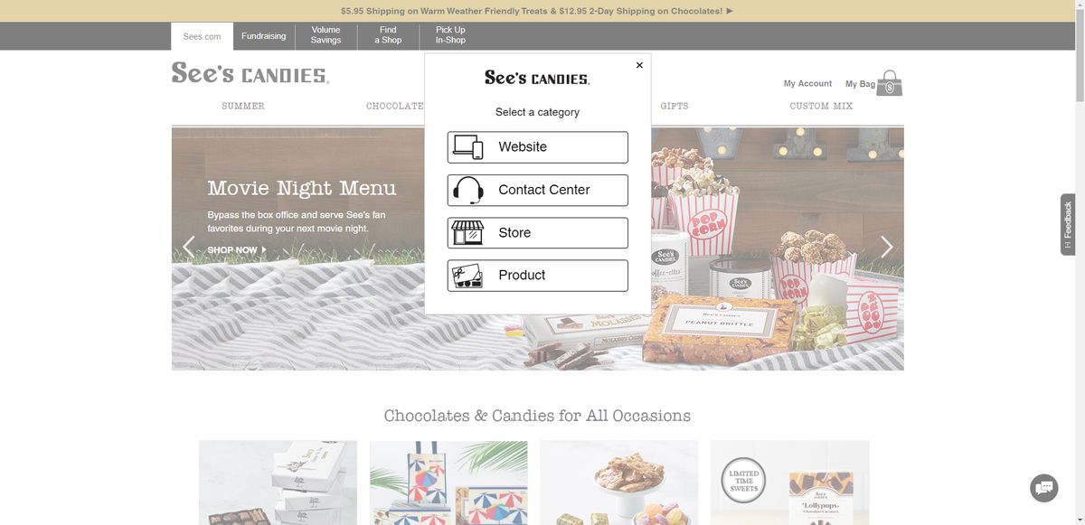
The form has some helpful and relevant bits in it—like the feedback category which includes things like:
- Order Issue
- Checkout Issue
- Issue Creating a Custom Mix
- Search/Navigation Challenges
- And more
There’s also a note in the feedback field that advises users not to enter personal information like credit card numbers. That’s a nice touch:
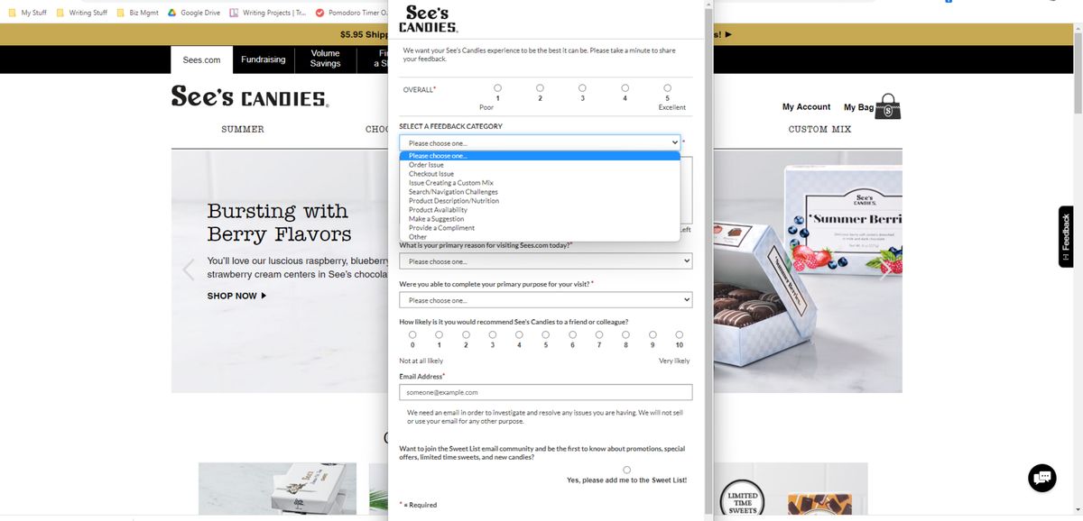
However, the rest of the form is wasted space and energy. The fact that it addresses major website problems in the feedback category, but then asks the user to click the box to subscribe to their Sweet List? It’s an odd choice.
I think there are two lessons to take away from this. One is to only include the most relevant and necessary fields in your feedback forms. The second is to make separate forms for feedback and praise. Emotions tend to run high when users are going through a negative experience. And those negative emotions can easily taint what would otherwise be positive feelings about a brand or its product.
Tip 4: Program Your Products to Ask for Feedback When an Error Occurs
There are certainly some users who will encounter a technical issue on a website or app and want to report it. It’s the same reason why users are willing to take part in user research and testing in the first place. They want to have a say in shaping the products they use the most.
Other users, however, might not have that urge or even know that they have the ability to report an issue or provide feedback. To ensure that you’re retrieving as much real-time user feedback as possible, you might want to consider prompting your users for feedback when an error is detected.
For example, if a user is struggling to complete the checkout, a popup might display with recommendations on how to fix the issue. It might also provide them with a live chat link so they can get immediate technical assistance. By making your product smart enough to notice when something is wrong in the experience, you’ll catch more errors and prevent many others from encountering them.
The real-time notification or popup is a good way to handle this. Another option for mobile apps is to use gestures or motion to detect issues. Just be careful about how you set this up. The gestures should feel natural and be easy to remember.
For instance, I went digging through a number of apps today to see what kinds of feedback forms were available. I eventually found Instagram’s “Report a Problem” in the Help area of the app. However, this is what appears when you click on it:
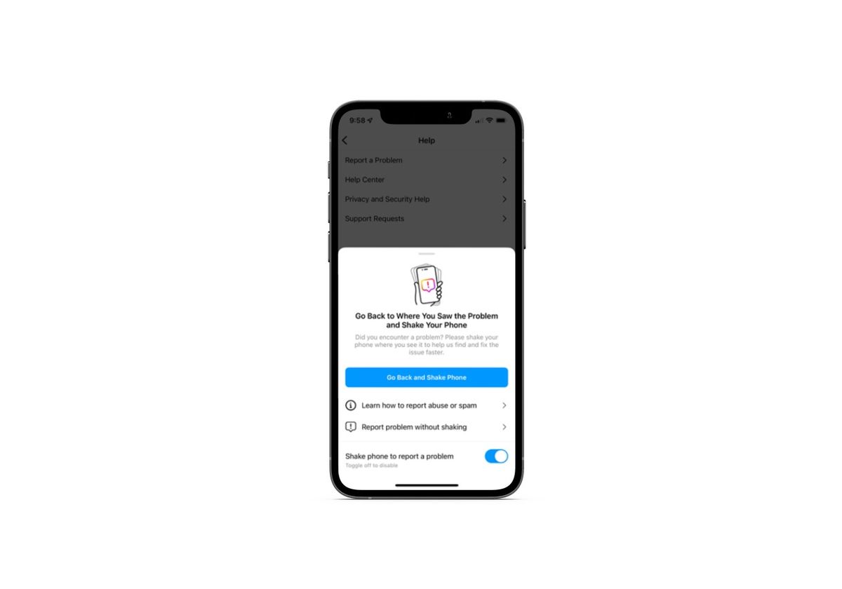
What users find is a popup that explains that they need to return to the troublesome area and shake their phone in order to report the issue. They have the option to report the problem without shaking, but the option is lower down on the popup and they might not take the time to read that far down if they’re in a hurry.
When the user goes back to the problematic area (if they can easily find it), they’re going to see another popup. This one asks “Did something go wrong?”:
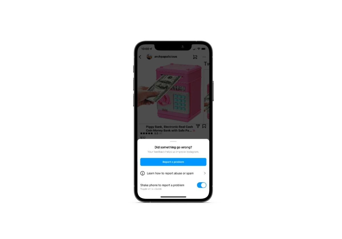
It’s not the most practical way to have an app detect an issue and ask the user if they want to submit a report. That said, at least the designers have considered it important enough to include the feature for their users.
Tip 5: Streamline the User Feedback and Bug Tracking Process
So I already addressed the issues that arise when you present users with a feedback form but fail to ask them all the relevant technical details. Or to direct their issue to the right team to handle it. Customer support can become very costly for an organization if they don’t tighten up the website or app feedback process.
One way to streamline things is to let an AI assistant do some of the work for you. That’s what Burger King does. Customers that click on the Contact Us button in the navigation or footer encounter this customer support form:

The chatbot is friendly, helpful and, most importantly, adaptive. It provides users with a number of reasons why they might need support—including technical ones. When they choose the type of issue they’re experiencing, the chatbot gives them specific tips on how to resolve the issue. If they can’t fix it that way, the bot then asks for contact details so a support rep can get in touch.
Don’t forget about streamlining the backend of your feedback and bug reporting process. Bug tracking software, for instance, should give you the option to view issues in real-time on your users’ screens or to enable them to send along screenshots. Fiddler Jam does this.
Learn more about Fiddler Jam—an end-to-end troubleshooting solution that helps users, support and engineering solve problems quickly.
While this solution might not be relevant for a company like Burger King, it would be for a software company. This is something I’ve personally used with my web hosting, accounting software and CRM providers before to resolve issues and provide bug reports. It’s the most effective way for a company and user to communicate, even if they don’t speak the same (technical) language.
I’d also suggest using a bug tracking tool that automates the chain of command. The second someone reports an issue on the website or app, it enters the queue for resolution and reminders are sent to the team leader until it’s fixed. This will ensure that all issues are reported and resolved in a timely manner.
Wrap-up
If you’re serious about creating digital products that are easy and enjoyable to use, then user feedback is a must. Not only will users be able to clue you into the features that matter most to them, but they’re on the frontlines of your product every day. When an issue arises, they’re in the best position to tell you about it.
So, you need to give users a way to leave their feedback in a way that’s intuitive for them to submit and helpful for you to process. The product examples and best practices above should give you some ideas on how to handle this going forward as you build user-centric digital products.
Some might argue testing through the eyes of the user is, in fact, the only testing that matters.

Suzanne Scacca
A former project manager and web design agency manager, Suzanne Scacca now writes about the changing landscape of design, development and software.

