The Web Animation API

Summarize with AI:
Let’s look at differences between CSS Transitions/Animations and the Web Animation API (WAAPI), plus some hands-on examples, starting from simple to more complex animations.
The human brain has something called “change blindness”—when we’re focused on one part of the screen, we completely miss changes happening elsewhere. Our brains ignore static objects, but movement grabs attention. So animations aren’t just decoration; they help users notice important changes they might otherwise miss.
This brings us to the Web Animation API (WAAPI). If you’ve used libraries like Framer Motion, GSAP or Lottie, you might wonder why we need another way to animate. The Web Animation API is different because it’s a browser-native feature. It allows us to create animations directly in JavaScript without dependencies. This way, it gives us control over timing, playback and performance.
In this post, we’ll look at the differences between CSS transitions/animations and WAAPI. We will also walk through some hands-on examples, starting from simple to more complex animations.
Prerequisites
- A decent understanding of HTML and CSS
- Familiarity with JavaScript variables, functions, event handling and DOM manipulation
Project Setup
- Create a new folder for the project
- Open the folder in your code editor
- Install Live Server extension (download it from the extension panel)
CSS Transition
When learning CSS, it’s easy to think that transitions and animations are the same thing, but over time, it becomes clear that even though both can make interfaces come alive and feel more lively, they work quite differently.
Transitions handle smooth changes between two states, like a box changing color when we hover. Instead of an instant change, we get a smooth transition.
CSS Transition Properties:
- transition-property: This describes the property or properties we want the transition effect to be applied to.
- transition-delay: This is like a little pause before the transition takes effect, so you’re telling the browser to wait for a certain period before applying the transition effect.
- transition-timing-function: This controls how fast the transition moves—ease (default), ease-in, ease-out or cubic-bezier().
- transition-duration: This property controls how long the transition should last. It’s an important part of any transition—without it, the transition won’t work at all. This duration can be set in seconds (s) or milliseconds (ms).
- transition: Instead of writing all of these individually, we can use the transition shorthand and combine everything in one line like this:
transition: <property> <duration> <timing-function> <delay>.
Let’s look at an example:
.box {
  font-size: 20px;
  cursor: pointer;
  background-color: blue;
  color: white;
  margin: 0 auto;
  height: 70px;
  width: 200px;
  display: flex;
  justify-content: center;
  align-items: center;
  transition-property: background-color;
  transition-delay: 100ms;
  transition-timing-function: ease-in;
  transition-duration: 600ms;
}

.box:hover {
  background-color: red;
}
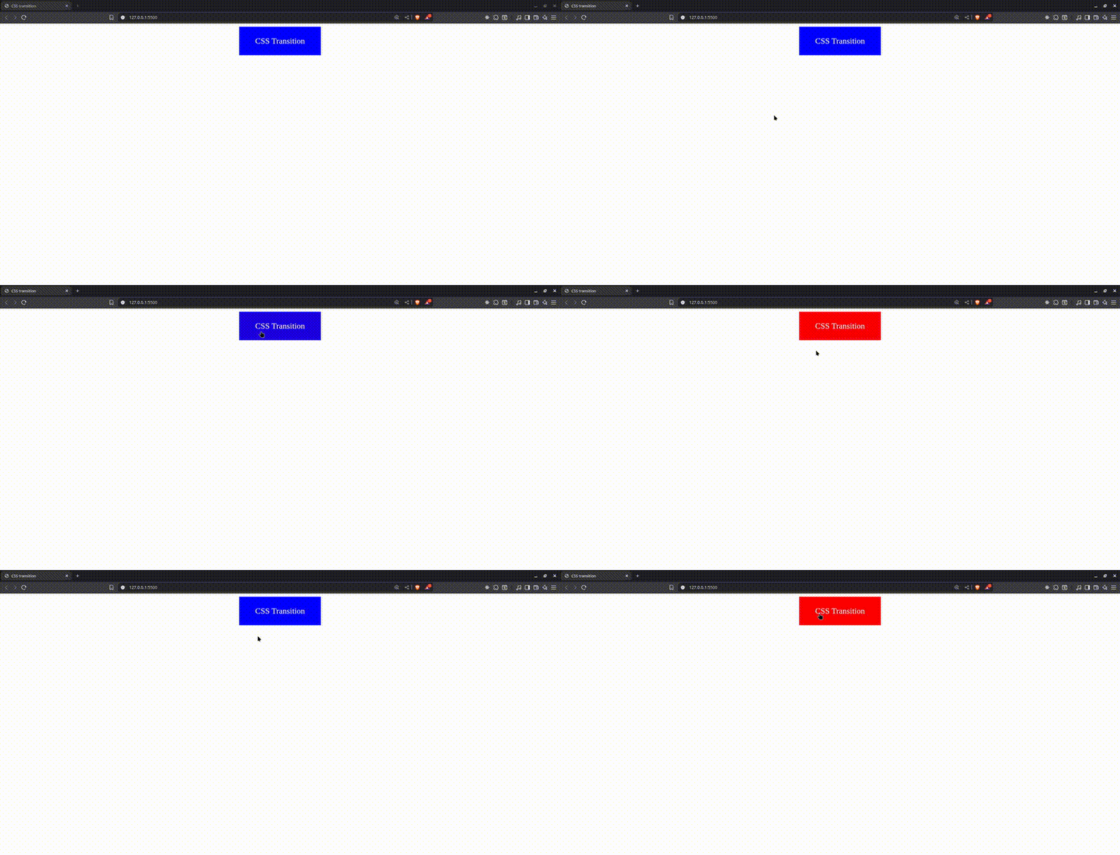
In the CSS snippet above, we were able to transition smoothly from an initial background color of blue to red. This only happens when an event is triggered. In our case, we used the :hover pseudo-class to respond to user interaction. You’ll also notice that we defined the transition properties individually. But the same result can be achieved using the transition shorthand, where all the properties are combined into a single line for cleaner code.
CSS Animations
CSS animations are another way to animate elements between states. With @keyframes, you can define multiple stages and create animations that run automatically without user interaction. An example would be a loading spinner.
To create animations, it’s important to note that you need two things:
- Apply animation properties to the element
- Define keyframes. These are a set of rules that describe how an element should change over a certain time. For the animation to work, it’s important to bind the
animation-nameto the keyframe you defined.
Animation Properties in CSS
- animation-name: This is how the browser knows which animation sequence to follow. For your animation to work, the name here must match the name you gave in your
@keyframesdefinition. - animation-duration: This specifies how long we want our animation to take to complete one cycle.
- animation-delay: Similar to
transition-delay, this property tells the browser how long to wait before starting the animation. - animation-iteration-count: This property tells the browser how many times an animation should run. You can set a specific number (let’s say 3, and it will run just three times) or use
infinite, which means the animation will loop without stopping. - animation-direction: This property allows you to set the direction of your animation, like a playback control. You can have it move forward (which is the default) or backward (reverse).
- animation-play-state: This property gives us control over the state of our animation—whether it’s paused or running. You can also use this with JavaScript’s
onclick()function to change the animation state when users click on elements. - animation-timing-function: Similar to the
transition-timing-function, this property lets us control the speed of our animation at different points throughout its duration. - animation-fill-mode: This is probably one of those properties where we need a code snippet to explain, as it’s not self-explanatory like the rest of the properties. It controls what the element will look like before the animation starts (that is, during
animation-delay) and what it looks like when the animation is over. There are four values that animation-fill-mode can take:none,forwards,backwardsandboth.
Here is an example using the animation-fill-mode: forwards:
@keyframes moveRight {
  from { transform: translateX(0px); }
  to { transform: translateX(200px); }
}

.green-box {
background: green;
height: 70px;
width: 200px;
animation-name: moveRight;
animation-duration: 0.5s;
animation-timing-function: ease;
animation-fill-mode: forwards;

.yellow-box{
margin-top: 2rem;
background: yellow;
height: 70px;
width: 200px;
animation-name: moveRight;
animation-duration: 0.5s;
animation-timing-function: ease;
/* animation-fill-mode blank here so it defaults no none */
}
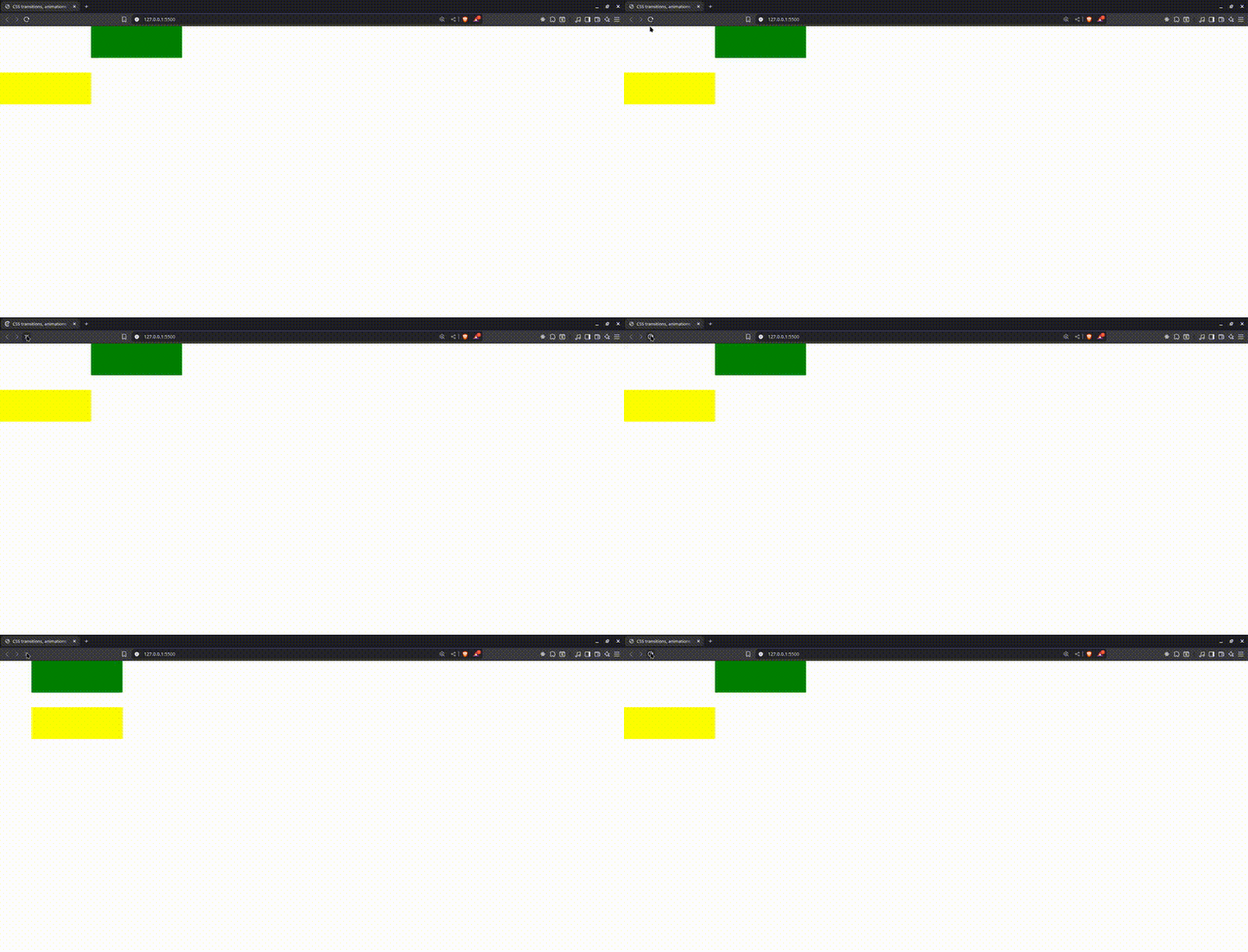
In this example, we are transforming an element along the X-axis from 0px to 200px. The green box remains at the final stage of the animation because we used animation-fill-mode: forwards, which tells the browser to keep the last frame. The yellow box, on the other hand, uses the default none, so it goes back to its initial state.
The Animation Shorthand
With animations, we get the flexibility of a one-liner using the animation shorthand. This allows us to merge multiple animation properties such as animation-name, animation-duration, animation-timing-function, and more into a single line of code. It saves time and keeps our code cleaner.
Here’s an example:
.spinner {
  width: 30px;
  height: 30px;
  border: 4px solid #ccc;
  border-top: 4px solid rebeccapurple;
  border-radius: 50%;
  animation: spinn 0.8s linear infinite;
  margin: 4rem auto;
}

@keyframes spinn {
  from {
    transform: rotate(0deg);
  }
  to {
    transform: rotate(360deg);
  }
}
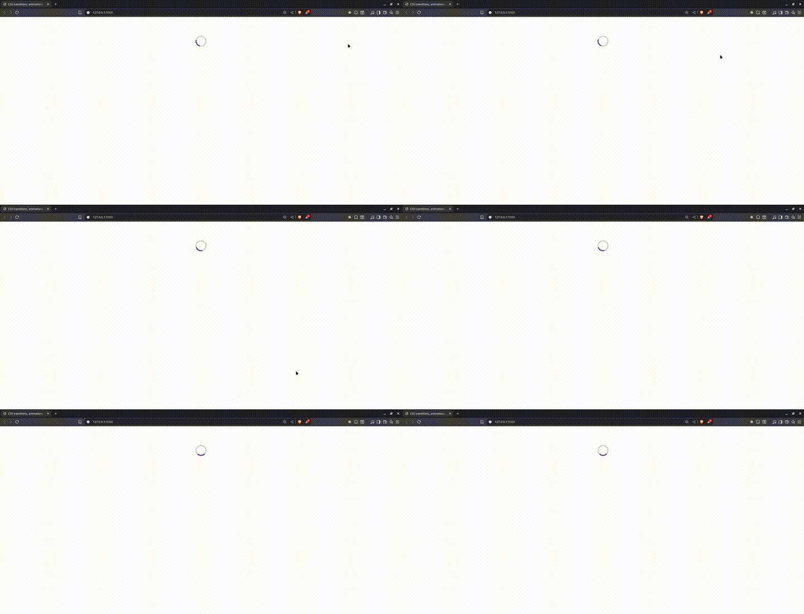
You will notice how we bind our animation name to the keyframe, which is where we describe how our animation will look throughout its duration. Without that connection, our animation won’t work.
We used linear because we want a constant and consistent speed without any pauses or slowdowns, which isn’t the case with ease, ease-in and similar values, as they speed up and slow down at different points. You can read more about the animation-timing-function in the MDN documentation.
Web Animation API (WAAPI)
The WAAPI is a browser-native JavaScript API that allows you to create and control animations on elements just like CSS transitions and animations, but with more power, flexibility and runtime control.
How do we use this API? Well, it’s simple—we just call the animate() method on a DOM element. This animate() method takes two parameters: an array of keyframes and an object of options.
The WAAPI provides us with the ability to pause, play and manipulate the playback with methods it provides. With CSS, we know where we want to start from; in other words, we hardcode the to and from values. But with the WAAPI, we can do this dynamically.
Another major perk is that we don’t need an external library. WAAPI is built into the browser, so we don’t need to install any third-party tools to get smooth and powerful animations working. This keeps our pages lighter.
Similar to CSS, the WAAPI runs on the compositor thread when the animation is inexpensive and will run on the main thread when our animations are expensive. We’ll talk more about this when highlighting drawbacks.
Most modern browsers support the Web Animation API, but you can always check caniuse if you want to be sure about specific browsers.
Getting Started with the Web Animation API
As we have already established, working with the WAAPI is quite simple. If you’re already familiar with CSS animations (which we already covered), you will start to recognize familiar patterns here. The more you play with it, the more it makes sense, and you’ll realize how much power and flexibility WAAPI gives you over traditional CSS animation techniques.
The WAAPI revolves around the animate() method. This method can be called on all DOM elements, and that’s how we start any animation.
It takes two parameters:
- Keyframes: An array of objects that define how an element changes over time
- Options: An object that controls the timing and how the animation behaves
Here is the syntax:
element.animate(keyframes, options);
For our examples, we’ll be using a simple project structure: an index.html file for the markup, a CSS file for simple styling, and a script.js file where we will explore the Web Animation API with JavaScript.
Initially, the script.js file is empty, and elements to be animated will be added incrementally as we walk through the examples.
Let’s look at this in practice:
const loader = document.querySelector(".loader");
loader.animate(
  [
    { transform: "translateY(0px)", opacity: 1, offset: 0 },
    { transform: "translateY(-20px)", opacity: 0.8, offset: 0.3 },
    { transform: "translateY(10px)", opacity: 0.6, offset: 0.6 },
    { transform: "translateY(0px)", opacity: 1, offset: 1 },
  ],
  {
    duration: 800,
    iterations: Infinity,
    easing: "ease-in-out",
  }
);
Here is the resulting animation:
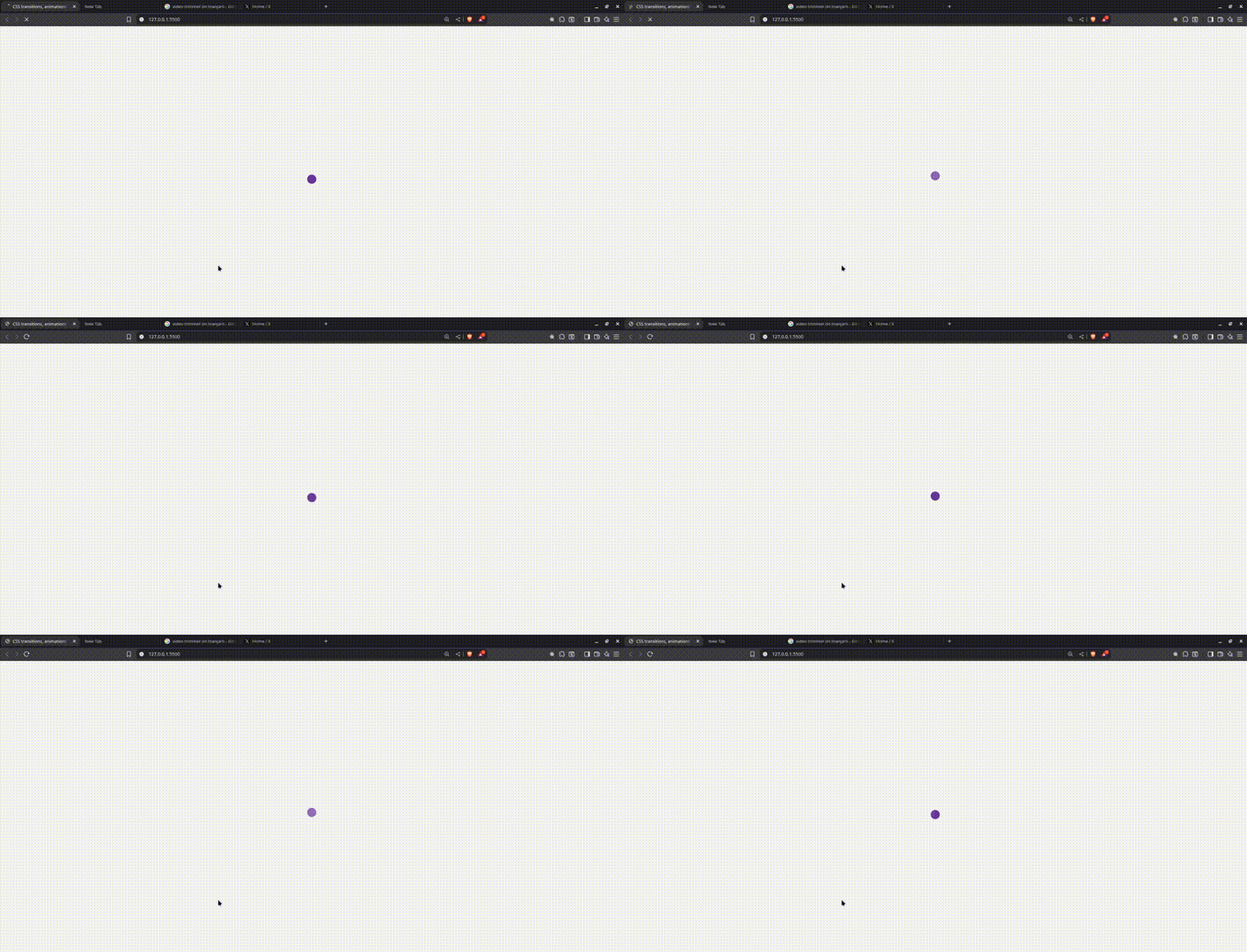
Here, we created a simple loader that bounces up and down, which we achieved using translateY. We also used opacity to create the illusion of fading at different points. One thing you’ll notice is the offset property, which helps us control timing and spans from 0 to 1. 0 is the beginning, 1 is the end and everything in between represents different points during the animation.
Now that we’ve defined what should happen at each stage of the animation using keyframes and offset, the next thing to discuss is how we control the overall behavior of the animation, and that’s exactly what the options object does.
In the animation above, the second argument (the object right after the keyframes) controls how the animation runs, not just what it looks like.
{ duration: 800,
iterations: Infinity,
easing: "ease-in-out", }
Let’s break these down quickly:
- duration: Indicates to the browser how long an animation cycle should last; in our case, 800 milliseconds.
- iterations: The number of times the animation repeats is controlled by iterations. In this case, we set it to infinity, meaning it loops indefinitely, which is ideal for a loader.
- easing: This specifies the animation’s tempo.
ease-in-outbegins slowly, accelerates and then slows down once more, creating a much smoother effect than a linear bounce.
These are just a few of the most popular options. With additional properties like delay, direction, fill and endDelay, WAAPI provides us with even more control.
Here is another example of a box that pops into view. The animation runs just once, and we want it to stay in its final state when the animation finishes.
const popBox = document.querySelector(".pop-box");
popBox.animate(
  [
    { transform: "scale(0)", opacity: 0 },
    { transform: "scale(1.2)", opacity: 1 },
    { transform: "scale(1)", opacity: 1 },
  ],
  {
    duration: 600,
    easing: "ease-out",
    fill: "forwards",
    direction: "normal",
  }
);
Here is the resulting animation:
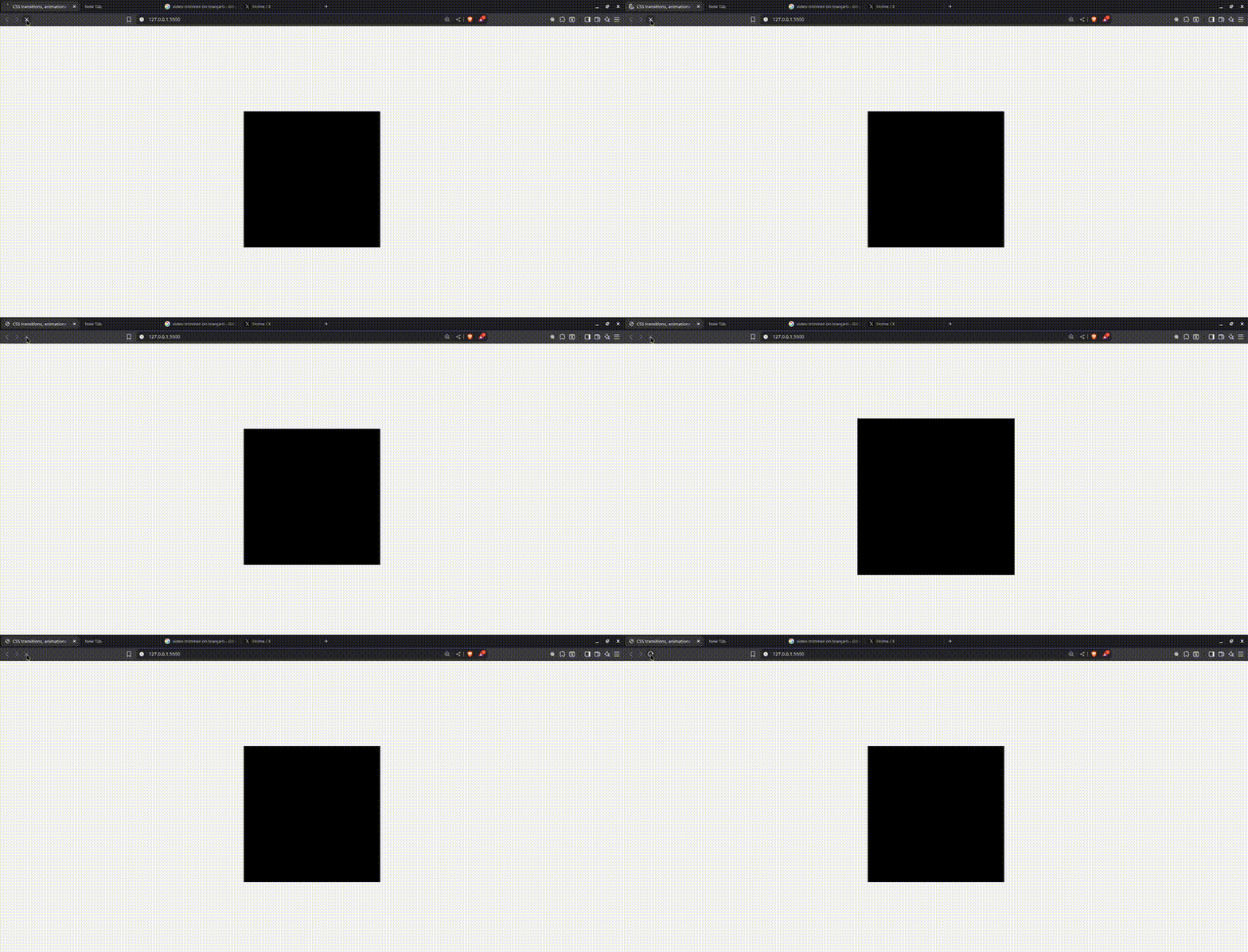
What is new here? fill: 'forwards'. What this does is tell the browser that when the animation ends, it should retain the last frame. In our case, it maintains { transform: "scale(1)", opacity: 1 }.
You will also notice we used direction: 'normal'. This means that the animation plays in the natural order, which is the default, but you can also use reverse, alternate or alternate-reverse.
Next, we’ll look at an example that responds to user interaction, where we will have simple pause and resume functionality on our animation when we hover and leave.
const runner = document.querySelector(".runner");
const animation = runner.animate(
  [
    { transform: "translateX(0)" },
    { transform: "translateX(200px)" },
    { transform: "translateX(0)" },
  ],
  {
    duration: 2000,
    iterations: Infinity,
    easing: "ease-in-out",
    direction: "alternate",
  }
);
runner.addEventListener("mouseenter", () => animation.pause());
runner.addEventListener("mouseleave", () => animation.play());
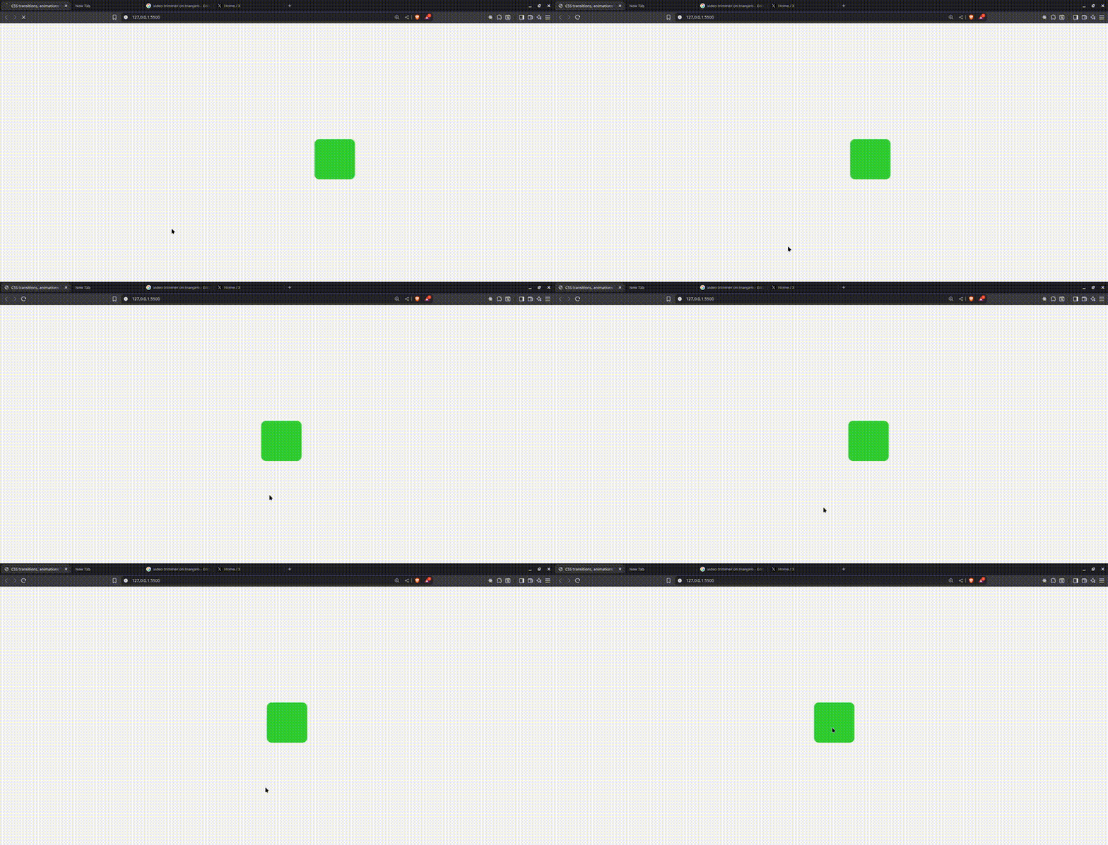
Here, we are animating a green box that moves left and right continuously in a loop. The difference here is that, unlike CSS, we can control the animation dynamically using mouse events.
When the user hovers over the box, it plays, and when they move the cursor away, it pauses. All of this is handled in real time using the play() and .pause() methods from the WAAPI.
Let’s take it a step further. In the next demo, we’ll be animating multiple elements with custom behaviors and perfectly timed delays to create a staggered animation with bouncing balls, where some balls go up and some go down.
Add this to your index.html file:
<div class="ball-container">
  <div class="ball up"></div>
  <div class="ball down"></div>
  <div class="ball up"></div>
  <div class="ball down"></div>
</div>
Add this to your CSS file:
.ball-container {
  display: flex;
  justify-content: center;
  gap: 20px;
  margin-top: 100px;
}
.ball {
  width: 20px;
  height: 20px;
  background: royalblue;
  border-radius: 50%;
}
Add this to your script.js file:
const balls = document.querySelectorAll(".ball");
balls.forEach((ball, index) => {
  const isUp = ball.classList.contains("up");
  ball.animate(
    [
      { transform: "translateY(0px)" },
      { transform: `translateY(${isUp ? "-20px" : "20px"})` },
      { transform: "translateY(0px)" },
    ],
    {
      duration: 1000,
      delay: index * 200,
      iterations: Infinity,
      direction: "alternate",
      easing: "ease-in-out",
    }
  );
});
Here is the resulting animation:
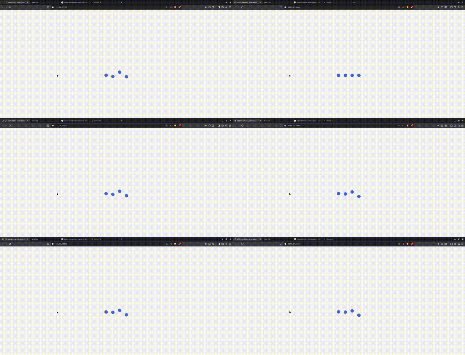
So here, we have a bunch of balls bouncing—some go up while some go down, but they’re not all jumping at the same time. Thanks to the delay we get from the options object, each one starts a bit after the last, giving us this smooth, cool and wavy bounce effect. You could try this with CSS, but it would be repetitive and a real headache.
One other handy property is the currentTime() property, which is returned by element.animate(). It represents the current progress of our animation, measured in milliseconds. It’s a read/write property, meaning it can be used to read how far along our animation is or set the animation to a specific point in time, like seeking or jumping to some point between the beginning and the end of the animation.
Here is an example using it:
const rotateBox = document.querySelector(".rotate-box");
const toggleBtn = document.getElementById("toggle");
const seeker = document.querySelector(".seeker");
const rotateBoxAnim = rotateBox.animate(
  [
    {
      transform: "rotate(0deg)",
      borderRadius: "0%",
    },
    {
      transform: "rotate(180deg)",
      borderRadius: "50%",
      background: "orange",
    },
    {
      transform: "rotate(360deg)",
      borderRadius: "0%",
      background: "firebrick",
    },
  ],
  {
    duration: 4000,
    fill: "forwards",
  }
);
rotateBoxAnim.pause();
let isPlaying = false;
toggleBtn.addEventListener("click", () => {
  if (isPlaying) {
    rotateBoxAnim.pause();
    toggleBtn.textContent = "Play";
  } else {
    rotateBoxAnim.play();
    toggleBtn.textContent = "Pause";
  }
  isPlaying = !isPlaying;
});
seeker.addEventListener("input", (e) => {
  const percent = e.target.value;
  const duration = rotateBoxAnim.effect.getComputedTiming().duration;
  rotateBoxAnim.currentTime = (percent / 100) * duration;
  rotateBoxAnim.pause();
  isPlaying = false;
  toggleBtn.textContent = "Play";
});
setInterval(() => {
  if (isPlaying) {
    const duration = rotateBoxAnim.effect.getComputedTiming().duration;
    const progress = (rotateBoxAnim.currentTime / duration) * 100;
    seeker.value = progress;
  }
}, 100);
Here is the resulting animation:
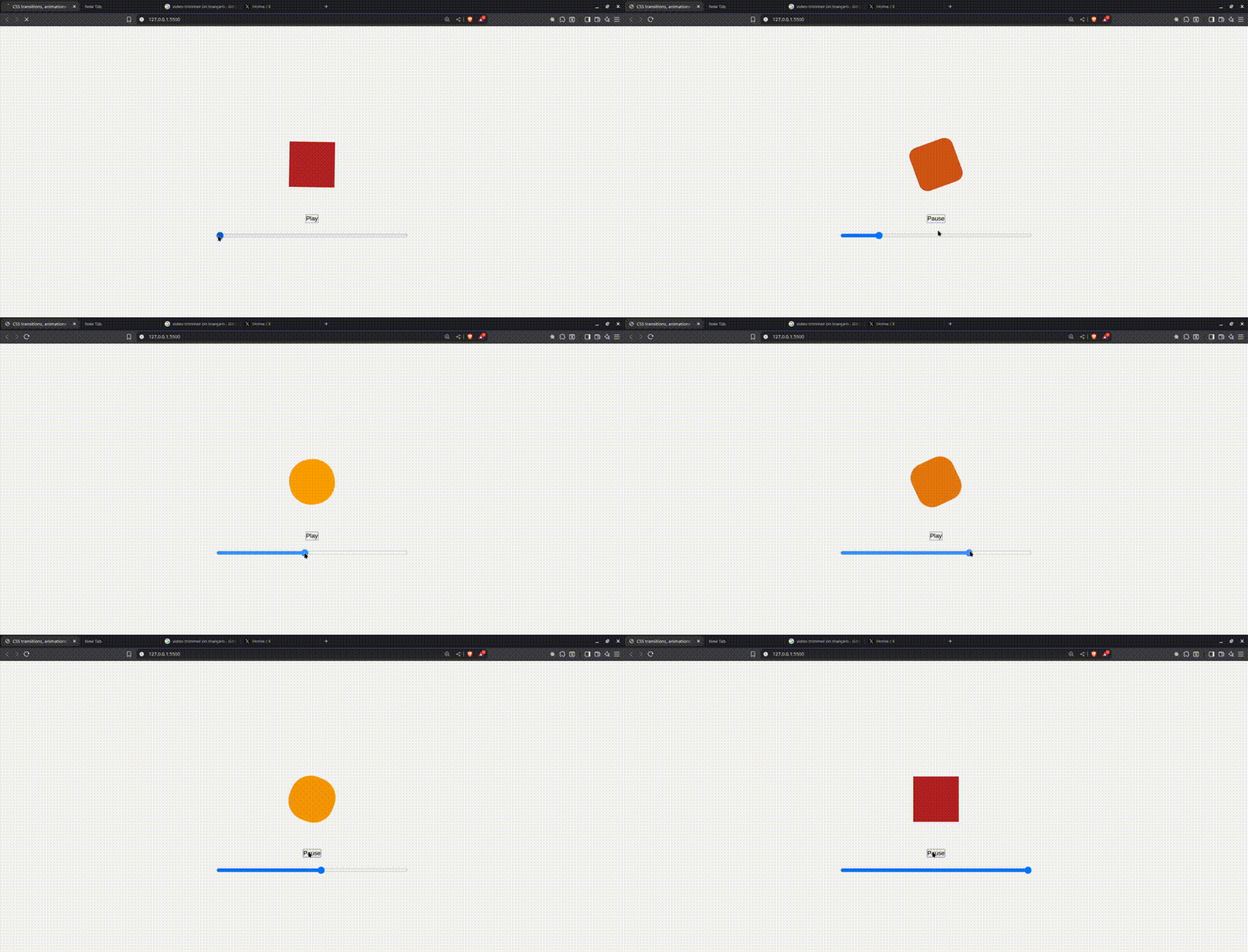
In this example, we built a simple animation controller using the Web Animations API. The red box spins and scales, and we added a slider that acts like a seeker, similar to a video progress bar. When you move the slider, the animation jumps to that exact point and pauses.
We also added a play/pause button so you can control the animation manually.
The setInterval() part keeps updating the slider value in real time as the animation plays, so it always reflects the current position. Altogether, it’s a clean way to give users full control over an animation’s playback using just plain JavaScript and the WAAPI.
Another property we can also play with is the playbackRate() property, which lets us speed up our animation dynamically. We can build speed controls around this and give the user the power to control the speed.
const runner = document.querySelector(".run-circle");
const fasterBtn = document.querySelector(".faster");
const slowerBtn = document.querySelector(".slower");
const runnerAnim = runner.animate(
  [
    { transform: "translateX(0)" },
    { transform: "translateX(200px)" },
    { transform: "translateX(0)" },
  ],
  {
    duration: 2000,
    iterations: Infinity,
    direction: "alternate",
    easing: "ease-in-out",
  }
);
fasterBtn.addEventListener("click", () => {
  runnerAnim.playbackRate *= 2;
});
slowerBtn.addEventListener("click", () => {
  runnerAnim.playbackRate *= 0.5;
});
In this example, we have a circle that moves back and forth continuously. The Speed up button doubles the animation speed each time it’s clicked, while the Slow down button reduces the speed by half. We are using the playbackRate property to control the speed in real time—multiplying by 2 makes it faster, and multiplying by 0.5 makes it slower.
This example allows us to control speed in real time. When we call the animate() method on an element, we also get a promise that we can chain with .then(). It resolves when an animation finishes naturally and rejects when the animation is canceled with animation.cancel().
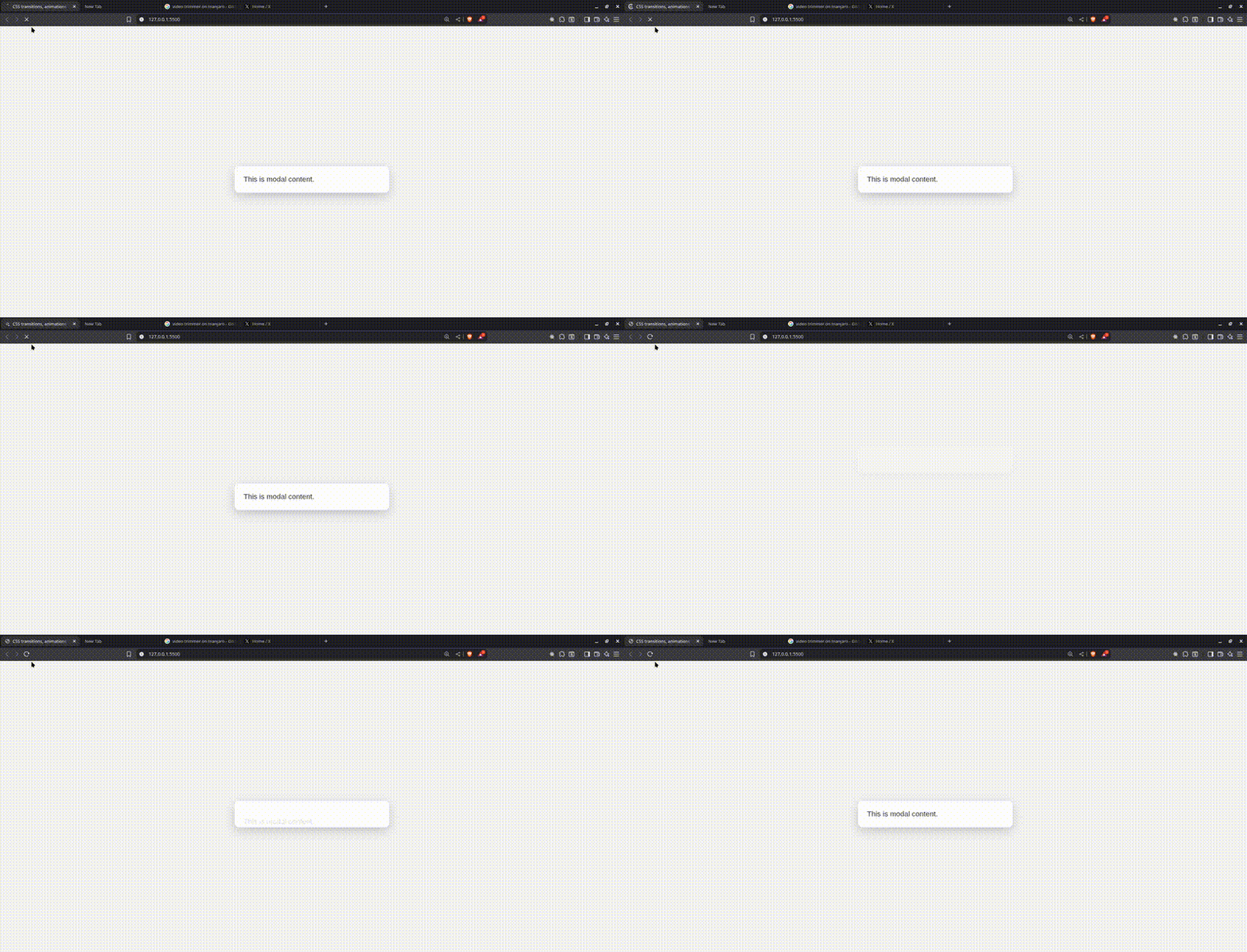
With this, we can chain animations. Let’s say, wait for a modal to finish displaying, then make text appear in the modal. So when the modal is opening, it’s empty, and when it’s complete, the text shows in the modal. This helps us coordinate animations sequentially.
Here is an example showing it:
const modal = document.querySelector(".modal");
const modalText = document.querySelector(".modal-text");
const modalSlideIn = modal.animate(
  [
    { transform: "translateY(-100px)", opacity: 0 },
    { transform: "translateY(0)", opacity: 1 },
  ],
  {
    duration: 500,
    fill: "forwards",
  }
);
modalSlideIn.finished.then(() => {
  const textFadeIn = modalText.animate(
    [
      { opacity: 0, transform: "translateY(20px)" },
      { opacity: 1, transform: "translateY(0)" },
    ],
    {
      duration: 300,
      fill: "forwards",
    }
  );
});

Drawbacks of Using the Web Animation API
Animations are cool, but they can be heavy on the browser if you’re not careful. The browser is constantly doing a lot of work behind the scenes to repaint the screen, ideally doing this about 60 times per second. That 60 frames per second (FPS) target is what gives us that smooth, natural motion. But to hit it, the browser only gets about 16.67 milliseconds to do everything: calculate styles, repaint, update positions. If it takes longer than that, you start to notice the stutter. Things feel laggy, and the whole experience breaks down.
Some drawbacks include:
- Compared to CSS animations, with WAAPI, you’re doing everything yourself, from writing out the keyframes in JavaScript to setting up the whole options object for timing, easing, delay and all that. And if you’re chaining animations or waiting for one to finish, you might also have to deal with promises. It can feel like a lot, especially when you think about how the same thing could’ve been done with just a few lines of CSS.
- For simple animations like a button transition on hover, using the Web Animations API can be compared to bringing a gun to a knife fight.
- You’re still limited to what CSS allows. The Web Animations API doesn’t let you animate anything you want; it follows the same rules as CSS when it comes to what can be animated. So you still can’t suddenly switch between flex and block. Properties cannot be animated. WAAPI gives you more control, but it doesn’t break the rules of how the browser handles animations. You’re working with the same set of animatable CSS properties like
opacity,transform,colorand so on.
The bottom line is to animate transform and opacity whenever you can. These properties skip layout and paint steps entirely and go straight to the compositing stage. That means the GPU handles them, not the main thread, which gives you smooth performance, even on lower-end devices. But if you animate properties like width, height, top, left or margin, you’re asking the browser to recalculate layouts and repaint, and that’s expensive. That’s where things start to look off.
Conclusion
The Web Animations API gives you control over how elements move on your website. Sure, you can animate things, but you also get precise timing, sequencing and methods like pause() and play(). Also, the fact that WAAPI returns a promise means you can easily chain animations or wait for one to finish before starting the next. No need to pull in any external library just to handle that.
That doesn’t mean you should throw animation libraries in the bin completely. Many of them still have useful features and shortcuts. However, knowing what WAAPI can do helps you make better decisions about when to use native methods versus reaching for a library.
There is a lot more we can do with the Web Animation API—we only touched the surface. If you want to dig deeper into WAAPI, check out the MDN Web Animations API docs.
Make Your Life Easier
Implement tidy transitions and animation into your app with components already built for it. The Kendo UI JavaScript component libraries come with animation features built into accessible, professionally designed components created to give you a head start.

Christian Nwamba
Chris Nwamba is a Senior Developer Advocate at AWS focusing on AWS Amplify. He is also a teacher with years of experience building products and communities.

