
Visualize Trends with the KendoReact Trendlines

Summarize with AI:
It’s easy to get stuck in the weeds when we’re dealing with a lot of data. Sometimes, we need a new way of looking at things—a way to take a step back and find the big takeaways. That’s what the new KendoReact Chart Trendlines are perfect for!
What are Trendlines?
Trendlines are a new element that can be optionally added to the Progress KendoReact Chart component. They provide a visual representation (in the form of an additional line added to the chart) of the trends within the data set.
There are two types of Trendlines that can be added:
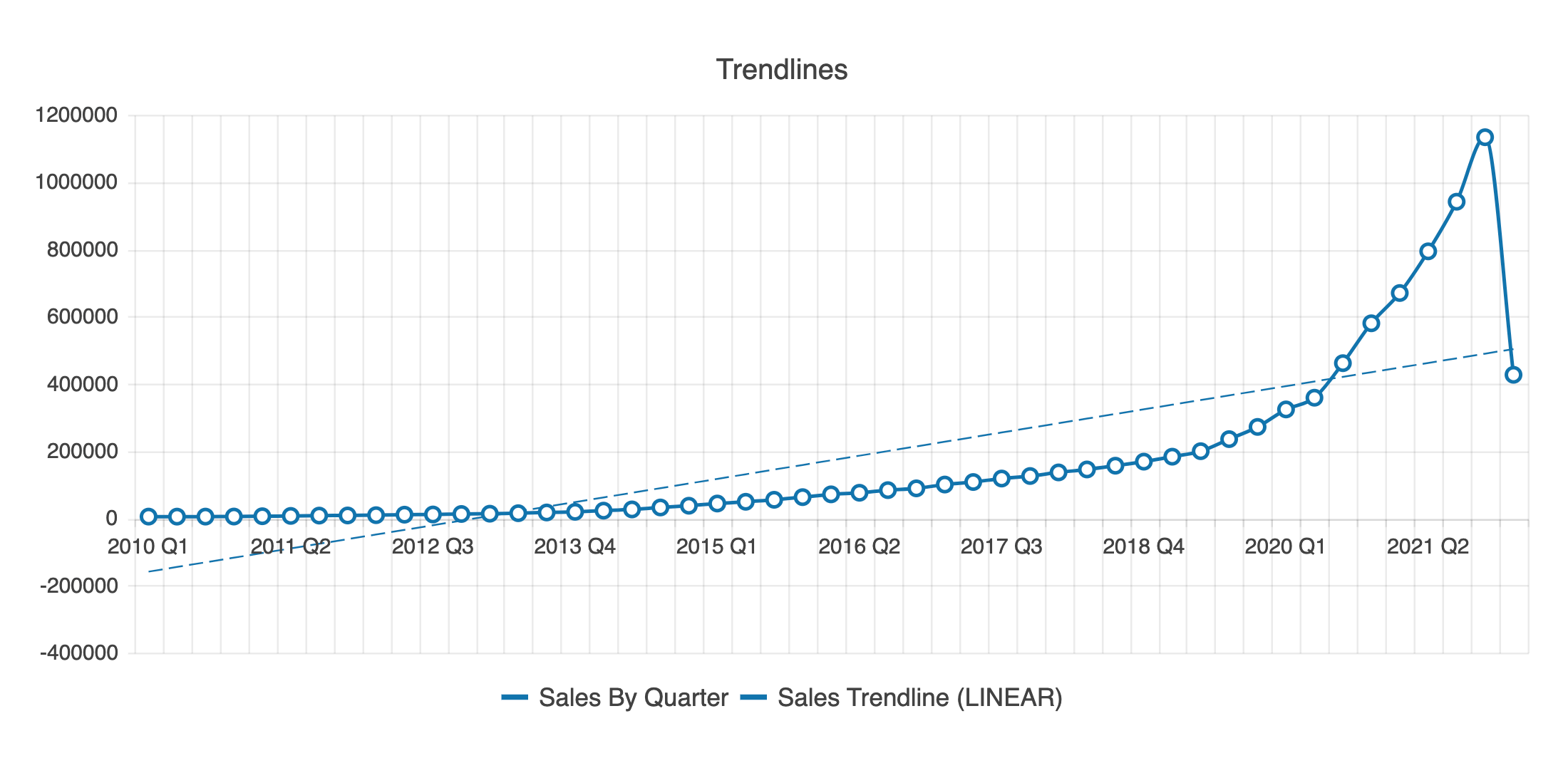
Linear: Depicts whether a particular quantity is increasing or decreasing over time
Moving Average: Smooths out the variations in the data by averaging all points in a period
Implementing Trendlines
We can choose between these two options or add them both to a single chart! Just add a new ChartSeriesItem child to the Chart component and define the type and for properties to select which type of Trendline to use and which data to base it on!
<ChartSeriesItem
  type="movingAverageTrendline"
  for="Sales By Quarter"
/>
Optionally, we can also change the color, dash type, name, style and more, which can help set it apart visually if the chart has lots of different content. Check out the docs for a complete rundown of every applicable Trendline property!
Forecasting with Trendlines
One of the coolest things that Trendlines can do, though, is create a forecast of anticipated results based on the current dataset. This is perfect for common projects like sales projections or growth forecasts!
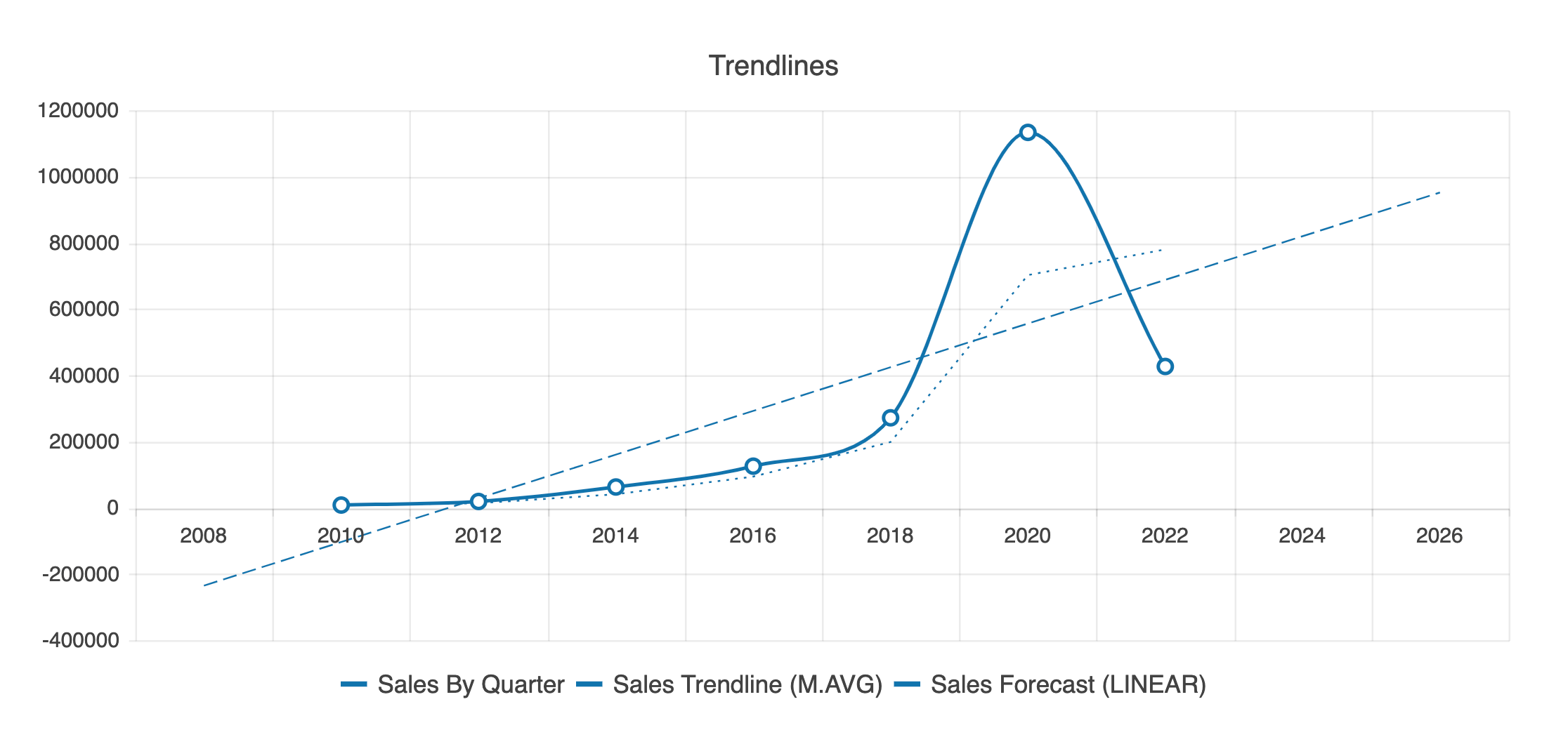
To create your own forecasts, add beforeand after properties set to the number of desired intervals to your ChartSeriesItem.
<ChartSeriesItem
  name="Sales Forecast (LINEAR)"
  type="linearTrendline"
  for="Sales By Quarter"
  trendline={{ forecast: { before: 2, after: 5 } }}
/>
Try It Yourself!
The Trendline element allows us to give our users a new perspective and understanding of the data in our Chart components. Give it a shot and see how the user experience of your app can benefit—and how fast your development time can be when complex data visualizations like this are ready to use right out of the box!
And as always, if you aren’t already using the KendoReact library, you can try it out completely free for 30 days.

Kathryn Grayson Nanz
Kathryn Grayson Nanz is a developer advocate at Progress with a passion for React, UI and design and sharing with the community. She started her career as a graphic designer and was told by her Creative Director to never let anyone find out she could code because she’d be stuck doing it forever. She ignored his warning and has never been happier. You can find her writing, blogging, streaming and tweeting about React, design, UI and more. You can find her at @kathryngrayson on Twitter.
Related Posts
Comments
All articles
Topics
Web MobileMobile
Desktop
Design
Productivity
People
