Visual and Dimension Improvements in UI for ASP.NET AJAX

Summarize with AI:
Learn about the latest enhancements you can enjoy in the appearance and dimensions of the Telerik UI for ASP.NET AJAX controls.
Rich-featured functionality and stability are two essential ingredients when it comes to Telerik UI for ASP.NET AJAX controls development. But when it comes down to it, what attracts users to your application and keeps them coming back is the first impression—the love at first sight.
Visual elements, color scheme, dimension dependencies and more provide a consistent and expressive visual language that guide the user through the layout into the depths of your project. We give the star role to the user in terms of how we manage new technologies and data-driven infrastructures, and aim to create user-centered designed controls.
By using a consistent set of elements and effects, your users will naturally navigate to the areas you want them to, and will complete their goals faster.
Visual Consistency
Your layout is a complete and synchronized micro-system, and you should carefully choose the interaction method you'll use. For example, one button could be bigger than the others or have a different color when used for a primary action. If it's not intentional, however, inconsistency will disturb and confuse the consumer.
The migration from Classic to Lightweight render mode of Telerik ASP.NET AJAX controls causes some slight visual differences. Classic controls use image sprites for borders with rounded corners, gradients, icons etc., while Lightweight controls take advantage of CSS.
SASS is used for Style Sheet authoring of ASP.NET AJAX themes. To avoid an endless set of colors and inconsistency in theme palettes, skin variables are very precisely reduced or reused with CSS manipulations. Although the improvements result in several visual modifications, the latest generated skins are easier to support and customize with CSS or using the Telerik Theme Builder for ASP.NET AJAX. If you prefer the Classic look, changes can easily be overridden with a CSS rule.
Dimension Improvements
With the introduction of the Lightweight render mode, the performance and flexibility of our ASP.NET AJAX controls increased. Inspired by the most popular frameworks and leading design principles, during the last few releases we followed modern trends and good UI practices, enlarging the dimensions of Telerik AJAX controls.
All dimensions are defined in the base CSS files of each control. Skin specific files provide the visual styles only as color, background-color and border-color. Therefore, in various skins all controls have equal measurements and differ only in colors and shades.
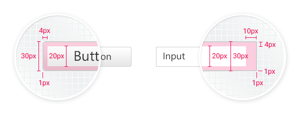
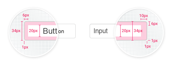
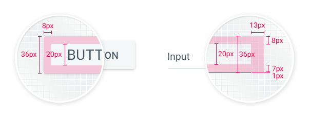
Since the R1 2016 SP1 release we have improved the metrics of AJAX form controls: RadButton, RadInput, RadComboBox and RadDropDownList, etc. The ASP.NET AJAX skin palette is divided into three main categories: Default or Classic skins, Bootstrap skin and the new Material skin. In each of the above there are established interrelated connections between width, height, font size (14px), line height (20px), paddings and borders. A dimension-orientated scheme based on line height and font size ratio is created—1.428571429 (20/14)—that keeps the main proportions of controls consistent with each other, used individually, combined in a complex data form or integrated in composite controls like RadToolbar. By changing just the font size, the layout of the controls can easily be adjusted to fulfill various needs.
The default width of form controls is set to 12em, which can easily be overridden by a CSS rule. The only exception is RadButton and RadFormDecorator Button—their min-width is defined as 64px, which improves the behavior of call-to-action buttons with short content like “OK” and “Save.”
Default Skins
Default skins are all our well-known classic skins, supported through the years: Black, Default, Silk, Glow, all Metro skins, all Office skins, etc. The default height of the controls it set to 30px for a base font size of 14px.

Bootstrap Skin
All metrics in Bootstrap skin are based on the Bootstrap framework requirements and specifications. Our main goal is to be consistent, not only in the UI for ASP.NET AJAX controls environment, but also synchronized with Bootstrap components, used together on one page, in one project. Default height of form controls is set to 34px, when the base font size is set to 14px.

Material Skin
Material design challenged the ASP.NET AJAX team to create a skin identical to Google's visual language and principles. The final result is a skin based on typography, grid, space, scale and color scheme that adheres to Material design guidelines. All form controls are set to a 36px height for a base font size of 14px.

Font Icons
The use of font icons and SVG images has increased in popularity over the last few years. One of the greatest benefits of using font icons is the ability to scale them up and down with ease. However, if we would like to have crisp, sharp images, we need to deal with some technical limitations—especially in small sizes.
Although font icons consist of vector graphics, we should keep in mind that each icon is designed in a fixed pixel grid. A pixel grid is the minimum-scaled canvas in which our icon would look pixel-perfect. Every detail of the icon should be aligned to that grid system. Therefore, the final image-icon will have the best quality when its size equals the base pixel grid size or multiplies it.
If you'd like to use icons with a font size of 16px, 32px or 48px, you should use a font icon design in a base grid canvas scalable to 16x16. If you'd like to use an icon in 14px, 28px or 42px size, the base canvas should be 14x14, etc. So, when one uses a font with a pixel grid base of 16px and sets the font size to 17px, the browser is going to antialiase the semi-transparent pixels and render a blurred image. Have in mind that the bigger the font icon size is, the better quality the image will be.
![]()
Lightweight render mode of Telerik AJAX Controls embedded a Telerik font icon for better optimized performance. It is designed in a 16px grid base, so for best image quality it should be used in a 16-scalable size. In the near future, it will be very easy to change the font size of all embedded icons with a CSS rule.
The only exception is Material skin. It uses a Material Icons font, depicted by Google to correspond to the Material design concept and approach. It is optimized for a 24px base, although Google recommends using it in 18px, 24px, 36px and 48px sizes. The font is included in Telerik.Web.UI assembly and is embedded on the page when the Material skin is in use. As Google updates the Material font icon, we are going to update it regularly as well.
What’s Next
Our main goal is to have all ASP.NET AJAX Controls follow unified measurement guidelines, and adhere to a space system that can easily be customized with CSS and is scalable with font-size settings. We have already started to improve navigation controls dimensions: RadMenu, RadNavigation, RadTabstrip and RadToolbar. Next stop are data management controls: RadGrid, RadTreeList, etc.
We want to hear your feedback—let us know what you think in the comments section below.

Liliya Karakoleva
Liliya Karakoleva is a Principal UX Designer. She joined the Telerik ASP.NET AJAX team in 2012 and is responsible for the UI of the controls, demos’ appearance, themes, etc. Her main challenge is to combine technological innovations and creativity to provoke the natural instincts of users and create a pleasant and joyful experience with a certain system. In her spare time is interested in modern and contemporary art, and loves traveling and good music.
