Up and Running with React Form Validation

Summarize with AI:
Update: If you are looking for a ready-made form solution, check out this professionally-developed React Form component, part of the KendoReact UI component library. TJ VanToll wrote a helpful article about how to implement it: How to Build Forms with React the Easy Way.
Join me as I walk through adding custom form validation in React in a few easy steps. Get up to speed creating your own custom form validation in your React components.
This article teaches basic React form validation using controlled state inside of components. We use classes and plan to have a follow up article on doing the same thing with React Hooks.
TIP: Check out the "KendoReact Form Design Guidelines" for best practices and usage examples for building great forms in React!
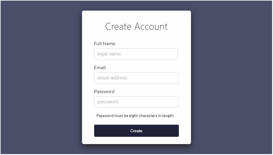
Our starting point will be a StackBlitz demo which only has a few form elements and some basic styling. We will build a registration form using a full name, email and password field:

It's a simple and canonical form example showing how to use basic logic, and a regular expression that can be re-used in my other React components. This tutorial should be great for beginner to intermediate level React developers, if you are familiar with HTML, CSS and basic React.
We will keep everything in one file for simplicity sake, but I have split the Register feature into its own component. I have added some CSS and HTML in the StackBlitz starter demo but zero JavaScript logic outside of basic component composition.
The <dialog> modal was considered but not used in this tutorial. You can find information on how to use it in all browsers with a polyfill here. We don't
use it because it does not have support outside of Chrome.
If you were here to learn validation using KendoReact, we have great instruction on that topic, you can find it here: Getting Started with KendoReact Form validation 😊
Instead we are going to learn about building your own implementation using HTML forms, React and JavaScript to validate our form and cover teaching the inner workings of React UI components.
We will start with this StackBlitz demo:
*Open This StackBlitz demo and fork it to follow along!
One of the things to notice in the form I have setup for you is that we have specified three different types of inputs. We have a fullName, email and password input. It's very important to use the right type on each
input as it will assist their form fillers and allow for obfuscation of the password.
On the Form tag and on the individual inputs I have placed noValidate (noValidate in jsx turns into novalidate in html). Adding this doesn't disable form validation. It only prevents the browser from interfering
when an invalid form is submitted so that we can “interfere” ourselves.
We are going to build our form validation from this point and do all of the JavaScript logic ourselves. Currently the form does not submit or work in anyway, it has only been styled.
The first thing we want to add is a constructor to our Register component:
constructor(props) {
  super(props);
  this.state = {
    fullName: null,
    email: null,
    password: null,
    errors: {
      fullName: '',
      email: '',
      password: '',
    }
  };
}
Our state will contain a property for each input as well as have an object (error) which will hold the text for our error messages. Each form input is represented in this error object as well. If we detect the input is invalid, this string
will have a value, otherwise the value will be empty or zero. If it's not zero, we will create logic to display the message to the user.
Next we will add the handleChange() function. It should come right before the render method of our Register class:
handleChange = (event) => {
  event.preventDefault();
  const { name, value } = event.target;
  let errors = this.state.errors;

  switch (name) {
    case 'fullName':
      errors.fullName =
        value.length < 5
          ? 'Full Name must be 5 characters long!'
          : '';
      break;
    case 'email':
      errors.email =
        validEmailRegex.test(value)
          ? ''
          : 'Email is not valid!';
      break;
    case 'password':
      errors.password =
        value.length < 8
          ? 'Password must be 8 characters long!'
          : '';
      break;
    default:
      break;
  }

  this.setState({errors, [name]: value}, ()=> {
      console.log(errors)
  })
}
This function fires everytime we enter a character into an inputs on our form. It switches on the event.target.name, constantly checking to see if we have reached a minimum character limit or if we have found a RegEx match. Each time a character
is entered, an event will be passed to this function getting destructured. Destructuring assignment plucks
our values out of the event.target object and assigns them to local variables (name and value) inside of our function.
In destructuring, the line of code below:
const { name, value } = event.target;
The destructuring example above is is equivalent to:
let name = event.target.name;
let value = event.target.value;
The handleChange() function uses a switch to check that you have entered the correct length input in the case of the email, it will run a RegEx (that we still need to create) and ensure that it matches the regular expression that checks for
a proper email format.
We will not get into Regular Expressions, however; I got my expression from a StackOverflow answer which showcases a few decent RegEx solutions for validating emails.
Just above our Register class we can add a const that holds this RegEx and then we can call .test() on that RegEx string to see if our input matches and returns true, otherwise we will add an error message to
our local copy of our error state.
const validEmailRegex =
  RegExp(/^(([^<>()\[\]\.,;:\s@\"]+(\.[^<>()\[\]\.,;:\s@\"]+)*)|(\".+\"))@(([^<>()[\]\.,;:\s@\"]+\.)+[^<>()[\]\.,;:\s@\"]{2,})$/i);
The RegEx is nearly impossible to read, but rest assured it covers most cases that we want to check including accepting unicode characters. Understand that this is just a test we perform on the frontend and in a real application you should test the email on the server-side with legit validation depending on your requirements.
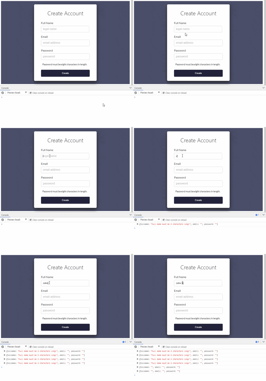
This is a great spot to stop and check our work, in fact most of our validation is already working, if we go into our console for this page we can see what error messages are being created up until we satisfy each inputs validation:

As you can see, as soon as we enter our first character in the fullName input, we get an error message. The fullName input requires that we enter at least 5 characters. We see that in our console up until we meet the criteria,
then the error message disappears. Although we will not continue logging these errors in the console, we will pay attention in future code to the fact that we either have an error message or not. If so, we will display that error message to the user
directly underneath the input.
This StackBlitz demo is a saved version of our current progress - we still have a few more things to plug in though.
Our next order of business is to handle a form submission and provide a function that, upon form submission, can check to see if we have any error messages present to show the user.
Considering our handleChange() function is already updating our local component state with errors, we should already be able to check for validity upon form submission with handleSubmit(). First I want to remove the console.log statement inside the setState call. Let's update that line at the bottom of the handleChange() function to read:
this.setState({errors, [name]: value});
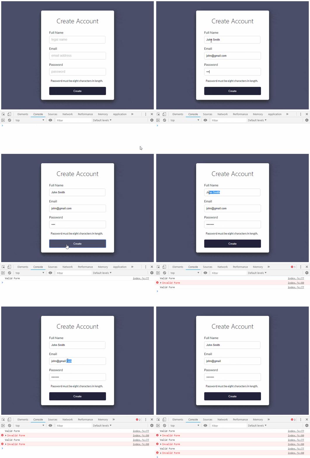
Now, we will create the new handleSubmit() function and for the time being, we will console log a success or fail message based on the validity of the entire form. Add the following code just below the handleChange() function.
handleSubmit = (event) => {
  event.preventDefault();
  if(validateForm(this.state.errors)) {
    console.info('Valid Form')
  }else{
    console.error('Invalid Form')
  }
}
In our handler for the submit event, we need to stop the event from bubbling up and trying to submit the form to another page which causes a refresh and then posts all of our data appended to the web address. The line of code that does this is event.preventDefault() and if you have not used it before, you can read up on it here: React Forms: Controlled Components. This is one of the better resources that explains why
it's needed in React forms.
As you can see from the code above, we also need to add a function called validateForm which we call out to in order to check validity. We then display a console message of valid or invalid. We will add this function just below the RegEx
we created:
const validateForm = (errors) => {
  let valid = true;
  Object.values(errors).forEach(
    // if we have an error string set valid to false
    (val) => val.length > 0 && (valid = false)
  );
  return valid;
}
At this point we should be able to fill out the entire form and check validity.

We are getting close to the home stretch, we have a form that submits and determines if we have met the criteria for each input and we have the ability to return a valid or invalid state. This is good!
Inside of our Register component's render and before the return, we need to destructure our this.state.errors object to make it easier to work with.
const {errors} = this.state;
This will allow us to write some pretty simple logic below each input field that will check if the error message for that field contains a message, if so we will display it! Let's write our first one underneath the fullName input.
{errors.fullName.length > 0 &&
  <span className='error'>{errors.fullName}</span>}
Now lets do the same underneath the next two inputs, first the email input:
{errors.email.length > 0 &&
  <span className='error'>{errors.email}</span>}
And next we will do the password input:
{errors.password.length > 0 &&
  <span className='error'>{errors.password}</span>}
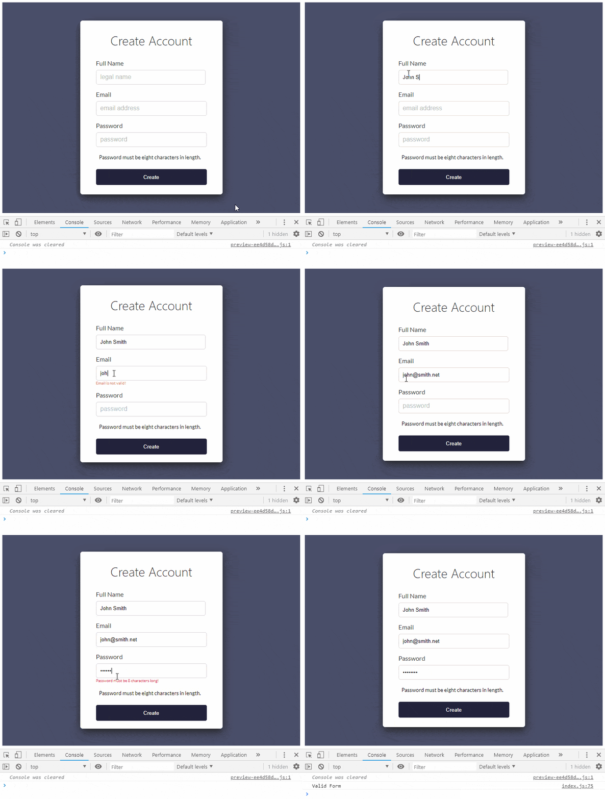
And just like that we should have our entire form working and alerting the user to any errors so long as we have touched the individual inputs. The current logic should keep from showing our error messages until we start typing in the input as well, if we back out of an input and remove all text that we have typed, the error messages will remain as they have been touched and are now invalid. Let's take a look at the form in action:

There are a few things you could do above and beyond what we have done here. One is that, instead of adding a span underneath the input when the form becomes invalid, we could have the span always there and just display it using a CSS class if it's invalid. What's the difference? Well it would help to get rid of the jump when the error message arrives and disappears.
Also we could just have a large section at the bottom that displays all known errors only upon hitting the submit button. These are all great ideas and things you should explore on your own now that you have a better understanding of how to validate a form.
Finally, I want to link below to the final version of our form in StackBlitz. So much more is possible, but this is a good stopping point to sit back look it over and decide exactly how we want things to work before moving forward. Thanks for taking the time to learn here with me and remember that we have KendoReact components that make form validation a breeze. Try them out here!
Also feel free to check out this additional version of the StackBlitz demo where I provide a visual UI for letting the user know that the form is valid or invalid rather than printing a line to the console. We are just scraping the surface here, there is so much more we can do when implementing custom validation. There are many solutions out there that make it easy to do do validation, but an exercise like this one although very basic helps us to understand how to get started rolling our own validation rather than relying on a third part to do so.

Eric Bishard
Eric Bishard is a Developer Advocate and former member of the KendoReact team at Progress. A software engineer with experience building web based applications with a focus on components for user interfaces in Angular and React, Eric works with @Couchbase, tweets @httpJunkie and blogs at ReactStateofMind.com.

