
ThemeBuilder vs. Manual CSS: Which is Best for Your Team?

Summarize with AI:
See which of these approaches to styling and theming Kendo UI components works best for your team and project.
As we’ve explored in other blogs, there are multiple options when it comes to writing (or not writing!) CSS for your Kendo UI components. Today, we’re going to take a look at some code samples and explore how these different options would function in a real-world environment.
As with most things in tech, there’s no real right or wrong approach here—just different ways of doing things. At the end of the day, any of these options will offer you a beautifully styled application using our highly customizable and accessible Kendo UI components. The only options that are “wrong” are the ones that are wrong for your team! This guide will help you make an informed decision about which styling approach is best for you.
Generating CSS or SCSS with ThemeBuilder
ThemeBuilder is a full WYSIWYG editor (what you see is what you get) for all our components, allowing developers or designers to dive deep and customize the details of each component—without having to actually write any CSS themselves!
This is a great fit for teams that don’t have a UX engineer or other front-of-the-front-end specialist, and would prefer not to style components manually. It’s also a fantastic option for companies with a design team—the no-code approach to ThemeBuilder styling makes it possible for non-coding designers to implement a design system or UI theme by themselves, without needing to navigate the infamous handoff. When the components in the Live Preview are looking just the way you like, all you need to do is click the Export button to generate production-ready code—in both vanilla CSS and SCSS.
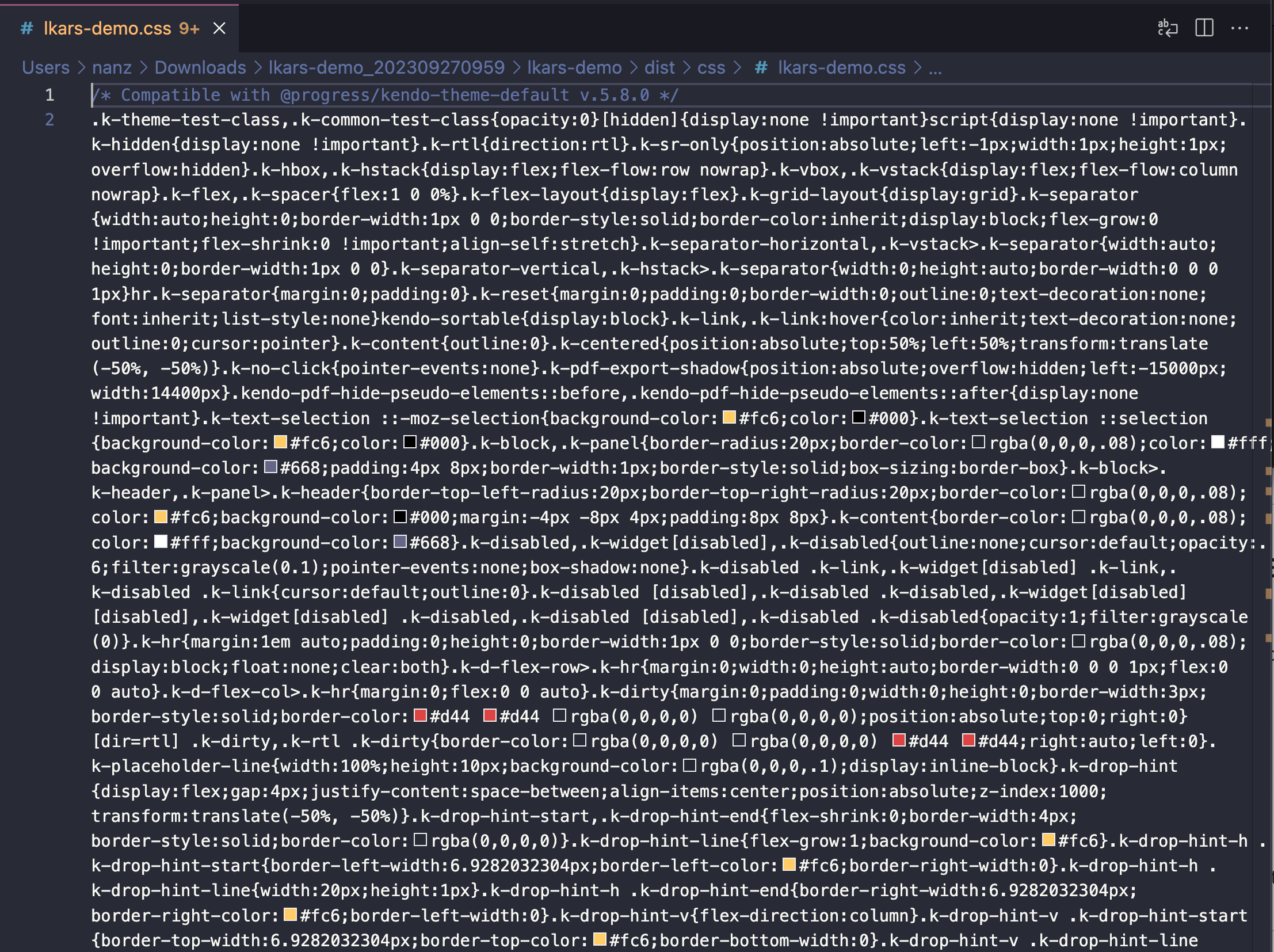
If you’re using vanilla CSS in your application, the exported ThemeBuilder CSS will be a large, minified CSS file—similar to many standard CSS libraries. Use this as the global styles for your application, and don’t spend another second thinking about CSS!
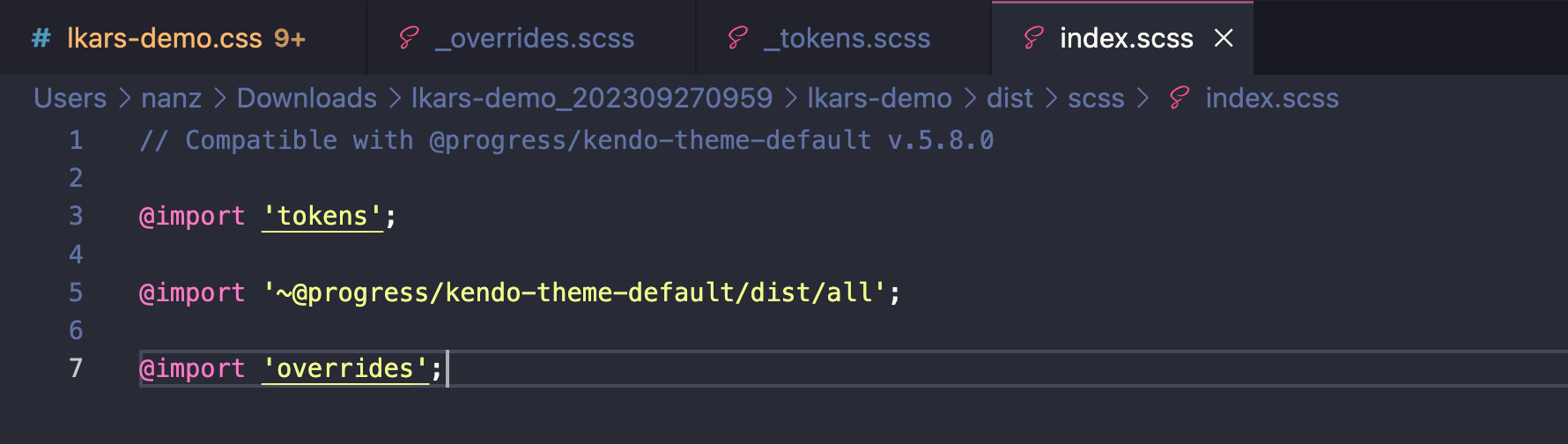
If you’re using SCSS in your application, however, the exported ThemeBuilder files will be slightly more complex—but also significantly more human-readable. It comes as a set of three interconnected files: _overrides.scss,
_tokens.scss and index.scss.
The index.scss file simply imports all of the required styling content into one “hub” file, which can then be used as your global style page.
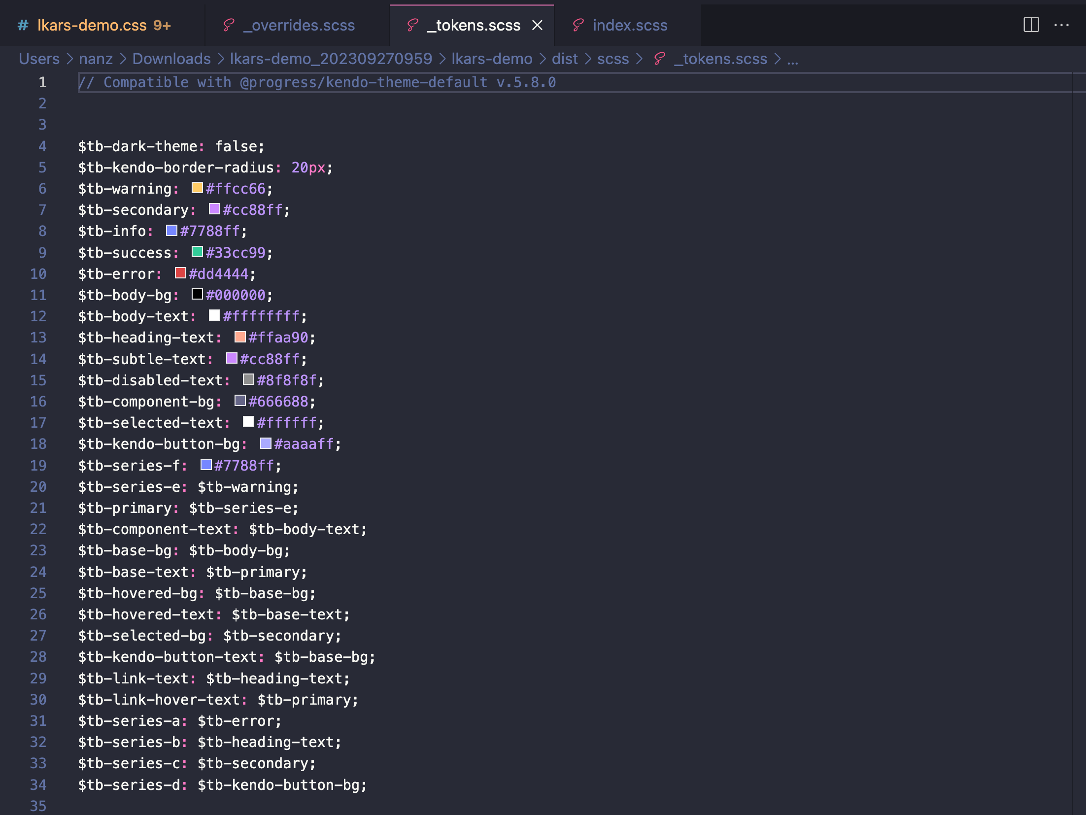
_themes.scss defines all the variables used in your theme.
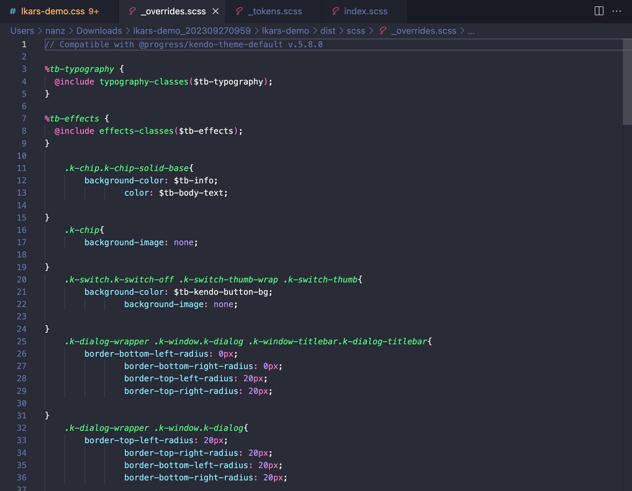
And (as you might guess) _overrides.scss is where you’ll find any specific component style adjustments you set in the Advanced Edit panel of the ThemeBuilder.
Manually Writing CSS or SCSS
There are a few different options for those teams who prefer to take a slightly more hands-on approach to their styling. Let’s take a look at them in order from least to most involved:
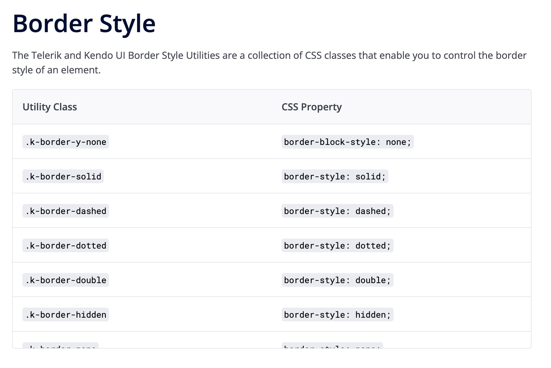
CSS Utilities
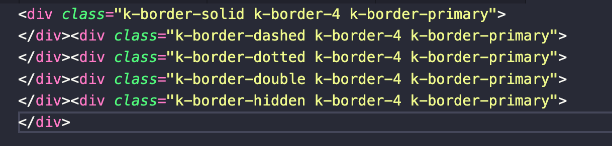
The Kendo UI themes all come bundled with CSS Utilities, a Tailwind-esque approach to styling based around our set of pre-defined utility classes. With CSS Utilities, you won’t have to define any of the classes yourself—you can simply apply the classes without writing any CSS. A full list of the available CSS Utility classes can be found in our Design System documentation.
When applied, the HTML will look like so:
SCSS Variables
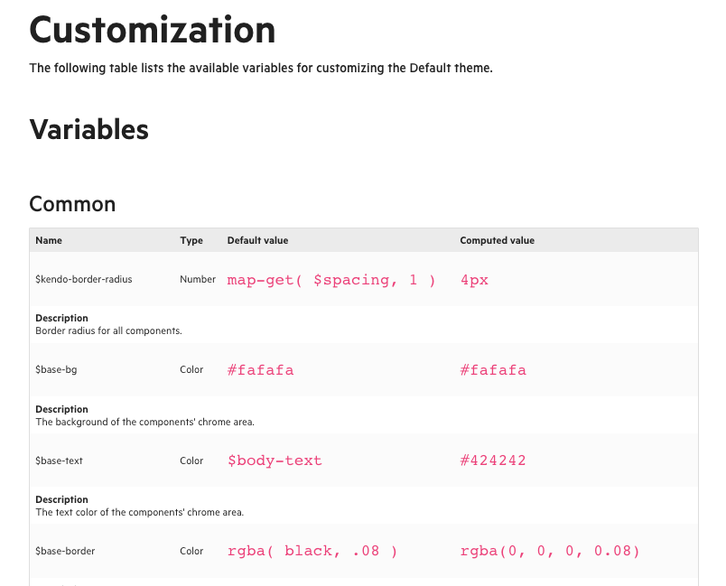
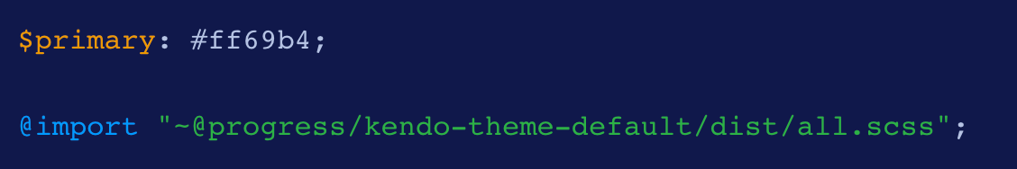
For those who want to have a little more direct control, writing some—but not all—of the styles themselves, we offer a wide array of SCSS variables that can be easily customized. Each Kendo UI theme includes a set of variables that can be adjusted for easy theming. The Iist of variables is slightly different for each theme, and can be found in our documentation for the Default, Bootstrap and Material themes.
And reassigning the default values of those variables looks like this:
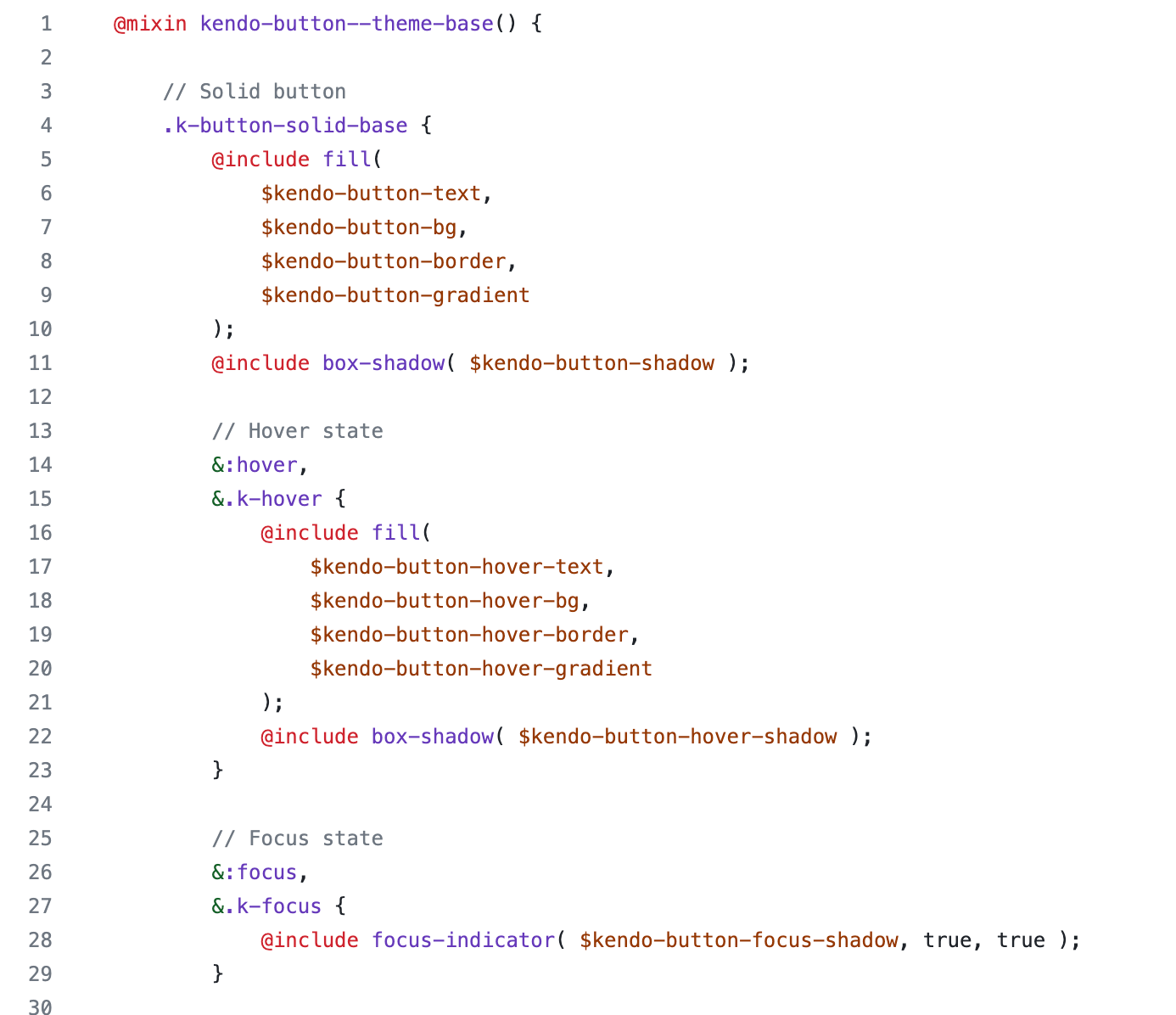
Editing the Theme Source Code
Of course, it’s also completely possible to edit the source code of the themes directly—although not particularly recommended unless you’re a CSS whiz.
To make your own custom theme by manually modifying the source code, you’ll need to clone the kendo-themes repo and install
the dependencies for all the themes (
npm install && npx lerna bootstrap). Then, you’ll be able to make any edits you like!
The styles in kendo-themes are broken out by theme type, then again by component. So, for example, if you wanted to update some styles for the Button component in the Default theme, you’d want to go to
kendo-themes/packages/default/scss/button.
In each component folder, you’ll find four files: _index.scss, _layout.scss, _theme.scss and _variables.scss.
Generally, you’ll want to leave the _index.scss file alone, since it’s just collecting and exposing the various other files needed. The
_layout file has positioning, spacing and alignment styles. The _theme file is where you’ll customize the display options for different component states and variants. And, of
course _variables is where you can update the SCSS variables used throughout the component styles.
When you’re ready to build, just run npm run sass or npm run dart to create your customized theme—you’ll find it in the packages/[theme name]/dist/all.css file. Add the compiled CSS to your project, and you’re ready to go!
Which is Best for Your Team?
With this wide variety of approaches, Kendo UI empowers you to style and theme our components, no matter how comfortable you are—or aren’t—with writing CSS!
If you have a designer, they’ll love being able to make their own edits and implement their own design system in the ThemeBuilder. If you just need to be able to make some quick customizations, the CSS Utilities make it a breeze to add class-based predefined styles without ever opening a CSS file. If you have a specialized frontend or UX engineer, they’ll appreciate the full access and high levels of control they can have by editing the theme source code directly. Give them all a shot, and see which one best suits the needs of your team and project!

Kathryn Grayson Nanz
Kathryn Grayson Nanz is a developer advocate at Progress with a passion for React, UI and design and sharing with the community. She started her career as a graphic designer and was told by her Creative Director to never let anyone find out she could code because she’d be stuck doing it forever. She ignored his warning and has never been happier. You can find her writing, blogging, streaming and tweeting about React, design, UI and more. You can find her at @kathryngrayson on Twitter.
Related Posts
Comments
All articles
Topics
Web MobileMobile
Desktop
Design
Productivity
People
