
Meet the ThemeBuilder Figma Import

Summarize with AI:
We need Figma design tokens to become CSS variables. Moving those values manually from Figma into our stylesheets is painful, to say the least. Thankfully, there’s a better way with ThemeBuilder!
When designers hand off their Figma mockups to developers, there are a few main things that developers are trying to take from those files:
- A general understanding of which elements should go where on the page
- Any planned user interactions (i.e., “What happens when they click this button?”)
- Specific values for the CSS (hex colors, font sizes, border radii, etc.)
The first two can usually be picked up pretty quickly as the developer explores the Figma file and plays with the prototype. It’s the third one—all those little values that need to be copied over—that’s the most tedious.
Dealing with Design Tokens
In Figma, those values are captured as “design tokens.” Depending on the scope of the design, there could be anywhere from just a handful to well over 100 design tokens in a single file! This is especially true in the case of design system documentation, where the design team will have created a great many of these design tokens to capture every possible interaction state of every single component.
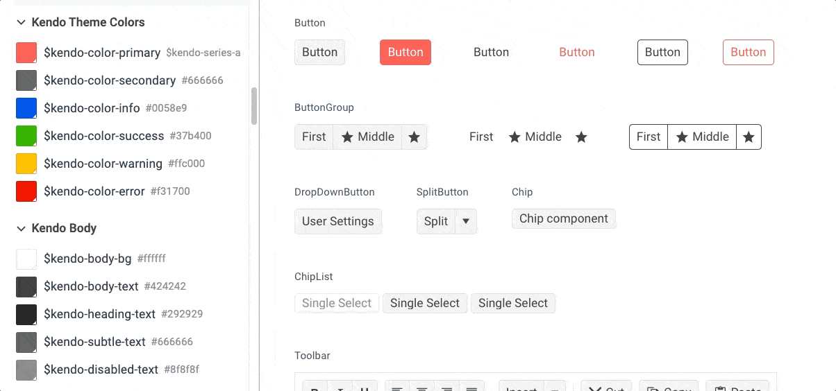
For example, the Kendo UI Figma Kit includes 150 different design tokens that capture every aspect of the UI look and feel: drop shadows, gradients, colors, typography, borders, focus and hover state effects, and so much more!
We need those design tokens to become CSS variables. Moving those values manually from Figma into our stylesheets is painful … to say the least. Thankfully, there’s a better way.
Progress ThemeBuilder not only allows us to import the variables from Figma, it also gives us a real-time preview of how the components will look in the Live Preview panel! When we apply the imported design tokens to our Theme Styles in ThemeBuilder, the components in the Live Preview will immediately update to reflect those changes across the entire library. That gives us the opportunity to do a quick visual check against the Figma file and ensure that the components look the way the designers intend them to look.
How to Use the ThemeBuilder Figma Plugin
To take advantage of this, we need four things:
- An application using one of the Telerik or Kendo UI component libraries
- A Figma file with design tokens defined. We can use the associated Telerik or Kendo Figma Kit for this, but we don’t have to—any Figma file will work!
- The Progress ThemeBuilder Figma Plugin
- ThemeBuilder
Let’s assume that we already have an application using KendoReact. Our design team has a Figma file where they’ve created a new look and feel for the application UI. They’ve sent us the mockup, and it’s our job to implement those styles in the app.
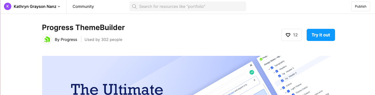
The first thing we do is install the ThemeBuilder Figma Plugin by clicking the “Try it out” button in the top right corner of the Progress ThemeBuilder page in the Figma Community. This will add the plugin to our Figma account, so we can access it in all of our files.
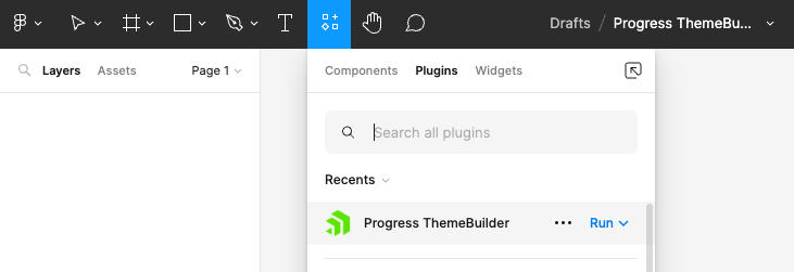
Then, we open the Figma file sent by the design team. We can run the plugin by clicking on the Add-Ons button in the toolbar, switching to the Plugins panel, and selecting Progress ThemeBuilder from the list.
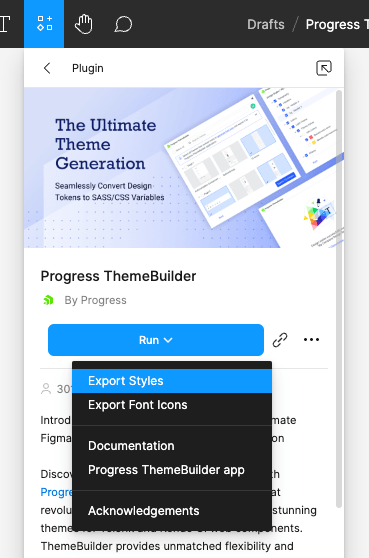
When the ThemeBuilder Plugin is open, click the “Run” button and select “Export Styles” from the dropdown menu. We’ll be prompted to log in to ThemeBuilder.
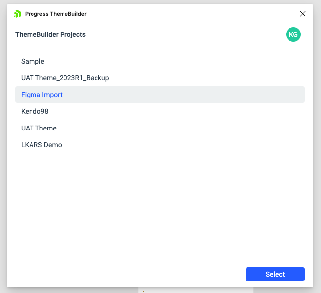
When we return to Figma, our available ThemeBuilder projects will be available for selection in the modal window. Choose the project for import, and click “Select.”
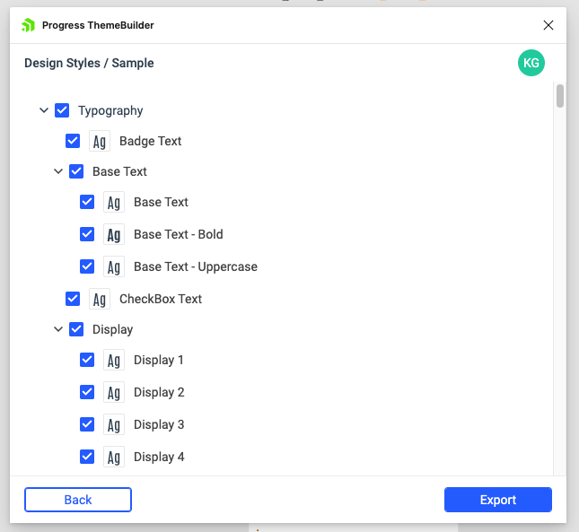
Then, we’ll be shown a list of every single design token in that Figma file. They’ll all be selected for export by default, but we can customize that if (for example) we only want the colors and not the typography. In this case, however, we would want everything, so let’s leave it all checked and click the “Export” button.
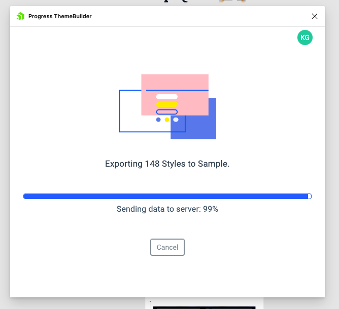
In just a few seconds, the export will run and we’ll see a confirmation message telling us that the export was successful!
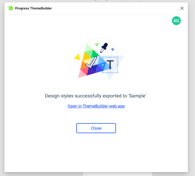
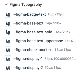
If we follow the “Open in ThemeBuilder web app” link, we’ll be taken to our ThemeBuilder project where the Figma design tokens are now visible in the left-hand Theme Styles column. All the imported styles will have a “--figma” prefix, so we can easily tell them apart from any styles we might have created earlier.
Then, we just assign those new Figma design token values to our existing theme styles! Note how the updated color is immediately applied to the components in the Live Preview.
When we’ve assigned all the variables and are happy with how the new styles are looking, we can use the Export tool in ThemeBuilder to export application-ready CSS that captures all the changes we made.
Just like that, we updated the design of our entire component library to match the design team’s mockup—without writing a single line of CSS!
Ready to Try it Out?
If you aren’t already using a Telerik or Kendo UI component library, you can try one out completely free for 30 days. Same goes for ThemeBuilder—try it free for a week and see just how easy it can be to theme, adjust and export styles. Each tool is powerful on its own, but together they make the perfect team for bridging the gap between design and development!

Kathryn Grayson Nanz
Kathryn Grayson Nanz is a developer advocate at Progress with a passion for React, UI and design and sharing with the community. She started her career as a graphic designer and was told by her Creative Director to never let anyone find out she could code because she’d be stuck doing it forever. She ignored his warning and has never been happier. You can find her writing, blogging, streaming and tweeting about React, design, UI and more. You can find her at @kathryngrayson on Twitter.
Related Posts
Comments
All articles
Topics
Web MobileMobile
Desktop
Design
Productivity
People
