
From Design to Development in 7 Steps With Progress ThemeBuilder

Summarize with AI:
A step-by-step guide through the process of taking a project from design to development using Progress ThemeBuilder!
Progress ThemeBuilder is a web application that functions as a full WYSIWYG (what you see is what you get) editor for all of our components, allowing developers or designers to dive deep and customize the details of each component—without touching any CSS or Sass. It’s our recommended approach for teams who want to make design changes to the Telerik or Kendo UI libraries in a visual, no-code environment and then export code directly.
But what does that process look like? Today, we’re going to go step-by-step through the process of taking a project from design to development using ThemeBuilder Pro!
Step 1: Setting Up a New ThemeBuilder Project
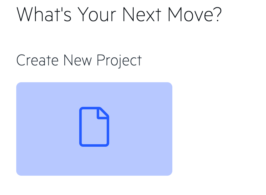
Before any of the truly fun stuff can happen, you need to create a new ThemeBuilder project! Head over to the ThemeBuilder Dashboard, login or set up a (free!) Telerik account, and then select “Create New Project”:
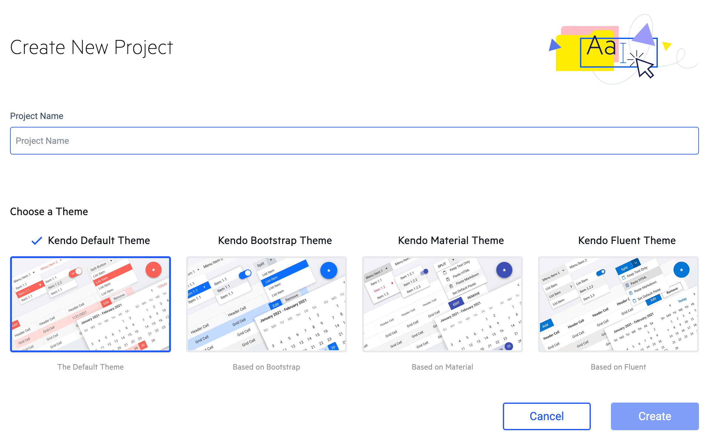
On the next page, you’ll be asked to give your project a name and select a Theme to base it on. If you’re already using one of these common design systems—Bootstrap, Material or Fluent—you can select one of those and start with all the basic styles already in place. If you want to create something completely new, we recommend starting with the Kendo Default Theme and customizing from there.
Step 2: Designing
This step can look a little different, depending on whether you have a designer on your team and are receiving design changes from them as part of the handoff or if you’re handling the design yourself.
With a Designer
If you have a designer on your team, it’s most beneficial to start with our Figma UI Kits. These kits offer the designers a full breakdown of every single component, atomic design style in a Figma file. The Figma Kits also come in various theme varieties (Kendo Default, Bootstrap, Material and Fluent), so if you’re using one of those design systems you’ll already be synced up from the very start.
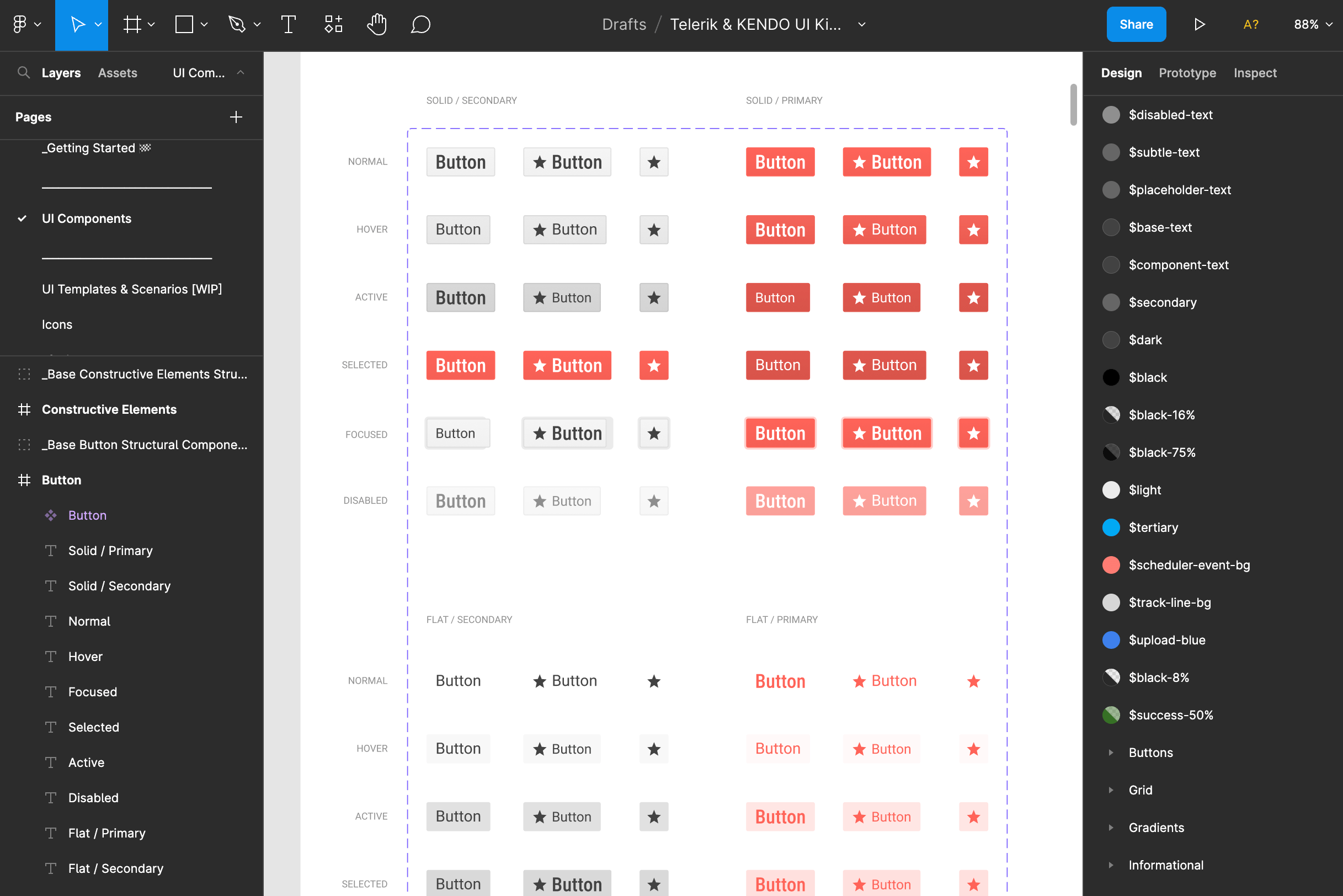
The Figma Kits are hugely beneficial because they allow the designer to a) get a complete understanding of the library and b) make any changes using the software that they’re most familiar with. In this situation, you might be invited to view the Figma Kit file that includes their design updates, and it will be your job to translate these into code—a task easier than ever before with ThemeBuilder Pro, since the Figma design tokens align one-to-one with the Theme Style tokens in the ThemeBuilder left-hand sidebar!
Without a Designer
If you’re handling the design yourself, then you can jump straight into ThemeBuilder! Because ThemeBuilder uses a WYSIWYG approach to editing, any changes you make to the components will be immediately reflected in the Live Preview panel. And if you change your mind, any adjustments you make can be quickly and easily reverted using the reset function. So get creative with it and don’t be afraid to experiment!
Step 3: Creating Your Custom Theme
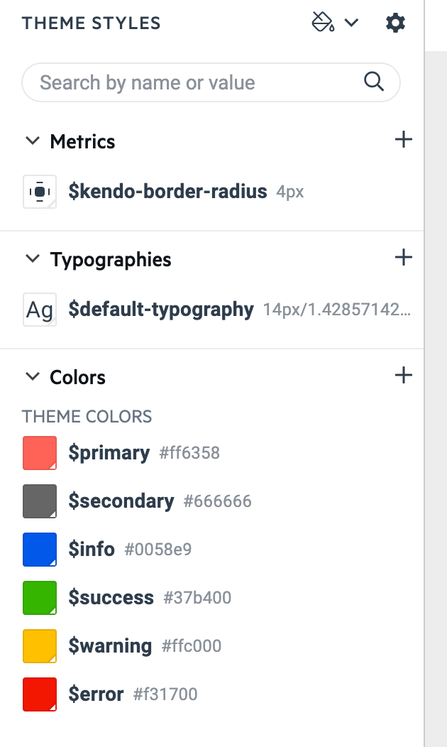
We recommend starting by making high-level updates to the theme, using the variables in the left-hand “Theme Styles” sidebar. These changes will immediately apply across the entire library of components (as you’ll see in the Live Preview), so you can quickly change colors, typography and border radius values.
Once you’ve assigned a value to any variable, it will show up in a dropdown when you go to set future variables, making it easier than ever to set cohesive styles for your application. And, as mentioned, these values align with the Figma Kit Design Tokens, so you can quickly and easily copy over the values for a painless handoff.
>
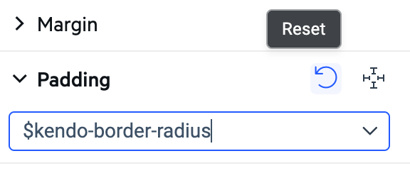
You can also create your own values! This is especially useful for teams that are using ThemeBuilder to support their own custom design system. To add a new variable, just click the “+” button on the right-hand side of the “Colors” header. You’ll then be prompted to name your variable and set a base value (which you can change later). Any new variables you create will be added to the bottom of the Theme Styles sidebar under the “Other” heading.
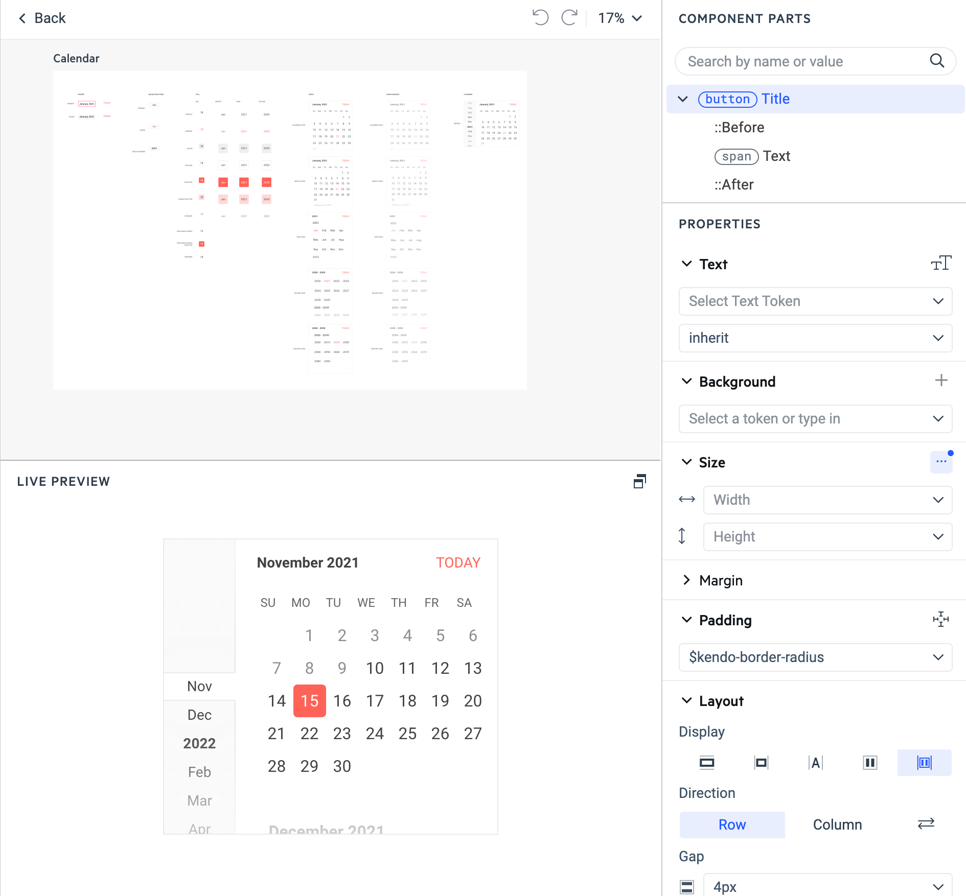
Step 4: Previewing and Editing Components
Once you’ve set those values, you can start to explore the way those settings look across all the components, using the Live Preview. Make sure to interact with all your components, so you can check how your styles function during various interaction states—toggle switches, click buttons, expand dropdowns and more! Your users won’t only be seeing the components in their default positions, so it’s important to review how your theme will look in different situations.
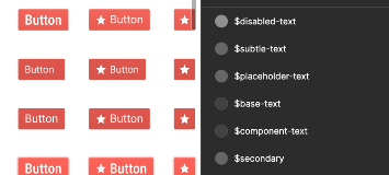
If you see anything that doesn’t look quite right or just something not included in that high-level list that you’d like to adjust (such as padding or margin, more granular text settings, justification and alignment, outline, effects and more), then the new Advanced Edit panel will walk you through those options. And because of the atomic design approach, changes you make to the button (for example) will automatically be reflected in every component that uses or includes a button—toolbars, button groups, inputs, dropdowns, etc.
Step 5: Sharing
We know that good design doesn’t happen in a vacuum, which is why you can also share your ThemeBuilder Pro theme and work together on it with another teammate. Collaborate by editing components together in real time, or easily send your work for approval.
To share a ThemeBuilder project, click the Share button in the top right of the navigation bar. This will open a model that allows you to add other teammates to the project via e-mail address. You can also revoke access from here, if needed.
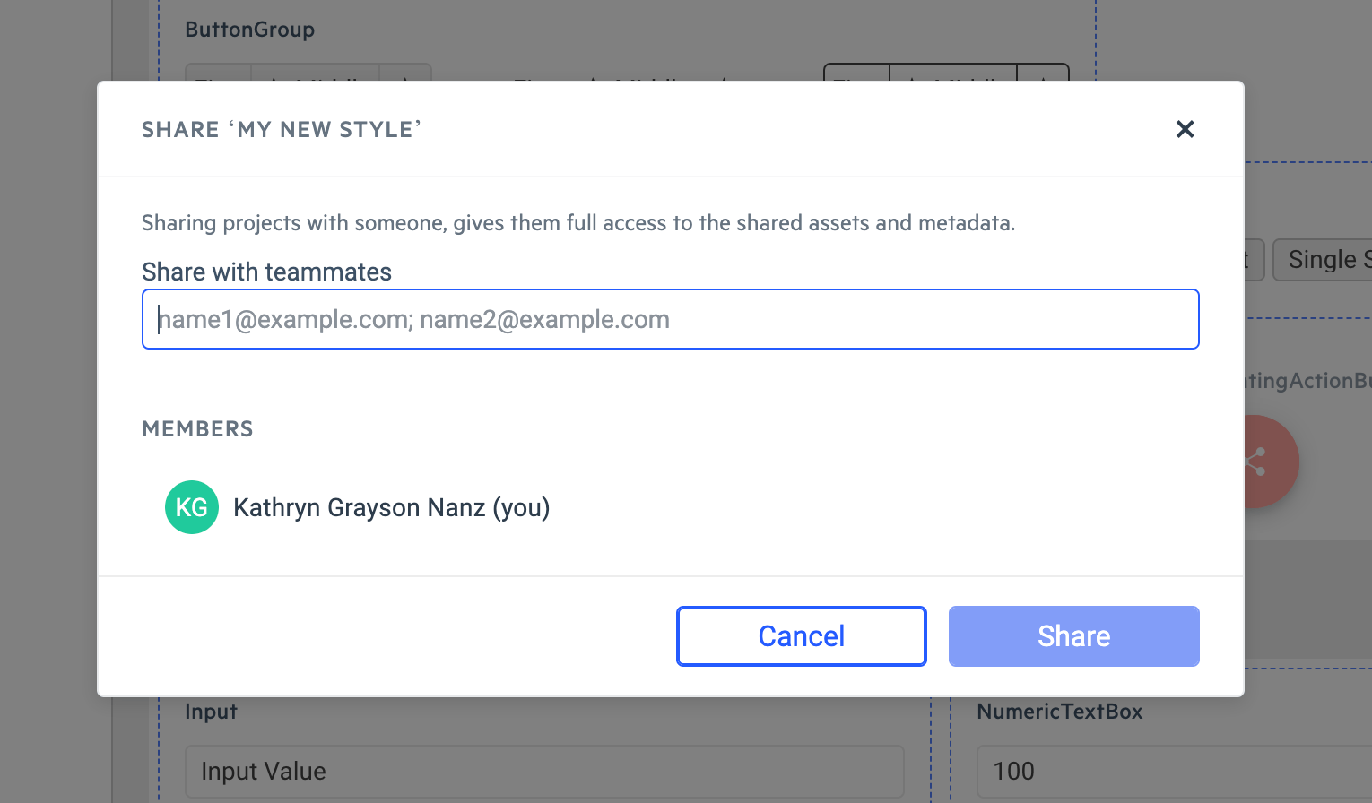
Once you’re happy with the design and have the stakeholder approval you need, this feature will also allow you to share across product teams so everyone can export the same CSS and Sass files to achieve a truly consistent look and feel across your suite of applications.
Step 6: Exporting
Speaking of exporting, you can start a theme export by clicking the “Export” button in the top right corner of the navigation bar.

When you do this, all the content in your project will be automatically converted into CSS and Sass and downloaded in a zip file. Yep … it’s just that easy!
Step 7: Integrating Into Your Application
Believe it or not, it’s just about as easy to integrate your new theme into your existing application as it is to download the files!
The zip file you downloaded has two main folders: “css” and “sass”, both nested within a “dist” parent folder. Depending on what you’re using in your application, choose the one you need, and it’s literally as easy as dragging and dropping the files! In less than 30 seconds, you can apply the exported ThemeBuilder styles and see them reflected in every Telerik and Kendo UI component in your application—without ever needing to write a single line of Sass or CSS!
Ready To Give It a Shot?
ThemeBuilder Pro is available for KendoReact, Kendo UI for Angular, Kendo UI for Vue, and Telerik UI for Blazor. Support for Kendo UI for jQuery, Telerik UI for ASP.NET MVC, Telerik UI for ASP.NET Core, Telerik UI for PHP, and Telerik UI for JSP is launching early 2023.
Want to see just how easy it can make styling your application? Try ThemeBuilder for free today!

Kathryn Grayson Nanz
Kathryn Grayson Nanz is a developer advocate at Progress with a passion for React, UI and design and sharing with the community. She started her career as a graphic designer and was told by her Creative Director to never let anyone find out she could code because she’d be stuck doing it forever. She ignored his warning and has never been happier. You can find her writing, blogging, streaming and tweeting about React, design, UI and more. You can find her at @kathryngrayson on Twitter.
Related Posts
Comments
All articles
Topics
Web MobileMobile
Desktop
Design
Productivity
People
