
Creating a Unique Theme with Custom Fonts and Icons in ThemeBuilder

Summarize with AI:
See how to import a font—including custom icon font libraries—into your ThemeBuilder styles, ready to implement in your app!
You might already know about all the amazing customization options the Progress ThemeBuilder offers in terms of colors, padding, effects like border radius and drop shadow, and more. But did you know that you can also import your own fonts and icons as well, for a truly personalized look?
If your brand style guide specifies the use of a licensed font or if your design team has invested in the creation of custom icons, you can still seamlessly integrate those assets into the theming of your component library—and export production-ready code!
Custom Fonts
ThemeBuilder already includes access to a collection of standard, familiar fonts to use in your typography system. To change the default font used across the entire component library, just update the $kendo-default-typography variable in the “Typographies” subsection of the Theme Styles sidebar.
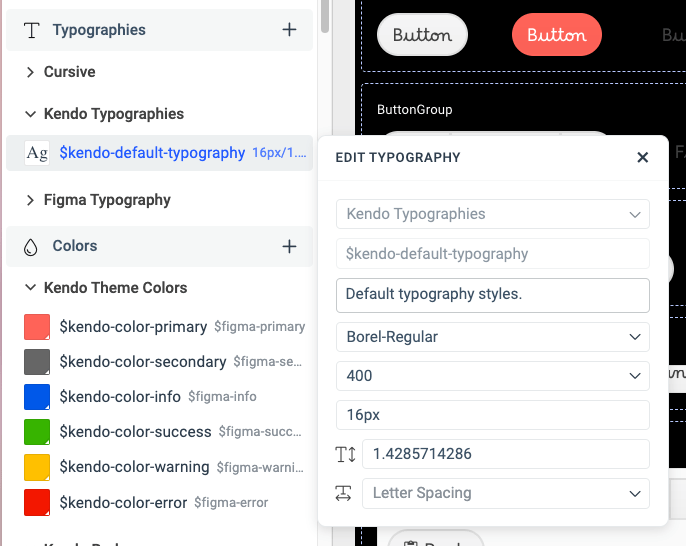
However, if you’ve fallen in love with a beautiful Google font or invested in a specific licensed font family, you can absolutely use those as well! To import a font, just take the following steps:
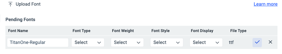
- Click the gear icon in the top navigation bar to open Project Settings.
- Open the Fonts tab from the Project Settings sidebar.
- Click the Upload Font button to add any font files from our system.
- Customize font details, such as type, weight and style. The “Font Type” detail is required, but the others are optional.
- Click the checkmark icon to add the new font to the theme font options!
Once it’s been moved from Pending Fonts to Uploaded Fonts, we know it’s ready to use in our design. Now, when we update the default font (or any other typography option), we’ll see our custom font in the Font Family dropdown options list.
Custom Icons
We can also make use of the Upload Font process to add custom icon sets as well! Just export your custom icon set as an icon font or download the icon font for your preferred library.
For example, let’s say we want to use popular icon library Font Awesome in our project. I’ll download the free OTF files from the Font Awesome downloads page, then open up ThemeBuilder and follow the same process as above—just make sure the set the Font Type as “Icon.”
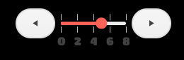
Then, to change out an icon, click on a component and open the Advanced Edit panel. In this example, I’ll change out the icons in the Slider component. Then, take the following steps:
Select the
iconfrom the Component Parts pane in the top right corner of the Advanced Edit sidebar.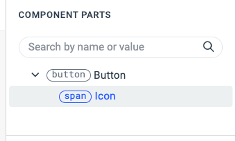
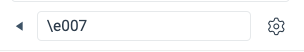
Open the Text subsection. Click the typography icon on the right-hand side to switch to “Set Local Text Properties” if you haven’t assigned the new font as a variable in Theme Styles.
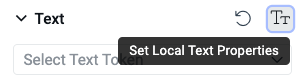
Choose your uploaded font from the Font Families dropdown.
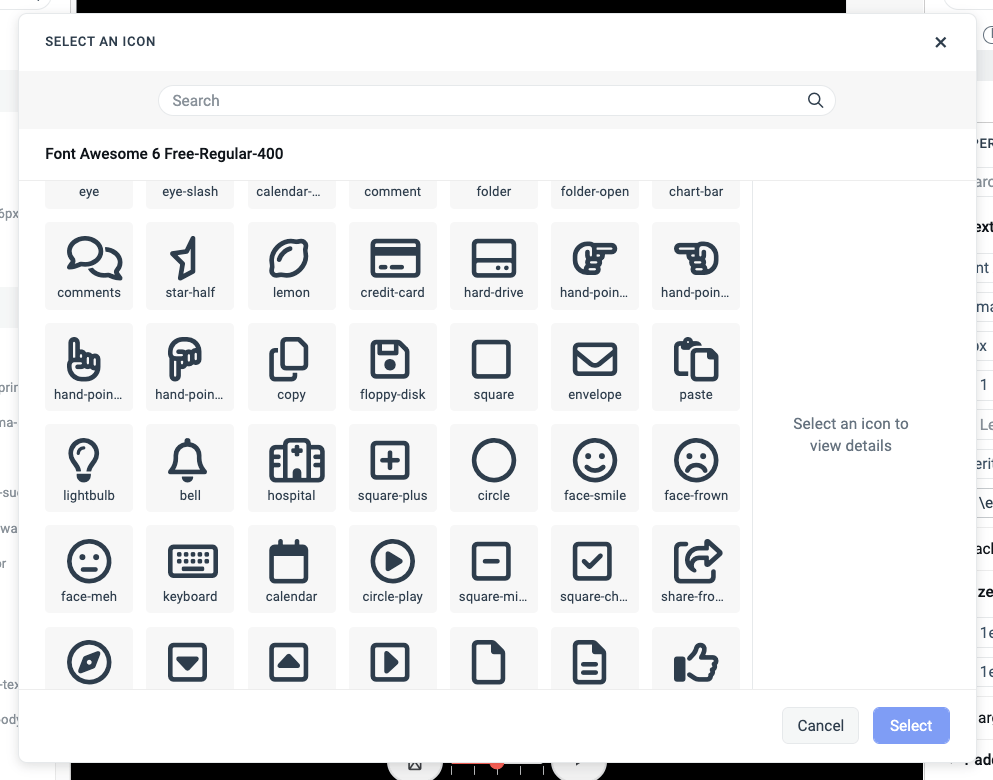
Click the gear icon in the bottom right of the Text panel to open the icon selection menu.
Choose a new icon from the icon selection panel.
Make any necessary text size or spacing adjustments.
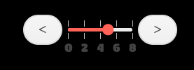
And just like that, you can apply your own custom icon set to change the look and feel of your components in ThemeBuilder. Here’s a before and after, showing the default Slider icons and the updated ones using the Font Awesome library.
As you can see, it only takes a couple minutes to get custom fonts and icons loaded into the ThemeBuilder and ready to use in your project! Try it yourself with our free 7-day trial, and check out our docs for more ways the ThemeBuilder can make styling your component library fast and easy!

Kathryn Grayson Nanz
Kathryn Grayson Nanz is a developer advocate at Progress with a passion for React, UI and design and sharing with the community. She started her career as a graphic designer and was told by her Creative Director to never let anyone find out she could code because she’d be stuck doing it forever. She ignored his warning and has never been happier. You can find her writing, blogging, streaming and tweeting about React, design, UI and more. You can find her at @kathryngrayson on Twitter.
Related Posts
Comments
All articles
Topics
Web MobileMobile
Desktop
Design
Productivity
People
