A Developer’s Guide to Implementing a Design System (Part 1)

Summarize with AI:
You know how a design system can benefit your team from a design perspective. But what does it look like for a developer to implement a design system? Let’s take a look!
So, your team has decided to implement a design system. Cool! You’ve heard the long list of benefits, the design team has sold you on how great it’s gonna be, and you’ve totally bought in. You sit down at your keyboard, ready to make things happen, but that’s when you pause … nobody has discussed how this design system will actually get implemented. You’ve seen the Figma kits, the style guide and the written documentation—it all looks great, but it’s not code.
For a design system to truly function, it needs to be an inherent part of the codebase. Making a design system easy to use is an integral part of adoption—it needs to function as a natural extension of the existing workflow. With tools like Figma, design system tokens, components, icons and more can all be built right into the flow of a designer’s primary workspace … but what does that look like for a developer? Let’s break it down.
Laying the Groundwork
Global CSS
One of the primary benefits of a design system is the way in which it can improve the cohesiveness of our user interfaces. When everything is styled the same way, it becomes easier for users to find their way around our website or application and more accurately anticipate how elements of the UI will behave.
This makes our interfaces intuitive and reduces the friction of new user onboarding and introducing new features. Not to mention, it speeds up the design and development process as well—when we can lean on a library of existing patterns and don’t have to re-invent the wheel every time we add something new, we can move a hell of a lot faster.
The heart of our design system implementation in the codebase is our global CSS file. This file will include all the basic styles required to build our components, so we can simply import it and call on our library of classes, variables, etc. when styling a page.
Any styles specific to the page, component or other element should go in a scoped CSS file that only applies to that specific part of the application. However, if we do our jobs right, those files should be fairly minimal—the vast majority of our styles will be pulled from our global CSS and reused across the entire application.
Choosing a CSS Pre-Processor or Framework
For many teams, the use of a CSS extension of some kind can help lighten the load when implementing a design system. While it is possible to use vanilla CSS (especially now that it includes math functions and custom properties/variables), there are several libraries that can still provide several useful benefits when it comes to reusing and remixing styles, doing advanced or complex computations, etc.
In general, the best option is the one the team is most familiar with and/or excited about. Adoption is one of the largest hurdles to clear when starting a design system, so anything we can do to make it easier is a step well worth taking. If the team has already been using Sass, stick with Sass! If Tailwind is your jam, go for it!
The only thing we’ll want to avoid are CSS frameworks that are tightly coupled with other design systems. For example, Bootstrap is an incredibly popular option, but it’s also very opinionated from a design perspective. Similarly, MUI is a well-known library, but it’s strictly tied to Google’s Material Design system.
If design is using one of these existing systems as a jumping-off point for their own design system (which is a completely valid thing to do—and a great way to speed up the process), then using the associated framework makes all the sense in the world. However, if they’re not, then using a framework or library tied to a different design system will only create challenges down the road.
Personally, my preference is Sass: I find that the mixins, partials and operators are hugely useful when it comes to creating reusable snippets of code for a design system. And, since it’s “just” a pre-processor and not a framework, it’s not opinionated in a design sense and there aren’t any default values (colors, spacing values, etc.) that will need to be overwritten.
Design Tokens
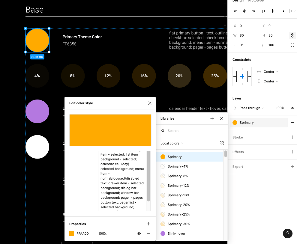
The smallest pieces of a design system are the design tokens—colors, fonts, measurements and other reusable aspects that get repeatedly applied to various components. For example, we generally want the border radius to be the same across different elements. When the border radius on a button is the same as the border radius on an input, it makes the design look cohesive and intentional.
In that situation, manually defining the same border radius value in our CSS over and over again on various elements would be frustrating, time-consuming and difficult to maintain (if that value ever changed in the future). It’s only natural for us to make it a reusable variable!
Design tokens work in exactly the same way. When we get a list of design tokens as part of a design system, one of the easiest and most useful things we can do is immediately turn those tokens into variables in our global CSS file.
$primary: #FFAA00

That being said, there’s more to it than just “make some variables.” When we’re defining those variables, it’s also important for us to keep naming, hierarchy and future expansion of the design system in mind.
Hierarchy and Future Growth
As the joke goes: the two hardest things in programming are cache invalidation, naming and off-by-one errors.
As we’re naming and defining the list of variables based on the design tokens, it’s important to keep in mind that design systems (especially in their early days) are not a finished project. Changes and new additions should be an expected part of the design system experience. As the brand, product line or software expands, the design system will need to expand along with it. For that reason, we need to leave room for growth in our coding of the design system as well.
For example, the list of design tokens we get from the design team might currently include three standard padding sizes: 6px, 10px and 14px. The “t-shirt
sizing” naming convention is pretty easy to understand, so we decide to name those variables “padding-small,” “padding-med” and “padding-large.” Three months later, the design team sends a message to let us
know they’ve determined the need for an additional padding value—8px. Because of the way we named the variables earlier, there’s no easy way for us to fit this new variable into our existing structure.
In general, it’s a good idea to define variables based explicitly on what they are or what they do, not their relationship to other variables. Nate Baldwin wrote a fantastic breakdown on how Intuit created a flexible design token taxonomy for Intuit’s design system that’s well worth a read and does a fantastic job explaining how they approached the same problems.
Flexible Units
When it comes to actually defining the variables, there might need to be some slight adaptations made between what design sends over and what gets written into the CSS.
Many design programs still function on a basis of pixels. While that makes sense for prototyping and designing, we’ll want to ensure that we’re using more responsive and flexible units when we define the variables on our end. By converting
hard values to ems, rems, percentages and other flexible units, we can create fluid systems that not only work well on screens of all sizes, but also can be chained together to
make updates and maintenance easier.
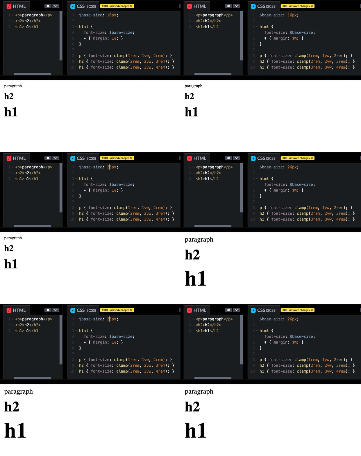
For example, if we were to use rems for the entirety of our typography system, we can build a system where all our units are scaled relatively to the base value. We’ll set that base value at whatever design determines, then convert the rest to rems. In the future, if the design team ever needs to make an adjustment to the typography system, we can then simply adjust the base value and the rest will scale accordingly.
$base-size: 26px;

html { font-size: $base-size; }

p { font-size: clamp(1rem, 1vw, 2rem); }
h2 { font-size: clamp(2rem, 2vw, 3rem); }
h1 { font-size: clamp(3rem, 3vw, 4rem); }

Synchronizing Names
Finally, it’s important to make sure that our variable names match the design token names as closely as possible, in order to ease communication between design and development. If we’ve defined a color as “primary” and the design team refers the same color as “main,” wires will inevitably get crossed—and this only increases in complexity as our list of variables/design tokens grows longer. Every name that we synchronize lowers our chances of miscommunication.
If we’re taking advantage of a component library with an associated Figma kit (more on that in the next section), then that should already be done for us! If we’re building from scratch, however, then it’s well worth keeping in mind.
Icons
Icons are one of those “small” things that can fall through the cracks when we’re thinking about putting together a design system. While they might not be quite as foundational as our design tokens, they’re still something that we’ll need almost as soon as we start building or styling components.
Of course, we have many different ways of solving this problem. Some of the most common include pre-existing third-party icon libraries (such as Font Awesome), icons bundled into a third-party component library (like the Kendo UI icons), or a completely custom set of icons designed and maintained by your design team. Obviously, going 100% custom will require more work (on both the design and dev side), but might be worth it to achieve a truly unique look—or if the UI will require icons for uncommon symbols or concepts.
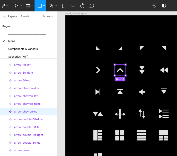
My recommendation is (as always) to use whatever is most frictionless for your team—both developers and designers. For example, if you’re using a third-party component library (such as Kendo UI), then it’s smart for developers to use their icons for everything, in order to create a cohesive look and allow the components to blend seamlessly with the rest of the UI. That also benefits the designers, who have easy access to the exact same icon set for mockups and prototyping via the Figma Kits.
<SvgIcon icon={arrow-chevron-up} size="medium" />

Implementing icons generally takes one of two forms: a custom icon font or a library of SVGs. While icon sprite sheets are still an option (and some folks feel very positively about them), they’re becoming less and less common—I wouldn’t recommend going this route, simply because it’s a method less people are likely be familiar with and will therefore require more explanation and management.
Icon fonts are fonts which contain vector glyphs instead of letters and numbers. They can be styled with CSS the same way we style text. SVG icons, on the other hand, are more lightweight, load faster and are resolution-independent. Perhaps more importantly, SVG icons are (in my opinion) easier to maintain because the entire font file doesn’t need to be updated in order to replace or adjust a single icon. SVGs also offer more flexibility for UI animation, if that’s of interest. For those reasons, I recommend going with SVGs over an icon font.
Beyond the Basics
But that’s not all, of course! In the next section, we’ll discuss what happens when we start to put those design tokens and icons to work in order to create accessible components, patterns and templates!

Kathryn Grayson Nanz
Kathryn Grayson Nanz is a developer advocate at Progress with a passion for React, UI and design and sharing with the community. She started her career as a graphic designer and was told by her Creative Director to never let anyone find out she could code because she’d be stuck doing it forever. She ignored his warning and has never been happier. You can find her writing, blogging, streaming and tweeting about React, design, UI and more. You can find her at @kathryngrayson on Twitter.

