Simplifying User Choices with .NET MAUI ToggleButton

Summarize with AI:
Learn how to use the Telerik UI for .NET MAUI ToggleButton to add clear and simple toggle states in your .NET MAUI app.
In this post, I’m going to tell you what you need to know to work with the recently launched Progress Telerik UI for .NET MAUI ToggleButton control in your .NET MAUI applications. This control will allow your users to select between toggled or untoggled states in a very simple visual way. Let’s get to know it!
Setting Up the initial project
To use the .NET MAUI ToggleButton control in your applications, you can follow the installation guide in the Telerik documentation. In my case, as I’ve opted for the NuGet package installation option, I’m going to add them to the project and execute the UseTelerik method in MauiProgram.cs, as seen below:
public static class MauiProgram
{
    public static MauiApp CreateMauiApp()
    {
        var builder = MauiApp.CreateBuilder();
        builder
            .UseTelerik()
            ...
    }
}
To make this example more entertaining, I’ve created a sample page interacting with the Unsplash service, where you can register as a developer in just a few minutes. The code for the MainPage.xaml looks like this:
<Grid BackgroundColor="#373740">
    <Grid.RowDefinitions>
        <RowDefinition Height=".7*" />
        <RowDefinition Height=".15*" />
        <RowDefinition Height=".15*" />
    </Grid.RowDefinitions>
    <Frame Margin="15" CornerRadius="15">
        <Grid>
            <Grid.RowDefinitions>
                <RowDefinition Height=".8*" />
                <RowDefinition Height=".2*" />
            </Grid.RowDefinitions>
            <Image
                x:Name="PhotoImage"
                Grid.RowSpan="2"
                Aspect="AspectFit" />
            <Grid
                Grid.Row="1"
                BackgroundColor="Black"
                Opacity=".7">
                <Label
                    x:Name="PhotoDescription"
                    Margin="10"
                    TextColor="White" />
            </Grid>
        </Grid>

    </Frame>
    <VerticalStackLayout Grid.Row="1" Margin="15">
        <Label
            FontAttributes="Bold"
            FontSize="15"
            Text="Image Options"
            TextColor="White" />
        <HorizontalStackLayout Margin="0,15,0,0" Spacing="25">
            <!--  ToDo Options  -->
        </HorizontalStackLayout>
    </VerticalStackLayout>
    <Button
        Grid.Row="2"
        Margin="15"
        Clicked="Button_Clicked"
        Text="Get Cool Image" />
</Grid>
To interact with the Unsplash service, fortunately, there’s a NuGet package we can install that contains all the necessary functionality to make calls to the service. You can search for it as UnsplashSharp by Thomas Sebastian Jensen.
Once you’ve installed the NuGet package, you should add the following code to the MainPage.xaml.cs file:
public partial class MainPage : ContentPage
{
    public Photo Photo { get; set; }
    public MainPage()
    {
        InitializeComponent();
    }

    protected override async void OnAppearing()
    {
        await GeneratePhotoAsync("nature");
    }

    public async Task GeneratePhotoAsync(params string[] searchTerms)
    {
        string terms = string.Empty;
        if (searchTerms != null)
        {
            foreach (var term in searchTerms)
            {
                terms += term;
                terms += ",";
            }
            terms = terms.Substring(0, terms.Length - 1);
        }

        var client = new UnsplashSharp.UnsplashService("Your Unsplash Access Key");

        var photos = await client.GetRandomPhotosAsync(1);
        Photo = photos[0];
        PhotoImage.Source = ImageSource.FromUri(new Uri(Photo.Urls.Regular));
        PhotoDescription.Text = Photo.Description;
    }

    private async void Button_Clicked(object sender, EventArgs e)
    {
        await GeneratePhotoAsync("nature");
    }
}
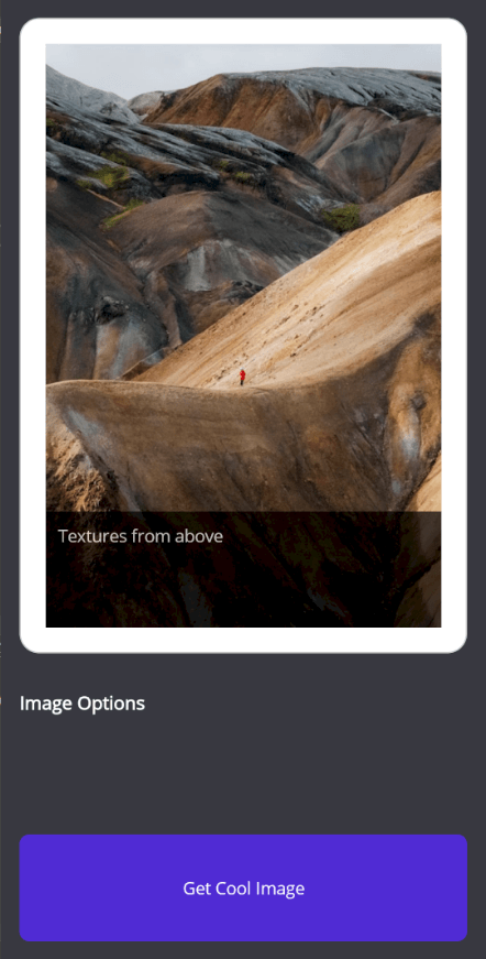
I’ve simplified the code as much as possible to keep it simple, but you can add your own ViewModels if you decide to expand the exercise. When you start the project with the above changes, you’ll see a nice page that allows you to get nature photographs by pressing the button:

As you can see, I’ve left a space to place some options that will determine the type of photographs to query, an excellent use case for using a ToggleButton.
Adding the ToggleButton Control to the Project
To use the ToggleButton control in your application, you need to add the following namespace to the XAML page:
<ContentPage ...
    xmlns:telerik="http://schemas.telerik.com/2022/xaml/maui">
Let’s say that, as part of the application, we want to give the user the first option to get only square photos. As a second option, we want the user to be able to decide whether to disable the content filter, which by default will be enabled.
To achieve this, we’ll create a pair of ToggleButtons in their simplest form:
<HorizontalStackLayout Margin="0,15,0,0" Spacing="25">
    <telerik:RadToggleButton
        x:Name="squareOnlyOption"
        Content="Square photos"
        HeightRequest="50"
        WidthRequest="100" />
    <telerik:RadToggleButton
        x:Name="safeContentOption"
        Content="Safe content"
        HeightRequest="50"
        VerticalOptions="Center"
        WidthRequest="100" IsToggled="True"/>
</HorizontalStackLayout>
In the code above, you can see that we’ve created a RadToggleButton control, assigning a text string as content. Similarly, in the second ToggleButton, we’ve indicated that the value of the IsToggled property is true, which causes the following rendering:

You can press each of the above ToggleButtons, which will cause them to be selected and deselected, showing their state.
Customizing a ToggleButton
Surely when you use the ToggleButton control, you’ll want to customize its properties to change the background color, text color, among other values. There are several properties that will allow you to achieve this goal:
- Background and BackgroundColor: To change the background color
- BorderBrush and BorderColor: To change the border color
- BorderThickness: To change the thickness of the border line
- CornerRadius: To specify the rounding of the border corners
- Padding: To add padding to the control
If the content is a text string as in the example from the previous section, you can apply the following properties:
- TextColor: To change the text color when the content is a string
- HorizontalTextAlignment: To specify horizontal alignment
- VerticalTextAlignment: To specify vertical alignment
- FontFamily: To assign a font family
- FontSize: To change the font size
- FontAttributes: To change font attributes
Let’s modify some properties in the ToggleButtons of our example as follows:
<VerticalStackLayout Grid.Row="1" Margin="15">
    <Label
        FontAttributes="Bold"
        FontSize="15"
        Text="Image Options"
        TextColor="White" />
    <HorizontalStackLayout Margin="0,15,0,0" Spacing="25">
        <telerik:RadToggleButton
            x:Name="squareOnlyOption"
            BorderBrush="White"
            BorderThickness="3"
            Content="Square photos"
            CornerRadius="50"
            HeightRequest="50"
            TextColor="White"
            WidthRequest="150">
            <telerik:RadToggleButton.Background>
                <LinearGradientBrush>
                    <GradientStopCollection>
                        <GradientStop Offset="0" Color="#EB5E4B" />
                        <GradientStop Offset="0.5" Color="#C02E98" />
                        <GradientStop Offset="1" Color="#9919D0" />
                    </GradientStopCollection>
                </LinearGradientBrush>
            </telerik:RadToggleButton.Background>
        </telerik:RadToggleButton>
        <telerik:RadToggleButton
            x:Name="safeContentOption"
            BorderBrush="White"
            BorderThickness="3"
            Content="Safe content"
            CornerRadius="50"
            HeightRequest="50"
            IsToggled="True"
            TextColor="White"
            WidthRequest="150">
            <telerik:RadToggleButton.Background>
                <LinearGradientBrush>
                    <GradientStopCollection>
                        <GradientStop Offset="0" Color="#EB5E4B" />
                        <GradientStop Offset="0.5" Color="#C02E98" />
                        <GradientStop Offset="1" Color="#9919D0" />
                    </GradientStopCollection>
                </LinearGradientBrush>
            </telerik:RadToggleButton.Background>
        </telerik:RadToggleButton>
    </HorizontalStackLayout>
</VerticalStackLayout>
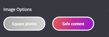
With this, we get the following result:

From the above example, you can notice two things: first, that by modifying some properties you can achieve surprising results, and secondly, that although similar properties have been applied to the second ToggleButton, it seems that the background has not changed. This happens because the properties affect the Normal state of the control—that is, an untoggled state.
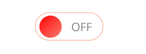
Another way to customize a ToggleButton is by modifying the ContentTemplate property to assign different templates according to the toggled state. An example of this is to apply an on/off switch styling to the control, as in the following example:
<telerik:RadToggleButton
    x:Name="squareOnlyOption"
    Padding="0"
    Background="Transparent"
    Content="Square photos"
    HeightRequest="50"
    WidthRequest="120">
    <telerik:RadToggleButton.ContentTemplate>
        <DataTemplate>
            <Border StrokeShape="RoundRectangle 25" Stroke="LightSalmon">
                <Grid
                    Padding="10,0,0,0"
                    Background="White"
                    ColumnDefinitions=".3*,.7*">
                    <Ellipse HeightRequest="40" WidthRequest="40">
                        <Ellipse.Fill>
                            <LinearGradientBrush>
                                <GradientStopCollection>
                                    <GradientStop Offset="0" Color="Red" />
                                    <GradientStop Offset="1" Color="Salmon" />
                                </GradientStopCollection>
                            </LinearGradientBrush>
                        </Ellipse.Fill>
                    </Ellipse>
                    <Label
                        Grid.Column="1"
                        FontSize="20"
                        HorizontalOptions="Center"
                        Text="OFF"
                        TextColor="Gray"
                        VerticalOptions="Center" />
                    <Grid.Shadow>
                        <Shadow
                            Brush="Black"
                            Opacity="0.8"
                            Radius="40"
                            Offset="20,20" />
                    </Grid.Shadow>
                </Grid>
            </Border>
        </DataTemplate>
    </telerik:RadToggleButton.ContentTemplate>
</telerik:RadToggleButton>
The code above allows us to apply a custom design to the control as seen in the following image:

Now, let’s examine how to change the property values of a ToggleButton through Visual States.
Modifying the Visual States of a ToggleButton
In an example from the previous section, you’ve seen that the gradient background has been applied to the ToggleButton when its state is selected. Ideally, we would apply the gradient color when the control is selected, and a more grayish control when it’s deselected.
To achieve this goal, we’ll use Visual States. You can find all the available visual states in a ToggleButton in the official documentation.
In our example, we’re going to add a resource dictionary at the page level to modify the style of the controls from a single place, indicating that we want to apply a different Background depending on the Normal and Toggled states as follows:
<ContentPage ...>

<ContentPage.Resources>
    <LinearGradientBrush x:Key="ToggledStateGradient">
        <GradientStopCollection>
            <GradientStop Offset="0" Color="#EB5E4B" />
            <GradientStop Offset="0.5" Color="#C02E98" />
            <GradientStop Offset="1" Color="#9919D0" />
        </GradientStopCollection>
    </LinearGradientBrush>
    <LinearGradientBrush x:Key="UnToggledStateGradient">
        <GradientStopCollection>
            <GradientStop Offset="0" Color="#A9A9A9" />
            <GradientStop Offset="0.5" Color="#BEBEBE" />
            <GradientStop Offset="1" Color="#D3D3D3" />
        </GradientStopCollection>
    </LinearGradientBrush>

    <Style TargetType="telerik:RadToggleButton">
        <Setter Property="FontAttributes" Value="Bold" />
        <Setter Property="TextColor" Value="White" />
        <Setter Property="BorderBrush" Value="White" />
        <Setter Property="BorderThickness" Value="3" />
        <Setter Property="CornerRadius" Value="50" />
        <Setter Property="HeightRequest" Value="50" />
        <Setter Property="WidthRequest" Value="150" />
        <Setter Property="VisualStateManager.VisualStateGroups">
            <VisualStateGroupList>
                <VisualStateGroup Name="CommonStates">
                    <VisualState Name="Normal">
                        <VisualState.Setters>
                            <Setter Property="Background" Value="{StaticResource UnToggledStateGradient}" />
                        </VisualState.Setters>
                    </VisualState>
                    <VisualState Name="Toggled">
                        <VisualState.Setters>
                            <Setter Property="Background" Value="{StaticResource ToggledStateGradient}" />
                        </VisualState.Setters>
                    </VisualState>
                </VisualStateGroup>
            </VisualStateGroupList>
        </Setter>
    </Style>
</ContentPage.Resources>
...
    <HorizontalStackLayout Margin="0,15,0,0" Spacing="25">
        <telerik:RadToggleButton x:Name="squareOnlyOption" Content="Square photos" />
        <telerik:RadToggleButton x:Name="safeContentOption" Content="Safe content"  IsToggled="True"/>
    </HorizontalStackLayout>
...
</ContentPage>
With this, we achieve the goal of showing the user in an easy and quick way the state of each ToggleButton:

You can find a list of all the Visual States that can be overridden in the official documentation.
States of the ToggleButton
In the previous exercises, you’ve learned how to modify the visual appearance of the elements, and you’ve even seen how to assign an active state to a ToggleButton through the IsToggled property, which, by the way, is a Bindable Property (meaning we can bind through Bindings).
The IsToggled property is the one that will allow you to know if a ToggleButton control is active or not, with the purpose of using its value to perform operations based on that state.
For example, in our case, we’re going to modify the GeneratePhotoAsync method to determine if the ToggleButtons are active or not, and invoke the API with the respective values as follows:
public async Task GeneratePhotoAsync(params string[] searchTerms)
{
    var squarePhotos = squareOnlyOption.IsToggled == true;
    var safeContent = (bool)safeContentOption.IsToggled;

    string terms = string.Empty;
    if (searchTerms != null)
    {
        foreach (var term in searchTerms)
        {
            terms += term;
            terms += ",";
        }
        terms = terms.Substring(0, terms.Length - 1);
    }

    var client = new UnsplashSharp.UnsplashService("Your Unsplash Access Key");

    var orientation = squarePhotos ? UnsplashSharp.Models.Enums.Orientation.Squarish : (UnsplashSharp.Models.Enums.Orientation.All);
    var contentFilter = safeContent ? UnsplashSharp.Models.Enums.ContentFilter.Low : (UnsplashSharp.Models.Enums.ContentFilter.High);

    var photos = await client.GetRandomPhotosAsync(1, orientation: orientation, contentFilter: contentFilter);

    Photo = photos[0];
    PhotoImage.Source = ImageSource.FromUri(new Uri(Photo.Urls.Regular));
    PhotoDescription.Text = Photo.Description;
}
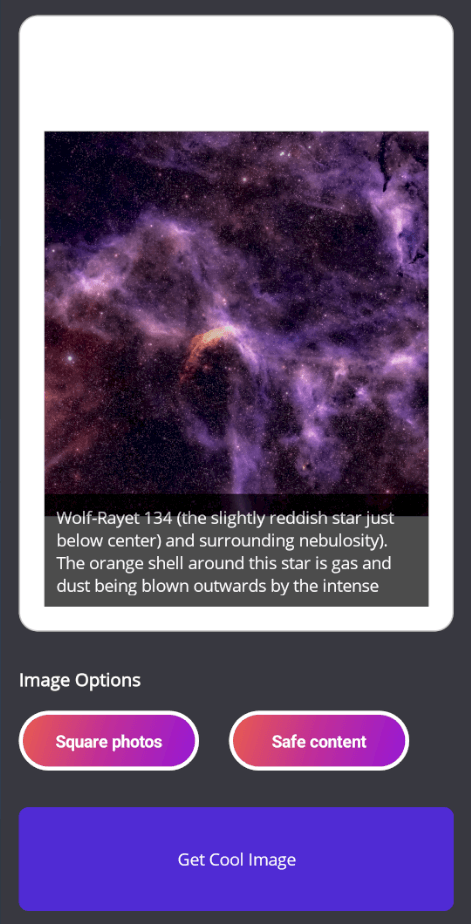
With the above modification, we can apply the filter to get square images as seen below:

In the code above, you’ve seen that we need to perform a conversion of the IsToggled value property as follows:
var squarePhotos = squareOnlyOption.IsToggled == true;
This is because the ToggleButton control can also have an indeterminate or null state in its IsToggled property. To activate this feature and allow the user to select an indeterminate state, we need to modify the IsThreeState property as follows:
<telerik:RadToggleButton
    x:Name="squareOnlyOption"
    Padding="0"
    Background="Transparent"
    Content="Square photos"
    HeightRequest="50"
    WidthRequest="120" IsThreeState="True">
Events and Commands of a ToggleButton
Another useful thing to know about the ToggleButton control is that it has the events IsToggledChanged, Clicked, Pressed and Released.
The IsToggledChanged event is fired when a change occurs in the IsToggled property. The Pressed event fires when the button is pressed, and Released fires as soon as the control is no longer being pressed. Finally, the Clicked event is triggered between the Pressed and Released events, as long as the pointer-up is within the control’s bounds.
To use them, we can do it in the following way in the XAML code:
<telerik:RadToggleButton
    x:Name="squareOnlyOption"
    Clicked="squareOnlyOption_Clicked"
    Content="Square photos"
    IsToggledChanged="squareOnlyOption_IsToggledChanged"
    Pressed="squareOnlyOption_Pressed"
    Released="squareOnlyOption_Released" />
In the code behind, we’ll have something like this:
private void squareOnlyOption_IsToggledChanged(object sender, Telerik.Maui.Controls.ValueChangedEventArgs<bool?> e)
{
    DisplayAlert("Toggled", "Square Only Option Toggled", "OK");
}

private void squareOnlyOption_Clicked(object sender, EventArgs e)
{
    DisplayAlert("Clicked", "Square Only Option Clicked", "OK");
}

private void squareOnlyOption_Pressed(object sender, EventArgs e)
{
    DisplayAlert("Pressed", "Square Only Option Pressed", "OK");
}

private void squareOnlyOption_Released(object sender, EventArgs e)
{
    DisplayAlert("Released", "Square Only Option Released", "OK");
}
Lastly, we also have the Command and CommandParameter properties in case we’re working with ViewModels.
Conclusion
In this article, you’ve learned how to use and customize the Telerik .NET MAUI ToggleButton control, to allow users to easily select and deselect options in your applications. Now that you have this knowledge, create unforgettable experiences in your apps for your users!

Héctor Pérez
Héctor Pérez is a Microsoft MVP with more than 10 years of experience in software development. He is an independent consultant, working with business and government clients to achieve their goals. Additionally, he is an author of books and an instructor at El Camino Dev and Devs School.

