How to Integrate Search-as-You-Type into Your .NET MAUI DataGrid

Summarize with AI:
Your .NET MAUI DataGrid can show real-time data, allow users to search with predictive text and use custom styles.
In this post, you’ll learn how to create a .NET MAUI application that connects to a real-time cryptocurrency information service, displaying the information in a Progress Telerik UI for .NET MAUI DataGrid control. You’ll also see how to customize the DataGrid to match your app’s colors, as well as how to use the Search as You Type functionality, allowing you to filter and highlight results as you type a text search. Let’s get started!
Setting Up the Initial Project
To begin our journey, let’s first install the NuGet packages we’ll use in our application, which are:
- Telerik.UI.for.Maui (you can follow the installation guide)
- CommunityToolkit.Mvvm
To use Telerik controls, it’s essential that you go to the MauiProgram.cs file and add the UseTelerik method to the builder, as shown below:
public static class MauiProgram
{
    public static MauiApp CreateMauiApp()
    {
        var builder = MauiApp.CreateBuilder();
        builder
            .UseMauiApp<App>()
            .UseTelerik()
            ...
    }
}
Next, create a class which we’ll call AssetsViewModel.cs and modify it to work with the Mvvm toolkit as follows:
public partial class AssetsViewModel : ObservableObject
{
}
We’ll be using the default MainPage.xaml file to simplify the process.
Creating Models for Consuming the Cryptocurrency Service
I love the idea of being able to experiment with real data, so I set out to find services that provide real-time information on cryptocurrency values. Fortunately, I found a service called CoinCap 2.0 that you can even try without registering, although it has a limit of 200 requests per minute (understanding a request as a record of a cryptocurrency).
The response of the request, if correct, has the following JSON structure:
{
    "data": [
        {
            "id": "bitcoin",
            "rank": "1",
            "symbol": "BTC",
            "name": "Bitcoin",
            "supply": "19747765.0000000000000000",
            "maxSupply": "21000000.0000000000000000",
            "marketCapUsd": "1165808360698.0693477874721805",
            "volumeUsd24Hr": "6473222897.4938131572636034",
            "priceUsd": "59034.9520919491065337",
            "changePercent24Hr": "-0.3843334475518520",
            "vwap24Hr": "59174.4649788736905926",
            "explorer": "https://blockchain.info/"
        }
    ],
    "timestamp": 1725147060308
}
By copying the above JSON code and using the functionality within VS 2022 located in Edit | Paste Special | Paste JSON As Classes, we’ll get a model like the following:
public class Assets
{
    public Datum[] data { get; set; }
    public long timestamp { get; set; }
}

public class Datum
{
    public string id { get; set; }
    public string rank { get; set; }
    public string symbol { get; set; }
    public string name { get; set; }
    public string supply { get; set; }
    public string maxSupply { get; set; }
    public string marketCapUsd { get; set; }
    public string volumeUsd24Hr { get; set; }
    public string priceUsd { get; set; }
    public string changePercent24Hr { get; set; }
    public string vwap24Hr { get; set; }
}
You can generate this model in a new class called Assets. Next, let’s create a second model called AssetModel which will be the one we’ll use in the graphical interface. The purpose of AssetModel is to be able to store the data with an applied format, which looks like this:
public class AssetModel
{
    public string Name { get; set; }
    public decimal Price { get; set; }
    public double _24hrs { get; set; }
    public string Symbol { get; set; }
}
With our pair of models ready, let’s continue with the creation of the View Model.
Creating the ViewModel That Will Obtain Cryptocurrency Information
Once we have the data model, it’s time to add functionality to the AssetsViewModel class, which will look like this:
public partial class AssetsViewModel : ObservableObject
{
    private readonly HttpClient _httpClient;
    [ObservableProperty]
    private ObservableCollection<AssetModel> assets;

    public AssetsViewModel()
    {
        _httpClient = new HttpClient();
    }

    public async Task LoadAssetsAsync()
    {
        var response = await _httpClient.GetStringAsync("https://api.coincap.io/v2/assets");
        var assetsResponse = JsonSerializer.Deserialize<Assets>(response);
        var data = assetsResponse.data.Select(item => new AssetModel
        {
            Name = item.name,
            Price = decimal.Parse(item.priceUsd),
            _24hrs = Math.Round(double.Parse(item.changePercent24Hr), 4),
            Symbol = item.symbol
        });
        Assets = new ObservableCollection<AssetModel>(data);
    }
}
From the above code, you can see the following features:
- An instance of
HttpClientis created and initialized in the constructor. This instance will be used to communicate with the service endpoint to obtain the data. - A property of type
ObservableCollectionwith a genericAssetModelis created, which we’ll bind to the graphical interface. - The
LoadAssetsAsyncmethod is specified, which will execute the request to the service. Within it, the endpoint that returns the list of binary coins is queried, which is deserialized to anAssetstype. - The deserialized list is converted to a new list of type
AssetModel, to obtain only the properties we’re interested in, applying data formatting operations.
Creating and Binding the .NET MAUI DataGrid Control
Now that we have the models and View Model ready, it’s time to create the graphical interface of the application, using the .NET MAUI DataGrid control from Telerik. This implementation is very simple, as all we need to do is add the namespace to the Telerik controls and add the reference to the DataGrid as follows:
<ContentPage
    ...
    xmlns:telerik="http://schemas.telerik.com/2022/xaml/maui">

    <telerik:RadDataGrid x:Name="dataGrid" ItemsSource="{Binding Assets}" />
    ...
</ContentPage>
On the other hand, in the MainPage.xaml.cs file, we need to remove the references to the default controls and initialize the BindingContext with a reference to AssetsViewModel. Also, we must override the OnAppearing method to invoke the LoadAssetsAsync method when the screen is displayed, as follows:
public partial class MainPage : ContentPage
{
    AssetsViewModel ViewModel;
    public MainPage()
    {
        InitializeComponent();
        ViewModel = new AssetsViewModel();
        BindingContext = ViewModel;
    }

    protected override async void OnAppearing()
    {
        await ViewModel.LoadAssetsAsync();
    }
}
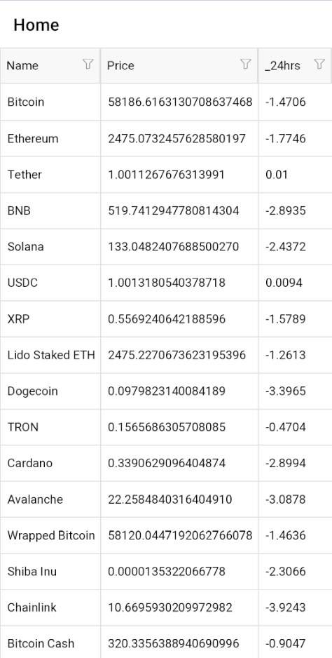
With these changes, when running the application we’ll already have a nice control that will display the real data coming from the service:
Performing a Synchronization to the Service at a Certain Time
In case you want to update the information on the application page, you need to create a timer and execute it every certain time. In our case, we can do it from the code behind in the OnAppearing method:
public partial class AssetsPage : ContentPage
{
    ...
    IDispatcherTimer timer;
    protected override async void OnAppearing()
    {
        await ViewModel.LoadAssetsAsync();
        timer = Dispatcher.CreateTimer();
        timer.Interval = TimeSpan.FromMilliseconds(60000);
        timer.Tick += async (s, e) =>
        {
            await ViewModel.LoadAssetsAsync();
        };
        timer.Start();
    }
    protected override void OnDisappearing()
    {
        timer.Stop();
        timer.Tick -= async (s, e) =>
        {
            await ViewModel.LoadAssetsAsync();
        };
    }
}
In the above example, the timer will be executed every minute. This is related to the fact that the REST service updates the information every 60 seconds, so it wouldn’t make sense to update in a shorter amount of time, although you can surely find another service that updates the information more often.
Customizing the Telerik DataGrid Control
Maybe within the requirements of your application, you need to apply certain colors to the DataGrid control to make them more in line with the theme of the application. In these cases, we must indicate to the control that we don’t want the columns to be auto-generated:
<telerik:RadDataGrid
    x:Name="dataGrid"
    AutoGenerateColumns="False"
    ItemsSource="{Binding Assets}">
</telerik:RadDataGrid>
Next, we must define a tag for each column according to its data type, among which we have at our disposal the following types:
- DataGridTextColumn: For text columns
- DataGridNumericalColumn: For numerical columns
- DataGridBooleanColumn: For columns with boolean values
- DataGridDateColumn: For columns representing dates
- DataGridTimeColumn: For columns representing TimeSpans
- DataGridComboBoxColumn: Uses the ComboBox control to select a value from a list
- DataGridTemplateColumn: To define a custom cell with a DataTemplate
- DataGridToggleRowDetailsColumn: Represents a DataGridColumn and allows showing and hiding item details
In our case, because we don’t want to perform any operation on the displayed information, we’re going to use the DataGridTextColumn type, assigning the text in the header and the property of the model we want to bind:
    <telerik:RadDataGrid...>

        <telerik:RadDataGrid.Columns>
            <!--  Symbol Column  -->
            <telerik:DataGridTextColumn HeaderText="Symbol" PropertyName="Symbol" />
            <!--  Name Column  -->
            <telerik:DataGridTextColumn HeaderText="Name" PropertyName="Name" />
            <!--  Price Column  -->
            <telerik:DataGridTextColumn
                CellContentFormat="{}{0:C}"
                HeaderText="Price(USD)"
                PropertyName="Price" />
            <!--  24h Column  -->
            <telerik:DataGridTextColumn HeaderText="24h" PropertyName="_24hrs" />
        </telerik:RadDataGrid.Columns>

    </telerik:RadDataGrid>
The above code allows us to have more control over each property in the columns, being able to customize them as much as we want. You can also customize the style of the cell content and their headers, using the HeaderStyle and CellContentStyle properties:
        <telerik:RadDataGrid.Columns>
            <!--  Symbol Column  -->
            <telerik:DataGridTextColumn HeaderText="Symbol" PropertyName="Symbol">
                <!--  Symbol Header Style  -->
                <telerik:DataGridTextColumn.HeaderStyle>
                    <telerik:DataGridColumnHeaderStyle
                        BackgroundColor="#1F1F27"
                        BorderColor="#1A1A1A"
                        BorderThickness="0,0,0,1"
                        HorizontalTextAlignment="Center"
                        TextColor="#929CB4" />
                </telerik:DataGridTextColumn.HeaderStyle>
                <!--  Symbol CellContent Style  -->
                <telerik:DataGridTextColumn.CellContentStyle>
                    <telerik:DataGridTextCellStyle
                        FontSize="15"
                        HorizontalTextAlignment="Center"
                        SelectedTextColor="White"
                        TextColor="White" />
                </telerik:DataGridTextColumn.CellContentStyle>
            </telerik:DataGridTextColumn>
            <!--  Name Column  -->
            <telerik:DataGridTextColumn HeaderText="Name" PropertyName="Name">
                <!--  Column Header Style  -->
                <telerik:DataGridTextColumn.HeaderStyle>
                    <telerik:DataGridColumnHeaderStyle
                        BackgroundColor="#1F1F27"
                        BorderColor="#1A1A1A"
                        BorderThickness="0,0,0,1"
                        HorizontalTextAlignment="Center"
                        TextColor="#929CB4" />
                </telerik:DataGridTextColumn.HeaderStyle>
                <!--  Symbol CellContent Style  -->
                <telerik:DataGridTextColumn.CellContentStyle>
                    <telerik:DataGridTextCellStyle
                        FontSize="15"
                        HorizontalTextAlignment="Center"
                        SelectedTextColor="White"
                        TextColor="White" />
                </telerik:DataGridTextColumn.CellContentStyle>
            </telerik:DataGridTextColumn>
            <!--  Price Column  -->
            <telerik:DataGridTextColumn
                CellContentFormat="{}{0:C}"
                HeaderText="Price(USD)"
                PropertyName="Price">
                <!--  Column Price Style  -->
                <telerik:DataGridTextColumn.HeaderStyle>
                    <telerik:DataGridColumnHeaderStyle
                        BackgroundColor="#1F1F27"
                        BorderColor="#1A1A1A"
                        BorderThickness="0,0,0,1"
                        HorizontalTextAlignment="Center"
                        TextColor="#929CB4" />
                </telerik:DataGridTextColumn.HeaderStyle>
                <!--  Symbol CellContent Style  -->
                <telerik:DataGridTextColumn.CellContentStyle>
                    <telerik:DataGridTextCellStyle
                        FontSize="15"
                        HorizontalTextAlignment="Center"
                        SelectedTextColor="White"
                        TextColor="White" />
                </telerik:DataGridTextColumn.CellContentStyle>
            </telerik:DataGridTextColumn>
            <!--  24h Column  -->
            <telerik:DataGridTextColumn HeaderText="24h" PropertyName="_24hrs">
                <!--  Column 24h Style  -->
                <telerik:DataGridTextColumn.HeaderStyle>
                    <telerik:DataGridColumnHeaderStyle
                        BackgroundColor="#1F1F27"
                        BorderColor="#1A1A1A"
                        BorderThickness="0,0,0,1"
                        HorizontalTextAlignment="Center"
                        TextColor="#929CB4" />
                </telerik:DataGridTextColumn.HeaderStyle>
                <!--  Symbol CellContent Style  -->
                <telerik:DataGridTextColumn.CellContentStyle>
                    <telerik:DataGridTextCellStyle
                        FontSize="15"
                        HorizontalTextAlignment="Center"
                        SelectedTextColor="White"
                        TextColor="White" />
                </telerik:DataGridTextColumn.CellContentStyle>
            </telerik:DataGridTextColumn>
        </telerik:RadDataGrid.Columns>
    </telerik:RadDataGrid>
With this, we have modified the style of the headers and the content of the cells, which will look like this:
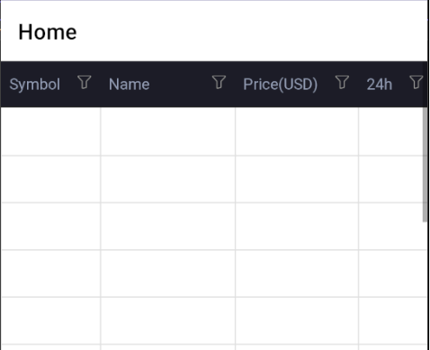
In the image above, you can see that it’s not possible to visualize the cryptocurrency information due to the default background color. To solve this problem and further customize the application, let’s modify the RowBackgroundStyle, AlternateRowBackgroundStyle and SelectionStyle properties as follows:
<telerik:RadDataGrid...>

    <telerik:RadDataGrid.Columns>
        ...
    </telerik:RadDataGrid.Columns>
    <telerik:RadDataGrid.RowBackgroundStyle>
        <telerik:DataGridBorderStyle BackgroundColor="#252526" />
    </telerik:RadDataGrid.RowBackgroundStyle>
    <telerik:RadDataGrid.AlternateRowBackgroundStyle>
        <telerik:DataGridBorderStyle BackgroundColor="#2E2E2F" />
    </telerik:RadDataGrid.AlternateRowBackgroundStyle>
    <telerik:RadDataGrid.SelectionStyle>
        <telerik:DataGridBorderStyle
            BackgroundColor="#3A3A3B"
            BorderColor="#4A4A4B"
            BorderThickness="{OnIdiom Default=0,
                                      Phone=1}" />
    </telerik:RadDataGrid.SelectionStyle>
</telerik:RadDataGrid>
With the above modifications, we can see the information correctly, and we’ve further customized the DataGrid design:

Now let’s see how to apply colors to the 24h column according to its value.
Implementing Custom Colors for Cryptocurrency Trend
If you’ve used any cryptocurrency or stock app, surely one piece of data you’re interested in knowing just by looking at it is the performance the cryptocurrency or stock has had. That’s why we’re going to color the data in the 24h column according to its trend.
To achieve this, we first need to create a class that inherits from the DataGridStyleSelector type, which looks like this:
class MyCellContentSelector : DataGridStyleSelector
{
    public DataGridStyle UpTemplate { get; set; }
    public DataGridStyle DownTemplate { get; set; }
    public override DataGridStyle SelectStyle(object item, BindableObject container)
    {
        DataGridCellInfo cellInfo = item as DataGridCellInfo;
        if (cellInfo != null)
        {
            var t = (cellInfo.Item as AssetModel)._24hrs;
            if ((cellInfo.Item as AssetModel)._24hrs > 0)
            {
                return UpTemplate;
            }
            else
            {
                return DownTemplate;
            }
        }
        return base.SelectStyle(item, container);
    }
}
From the above code, we see a pair of properties of type DataGridStyle which will allow us to know which Template to apply for the content of a cell. Next, in the SelectStyle method, the DataGrid cell is obtained and the value of the _24hrs property from the reference of the AssetModel bound to that cell.
Subsequently, it compares if the value is positive or negative and returns the corresponding template according to the evaluation.
The next step is to add the DataGridStyle styles. I’m going to do this in the resources section of the page where I’m using the DataGrid, as follows:
<ContentPage ...>

    <ContentPage.Resources>
        <local:MyCellContentSelector x:Key="MyCellContentStyleSelector">
            <local:MyCellContentSelector.UpTemplate>
                <telerik:DataGridTextCellStyle TextColor="#66BB6A" />
            </local:MyCellContentSelector.UpTemplate>
            <local:MyCellContentSelector.DownTemplate>
                <telerik:DataGridTextCellStyle TextColor="#D32F2F" />
            </local:MyCellContentSelector.DownTemplate>
        </local:MyCellContentSelector>
    </ContentPage.Resources>

    ...
</ContentPage>
In the code above, I’m defining a reference to the selector that I can use in the DataGrid controls and their different styles, which will be chosen according to the ContentSelector defined previously.
Finally, in the 24h column, let’s add the reference to the selector to the CellContentStyleSelector property:
 <telerik:DataGridTextColumn
     CellContentStyleSelector="{StaticResource MyCellContentStyleSelector}"
     HeaderText="24h"
     PropertyName="_24hrs">
     ...
 </telerik:DataGridTextColumn>
With the addition of the above code, we’ll be able to see that each value in the 24h column is colored according to its value, so the user will be able to immediately know the trend of the cryptocurrency:

Now let’s see how to add the Search-as-You-Type functionality to the DataGrid.
Adding Search-as-You-Type Functionality to the DataGrid
When working with many information records, being able to perform searches and filters through them is fundamental in our applications. The DataGrid control has the Search-as-You-Type functionality implemented natively, which we can activate through the SearchSettings property:
<telerik:RadDataGrid ...>

    <telerik:RadDataGrid.SearchSettings>
        <telerik:DataGridSearchSettings SearchPanelVisibilityMode="AlwaysVisible" />
    </telerik:RadDataGrid.SearchSettings>
With the above code, we’ll be able to see that a search bar is activated in the application that will filter the information as we type:
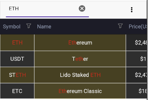
Some other properties may be of interest to us when implementing the search in the text box, such as the ApplyFilter property which specifies whether or not only the rows where there is a match with the query should be shown.
Another useful property is SearchTrigger, which contains the values Completed and TextChanged, and allows you to specify when the search should be executed. The first is to wait until we finish writing in the text box, while the second is to execute the query immediately after a change occurs in the search box.
The TextMatchMode property allows you to specify how the match should be made on the values, with the allowed values being Contains, StartsWith and WholeWord.
Searching for Multiple Values with the Search-as-You-Type Functionality
As part of the Search-as-You-Type functionality, it’s also possible to interact with the SearchStarting event that will be triggered before starting a search. This event can be useful for performing some type of preprocessing of the search information, with a practical case being when we want the user to be able to search for more than one term.
To use the event, we just need to subscribe to the SearchStarting event within DataGridSearchSettings as follows:
<telerik:RadDataGrid.SearchSettings>
    <telerik:DataGridSearchSettings
        ApplyFilter="True"
        SearchPanelVisibilityMode="AlwaysVisible"
        SearchStarting="DataGridSearchSettings_SearchStarting"
        SearchTrigger="TextChanged"
        TextMatchMode="Contains"/>
</telerik:RadDataGrid.SearchSettings>
In the code behind, we’re going to implement the event handler as follows:
 public partial class MainPage : ContentPage
 {
    ...
    private void DataGridSearchSettings_SearchStarting(object sender, Telerik.Maui.Controls.DataGrid.DataGridSearchStartingEventArgs e)
    {
        DataGridSearchSettings searchSettings = (DataGridSearchSettings)sender;
        string[] separators = {" ", "|", ","};
        List<string> split = searchSettings.SearchText?.Split(separators, System.StringSplitOptions.RemoveEmptyEntries).ToList();

        e.SearchTerms = split;
        e.SearchTermsLogicalOperator = LogicalOperator.Or;
    }
}
In the above code, the following actions are performed:
- The search configuration of the control is obtained.
- An array of separators is defined that we’ll use to identify different terms.
- Each term obtained from the text box is added to the search terms.
- An
Oroperator is used to indicate that we want to obtain any of the results obtained.
This will allow the user to obtain different results in a single query, using the separators specified in the code:
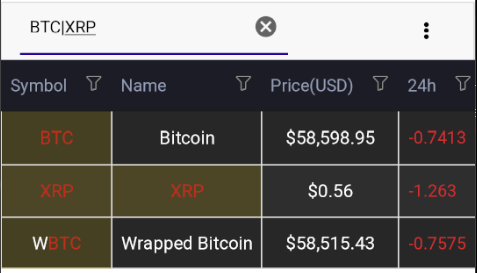
The above image shows the result of a search using the | separator.
Conclusion
Throughout this post, you’ve learned how to implement the Telerik DataGrid control from scratch, how to connect to a cryptocurrency information service to display real-time data, how to customize each element of the control to have a desired appearance, and how to enable the Search-as-You-Type functionality to filter search results. Happy coding!
Telerik UI for .NET MAUI comes with a free trial. Ready to give it a whirl?

Héctor Pérez
Héctor Pérez is a Microsoft MVP with more than 10 years of experience in software development. He is an independent consultant, working with business and government clients to achieve their goals. Additionally, he is an author of books and an instructor at El Camino Dev and Devs School.

