Exploring the Telerik .NET MAUI TemplatedButton

Summarize with AI:
The Telerik UI for .NET MAUI TemplatedButton gives you detailed control over the styling of your app’s buttons, including four states of control.
In this post, we’ll explore one of Progress Telerik’s newest buttons for .NET MAUI, the .NET MAUI TemplatedButton. This button allows us to customize a button as much as we want to fit perfectly with the design we want to implement. Let’s check it out!
Using the Most Basic Form of .NET MAUI TemplatedButton
To use the .NET MAUI TemplatedButton control, you must add the reference to the Telerik .NET MAUI controls NuGet package, as you can see in the documentation. Once the reference is added, you need to invoke the UseTelerik method within MauiProgram.cs:
public static class MauiProgram
{
    public static MauiApp CreateMauiApp()
    {
        var builder = MauiApp.CreateBuilder();
        builder
            .UseTelerik()
            ...
    }
}
Next, you should go to the page where you want to use TemplatedButton and add the corresponding namespace:
<ContentPage ...
             xmlns:telerik="http://schemas.telerik.com/2022/xaml/maui">
            ...
</ContentPage>
With the namespace ready, you can now use the TemplatedButton control, which in its most basic form is used like this:
    <VerticalStackLayout HorizontalOptions="Center">
        <telerik:RadTemplatedButton
            x:Name="templatedButton"
            Content="Demo App"
            HeightRequest="100"
            WidthRequest="250" />
    </VerticalStackLayout>
When you start the application with this code, you’ll see the control in its simplest form:
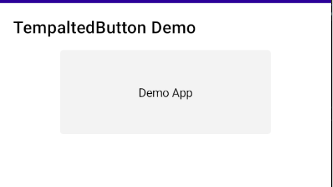
Maybe at this point you don’t see much difference compared to a standard .NET MAUI button, so let’s look at the different ways to manipulate the content of the TemplatedButton.
Default Customization Options for a TemplatedButton
The TemplatedButton control has several default customization options that we’ll see next.
Customization Properties of the TemplatedButton
The properties that a TemplatedButton has are the following:
- Background and BackgroundColor: Allow you to specify the background color of the control.
- BorderBrush and BorderColor: Allow you to specify the color of the control’s border.
- BorderThickness: Allows you to specify the thickness of the control’s border.
- CornerRadius: Allows you to specify a rounding of the control’s border.
- Padding: Allows you to specify padding in the control.
- TextColor: Allows you to specify a color for the control’s text.
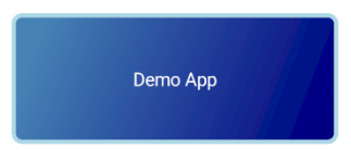
The following example shows how to use some of these properties in the control:
<telerik:RadTemplatedButton
    x:Name="templatedButton9"
    BorderBrush="LightBlue"
    BorderThickness="3"
    Content="Demo App"
    CornerRadius="8"
    HeightRequest="100"
    TextColor="White"
    WidthRequest="250">
    <telerik:RadTemplatedButton.Background>
        <LinearGradientBrush>
            <GradientStop Offset="0.1" Color="SteelBlue" />
            <GradientStop Offset="1" Color="Navy" />
        </LinearGradientBrush>
    </telerik:RadTemplatedButton.Background>
</telerik:RadTemplatedButton>
The above configuration results in the TemplatedButton being rendered as follows:
It’s important to note that it’s also possible to add these properties to a resource dictionary to apply a style with the same properties to multiple TemplatedButtons, as shown below:
<Style x:Key="CustomTemplatedButtonStyle" TargetType="telerik:RadTemplatedButton">
    <Setter Property="BorderBrush" Value="LightBlue" />
    <Setter Property="BorderThickness" Value="3" />
    <Setter Property="CornerRadius" Value="8" />
    <Setter Property="TextColor" Value="White" />
    <Setter Property="Background">
        <Setter.Value>
            <LinearGradientBrush>
                <GradientStop Offset="0.1" Color="SteelBlue" />
                <GradientStop Offset="1" Color="Navy" />
            </LinearGradientBrush>
        </Setter.Value>
    </Setter>
</Style>
When using the above style, we’ll get the same button but in a more simplified way:
<telerik:RadTemplatedButton
    x:Name="templatedButton9"
    Content="Demo App"
    Style="{StaticResource CustomTemplatedButtonStyle}"
    HeightRequest="100"
    WidthRequest="250" />
Now let’s see how to modify the Ripple effect of the control.
Applying a Ripple Effect
It’s possible to manipulate the Ripple effect of a TemplatedButton through the RippleColor and RippleMode properties. The first will allow us to specify a different color for the Ripple effect, while the second allows us to manipulate the behavior through the following values:
- Pulse (default): A Ripple effect is produced when the button is pressed, which fades immediately.
- Hold: A Ripple effect is produced when the button is pressed. If the button is held down, the effect is maintained as well.
- None: No Ripple effect is produced.
Below is an example with the above properties modified:
<telerik:RadTemplatedButton
    x:Name="templatedButton"
    telerik:RadEffects.RippleColor="LightPink"
    telerik:RadEffects.RippleMode="Hold"
    Content="Demo App"
    HeightRequest="100"
    WidthRequest="250" />
The above code results in the following control, which I have held down:
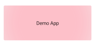
You can see that the Ripple effect is maintained due to the Hold value of the RippleMode property.
Different Ways to Configure the Content
Now that we have analyzed the properties that allow customization through different properties, let’s analyze how we can modify the ControlTemplate of a TemplatedButton, which is the visual structure of the control.
Specifying That the Content is a String
The most basic way to customize a TemplatedButton is to assign a text string as the content of the control. This is what we have done in the previous examples, assigning the string Demo App to the Content property. This way of assigning content causes a Label to be shown as the ControlTemplate of the control as long as the ContentTemplate property is not specified, as we will see later.
Specifying That the Content is an Object
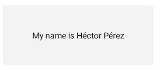
A very similar way to specify information is to assign an object to the Content property, which will cause the ToString method of the object to be invoked so that its result is displayed as a Label in the control. For example, suppose we have the following model:
public class Person
{
    public string FirstName { get; set; }
    public string LastName { get; set; }

    public override string ToString()
    {
        return $"My name is {FirstName} {LastName}";
    }
}
We can initialize and use it as follows:
<ContentPage ...>
    <ContentPage.Resources>
        ...
        <local:Person
            x:Key="name"
            FirstName="Héctor"
            LastName="Pérez" />
    </ContentPage.Resources>

    <VerticalStackLayout HorizontalOptions="Center" Spacing="10">
        <telerik:RadTemplatedButton
            x:Name="templatedButton4"
            Content="{StaticResource name}"
            HeightRequest="100"
            WidthRequest="250" />
    </VerticalStackLayout>
This will display the content of the ToString method as follows:
Now let’s look at how to modify the ContentTemplate property to customize the control according to our needs.
Specifying a ContentTemplate as Content of the TemplatedButton
One of the ways we can get the most out of the TemplatedButton control is to customize the ContentTemplate property. This allows us to create unusual buttons that better adapt to the identity of an application, which can be as complex as we need.
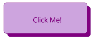
For example, suppose you need to add a dark shadow to your buttons. By customizing the ContentTemplate property we can add two Rectangles and a Label to achieve this goal:
<telerik:RadTemplatedButton
    x:Name="templatedButton2"
    Padding="0"
    Background="Transparent"
    HeightRequest="100"
    WidthRequest="250">
    <telerik:RadTemplatedButton.ContentTemplate>
        <DataTemplate>
            <Grid>
                <RoundRectangle
                    Margin="10,10,0,0"
                    CornerRadius="8"
                    Fill="#085E7D" />
                <RoundRectangle
                    Margin="0,0,10,10"
                    CornerRadius="8"
                    Fill="#AFE9FD"
                    Stroke="#085E7D"
                    StrokeThickness="2" />
                <Label
                    FontAttributes="Bold"
                    FontSize="20"
                    HorizontalOptions="Center"
                    Text="Click Me!"
                    TextColor="#085E7D"
                    VerticalOptions="Center" />
                <Grid>
                    <RoundRectangle
                        Margin="10,10,0,0"
                        CornerRadius="8"
                        Fill="#800080" />
                    <RoundRectangle
                        Margin="0,0,10,10"
                        CornerRadius="8"
                        Fill="#CDA4DE"
                        Stroke="#800080"
                        StrokeThickness="2" />
                    <Label
                        FontAttributes="Bold"
                        FontSize="20"
                        HorizontalOptions="Center"
                        Text="Click Me!"
                        TextColor="#800080"
                        VerticalOptions="Center" />
                </Grid>
            </Grid>
        </DataTemplate>
    </telerik:RadTemplatedButton.ContentTemplate>
</telerik:RadTemplatedButton>
With this we achieve a button like the one in the following image:
As you can see, it’s very easy to customize a TemplatedButton as much as we want. Now, let’s see which events and commands are available in the control.
Events and Commands Available in TemplatedButton
The TemplatedButton control has three events that we can use to perform operations when they are triggered: Clicked, Pressed and Released.
The Clicked and Pressed events are very similar in the aspect that both are triggered as soon as the control is pressed in some way. These events can be very useful for performing some processing or validation before carrying out the execution of an operation.
On the other hand, the Released event is triggered once the TemplatedButton has stopped being pressed. This event could be useful for some post-processing, such as stopping showing a Loader or enabling/disabling another control.
In the following example, I show a TemplatedButton with the events added:
<telerik:RadTemplatedButton
    x:Name="templatedButton6"
    Clicked="templatedButton6_Clicked"
    Content="Demo App"
    HeightRequest="100"
    Pressed="templatedButton_Pressed"
    Released="templatedButton_Released"
    WidthRequest="250" />
In the code behind, we would have the event handlers as follows:
private async void templatedButton_Pressed(object sender, EventArgs e)
{
    await DisplayAlert("Button Pressed", "The button was pressed", "OK");
}

private async void templatedButton_Released(object sender, EventArgs e)
{
    await DisplayAlert("Button Released", "The button was released", "OK");
}

private async void templatedButton6_Clicked(object sender, EventArgs e)
{
    await DisplayAlert("Button Clicked", "The button was clicked", "OK");
}
In case you want to communicate with a View Model, we also have the Command property that allows executing a command when the button is clicked, while the CommandParameter property allows sending an additional parameter to the command. The definition of the Command and CommandParameter properties looks like this:
<telerik:RadTemplatedButton
    x:Name="templatedButton7"
    Command="{Binding ButtonClickedCommand}"
    CommandParameter="Héctor"
    Content="Demo App"
    HeightRequest="100"
    WidthRequest="250" />
The definition of the command should be defined in the ViewModel as in the following example:
public partial class MainViewModel : ObservableObject
{
    [RelayCommand]
    public void ButtonClicked(string data)
    {
        Debug.WriteLine($"Hello {data}");
    }
}
Defining Visual States
In .NET MAUI, it’s possible to define different visual appearances for each state of a control. In a TemplatedButton we have four possible visual states:
- Normal: When a button is not pressed
- Pressed: When a button is pressed
- PointerOver: Available only in desktop apps and occurs when we hover the cursor over the button
- Disabled: When a button is disabled
We can define the visual states in different parts of our code. The following example shows how to define them within a style to apply to multiple instances of a TemplatedButton:
<ContentPage ...>
    <ContentPage.Resources>
        ...
        <Color x:Key="ButtonPrimaryTC">#FFFFFF</Color>
        <Color x:Key="ButtonPrimaryDefaultBG">#7E49FF</Color>
        <Color x:Key="ButtonPrimaryPressedBG">#681EE3</Color>
        <Color x:Key="ButtonPrimaryDisabledBG">#F1F5F9</Color>
        <Color x:Key="ButtonPrimaryDisabledTC">#CBD5E1</Color>

        <Style x:Key="CustomButtonStyle" TargetType="telerik:RadTemplatedButton">
            <Setter Property="VisualStateManager.VisualStateGroups">
                <Setter.Value>
                    <VisualStateGroupList>
                        <VisualStateGroup Name="CommonStates">
                            <VisualState x:Name="Normal">
                                <VisualState.Setters>
                                    <Setter Property="Scale" Value="1" />
                                    <Setter Property="Background" Value="{StaticResource ButtonPrimaryDefaultBG}" />
                                    <Setter Property="TextColor" Value="{StaticResource ButtonPrimaryTC}" />
                                </VisualState.Setters>
                            </VisualState>
                            <VisualState Name="PointerOver">
                                <VisualState.Setters>
                                    <Setter Property="Background" Value="#E8F5F4" />
                                    <Setter Property="TextColor" Value="#000000" />
                                </VisualState.Setters>
                            </VisualState>
                            <VisualState x:Name="Pressed">
                                <VisualState.Setters>
                                    <Setter Property="Scale" Value="0.95" />
                                    <Setter Property="Background" Value="{StaticResource ButtonPrimaryPressedBG}" />
                                    <Setter Property="TextColor" Value="{StaticResource ButtonPrimaryTC}" />
                                </VisualState.Setters>
                            </VisualState>
                            <VisualState x:Name="Disabled">
                                <VisualState.Setters>
                                    <Setter Property="TextColor" Value="{StaticResource ButtonPrimaryDisabledTC}" />
                                    <Setter Property="BackgroundColor" Value="{StaticResource ButtonPrimaryDisabledBG}" />
                                </VisualState.Setters>
                            </VisualState>
                        </VisualStateGroup>
                    </VisualStateGroupList>
                </Setter.Value>
            </Setter>
        </Style>
    </ContentPage.Resources>

    <VerticalStackLayout HorizontalOptions="Center" Spacing="10">
        ...
        <telerik:RadTemplatedButton
            x:Name="templatedButton8"
            Content="Demo App"
            CornerRadius="8"
            HeightRequest="100"
            Style="{StaticResource CustomButtonStyle}"
            WidthRequest="250" />
    </VerticalStackLayout>
</ContentPage>
In the above example, the visual states will allow a TemplatedButton to change both color and size when pressed, further expanding the customization options of the control.
Conclusion
In this article, we have explored the TemplatedButton control in detail, as well as its different customization options that will allow you to adjust it to the design requirements of your .NET MAUI applications.
Give this component, plus the growing list of controls available, a try, with the free Telerik UI for .NET MAUI trial.

Héctor Pérez
Héctor Pérez is a Microsoft MVP with more than 10 years of experience in software development. He is an independent consultant, working with business and government clients to achieve their goals. Additionally, he is an author of books and an instructor at El Camino Dev and Devs School.

