January XAML Fest for .NET MAUI—Instagram Suggestion Card

Summarize with AI:
Learn how to create the suggested friend cards like you’ve seen in Instagram. We’ll use XAML in a .NET MAUI app.
Welcome to the January XAML Fest! This article will guide you on how to create an Instagram suggestion card. If you’re unfamiliar, this refers to the card that appears in a horizontal list when Instagram suggests new friends.
We will cover various comprehensive topics, teaching you how to apply them in a simple way. This includes the use of borders, rounding an image, and more. So, let’s get started! 💪
The January XAML Fest is a month-long initiative where we showcase various replications of iconic user interfaces. If you’re keen to learn more about this exciting journey, I encourage you to check out the article “Welcome to the January XAML Fest for .NET MAUI.”
For a comprehensive understanding, here’s an outline of the topics that will structure our article’s explanation:
- Tips for maximizing the learning experience
- Understanding the UI structure
- Preparing with mock data
- Setting up the main code structure
- Developing each step in detail
✍️ Tips for Maximizing the Learning Experience
Before we embark on the coding and design journey, it’s essential to make sure you’re fully prepared to make the most of this post. Here are some helpful tips to enhance your experience and increase your productivity as you recreate the Instagram suggestion card:
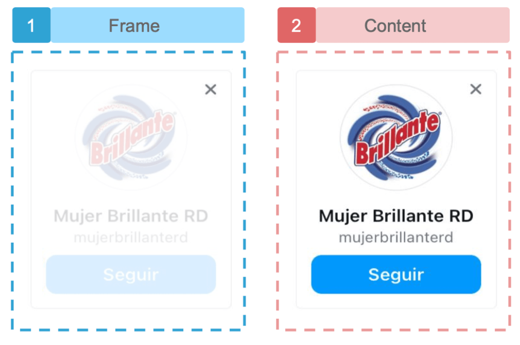
Visual reference of the original UI: To begin, we’ll display an image of the original UI, segmented into steps. Each one corresponds to a different aspect of the design we’ll be addressing.
In-depth design analysis: Each step will include an image highlighting the specific design element we’re concentrating on. This approach offers a clear and focused examination of each design component.
Guided coding sections: In every coding section, keep an eye out for a comment that says, “Insert the code being described in the following section here.” This comment serves as your prompt to insert the forthcoming code explanation right at that point, ensuring a smooth and organized coding experience.
With all these tools at your disposal, you’re now fully equipped to dive into the UI code. Get ready for an exciting journey that offers hands-on experience and in-depth knowledge of .NET MAUI, particularly focusing on XAML for the graphical interface. Let’s start this enjoyable adventure—happy coding! 🚀🎨🌟
Understanding the Card Structure
Before beginning to code, spend some time understanding the scope and implications of your project. This initial stage involves breaking down the design into smaller, manageable parts, each referred to as a “step.” Each step must have an order number, description and unique color for easy identification. This not only aids the development process but also makes this guide easier to follow. Let 's get started!

Setting up the Main Code Structure
Let’s start by developing the main code structure. This will contain the code for all steps outlined in this article. Consider it as crafting the skeleton of your card, serving as the foundation for our upcoming steps. Let’s get started!
Adding a CollectionView
Our goal is to transform a single card design into a horizontal list using a CollectionView. This will enable us to add cards to the CollectionView corresponding to the number of records in our data source.
<CollectionView HorizontalScrollBarVisibility="Never"
		        ItemsSource="{Binding suggestions}"
			    ItemsLayout="HorizontalList"
			    HorizontalOptions="Fill">
    <CollectionView.ItemTemplate>
	    <DataTemplate>
		    <!-- Here goes the code explained in the next explanation -- >
	    </DataTemplate>
    </CollectionView.ItemTemplate>
</CollectionView>
Preparing with Mock Data
For demonstration purposes, we’ll introduce some mock data. This way, you can see your list in action.
➖ Create your Model: Begin by creating the Suggestions.cs class, which will serve as your model.
public class Suggestions
{
    public string Picture { get; set; }
    public string Name { get; set; }
    public string Handle { get; set; }
}
➖ Populating Mock Data: Start by creating the SuggestionViewModel class. Below, I’ve provided data for three cards, but feel free to add as many as you need for your example.
public class SuggestionViewModel
{
public ObservableCollection<Suggestions> suggestions { get; set; }
    public SuggestionViewModel() {
    suggestions = new ObservableCollection<Suggestions>
	    {
		    new Suggestions { Picture = "brillante", Name="Mujer Brillante RD", Handle="mujerbrillanterd"},
		    new Suggestions { Picture = "jose", Name="Jose Perez", Handle="joseperez"},
		    new Suggestions { Picture = "marie", Name="Marie White", Handle="mariawhite"}
	    };
    }
}
Connecting the Data with the XAML Page
To link this data to the XAML, we will use the default page named MainPage.xaml. We will adjust the associated code behind (MainPage.xaml.cs) and add the BindingContext as follows:
public MainPage()
{
    InitializeComponent();
    BindingContext = new SuggestionViewModel();
}
Setting the Main Layout
We almost have the main structure ready to develop step by step! We only need to add the main layout. We’ll use a VerticalStackLayout, which will be located within the CollectionView and will contain the code blocks from steps one and two.
<VerticalStackLayout Padding="5,10" WidthRequest="170">
    <!-- Here goes the code explained in the next explanation -- >
</VerticalStackLayout>
✍️ For more information about layouts in .NET MAUI, I invite you to read the article “Exploring Layout Options in .NET MAUI.”
Developing Each Step in Detail 🕵️♂️
Our structure is now in place! 💃 Let’s start crafting the visual elements for each step.
Step 1: Frame

In the previous session, you will see code that says “<!-- Here goes the code explained in the next explanation -->.” You must add the code that you will learn to create exactly here.
This step serves as the main container. It requires only one element: a box with rounded borders that encompasses all of the card’s content. Let’s explore this process:
➖ Box with rounded borders: We will use the Border control to add it. One key property is StrokeShape, which allows us to specify a rectangle with rounded edges, having a roundness value of 10, as demonstrated below:
<Border BackgroundColor="{AppThemeBinding Light=White,Dark=#222327}"
	    HeightRequest="220"
	    StrokeShape="RoundRectangle 10">
    <!-- Add a layout of the following step here -- >
</Border>
In the BackgroundColor property, I added the AppThemeBinding markup extension. This allows us to assign values based on the appearance mode active on the user’s device. In this case, the background color will be white in light mode and gray in dark mode.
✍️ This topic is very interesting. I invite you to explore more by reading the article “Handling Light and Dark Mode With .NET MAUI.”
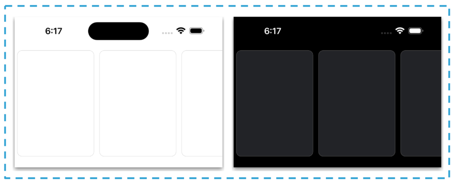
Now, you’ll see how your result should appear after the first step. There are two screenshots provided to show the outcomes in both light and dark modes.

⚠ Remember that there are three cards because we initially added three records to the mock data above.
Step 2: Content

Since Border control only allows one element inside and it contains various information, let’s include everything inside a grid layout. I selected the grid because it offers greater flexibility in organizing the necessary elements.
<Grid RowDefinitions="Auto,Auto,Auto,Auto,Auto" RowSpacing="7" HorizontalOptions="Fill"  VerticalOptions="Center" Padding="5,10">

    <!-- Add the close icon code here -->
    <!-- Add the rounded image here -->
    <!-- Add the names & handle here -->
    <!-- Add the follow button here -->

</Grid>
Now, we are going to add each one of the elements of the card. They are the following:
➖ Close icon: Let’s start by adding the Close icon (X) located in the upper right part.
<Image Grid.Row="0" HorizontalOptions="End" VerticalOptions="Start" Source="close" HeightRequest="11" WidthRequest="11" Margin="0,0,5,0"/>

<!-- Insert the code being described in the following section here -->
➖ Rounded image: In previous articles, I used the AvatarView from the .NET MAUI Community Toolkit to create a rounded image. Now, I’ll demonstrate an alternative method by showing you how to achieve the same effect manually using a Frame.
<Frame Grid.Row="0" IsClippedToBounds="True" CornerRadius="40" HeightRequest="80" WidthRequest="80" HasShadow="False" Padding="0">
    <Image Source="{Binding Picture}" Aspect="AspectFill" />
</Frame>

<!-- Insert the code being described in the following section here -->
➖ Name & handle:
<Label Grid.Row="2" HorizontalTextAlignment="Center" Text="{Binding Name}" FontSize="14" FontAttributes="Bold"/>

<Label Grid.Row="3" HorizontalTextAlignment="Center" Text="{Binding Handle}" FontSize="14" TextColor="Silver"/>

<!-- Insert the code being described in the following section here -->
➖ Follow button:
<Button Grid.Row="4" CornerRadius="10" TextColor="White" HorizontalOptions="Fill" HeightRequest="10" Text="Seguir" BackgroundColor="DodgerBlue"/>
Our final part is now ready! 😎 Your result should look like the following image in both light and dark mode:

And our Instagram Suggestion Card is done!
Thanks for reading! 👋 See you next time! 💚💕

Leomaris Reyes
Leomaris Reyes is a software engineer from the Dominican Republic specializing in mobile development. She is a 7-time Microsoft MVP and actively builds mobile applications while sharing practical knowledge through technical articles and developer-focused content.
Through her work, she explains programming concepts, developer tools and real-world development practices to help developers grow in their careers.
You can follow her on Instagram and TikTok at @leomarisreyes.dev, read her articles on AskXammy, and connect with her on LinkedIn, where she shares tutorials, insights and resources for developers.

