Exploring Layout Options in .NET MAUI

Summarize with AI:
.NET MAUI has four layout classes to help you organize the user interface of your app. Let’s look at them!
Howdy!! 🙋♀ It’s a pleasure for me to have you here! 💚 When developing a user interface for an app, we need a “mold” or “template” to help us organize the components that this UI will have. To do it in .NET MAUI, we have layouts, and in this article we will learn the different layouts available and how to use them in a very simple way!
What Is a Layout?
Layouts allow you to organize/group the controls of a user interface in an orderly manner. There are different types of layouts that have established the way in which each one organizes the controls assigned to them. Therefore, it is important to know each one of them to know how to choose correctly. You can use one layout or a mix of layouts.
Existing Layout Types in .NET MAUI
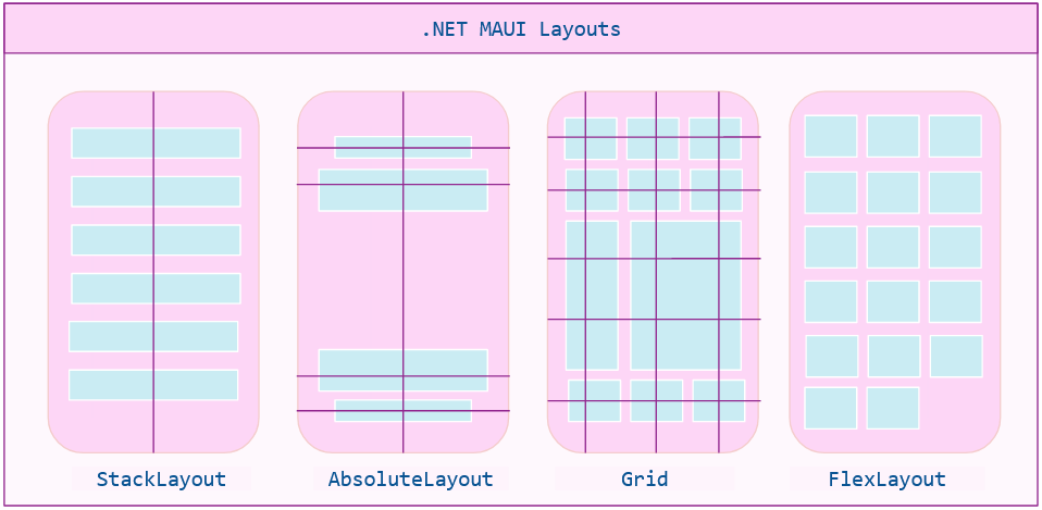
In .NET MAUI, we have four types of layout classes, which you can see in the image below. Next, we will look more closely at each type of layout.
StackLayout
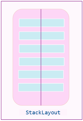
The StackLayout organizes child views in a one-dimensional stack either vertically or horizontally. If the size of a control is not specified, it will expand to fill the available space (width or height) according to the set orientation (vertical or horizontal). This layout is defined by the following properties:
StackLayout Orientation
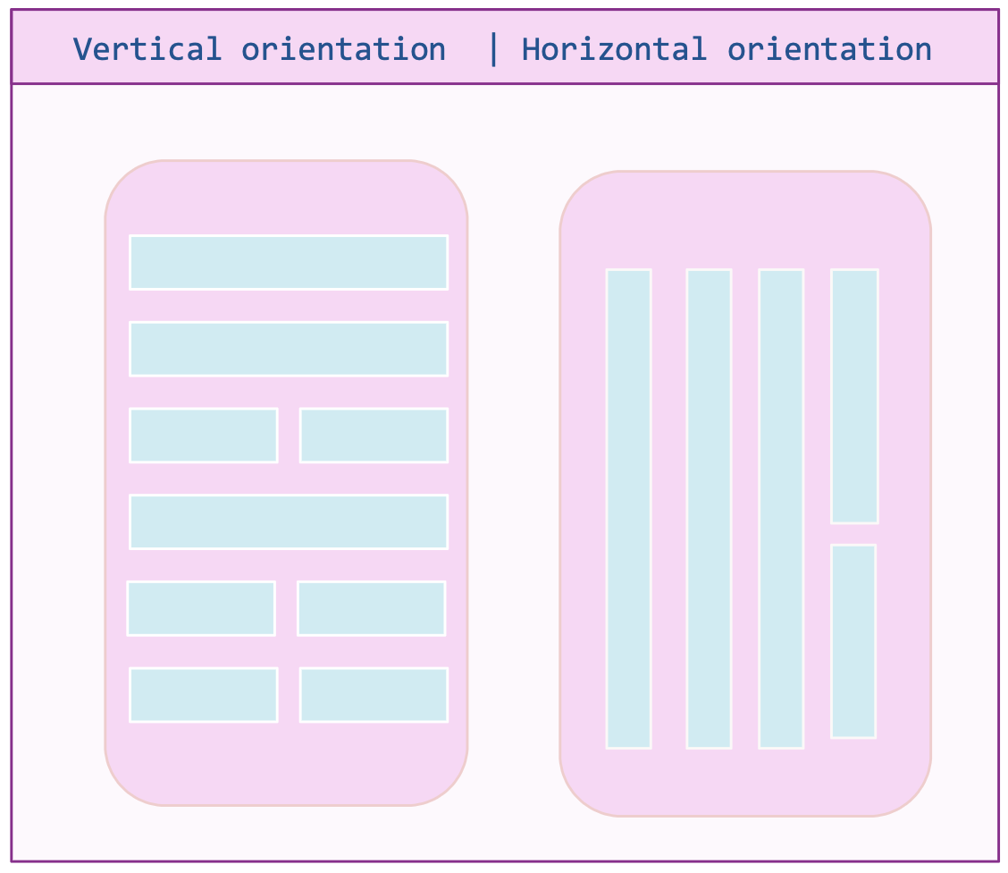
This indicates the orientation in which the controls contained in this layout will be displayed. This orientation can be either vertical or horizontal, and if you don’t specify, it will take vertical orientation as the default value.
The result of setting the horizontal or vertical orientation is an example like the following image (so you have an idea):
But we also have two sub-types of StackLayout which help us to directly design the organization of our controls. Let’s see:
HorizontalStackLayout: It organizes child views in a one-dimensional horizontal stack.
<HorizontalStackLayout >
<Label Text="Give me your name:" />
<Button BackgroundColor="Pink" Text="Enter"/>
</HorizontalStackLayout>
VerticalStackLayout: It organizes child views in a one-dimensional vertical stack.
<VerticalStackLayout>
<Label Text="Give me your name:" />
<Button BackgroundColor="Pink" Text="Enter"/>
</VerticalStackLayout>
⚠ Performance is better if you choose one of these last two options (clearly the one that best suits your needs) rather than choose the StackLayout and add the orientation.
StackLayout Spacing
This indicates the amount of space that each child view enters. This property receives a value of type double and has a default value of zero (not mandatory).
Now let’s see its implementation in code:
<StackLayout Orientation="Horizontal" Spacing="6">
	<Label Text="Give me your name:" />
	<Button BackgroundColor="Pink" Text="Enter"/>
</StackLayout>
AbsoluteLayout
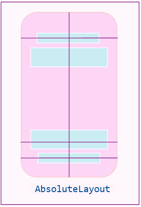
You can position elements using explicit values or values relative to the size of the layout. The position is specified as the top left corner of the child element relative to the top left corner of the AbsoluteLayout. This layout is ideal to use when you want to do some overlay effect on your controls.
This layout is defined by the following properties:
AbsoluteLayout.LayoutBound
It represents the position and size of a child. It has (0,0,AutoSize,AutoSize) as default value. The values it receives can be the following:
- Proportional: Indicates a relationship between a layout and a view.
<Button AbsoluteLayout.LayoutBounds=".30,.05,.23,.1" AbsoluteLayout.LayoutFlags="All" BackgroundColor="Pink" Text="Button Test" />
- Absolutes: Defines the values with fixed position. This only obtains the position, regardless of whether it fits on the screen or not.
<Button AbsoluteLayout.LayoutBounds="105,100,150,10" Text="Hello!" BackgroundColor="Pink" />
AbsoluteLayout.LayoutFlags
This indicates how controls will be interpreted on the screen. Some of the values it receives are as follows:
- XProportional - YProportional: Indicates that the value of x and y, respectively, will be interpreted as proportional, and the others as absolute.
- HeightProportional - WidthProportional: Gets the height or the width, respectively, as proportional layout. The remaining elements are absolutes.
- PositionProportional: Gets X and Y as proportional layout. The remaining elements are absolutes.
- All: Take all values as proportional.
Finally, you can have a result like this:
<AbsoluteLayout>
  <BoxView Color="Pink" AbsoluteLayout.LayoutBounds="0.5,0,100,25" AbsoluteLayout.LayoutFlags="PositionProportional" />
  <BoxView Color="Green" AbsoluteLayout.LayoutBounds="0,0.5,25,100" AbsoluteLayout.LayoutFlags="PositionProportional" />
  <BoxView Color="Red" AbsoluteLayout.LayoutBounds="1,0.5,25,100" AbsoluteLayout.LayoutFlags="PositionProportional" />
  <BoxView Color="Blue" AbsoluteLayout.LayoutBounds="0.5,1,100,25" AbsoluteLayout.LayoutFlags="PositionProportional" />
  <Label Text="Centered text" AbsoluteLayout.LayoutBounds="0.5,0.5,110,25" AbsoluteLayout.LayoutFlags="PositionProportional" />
</AbsoluteLayout>
⚠ Example taken from the official documentation.
Grid
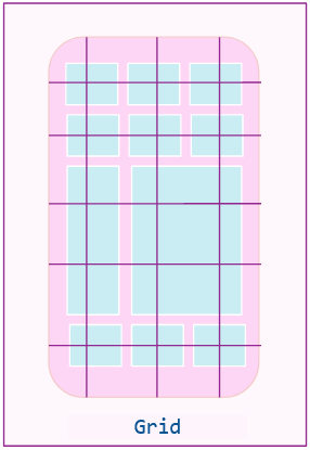
The Grid helps us to organize the elements through rows and columns, which must be defined according to the need of the user interface. These can be proportional or absolute size.
Now, let’s explore the Grid implementation structure.
Rows and Columns
Columns: In the ColumnDefinitions property, you can add as many columns as you need—you just have to separate them by commas and assign the corresponding size as in the following example.
<Grid ColumnDefinitions="10,*,auto">

<!-- your code here-->

</Grid>
Rows: In the RowDefinitions property, you can add as many rows as you need—you just have to separate them by commas and assign the corresponding size as in the following example.
<Grid RowDefinitions="auto,*">

<!-- your code here-->

</Grid>
And finally you will get the following results:
<Grid ColumnDefinitions="10,*,auto" RowDefinitions="auto,*">

<!-- your code here-->

</Grid>
To assign a control to a specific row and column you just have to do what I show in the following image:

Code example:
<Grid ColumnDefinitions="10,*,auto" RowDefinitions="auto,*">

<Button Grid.Row="0" Grid.Column="0" Text="Hello how are you!?" />

</Grid>
Size of Rows and Columns
It’s important to know how we will define the size of the rows and columns. We have three options, which I describe below:
- Absolute: Indicates with a specific size that the rows and/or columns will take. Example:
<RowDefinition Height="10" /> - Proportional (*): Indicates the size that a row and/or column will have by means of the remaining space of the device between other proportional values of the same type (row or column). Example:
<RowDefinition Height="*" /> - Auto: Adjusts the size of its rows or columns according to the size of its children. Example:
<RowDefinition Height="Auto" />
You can see more information about Grid here.
FlexLayout
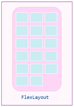
FlexLayout is similar to the StackLayout—it displays children horizontally or vertically in a stack. But it can also wrap its children if there are too many children to fit in a single row or column, and it also allows more granular control of the layout, including size, orientation and alignment of its child elements.
This layout provides proportional sizing for the controls they contain by arranging elements in a ratio based on the dimensions of the screen and between elements on the screen.
This layout is defined by the following properties:
Direction
It is responsible for indicating the direction that the elements contained in the layout will be taking. Among the supported values are the following:
- Column: It’s responsible for organizing the children of the layout from top to bottom by stacking them vertically.
- ColumnReverse: It’s responsible for organizing the children of the layout from bottom to top by stacking them vertically.
- Row: It’s responsible for organizing the children of the layout from left to right by stacking them horizontally. (This is the default value.)
- RowReverse: It’s responsible for organizing the children of the layout from right to left by stacking them horizontally.
Wrap
This is responsible for locating the design controls in a single line or more. Among the supported values are the following:
- Wrap: Indicates that the controls can be displayed on several lines if necessary (flexibility on demand)
- NoWrap: Places the elements on a single line (default value)
- Reverse: Indicates that the controls can be displayed on several lines if necessary in reverse order
JustifyContent
This specifies how the space between and around the children will be distributed along the main axis. Among the supported values are the following:
- Start, Center, End: Indicate start, center and end, respectively
- SpaceBetween: Distributes even spacing between the controls contained in the layout
- SpaceAround: Children should be evenly distributed, with the first and last children having a half-size space
- SpaceEvenly: Distribute all children spacing having equal space around them
Finally we would have a code like this:
<FlexLayout Direction="Column" AlignItems="Center" JustifyContent="SpaceEvenly">
  <Label Text="Give me your name:" />
  <Button BackgroundColor="Pink" Text="Enter"/>
</FlexLayout>
Wrap-up
That’s all! I hope you liked it and from now on, if you haven’t already, start using the different layouts available in .NET MAUI! 💚💕
See you next time! 💁♀️
Use a component library in sync with .NET MAUI’s release cadence. Try Telerik UI for .NET MAUI for free.

Leomaris Reyes
Leomaris Reyes is a software engineer from the Dominican Republic specializing in mobile development. She is a 7-time Microsoft MVP and actively builds mobile applications while sharing practical knowledge through technical articles and developer-focused content.
Through her work, she explains programming concepts, developer tools and real-world development practices to help developers grow in their careers.
You can follow her on Instagram and TikTok at @leomarisreyes.dev, read her articles on AskXammy, and connect with her on LinkedIn, where she shares tutorials, insights and resources for developers.

