Handling Light and Dark Mode With .NET MAUI

Summarize with AI:
Learn how to adapt your .NET MAUI applications’ appearance configuration (system theme) to show light or dark mode based on user preference.
Generally, our mobile devices have a system appearance configuration (system theme) option that allows us to decide if we prefer it in light or dark mode. This generally defines the set of colors on which the graphical appearance of the software of our device will be based. (Of course, there are apps that keep their original appearance without changing to the device’s default settings.)
Now, imagine that the app you are developing has the flexibility that you can adopt the appearance that your user configured on their device! 😍 This would be great because you could accommodate the user so that they can view your app in their favorite appearance and make their experience better, and at the same time you could build an app that is friendly enough for these cases!
In this article, we will learn how to adapt our applications to the appearance (system theme) configured on the device with .NET MAUI in very simple steps!
To start, I will divide the post into the following subtopics:
- Setting our app controls for both light and dark mode
- Getting and setting the user theme
First of All… 🔧 Platform Compatibility
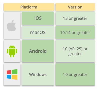
It’s important that you take into account the versions of the platforms that support these changes:

Setting Our App Controls for Both Light and Dark Mode
The AppThemeBinding markup extension allows us to specify a set of resources for both light and dark modes, which our app will later be able to identify and apply according to the theme (appearance) chosen in the system.
In more detail, by assigning this markup extension, we can assign to all the controls that we need what values their properties will take depending on the appearance mode configured on our device.
To achieve this, the AppTheme Binding is composed of the following properties:
- Light: Receives the value that the application will present in light mode. The type of value it receives will be related to the properties you are working on. For example, if you work with the Background property, you must send a Color value, but if you work with the ImageSource property, you must send an Image as a value.
- Dark: Receives the value that the application will present in dark mode. The type of value it receives behaves in the same way as explained in the previous point.
Now, let’s know the structure to apply:

Now, let’s see an example:
<Label BackgroundColor= "{ AppThemeBinding Light=Pink Dark=Blue } " />
⚠ Important: We can also implement them using Styles—as I show below:
<Style x:Key="LayoutStyle " TargetType="Layout ">
  <Setter Property="BackgroundColor "
Value="{AppThemeBinding Light=Pink, Dark=Blue} " />
  <!-- Your Setters here …→
</Style>
If you want to know more information about Styles, you can enter here.
Getting and Setting the System Theme (Appearance Mode)
Now we will learn two very important points about how to obtain and define the default appearance (theme) of our app.
Current System Appearance
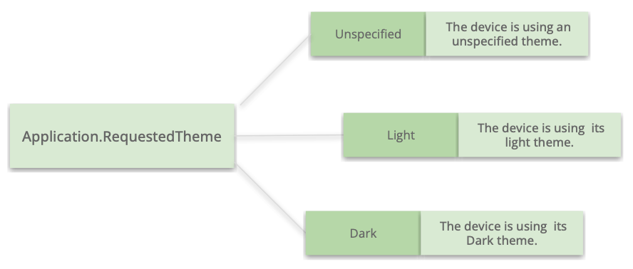
Let’s start by getting the current system appearance. To know it, you just have to use the Application.RequestedTheme property. This property returns an AppTheme enumeration member, which is composed of the following values:

And finally, an example line of code:
AppTheme currentTheme = (AppTheme)Application.Current.RequestedTheme;
Setting System Theme
Let’s continue with setting the system theme. We also have the option to set the appearance (theme) that our application will have as determined, regardless of the system configuration.
For example, let’s see how to set our app to always be in dark mode.
Application.Current.UserAppTheme = AppTheme.Dark;
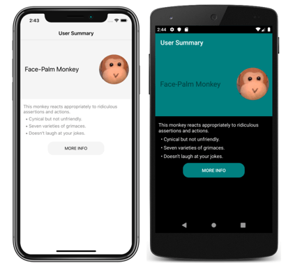
Finally, we have an example of the same app but with light and dark mode!
🗒 This image was taken from the official documentation.

Wrap-up
And done! With these simple steps we can handle the appearances of our app!
References: https://docs.microsoft.com/en-us/dotnet/maui/user-interface/system-theme-changes
Use a component library in sync with .NET MAUI’s release cadence. Try Telerik UI for .NET MAUI for free.

Leomaris Reyes
Leomaris Reyes is a software engineer from the Dominican Republic specializing in mobile development. She is a 7-time Microsoft MVP and actively builds mobile applications while sharing practical knowledge through technical articles and developer-focused content.
Through her work, she explains programming concepts, developer tools and real-world development practices to help developers grow in their careers.
You can follow her on Instagram and TikTok at @leomarisreyes.dev, read her articles on AskXammy, and connect with her on LinkedIn, where she shares tutorials, insights and resources for developers.
