January XAML Fest for .NET MAUI—Uber card UI 🚗

Summarize with AI:
We’re kicking off XAML Fest with a rebuild of the Uber-style card UI. See for yourself!
Welcome to the first UI exploration post of the January XAML Fest! 🎉 Today, we’re steering into the world of ride-sharing by breaking down and recreating the Uber card UI using .NET MAUI with XAML.
This sleek and functional interface element is a staple in modern app design, and I’m excited to explore it with you.
⚠ Preparing for the Journey
Before diving into the code and design, it’s crucial to be well-prepared to get the most out of this post. Below are some instructional notes to enhance your experience and efficiency as you reproduce the Uber card UI:
▪ See the original UI: At the outset, an image of the original Uber card UI will be presented, divided into blocks. Each block corresponds to a different part of the design we’ll be working on.
▪ Detailed block design: Each block will feature an image with the specific design element we are focusing on, highlighted in a box. This approach will provide a clear and focused view of each design aspect.
▪ Code block guidance: Within each code block, look for a comment saying: “Here, add the code that is being explained in the next block.” This comment is your cue to insert the upcoming block code explanation right at that point, ensuring seamless and organized coding.
With these guidelines in mind, you’re all set to smoothly navigate through the replication of the Uber card UI, gaining both practical experience and deeper insights into .NET MAUI and XAML. Let’s get started and happy coding! 🚀
Let’s Hit the Road! 🚗💨
Ready to start this exhilarating journey? Let’s gear up and break down the original Uber card UI design into manageable blocks. This approach allows us to focus on each element individually, ensuring a thorough and clear understanding as we reconstruct each piece in .NET MAUI and XAML.

Step 1: Set up the Structure and the Main Image

First of all, in this section, let’s set up the main structure of the card. This structure will hold the visual elements of both this step and the subsequent ones.
As observed in the reference image for replication, the card boasts rounded edges. To accomplish this, we will utilize Border control. For organizing the internal elements efficiently, a VerticalStackLayout will be employed, as demonstrated below:
<Border  Stroke="Silver"
StrokeThickness="1"
StrokeShape="RoundRectangle 20"
Margin="20"
HorizontalOptions="Fill"
HeightRequest="320">

  <VerticalStackLayout
  BackgroundColor="LightBlue"
  Spacing="10">

  <!-- Insert the elements container here for Step Number 1 -->

  <!-- Insert the elements container here for Step Number 2 -->

  <!-- Insert the elements container here for Step Number 3 -->

  </VerticalStackLayout>

</Border>
Please note that the VerticalStackLayout is set with a LightBlue background. This detail is crucial for the visual aspect of your UI.
✍️ If you wish to explore more about Borders, refer to the article Applying Border in .NET MAUI. Or learn additional insights on VerticalStackLayout here.
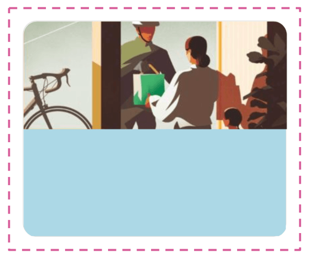
Now, upon completing the previous step, let’s proceed to add the main image.
<Image  Source="ubermainimage"
  HorizontalOptions="Center"
    HeightRequest="160"/>
Your work should mirror the appearance of the following image:

Step 2: Add a Description

Now, we’re about to unlock a new skill: learning to apply diverse styles to a single Label.
While this step can be accomplished with two separate Labels, we will demonstrate it with just one to showcase the process.
<Label Margin="10,0">
<Label.FormattedText>
<FormattedString>
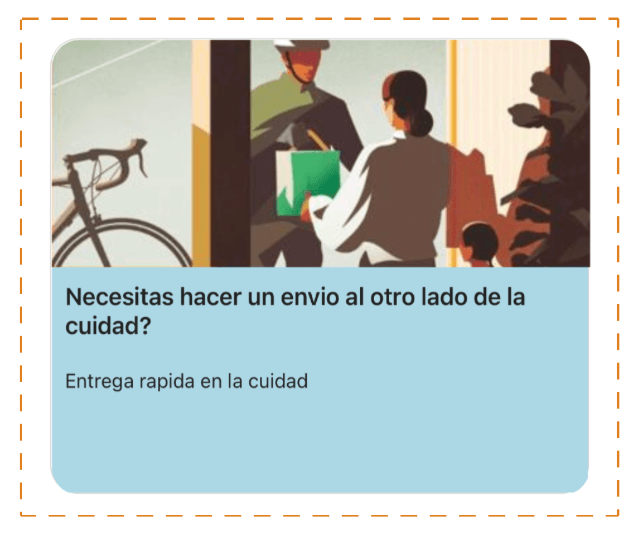
<Span Text="Necesitas hacer un envio al otro lado de la cuidad? " FontAttributes="Bold" FontSize="17"/>
<Span Text="Entrega rapida en la cuidad"/>
</FormattedString>
</Label.FormattedText>
</Label>
Finally, you will get a result like the following image:

Step 3: Add a Send Article Button

All we need to do in this step is to add the button used for sending an article. Let’s see how to do it:
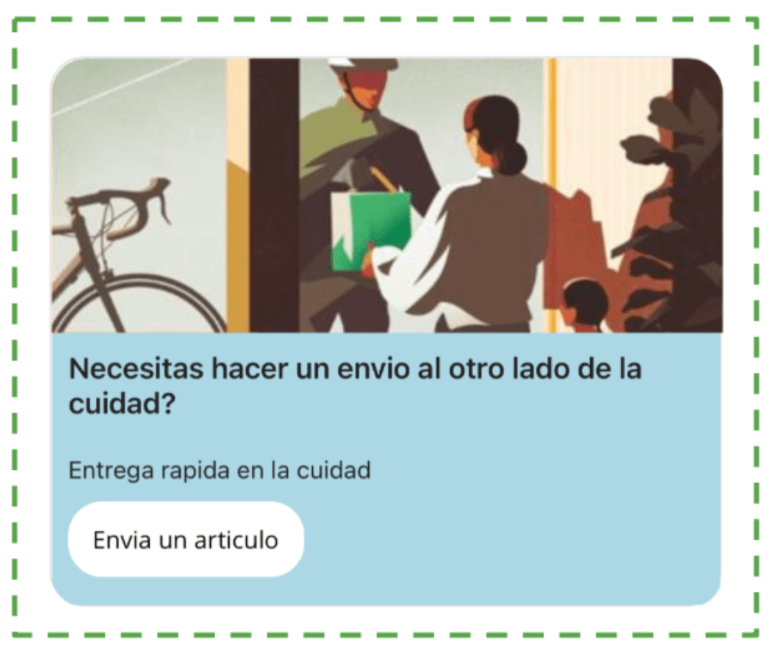
<Button Text="Envia un articulo"
  TextColor="Black"
  CornerRadius="20"
  Margin="10,0"
  BackgroundColor="White"
  HorizontalOptions="Start"/>
Finally, you will see a result like the following image:

And our Uber Card UI is done!
Thanks for reading! 👋 See you next time! 💚💕 Go on to the X (Twitter) card next!

Leomaris Reyes
Leomaris Reyes is a software engineer from the Dominican Republic specializing in mobile development. She is a 7-time Microsoft MVP and actively builds mobile applications while sharing practical knowledge through technical articles and developer-focused content.
Through her work, she explains programming concepts, developer tools and real-world development practices to help developers grow in their careers.
You can follow her on Instagram and TikTok at @leomarisreyes.dev, read her articles on AskXammy, and connect with her on LinkedIn, where she shares tutorials, insights and resources for developers.

