
How to Use Angular CDK Layout and Flex for Responsive Websites

Summarize with AI:
See how to replace a float-based layout with flexbox for better alignment and flexibility, and use Angular Flex CDK to reduce media queries CSS.
When we build a page, the elements need a layout structure to position them. In old times when we created interfaces to set these positions, we would use float or position in CSS to align our elements.
Nowadays, we need to take care to adapt to the user and we don’t know if they are visiting our page with a phone, PC or TV. In CSS, we have alternatives to the classic float and position to order and align our elements: Flex.
Flex is a native layout model in CSS and provides a set of ways to order HTML elements in the DOM, like aligning them side by side, ordering and reacting to remaining space and a ton of options. Flex helps us to create great flexible and responsive UI combined with the CSS media queries.
Since the deprecation of Angular Flex Layout, the Angular team recommends using CSS Flex or CSS Grid.
But instead of writing the CSS media queries with Flex rules in the CSS or Sass file, I prefer to keep the control, and this is the perfect moment to use CDK Layout!
What Is CDK Layout?
CDK Layout is a utility by Angular CDK to simplify building responsive UI, making it easy to react to screen size changes, using BreakpointObserver to listen for when layout shifts happen in the browser and updating the UI accordingly.
We could take the full weekend (depending on when you read this article) reading about Flex or we can learn by doing with a real-world scenario where you can learn about how to create layout with Flex and why to take advantage of CDK Layout.
Scenario
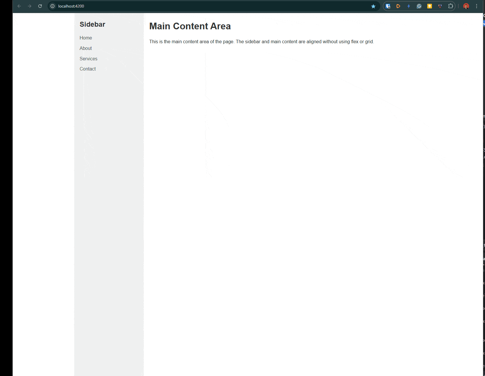
My friend created a project with a sidebar and main content area, but he wants his layout to be responsive for desktop and mobile. After reviewing his code, we found this:
He was using a float to position elements and create the layout 🙁, and this is not a modern way to build it.
.sidebar {
  float: left;
  width: 20%;
  background-color: #f0f0f0;
  padding: 20px;
  box-sizing: border-box;
  min-height: 100vh;
}

.main-content {
  float: left;
  width: 80%;
  padding: 20px;
  box-sizing: border-box;
  min-height: 100vh;
}
For example, this code shows how the design breaks when we transform from desktop to mobile. He wants this website to be responsive for both small and big screens, maybe hiding the sidebar for mobile.
We need to change the code, and this is our opportunity to learn how to get started with Flex and combine it with media queries to make it responsive. And after that we can refactor to combine with Flex Layout CDK. Let’s do it!
Setting Up the Project
First, we need to clone the project by running the following command in your terminal:
git clone https://github.com/danywalls/angular-flex-cdk.git
Cloning into 'angular-flex-cdk'...
remote: Enumerating objects: 70, done.
remote: Counting objects: 100% (70/70), done.
remote: Compressing objects: 100% (55/55), done.
remote: Total 70 (delta 22), reused 50 (delta 13), pack-reused 0 (from 0)
Receiving objects: 100% (70/70), 136.57 KiB | 1.10 MiB/s, done.
Resolving deltas: 100% (22/22), done.
Go to the directory angular-flex-cdk and install all dependencies with npm i. After that’s complete, run ng serve to see our project running.
npm i
ng serve
Component HMR has been enabled.
If you encounter application reload issues, you can manually reload the page to bypass HMR and/or disable this feature with the `--no-hmr` command line option.
Please consider reporting any issues you encounter here: https://github.com/angular/angular-cli/issues

Initial chunk files | Names         |  Raw size
polyfills.js        | polyfills     |  90.20 kB |
main.js             | main          |   5.35 kB |
styles.css          | styles        | 339 bytes |

                    | Initial total |  95.89 kB

Application bundle generation complete. [4.516 seconds]

Watch mode enabled. Watching for file changes...
NOTE: Raw file sizes do not reflect development server per-request transformations.
  ➜  Local:   http://localhost:4200/
  ➜  press h + enter to show help
In your browser, open http://localhost:4200 and our project is up and running!
After testing the app and using Chrome DevTools (F11) to change the size, it doesn’t look as expected! Let’s move to Flex.
Using CSS Flexbox with Media Queries
First, we’re going to make changes to the old-school float and left to the modern display Flex. In your editor, open the project and open the app.component.scss file. We’re going to edit the .container class to use display: flex and combine it with flex-wrap: wrap.
Flex sets how a flex item will grow or adapt to fit the space in the container and flex-wrap sets whether flex items are forced onto one line or can wrap onto multiple lines.
.container {
  width: 100%;
  max-width: 1200px;
  margin: 0 auto;
  display: flex;
  flex-wrap: wrap;
}
After making these changes, the sidebar and main content will align side by side, so we can remove the float: left option
display: flex;
flex-wrap: wrap;
We maintain the same width proportions (20% sidebar, 80% main content), but to make it responsive and hide the sidebar on mobile, we need to use CSS media queries.
Add a media query for screens smaller than a typical mobile breakpoint (e.g., 768px) and hide the sidebar and make the main content take 100% width on mobile.
/* Media query for mobile devices */
@media (max-width: 768px) {
  .sidebar {
    display: none;
  }

  .main-content {
    width: 100%;
  }
}
Save changes, reload and tada!!!
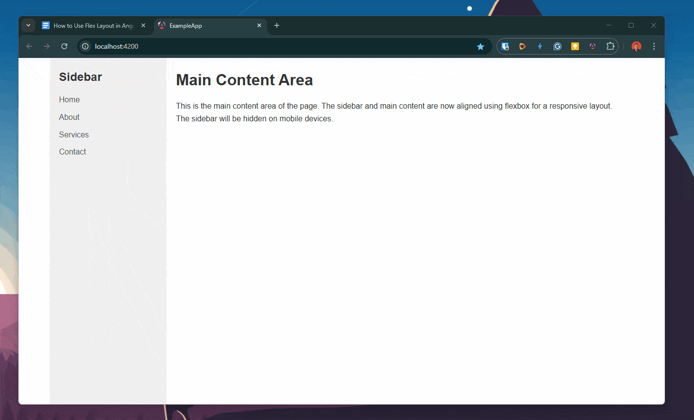
With just a few lines of code, we replaced the float-based layout with flexbox for better alignment and flexibility. By working in combination with CSS media queries to hide the sidebar and adjust the main content’s width on mobile devices, we improved responsiveness.
But we want to refactor it to a better version with Angular CDK!
Moving to Angular Flex CDK
Instead of writing all our logic in CSS with media queries, we can have more control over it using Angular Flex CDK with the BreakPointObserver.
First, open your terminal and install @angular/cdk.
npm i @angular/cdk
Open the app.component.ts and import BreakpointObserver from @angular/cdk/layout, using inject to declare a variable to use the BreakPointObserver.
private breakpointObserver = inject(BreakpointObserver);
Next , create a signal to track whether the viewport is mobile size. Used in combination with toSignal, it helps to transform the observable from breakpointobserver. And using the observe method helps us to listen for changes. We can filter specific breakpoints instead of the CSS like Breakpoints.HandsetPortrait, Breakpoints.TabletPortrait and more.
Here, we create a new variable isMobile to use in the template.
import { BreakpointObserver, Breakpoints } from '@angular/cdk/layout';
import {Component, inject} from '@angular/core';
import { toSignal } from '@angular/core/rxjs-interop';
import { map } from 'rxjs';
…
  isMobile = toSignal(
    this.breakpointObserver
      .observe([Breakpoints.HandsetPortrait, Breakpoints.TabletPortrait])
      .pipe(
        map(result => result.matches)
      ),
    {initialValue: false}
  );
Open the app.component.html, and update it to conditionally show/hide the sidebar based on the signal.
@if (!isMobile()) {
<div class="sidebar">
<h2>Sidebar</h2>
<ul>
<li><a href="#">Home</a></li>
<li><a href="#">About</a></li>
<li><a href="#">Services</a></li>
<li><a href="#">Contact</a></li>
</ul>
</div>
}
<div class="main-content" [class.full-width]="isMobile()">
<h1>Main Content Area</h1>
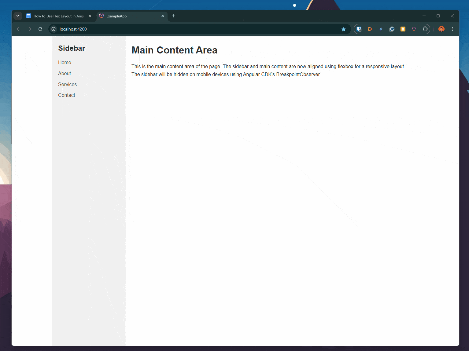
<p>This is the main content area of the page. The sidebar and main content are now aligned using flexbox for a responsive layout. The sidebar will be hidden on mobile devices using Angular CDK's BreakpointObserver.</p>
</div>
Now we can remove all related media queries from our CSS. Save changes and tada!!! We have the same behavior with less code!! Yeah!!! 😊
Recap
We learned how to move our legacy CSS to flexbox to build responsive websites, combining it with Angular Flex CDK to reduce the media queries CSS.
Now is your time to start to build responsive websites using Angular CDK Layout!
Source code:

Dany Paredes
Dany Paredes is a Google Developer Expert on Angular and Progress Champion. He loves sharing content and writing articles about Angular, TypeScript and testing on his blog and on Twitter (@danywalls).
Related Posts
Comments
All articles
Topics
Web MobileMobile
Desktop
Design
Productivity
People
