How to Improve the Ecommerce Checkout Experience

Summarize with AI:
Take a closer look at shopper complaints about the online checkout process as well as five things that web designers and developers can do to remove these problems in the first place.
There are many challenges when it comes to designing digital products for ecommerce.
First, how do you attract customers from around the web and get them to your store? Next, how do you design the store so that customers don’t get distracted, overwhelmed or lost among all the things being sold? Finally, how do you ensure that your checkout captures as many sales as possible from those customers?
I’d argue that this last challenge is the most important one to resolve and it should be dealt with before all else. Because it won’t matter how many visitors your online shop gets or how many items they put in their shopping carts. If the checkout experience doesn’t work for them, what was all that design and SEO work for?
In this post, we’re going to look at the top reasons shoppers abandon their digital carts along with what you can do to decrease that cart abandonment rate.
5 Ways to Improve the Ecommerce Checkout Experience
In 2023, Baymard Institute aggregated data from a wide range of resources on ecommerce cart abandonment rates. Their research found the average rate to be 70.19%.
The Baymard Institute also shared some of its own research on the reasoning behind cart abandonment. Putting aside the 47.8% of U.S. consumers who said they weren’t ready to buy, this chart lays out the various reasons why the remaining shoppers abandon their purchases:
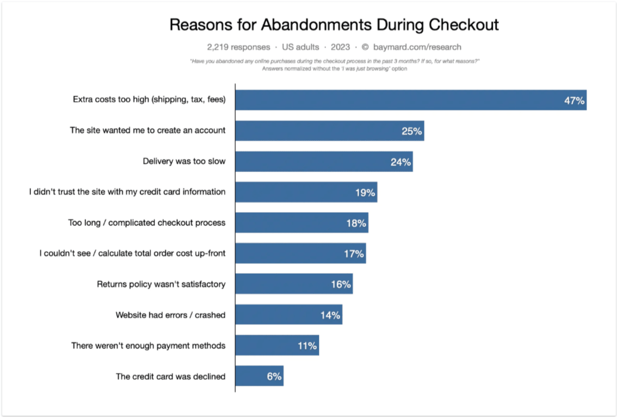
I’m going to use the rest of this post to show you ways to design the online checkout experience so that the majority of these reasons are no longer a factor.
1. Publish Fees on the Product and Cart Pages
The issue as reported by customers:
- 47% said that extra costs related to shipping, taxes and fees were too high.
- 17% reported not being able to see or calculate the total cost of their purchase upfront.
The solution:
As a consumer yourself, you know how frustrating this scenario is.
You see the item that you wanted is reasonably priced. You add it to your shopping cart and head over to checkout. That’s when you discover that your total is no longer reasonably priced.
There’s nothing wrong with businesses trying to cover some of those costs that make it expensive to do business in the first place. However, there is an issue in making shoppers wait until the very last minute to spring all those fees on them. And unless your store sells something they can’t get elsewhere, that’s a good enough reason for nearly half of your customers to abandon the purchase altogether.
The solution to this is simple: Be transparent. At the very least, those additional costs should appear in the cart.
That’s what we see in the sidebar pull-out cart on the website for the Medieval Torture Museum:

The ticket purchase is listed at the top. Down below the customer sees a breakdown of their costs:
- Ticket subtotal
- Tax
- Processing fee
- Total cost (in red)
This is the same total they’ll encounter when they reach the checkout page.
Now, it’s easier to add costs to the cart when your site sells digital products like tickets. That’s because you don’t have to worry about physical shipping costs, which is often a huge gripe of customers.
There are a few ways to work around this.
One option is to publish a notice on the product and cart pages that lets customers know that shipping will be calculated at checkout. Another option is to state the threshold for free shipping on the product pages and encourage customers to buy just a bit more so they don’t have to worry about being surprised with shipping fees.
The other option is to display estimated shipping costs for logged-in customers as Shutterfly does:
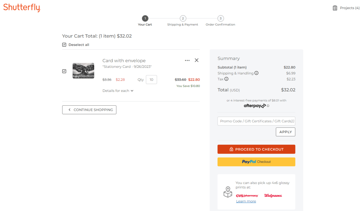
Because your site will already have the address for existing customers, the cart page can accurately depict what the relevant shipping and handling costs will be based on their ZIP code.
Although not as common, I’ve seen some stores add a Shipping Estimate field to the product pages. Customers enter their ZIP code and then they see their shipping costs while they shop. So that’s another option to consider.
2. Give Customers Various Options Throughout Checkout
The issue as reported by customers:
- 25% said they were forced to create an account before being able to check out.
- 11% said that there weren’t enough payment methods to consider.
The solution:
Ultimately what these two issues come down to is a lack of choice and control. Customers know that online businesses have the ability to be flexible when it comes to certain aspects of the checkout experience. So when
they see that they’re being forced down a narrow pathway without any other option, they resist it.
That doesn’t mean that your checkout experience needs to feel like the wild wild west with excessive amounts of choices left up to the customer. Just focus on the key areas noted in the feedback from Baymard Institute to give them the choices they want.
Let’s start with the account creation step.
Some customers understand the benefits of creating an account. The example above of being able to see shipping costs ahead of time is just one benefit. Logged-in customers also encounter personalized content and offers elsewhere during the shopping experience as well as in their email inboxes.
But not everyone wants to give that information away so freely, especially if they’re on the fence about the company.
You’re going to have to weigh the pros and cons of allowing for guest checkout on your website. Some companies it won’t make sense for—like ones who sell luxury items. But others, like Jersey Mike’s, can easily allow for guest checkout.
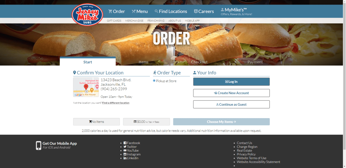
Customers who want the rewards and loyalty benefits will take the time to create a new account. Those who aren’t ready to do so or just don’t have the time to set up an account can pass.
The other major complaint that consumers have is regarding payment options. Even most retail stores these days offer customers the choice between self-checkout or going to a cashier. And when they step up to pay, they can do so with cash, credit card or by using Apple or Google Pay.
If you want to reduce friction at this step in the checkout process, give your customers a variety of payment methods to choose from as Cosabella does.
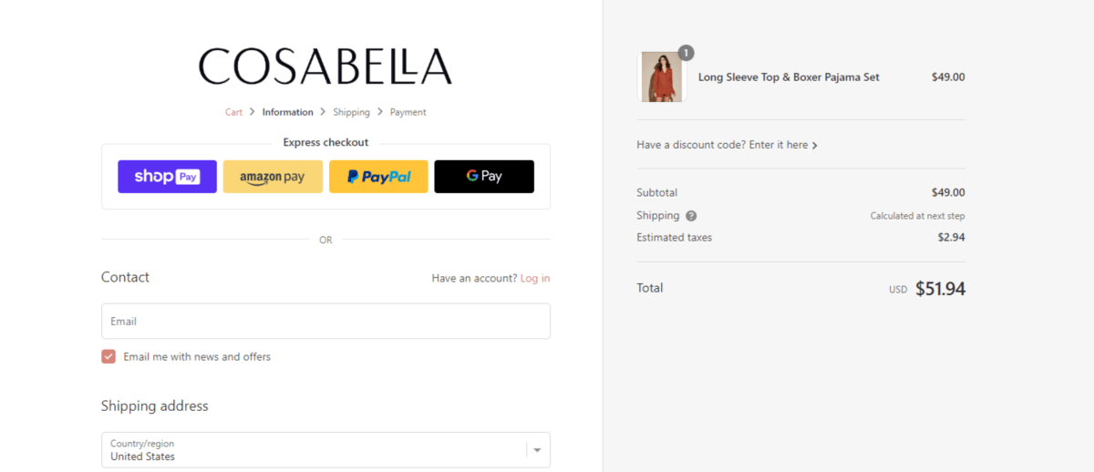
Customers can use Shop Pay, Amazon Pay, PayPal or Google Pay for express checkout. The other option is to fill out the form and enter their credit card information.
There’s another way to offer more options during checkout. You’ll find an example of it on the DefenderShield website.
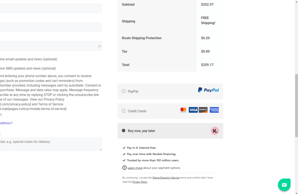
Buy now, pay later (or BNPL) is becoming more popular these days, especially on sites like these where it’s not uncommon for customers to rack up hundreds or thousands of dollars in charges.
Just try not to go overboard with it. There are tons of different payment processors and methods you could enable at checkout. You want to offer your customers choices, but not overwhelm them with so many options—especially irrelevant ones—that it becomes too much for them.
3. Implement a Strong Security Policy
The issue as reported by customers:
- 19% didn’t trust the website to protect their credit card information.
The solution:
On top of everything you do to secure your digital products, you also need to put the right security trust marks in place.
Why? Because the issue here isn’t that customers believe that they’re shopping with an untrustworthy brand. It’s that they’re worried about the security of the platform they’re sending their credit card details through.
Even if you created a security policy page for your ecommerce site or app, most customers wouldn’t know what half of the measures are that you took to protect their data and privacy. What you can do instead is follow Inno Supps’s lead and add a brief statement and guarantee to the checkout page.
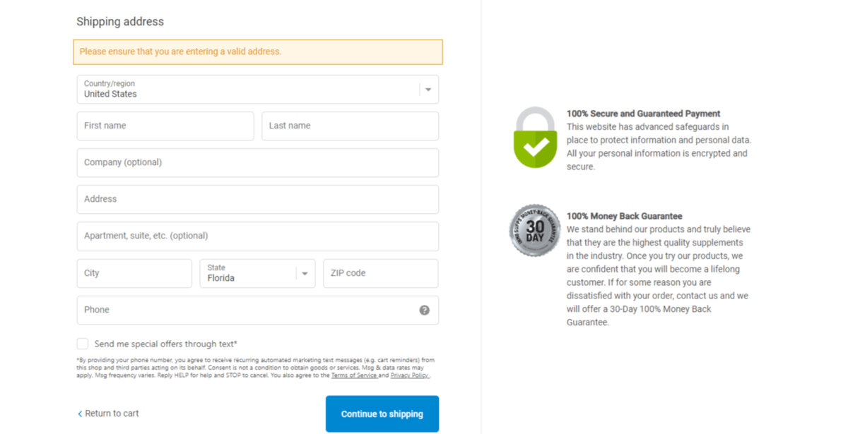
Beside the checkout form, the top statement reads as follows:
“100% Secure and Guaranteed Payment. This website has advanced safeguards in place to protect information and personal data. All your personal information is encrypted and secure.”
It also doesn’t hurt that they’re using the recognizable Shopify checkout system. If customers do enough shopping these days, they’ll instantly recognize the checkout page. That said, having the security notice on the sidebar is a nice touch.
Another way to ease shoppers’ concerns about security is to add reliable and recognizable trust marks to the page. Vitamin Sea Photography includes one at the bottom of the checkout form and two in the footer just beneath it.
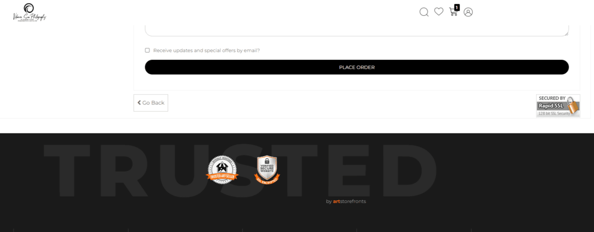
The one at the bottom of the form is proof of the website’s SSL certificate from Rapid SSL. There’s also a trust mark in the footer that backs up this security claim. It says “Verified Secure Website.” Users can hover over it to see more details about the implementation of the SSL certificate.
The other trust seal reads “Officially Registered Trusted Art Seller.” This might not seem like a security-related trust mark. However, users will find additional details that explain its importance:
“The presence of this badge signifies that this business has officially registered with the Art Storefronts Organization and has an established track record of selling art. It also means that buyers can trust that they are buying from a legitimate business. Art sellers that conduct fraudulent activity or that receive numerous complaints from buyers will have this badge revoked. If you would like to file a complaint about this seller, please do so here.”
This is a good example of finding the right trust marks for your store. While an antivirus or SSL certificate security seal might seem relevant, that might not be the kind of trust-building that customers are looking for from you.
4. Design the Checkout Form for Speed and Convenience
The issue as reported by customers:
- 18% said that checkout was too long or complicated of a process.
The solution:
According to data from Baymard Institute, checkout processes are too long.
Their usability tests found that the ideal checkout form contains between 12 and 14 elements or 7 to 8 fields. However, the average checkout form for U.S. businesses has 23.48 elements and 14.88 fields. It’s nearly double the size of what consumers consider an acceptable checkout experience.
If you’re not currently running heat map tests on your checkout pages to see where you’re losing shoppers, it would be a good idea to do so. Because if the average user is making it past about 12 elements (or 7 form fields) and then giving up, the length or complexity could be the problem.
The checkout process for Makenu Chocolate / True to the Source is a good example to follow if your checkout page needs a trim.
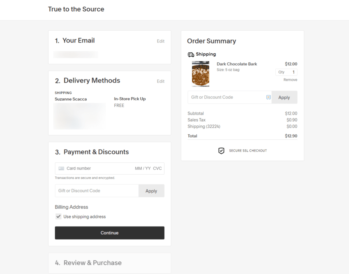
What you see above is the page after I’ve filled out most of the details. When someone first enters, however, they see only the step they’re working on and the names of the subsequent steps. It’s really well done.
The form keeps things simple too. All in all, customers have to fill in about 12 fields, click 4 buttons, and make 2 dropdown or radio dial selections. That’s it.
Dazzling Nights Jacksonville is another one that keeps things simple at checkout.
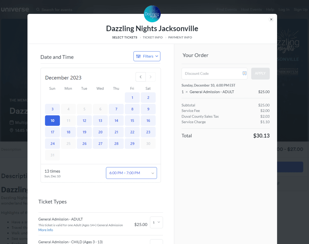
The breadcrumbs at the top let customers know that there are three steps in this checkout process:
- Select Tickets
- Ticket Info
- Payment Info
Each page is designed for the type of information being collected. For instance, customers aren’t asked to type out the date and time they want to buy tickets for. They select the date from a calendar and the timeframe from a dropdown list. They then use a quantity dropdown to select how many tickets they need.
The next pages use mostly form fields. Everything is kept to a minimum though. Aside from asking the user if they’d like to create an account for faster checkouts in the future, only the most necessary fields have been included.
5. Repair Loading Speeds and Bugs at Checkout
The issue as reported by customers:
- 14% reported experiencing website errors or crashes.
The solution:
This one I’m not going to go too deep on since the Telerik blog has covered general website performance from pretty much every angle at this point (including why it matters for UX).
While consumers might not be complaining directly about page speeds, a slow-loading checkout might have shoppers worried about the stability and security of the platform. So page speed optimization is an important place to start.
Encouraging shoppers to provide feedback and report bugs will also be useful. But it shouldn’t just be up to shoppers to let you know when someone’s gone awry.
Creating a system that monitors for common website errors and bugs is the next step. That means doing lots of testing on your digital product.
Load testing will help you identify if the product has any breaking points and then develop solutions to fix them.
Having someone on your team play around with your digital product and the checkout process on a somewhat regular basis is a must as well. Nothing beats hands-on experience with the checkout.
And if you feel it’s warranted, you could set up some user testing to help identify bugs and other types of friction in the process.
One other thing I will say is that it’s probably a good idea to review and test your form’s error handling. What consumers might see as a website error or bug might actually be from their own doing.
For instance, let’s say someone enters their credit card’s expiration date in the wrong format (e.g., MM/YYYY vs. MM/YY). If the form doesn’t validate each response and provide helpful error messaging, they might interpret the inability to check out as a website error.
Wrap-up
A high-quality checkout experience isn’t just one that is well-organized and attractive in design. Today’s shoppers pay attention to the nitty-gritty details of their experience. While some of these matters you can’t help (like their credit card getting declined), many of the reasons for cart abandonment can be avoided with better design and development choices.
Pay close attention to the data out of Baymard Institute. Consumers are telling you exactly what bothers them about the modern online checkout experience. The good news is, most of these issues can be fixed by prioritizing transparency, simplicity and performance.
This blog was prepared by Suzanne Scacca in their personal capacity. The opinions or representations expressed herein are the author’s own and do not necessarily reflect the views of Progress Software Corporation, or any of its affiliates or subsidiaries. All liability with respect to actions taken or not taken based on the contents of this blog are hereby expressly disclaimed. The content on this posting is provided “as is” with no representations made that the content is error-free.

Suzanne Scacca
A former project manager and web design agency manager, Suzanne Scacca now writes about the changing landscape of design, development and software.

