
Getting Started with the Blazor Diagram Component

Summarize with AI:
Visualizing workflows, hierarchy or other figures is easy with the Blazor Diagram component. Learn how customize it for your app.
Creating diagrams in web applications becomes necessary for those that need to display hierarchical information or workflows. Therefore, it is essential that in the Blazor components ecosystem there are reliable solutions that allow creating them quickly, while also offering flexibility to customize them according to the tasks to be performed.
In this post, I will tell you about the new Progress Telerk UI for Blazor Diagram component, which allows you to create diagrams in a simple way.
Creating Your First Figure with the Diagram Component
The first step to be able to create diagrams in your application is to configure your project to work with the Telerik components, according to the Blazor components installation guides.
Once the project has been configured, you should use the tag TelerikDiagram, which will be the main container where the diagram will be rendered, and where you can configure parameters such as Height, Width, Zoom, ZoomRate, MinZoom and MaxZoom. An example of its usage is the following:
<TelerikDiagram Height="500px" Zoom="0.8">
</TelerikDiagram>
When you run the application, you will see the canvas when you click on it:

Once we have our main container, let’s see how to add figures to it.
Adding Shapes to the Diagram Component for Blazor
To add shapes in Blazor, you should know some of the Shapes parameters:
Id: To identify the shapes and be able to relate themType: Indicates the shape typeWidthandHeight: Specify the size in pixels, with the default value being 100.XandY: Allow placing a shape at an exact position.Path: Allows specifying a custom shape
To add Shapes to the diagram you must define the collection of shapes through the tag DiagramShapes, adding to the collection a set of elements DiagramShape, specifying the characteristics of each shape.
Since in our current example we have not defined a Diagram layout (which we will see later), we can use the parameters X and Y to define some positions, as shown below:
<TelerikDiagram Height="500px" Zoom="0.8">
    <DiagramShapes>
        <DiagramShape Id="shape1"
                      Type="@DiagramShapeType.Circle"
                      X="10" Y="10" />
        <DiagramShape Id="shape2"
                      Type="@DiagramShapeType.Process"
                      X="100" Y="100" />
        <DiagramShape Id="shape3"
                      Type="@DiagramShapeType.Document"
                      X="200" Y="200" />
        <DiagramShape Id="shape4"
                      Type="@DiagramShapeType.Display"
                      X="300" Y="300" />
        <DiagramShape Id="shape5"
                      Type="@DiagramShapeType.Merge"
                      X="400" Y="400" />
    </DiagramShapes>
</TelerikDiagram>
In the previous code, you could see that DiagramShapeType is an enumeration with all the available shape types, which at the time of writing this article has 28 shapes available, including shapes of Image and Text. The previous code gives us the following rendering:
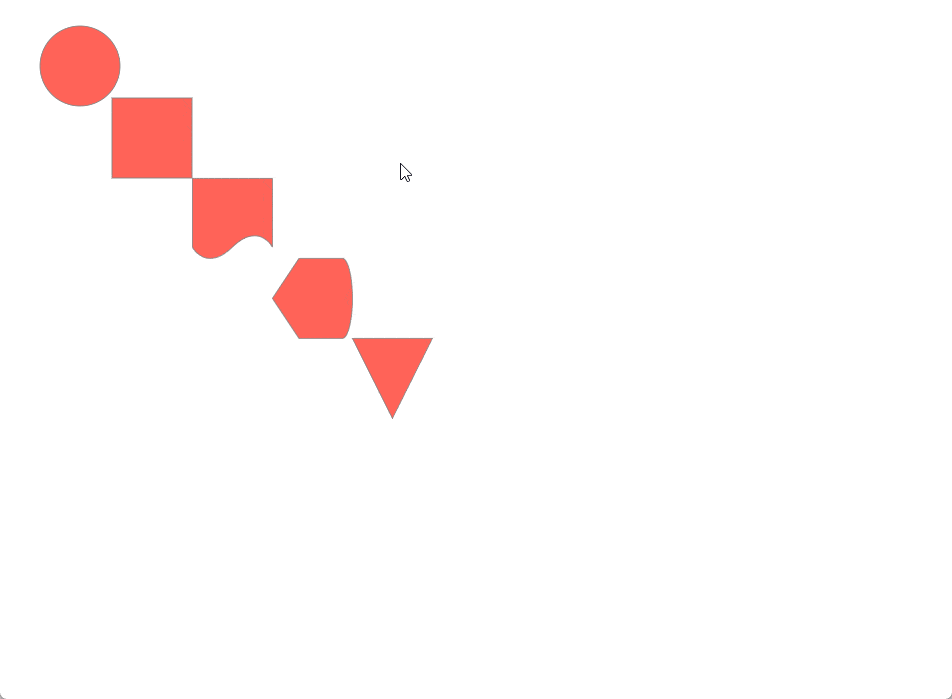
In the figure above, you can see that the shapes are displayed at the specified positions, and we can also move them as we wish.
Creating Connections Between Shapes
A feature that diagram-type controls should undoubtedly have is connections between shapes. Although users can create these connections automatically, it is also possible to create them from code. For this, the tag DiagramConnections must be declared, which is a list that we must fill with tags of the type DiagramConnection, each of which can have the following parameters:
FromIdandToId: These are the identifiers that will relate the connectionType: Determines the type of connection (eitherDiagramConnectionType.CascadingorDiagramConnectionType.Polyline)Cap: Determines the type of cap that will appear on the figure (options:DiagramConnectionsEndCapType.ArrowEnd,DiagramConnectionsEndCapType.FilledCircleorDiagramConnectionsEndCapType.None)
You can see an example of creating these relationships in the following example:
<TelerikDiagram Height="500px" Zoom="0.8">
    ...
    <DiagramConnections>
        <DiagramConnection
            FromId="shape1"
            ToId="shape2"
            Type="DiagramConnectionType.Cascading" />
        <DiagramConnection
            FromId="shape2"
            ToId="shape3"
            Type="DiagramConnectionType.Polyline" />
        <DiagramConnection
            FromId="shape3"
            ToId="shape4"
            Type="DiagramConnectionType.Cascading" />
        <DiagramConnection
            FromId="shape4"
            ToId="shape5"
            Type="DiagramConnectionType.Polyline" />
    </DiagramConnections>
</TelerikDiagram>
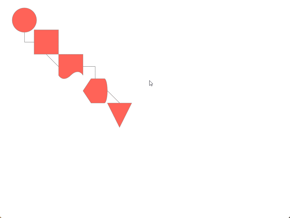
In the previous code you can see how I mixed the connection types, resulting in the following execution:
In addition to the previous parameters, it is also possible to define a Cap through the tags DiagramConnectionStartCap and DiagramConnectionEndCap, as well as a Selection Handle through the tag DiagramConnectionSelection. Below you can see an example of its configuration:
<TelerikDiagram Height="500px" Zoom="0.8">
    ...

    <DiagramConnections>
        <DiagramConnection FromId="shape1"
                           ToId="shape5"
                           Type="DiagramConnectionType.Cascading">
            <DiagramConnectionEndCap Type="@DiagramConnectionsEndCapType.ArrowStart" />
            <DiagramConnectionStartCap Type="@DiagramConnectionsStartCapType.FilledCircle" />
        </DiagramConnection>
        <DiagramConnection FromId="shape3"
                           ToId="shape4"
                           Type="DiagramConnectionType.Polyline">
            <DiagramConnectionSelection>
                <DiagramConnectionSelectionHandles Height="16" Width="16">
                    <DiagramConnectionSelectionHandlesFill Color="lime" />
                    <DiagramConnectionSelectionHandlesStroke Color="green" />
                </DiagramConnectionSelectionHandles>
            </DiagramConnectionSelection>
        </DiagramConnection>
    </DiagramConnections>
</TelerikDiagram>
Running the application gives us the following result:
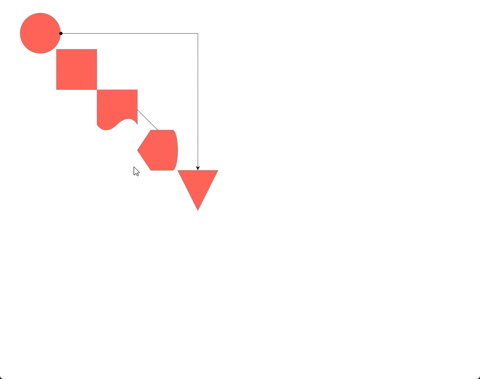
In the previous image, you can notice the use of Cap on the line that goes from the circle shape to the triangle shape, while the Selection Handle is active when the relationship between the shapes Document and Display is selected.
Setting a Layout in the Diagram
Once we know the elements we can use in the Diagram component, it’s time to talk about the predefined Layouts you can use so you don’t have to manually arrange the shapes. There are three main Layouts:
- Tree Layout: Allows distributing the shapes in a hierarchical form
- Layered Layout: Distributes the shapes focusing on a horizontal or vertical flow, minimizing distance between shapes, connection lengths and crossings between shapes
- Force Layout: Enables a distribution where it seems each shape is connected by invisible springs that push or pull the shapes until they reach an equilibrium position. Note that each run with this configuration will produce a different distribution every time
To use one of these layouts, you must use the tag DiagramLayout specifying the type, and it is also recommended to remove the use of the parameters X and Y as shown below:
<TelerikDiagram Height="500px" Zoom="0.8">

    <DiagramLayout Type="@DiagramLayoutType.Tree"  />

    <DiagramShapes>
        <DiagramShape Id="shape1"/>
        <DiagramShape Id="shape2"/>
        <DiagramShape Id="shape3"/>
        <DiagramShape Id="shape4"/>
        <DiagramShape Id="shape5" />
        <DiagramShape Id="shape6" />
    </DiagramShapes>

    <DiagramConnections>
        <DiagramConnection FromId="shape1" ToId="shape2" />
        <DiagramConnection FromId="shape1" ToId="shape3" />
        <DiagramConnection FromId="shape3" ToId="shape4" />
        <DiagramConnection FromId="shape4" ToId="shape5" />
        <DiagramConnection FromId="shape2" ToId="shape6" />
    </DiagramConnections>

</TelerikDiagram>
Aside from the main type for the layout, it is also possible, in the case of the Tree and Layered modes, to specify a Subtype.
For the Tree mode you can use the following values: Down, Left, MindMapHorizontal, MindMapVertical, Radial, Right, TipOver and Up.
For the Layered mode you can use the following values: Down, Left, Right and Up. An example of assigning the Subtype can be seen below:
<DiagramLayout Type="@DiagramLayoutType.Layered" Subtype="DiagramLayoutSubtype.Up"/>
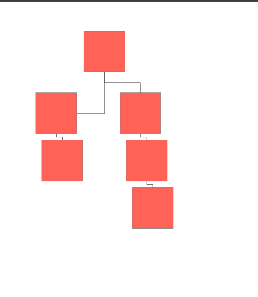
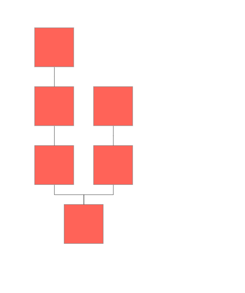
In the following images I show an example of each layout type being rendered:
Tree Layout Sample
Layered Layout Sample
Force Layout Sample
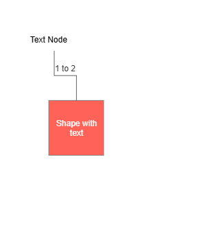
Adding Text to Diagram Elements
Another thing you’ll likely want to do when working with diagrams is use text in your diagrams. Let’s start by adding text to shapes. We can do this using the tag DiagramShapeContent, assigning the parameter Text, as shown below:
<DiagramShape Id="shape1">
    <DiagramShapeContent Text="Shape with text" />
</DiagramShape>
The above will add text inside the shape to display it. We also have the shape Text, which has no border or background and occupies minimal space, and we must also use a DiagramShapeContent to define the text:
<DiagramShape Id="shape2" Type="DiagramShapeType.Text">
    <DiagramShapeContent Text="Text Node" Color="black" />
</DiagramShape>
In addition to text on shapes, it’s also possible to add text on connections through the tag DiagramConnectionContent:
<DiagramConnection FromId="shape1" ToId="shape2">
    <DiagramConnectionContent Text="1 to 2" />
</DiagramConnection>
The result of the previous examples gives us the following output:
These customization options are undoubtedly very useful when creating diagram-based applications.
Conclusion
Throughout this article you discovered the Diagram component for Telerik Blazor, which you have seen offers many customization options and flexibility to adapt it to your needs.
In this article, I covered the main features of the component, but you also have advanced customization options such as the definition of shapes and connections in JSON, adding styles for shapes and connections, as well as more complex customization through the use of Visual Function.
I invite you to try the component and explore its full potential in your own Blazor-based applications. Telerik UI for Blazor comes with a free 30-day trial.

Héctor Pérez
Héctor Pérez is a Microsoft MVP with more than 10 years of experience in software development. He is an independent consultant, working with business and government clients to achieve their goals. Additionally, he is an author of books and an instructor at El Camino Dev and Devs School.
Related Posts
Comments
All articles
Topics
Web MobileMobile
Desktop
Design
Productivity
People
