Font Strategies for Fintech Websites and Apps

Summarize with AI:
Font strategies for fintech websites and apps: Best practices and current trends used by leading financial companies.
When choosing typography for a website or mobile app, there are certain goals you want to achieve. You need fonts that are legible and readable as well as reflective of the brand’s style and personality.
For some niches, you can have a lot of fun with typography—for instance, mixing up playful script fonts with simple sans serif ones. Fintech is not one of those niches.
That said, just because fintech typography calls for a more serious approach, that doesn’t mean you should just use Roboto and call it a day. While there are certainly some best practices to follow when selecting fonts, fintech designers are making some interesting choices these days.
In this post, I’m going to provide some tips on choosing fintech fonts. Then, I’m going to share what I observed after visiting the websites of a couple dozen fintech companies and how their choices may be ones you want to integrate into your own typography selection process.
General Guidelines for Choosing Fonts for Fintech Design
Whether you’re designing a fintech product or the website marketing it, there are certain best practices to follow when choosing typography:
Pick Fonts With Safety Baked Into Them
Security in fintech design is about more than implementing security measures to keep users safe and then applying trust marks to the UI to assure them of their security. Users also need to know that the fintech company is one that they’re safe with, so the design should be reflective of this as well.
When looking for fonts that reinforce this idea, choose ones that feel:
- Modern
- Safe
- Trustworthy
- Transparent
- Professional
- Strong
- Sturdy
- Reliable
- Balanced
This means no script fonts, outline fonts, vintage fonts, rustic fonts, decorative fonts and so on. Serifs and sans serifs are going to be your best friends in fintech design.
Form Must Follow Function
Typography plays a critical role in apps and on websites. This is why form should always follow function when selecting fonts.
First and foremost, legibility and readability cannot be compromised for the sake of a more attractive or experimental font design. While readability is always an important part of making an interface usable, legibility matters a lot in fintech.
Since fintech apps usually have a healthy mix of letters, numbers and punctuation, each character needs to be distinct. If any of a font’s characters are hard to distinguish from one another, users may struggle to understand what they’re reading or misinterpret it completely.
When considering fonts, examine the full character set. A good place to start is to compare the uppercase “I,” lowercase “l” and the number “1.” If you have a hard time distinguishing them from one another, you’ll need a different font.
Consider a Different Font for Numbers
Legibility is just as important for numbers as it is for special characters in fintech. Take, for instance, currency symbols. A font that uses unrecognizable versions of these symbols could lead to comprehension issues or, at the very least, slow things down for the reader.
You also have to consider how numbers and special characters line up in the UI. For example, let’s say you’re building a budgeting app. Many of the pages will contain lines of budget data or calculations. If you don’t use a monospaced numbers font, then the data won’t line up at the decimals, which will create issues for the end users.
While you always want to keep the number of fonts to a minimum on most sites and apps, fintech design may require you to use an additional font solely for numbers and special characters.
Make Sure They’re Multilingual
Unless you’re building a fintech product for users in a single country where they speak one language and use one currency, you’re going to need a font with multilingual support.
This might make it harder to find fonts since not all of them have Cyrillic character sets or ones for right-to-left languages like Hebrew or Arabic. That said, if the app is going to be marketed as an international solution, it’s pertinent that your font supports other languages.
Here are some tips for localizing fintech app design specifically for Latin American users.
How Do Leading Fintech Companies Handle Typography?
I spent the afternoon inspecting the websites of 25 leading fintech companies to see what kinds of fonts they use. While this doesn’t guarantee they’re the same ones used inside of their apps, I suspect they’re at least representative of the in-app typography.
The following are nothing more than my observations, so they’re not meant to be rules that you must abide by. However, I found some interesting trends that you may want to keep in mind as you choose fonts for fintech going forward:
1. Serif Fonts Are Scarce
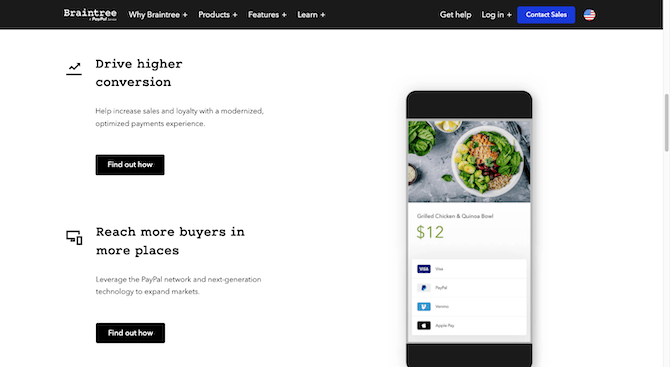
Every website I examined except for one uses a sans serif/sans serif font pairing. The only website that uses a non–sans serif is Braintree:

The header font used here is one called B Proportional and it’s a monospaced slab serif much like Courier. The paragraph font is a simple and straightforward sans serif called Avenir Next.
I find it interesting that this is the only example of a serif I could find anywhere. Even then, it’s not a serif in the way that Times New Roman or Georgia are. Serif fonts tend to feel classic and formal. This monospaced font feels more mechanical than anything else.
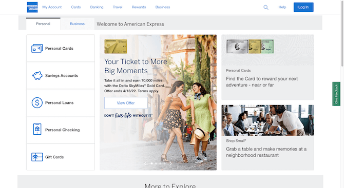
Why is it that fintech designs—and even financial banking designs—have steered away from serifs? Even a company like American Express that’s been around forever uses the Benton Sans font for its headers and Helvetica Neue for body text:

Perhaps it’s because financial companies want their brands and products to be seen as modern and friendly instead of outdated or stiff. It’s an interesting trend and something to keep in mind when deciding between serifs and sans serifs for your products.
2. The Fonts Reflect the FIN Side of the Business, Not So Much the TECH
Going into this, I had expected that at least a quarter of the sites I looked at would use a futuristic font for the header text. I didn’t find a single example of this.
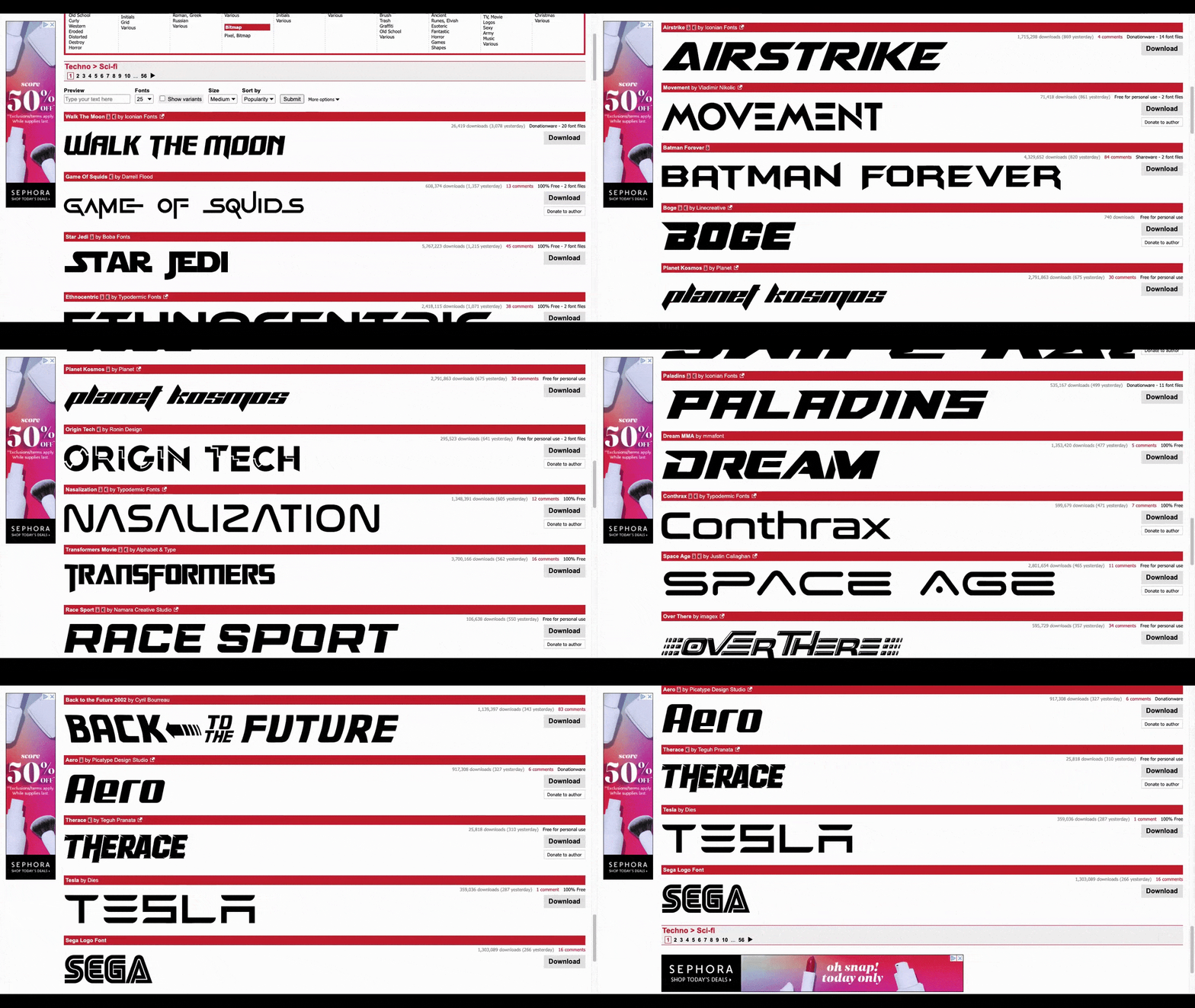
Now, some futuristic fonts are a little out there. That wasn’t what I had expected to see. However, if you look at a site like dafont.com, you’ll see a number of relatively tame options there (think of something like Conthrax, Aero or even Exo 2):

I wonder if it’s because a futuristic font would feel too abstract and intimidating. For a tech brand like Tesla, that style of typography makes a ton of sense. Their products have a cutting-edge and exclusive feel to them.
With fintech, you want everyone to feel like the product is accessible to them. So perhaps I was wrong to assume that there’d be any emphasis on the technology when styling the website’s or product’s fonts.
3. The Majority of Fintech Sites Use the Same Font Family
Four out of 25 fintech sites I visited used fonts from different families:
| Fintech Co. | Header Font | Paragraph Font |
|---|---|---|
| Avant | Effra | Open Sans |
| BlockFi | Circular STD | Public Sans |
| Braintree | B Proportional Bold | Avenir Next |
| Venmo | Athletics Medium | Scto Grotesk |
All the other fintech sites had fonts from the same family or subfamilies:
| Fintech Co. | Font Family |
|---|---|
| Acorns | Avenir Next |
| Ally | Lato |
| American Express | Helvetica Neue |
| Betterment | GT America |
| Brex | Inter Variable |
| Carta | Graphik Web |
| Charles Schwab | Charles Modern |
| Chime | Circular Pro |
| Current | GreyCliff CF |
| Gemini | Inter |
| Gravity Payments | Proxima Nova |
| Klarna | Klarna |
| Kraken | Celias |
| Mint | Avenir |
| PayPal | PayPal Sans |
| Robinhood | Capsule Sans |
| Starling Bank | Universal Sans |
| Stripe | Sohne Variable |
| Varo | Aktiv Grotesk |
| Xoom | PayPal Sans |
| Zelle | Zelle Sans |
One of the best reasons to design a site or fintech product with fonts from the same family is to create a more harmonious and stable vibe. It looks like that’s what a lot of fintech designers are going for.
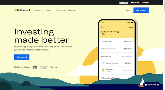
That said, with some fonts there is a good deal of variety in how style variants appear even when placed side by side. Just look at the Betterment hero image for an example of that:

If you want to create harmony through your typographic design, but want to keep the UI from feeling too monotonous, finding a large font family that allows for this will be useful.
Betterment uses a font family called GT America to do this, by the way. There are six subfamilies within it: Compressed, Condensed, Standard, Extended, Expanded and Mono(spaced). And there are 84 total styles available.
4. Web-Safe Fonts Don’t Seem To Be a Priority
Creating a consistent experience from user to user is an important aspect of UX design. However, the only way to ensure this happens when it comes to typography is to use web-safe fonts—ones that are compatible with every browser and don’t require a backup font.
The main issue with using web-safe fonts is that, well, they’re boring as all heck. They include fonts like:
- Times New Roman
- Georgia
- Tahoma
- Helvetica
- Arial
- Verdana
- Courier New
A common workaround I’ve seen these days is to use Google Fonts. They’re not necessarily guaranteed to render on every browser, but I think enough of them have been around long enough to be considered system defaults.
In my observations of fintech websites, however, no one is using traditional web-safe fonts, and many of them aren’t using Google Fonts either. BlockFi and Avant use Open Sans. Gemini and Brex use Inter. Ally uses Lato. That’s it for Google Fonts.
So, why is this happening with fintech typography? I don’t think it’s because no one cares about accessibility or anything like that. I think it’s probably more that the fonts used in fintech are basic sans serifs. There isn’t a ton of complexity in these fonts, so having to resort to displaying a backup font might not be seen as a big deal.
For example, this is the header text that appear in Mint’s hero image:

This is a font called Avenir. When I inspected the code in Google Chrome, it told me that the backup font is Helvetica. This is how that same headline appears in Fonts.com’s sample of Helvetica Black:

If you know what you’re looking for, you can see the differences in these two fonts. Like the round “o” and tall x-axis in Avenir. That said, I doubt many Mint users would notice a difference if they happened to encounter these fonts on different browsers. I also doubt it would change how they interpreted the style or personality of the brand since they’re pretty close in design.
Another reason I think some fintech brands don’t use web-safe or even Google Fonts is because they’re uploading the font files directly to the site. While that’s not usually a good thing for performance, the designer might not have another choice if they’re using custom fonts—which there are quite a few of here. Charles Schwab uses Charles Modern. Klarna uses Klarna. PayPal and Xoom use PayPal Sans. And so on.
By giving browsers the exact files to render, no backup is needed.
Wrap-up
While the fonts that fintech brands use vary quite a bit, the rules they play by don’t seem to vary much. From the basic guidelines I outlined earlier to the first-hand observations I noted about today’s leading fintech websites, there seem to be certain practices everyone has agreed to.
It makes sense considering the delicate nature of fintech. While these companies need to carve out a unique identity and niche for themselves, they can’t afford to scare off prospective or current users with risky design, which includes their typographic choices.
Next up, consider how to design fintech menu icons.

Suzanne Scacca
A former project manager and web design agency manager, Suzanne Scacca now writes about the changing landscape of design, development and software.

