Designing a Better Search Experience for Fintech

Summarize with AI:
Fintech users will inevitably go in search of something not readily available in the app you build for them. By designing a search form that’s easy to find and use, you can greatly improve your fintech users’ satisfaction and business.
As consumers turn more toward digital solutions to manage their money, they’re not going to choose any old fintech app. They want one that offers the best money management experience.
That said, even the most well-designed and featured-packed fintech solutions have a limited amount of space to work with. As such, when a user wants to know:
“How do I add a new spending category?”
“What does [metric] mean?”
“What are the best investments for 2022?”
The search bar is the best resource for getting additional answers and support to your users that don’t necessarily fit into the main app’s design.
In this post, we’re going to look at six things you can do to design a great search experience for fintech users and, by proxy, improve their overall experience with the app.
Creating a Better Search Experience in Fintech Apps
When fintech users encounter a poorly designed search experience, it can easily ruin an otherwise positive experience with an app. It’s like meeting with a potential accountant and discovering that they’re rude, slow, unknowledgeable or unhelpful. The relationship won’t last.
So, let’s look at what you can do to build a search experience that streamlines their in-app activity while boosting their trust in your solution:
1. Use Predictive Search So Users Don’t Have To Wait for Results
Predictive search is useful for a number of reasons.
For one, it doesn’t force users to wait before they start seeing responses populate. It’s the same reason why you don’t want to make users wait until after they’ve submitted a form. By providing real-time feedback, they’ll know they’re on the right track. What’s more, you can reduce the likelihood of an error or, in the case of search, the user coming up with no matching results.
Here’s an example from the NerdWallet mobile app:
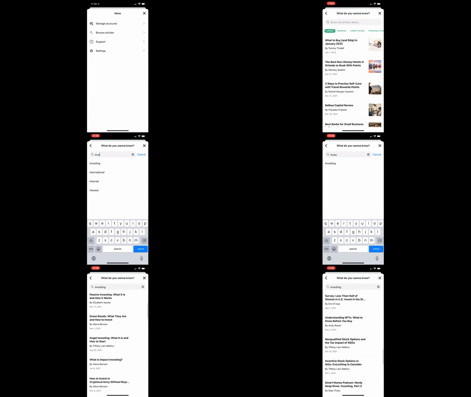
The search form asks users, “What do you wanna know?” As soon as they start typing, keywords begin to autopopulate. Even when the user makes a spelling mistake (“invea” instead of “inves”), the search form still knows what they’re looking for and fills in the correct word.
That’s the other reason why predictive search is a useful search feature. By anticipating what users are looking for, the autopopulated results prevent them from having to type out a full query.
2. Enable Users To Filter Search so They Don’t Have To Sift Through As Many Results
Fintech apps tend to collect loads of data and over long stretches of time, too. With so much information available within the app, the task of sifting through search results can become quite tedious.
By adding filters to your search form, users can narrow down which results they want to see. For instance, PayPal’s “Invoicing” search form comes with an “Advanced search” option:
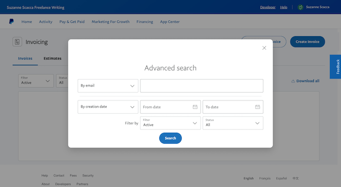
Rather than enter a word in the regular search field and hope it pulls up the right results, users can designate what kind of matches they want to see:
- Recipient email address
- Creation date range
- Invoice status
If your app has more complex data sets and fields, you may need to provide users with a bit more guidance when filtering their results. That’s what we see in Stripe’s search form:

When the user places their cursor in the search form, a list of suggested filters appears along with some Search tips. These filters look a lot like the ones we use in email platforms like Gmail.
Rather than clutter up the UI with a larger search form containing numerous filter toggles or checkboxes, Stripe keeps it simple. Users can either click on the filter they want to use or they can type it in on their own.
3. Display Recent Search Queries When Users Visit Often
With some fintech apps, you can expect visitors to return regularly. Like business owners logging in to issue invoices or pay suppliers. Or investors who want to check on how their stocks are doing.
If you’re building an app where you expect users to visit the app frequently and you know they’ll use the search form to do the same queries each time, you could improve their experience by adding recent searches to the dropdown.
For example, this was the first time I used the Fidelity Investments mobile app:
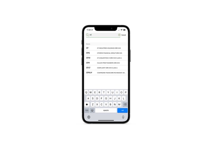
I did a search for “cf.” Stock symbols that start with those two letters appeared below my query. I ended up visiting the page for CF Industries Holdings.
I then went back to the home tab and clicked on the search bar once more. Before I had a chance to type anything in, this appeared:
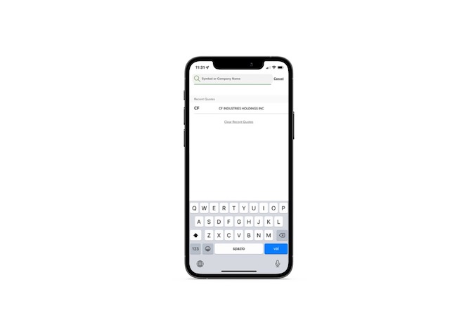
Beneath the search bar is a list of “Recent Queries.” However, it’s not simply the “cf” query I did the first time around. It’s the actual page I visited as a result of that query, making this result even more useful to me.
Fidelity Investments didn’t have me log in in order to use this app, so I’m only seeing this data based on this one visit. With other free-to-use apps, I don’t know if this recent search feature will be worth adding in. Where it will be valuable, however, is in apps where you can make the results truly personalized and based on existing customers’ data.
4. Design a Search Bar in Mobile Fintech Apps That’s Meant for Mobile Users
When it comes to mobile app form design, you can’t just treat it the way you would a web app form. For instance:
- Is the form easy enough to reach from the thumb zone?
- Is the form big enough to click into without risk of error?
- Is enough context provided to know what the user can do with the form?
- Will the correct keyboard appear based on what the user is going to type?
- Will the search results populate within the thumb zone for easy selection?
The Stash mobile app is a good example to follow:
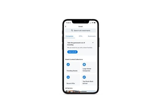
The search form sits close to the “Invest” page header, but not at the very top, which will help improve click reach. It’s also sized well both horizontally and vertically so that most, if not all, users will be able to click it open.
When the search form is activated, it changes shape/size somewhat, too:
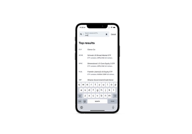
This restructuring of the form is so that the users can see the note “Search stocks & ETFs” while typing out their query.
The “Top results” then populate below with abundant white space between the first column, which contains the stock symbol, and the second column, which contains the company name. There’s also ample white space between each of the matching results. Mobile app users should have little issue scanning through the results and selecting the one they want with this well-structured and mobile-friendly design.
5. Add a Voice Search Option To Speed Up Mobile App Search
Considering how common (and convenient) it is for mobile users to use their voice to dictate messages, talk to an AI assistant or do searches, your fintech app should have a voice search option available.
I couldn’t find a ton of examples of this, so I think this is going to be (or at least it should be) the next big trend in mobile app search. Both within and outside of the fintech space.
One example I found was in the Apple Stocks app:
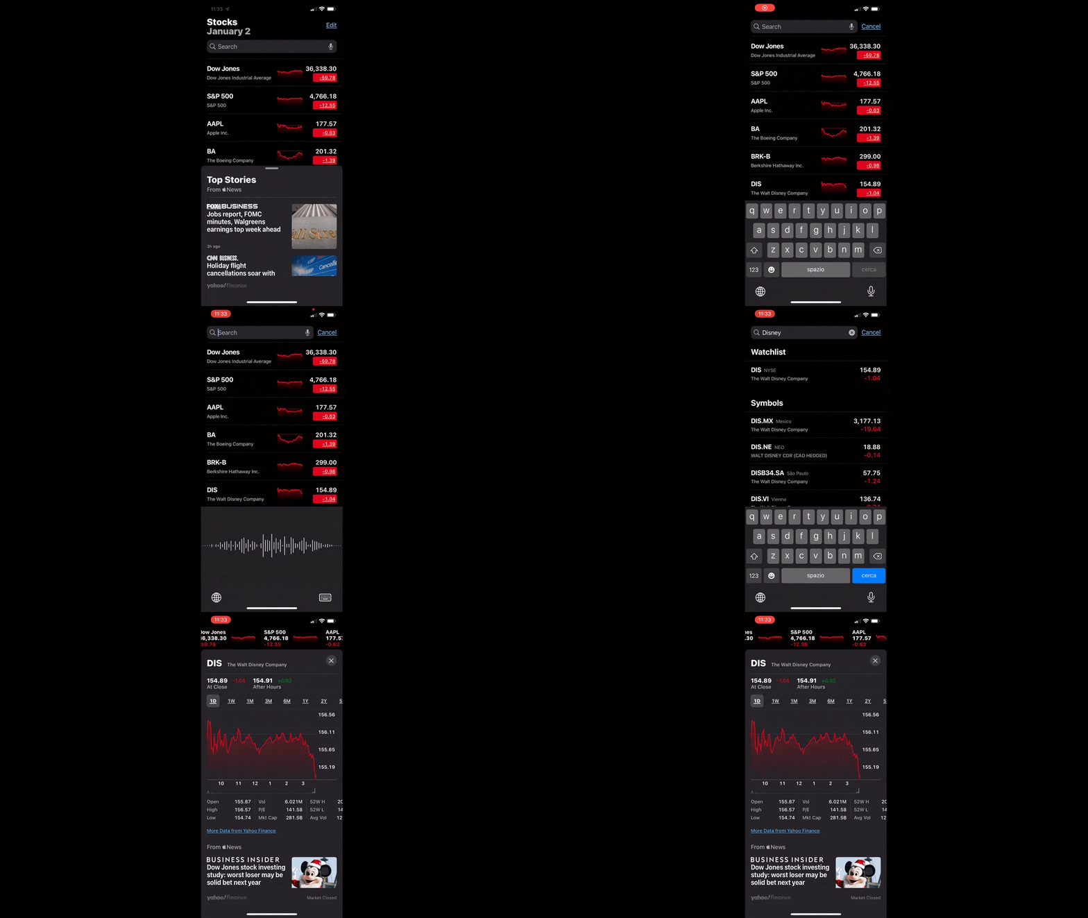
In the GIF above, you can see me activate the voice dictation function through the microphone icon. As I speak the word “Disney,” the result is filled into the form for me and the matching stock results appear below it.
Another app where I found voice search capabilities was Bank of America. However, it doesn’t appear in the app’s main search form:
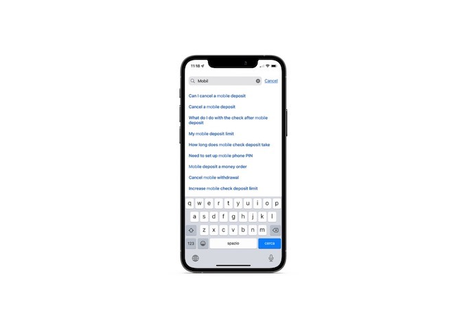
The form autopopulates results based on the letters the user types. In the example above, you can see what kind of results appear when I start to type out the word “mobile.” It’s only when I select one of the results that I gain access to voice search:
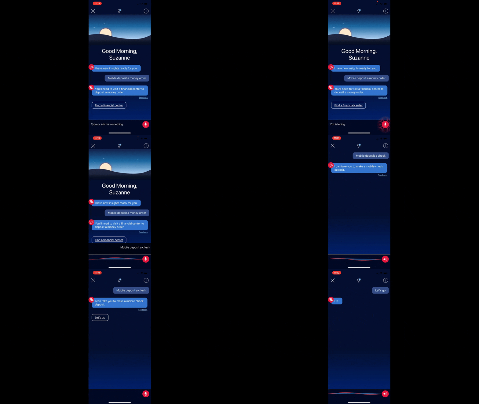
This is Bank of America’s AI assistant. My initial selection of “mobile deposit a money order” couldn’t be completed, so I used the voice search here to look up “Mobile deposit a check” instead.
You can see how the interface changes once voice search is activated. This particular form is a bit more engaging and helpful than the Apple Stocks one, though. It tells me it’s listening and then it types out what it hears before it starts searching for it. It’s not a huge difference from the other app, but those subtle changes may make a difference for your users.
6. Display Search Results in a Way That Makes Sense for Your Users
You have a few options for how you display search results to your users. Which one you choose will depend on things like how much data your users generally accumulate as well as what the context of the search is.
For example, Mint doesn’t have a search function in the header or main area of the app. It does, however, include what’s called a scoped search:

Global search is when a search form combs through the entire app for matches. Scoped search is when a search form only displays results from a specific data set. In this case, the form on the “Transactions” page only looks through data found in the user’s cash and credit accounts.
Because these results are specific to this page, it doesn’t make sense to present search results on a separate page. You want to keep users right where they are, so a form that autopopulates results beneath the query is going to work best.
Another option is to do as Fiverr Workspace does and enable users to do a global search from the header of the app. When a user engages with the magnifying glass icon, a pop-up modal appears:
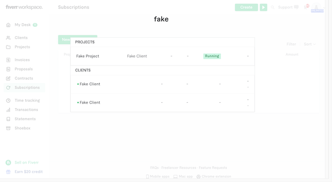
Matching results appear beneath the search field and are organized by projects and clients. I suspect that if I had created any invoices, proposals or contracts for this “fake” client, I’d see results for them here as well.
This particular design makes sense as most users will use search in order to look up one specific project. As such, they won’t need a lot of space to see all of their results. It also enables them to keep their eye on the main app UI in the background.
Another option for designing search results is to dedicate a full page to them as American Express does:
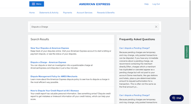
This particular search form isn’t meant to direct users to results from a personal data set. Instead, they’re going to use this search function to look up informational and support pages that explain how to do what they want in the app.
In the example above, I’ve searched for “Dispute a Charge” and am shown both a list of matching page results as well as full answers to related questions in a sidebar on the right. If your app has a large knowledgebase, this could be a good page design for you.
Wrap-up
It doesn’t matter if you’re building an informational fintech app like a stock tracker or a money management app like a budgeting tool. Fintech users expect quick and helpful access to information and features within the app. And if what they’re looking for isn’t in the main UI, they’re going to turn to the search form.
The six tips above are a good place to start when designing the search experience for your fintech users. If you can improve their search capabilities, you’ll improve their overall experience with the app and, in turn, up your app’s user retention rates.

Suzanne Scacca
A former project manager and web design agency manager, Suzanne Scacca now writes about the changing landscape of design, development and software.

