Building Trust with Fintech Security Features

Summarize with AI:
Fintech adoption may be growing faster than expected thanks to the events of 2020 … But just because there’s a growing demand for mobile finance technologies, that doesn’t mean fintech users have tossed aside their security and privacy concerns.
Those worries are still there—and with good reason.
In 2020 alone, Finastra was hit with a devastating ransomware attack, 2,000 Robinhood accounts were attacked and Dave’s data breach impacted 7.5 million users.
Data misuse is also a valid concern. 90 consumers filed a complaint against Klarna for using their data when they’d never given them permission to do so.
Now, even if your client is running a tight ship when it comes to app security, claiming that the app is secure on the website’s landing page or app store listing might not do much to instill trust in users.
Consumers might not be able to inspect your code or systems or even know what to look for. However, they do know what it looks like on the frontend when they’re interacting with a well-secured app. And this is why fintech apps need to be designed with security features.
Today’s we’re going to look at nine of these features and some good examples of their implementation:
1. Use HTTPS on Your Website
Many fintech apps are promoted outside of the app stores. If yours has a website of its own, then use this opportunity to make a strong impression in terms of security with an SSL certificate.
Here’s how it looks in the browser tab when you visit the Kabbage website:
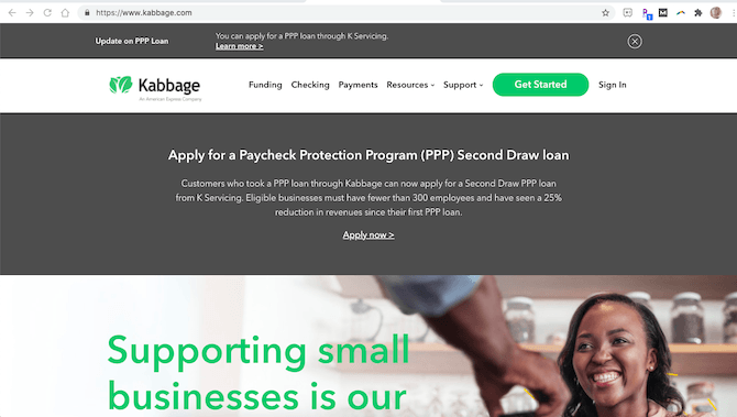
The lock symbol and HTTPS before the domain name tell us this website is secure. Visitors can even open up the domain details and check out the SSL certificate information.
Now, if visitors don’t know or don’t bother to look at the URL, that’s okay. The SSL certificate gives your website an edge up on competitors that don’t use one. That’s because security—specifically HTTPS—is one of Google’s ranking signals.
So, it’s worth it either way.
2. Add a GDPR Notice
This is something you should include in any websites or apps that collect information from users, no matter how minor it may seem. So, if the website generates leads or allows users to sign up, it should appear there.
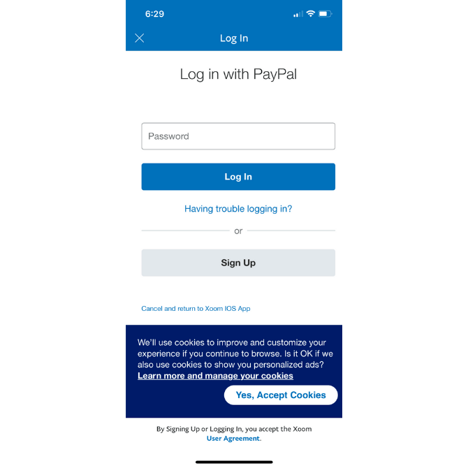
It can also go inside your app. Here’s what it looks like in the Xoom app (as well as all other PayPal apps):
If your app uses cookies to store user data, to personalize their experience or to restore their session in the future, then you need to get their consent to do so.
In the case of Xoom, it briefly explains how cookies enhance the in-app experience. Users can either accept the cookies or they can click “Learn more and manage your cookies” to update their tracking settings.
Offering cookie customization options is a good idea if you want to instill greater trust in your users.
3. Address Security and Privacy During Onboarding
One of the problems with many fintech apps is that they don’t address security or privacy until users have already signed up. Even then, the information is usually stored in some secondary menu.
Rather than wait until after signup, start addressing the matter of security during the onboarding process.
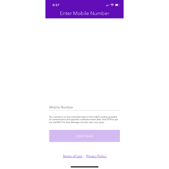
Zelle handles this nicely:
For anyone wondering why their phone number is needed and how to get out of SMS communications, Zelle provides a brief explainer under the Mobile Number field.
It also includes links to its Privacy Policy and Terms of Use at the bottom of the page in case users want to learn more.
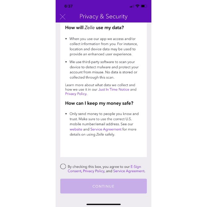
Even if users skip over those links, Zelle doesn’t let that important security information go unnoticed. This is the next screen users see:
Zelle addresses the matter of security and privacy in a concise and easy-to-read manner. It also provides helpful links along the way in case users still aren’t convinced.
Before they enter the app, users are required to consent to the security policies, which I think is a smart move. It forces users to think about something that could otherwise be easily dismissed or ignored … That is, until something happens to their data that they don’t like.
4. Encourage Stronger Passwords
While you can’t force your users to create a unique password for your app, you can ensure that the one they pick is difficult to crack.
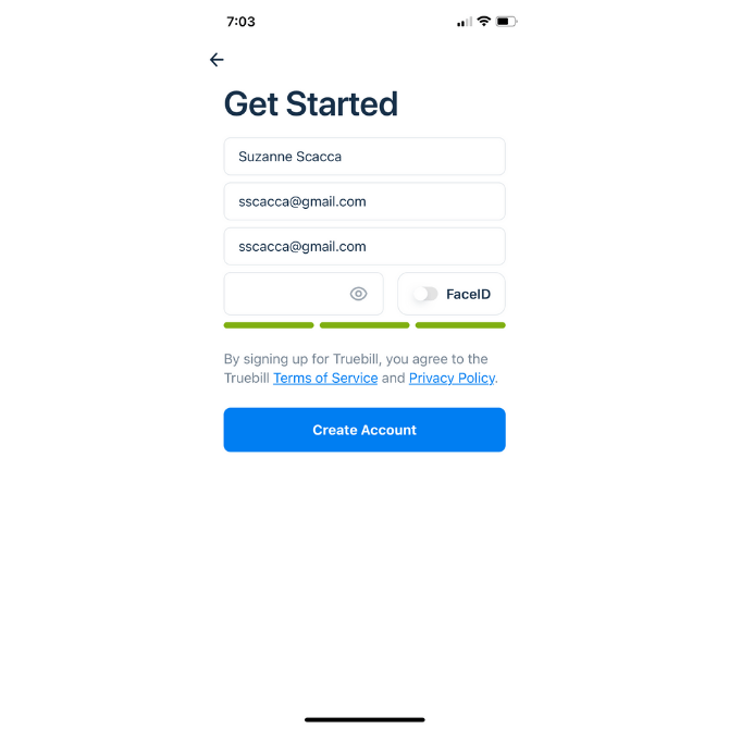
What I like about how Truebill handles this is that its password strength indicator uses color:
We know that people have an emotional connection to color. So, when they start to fill out the hidden password field with their characters, they’ll watch the indicator bar go from red (weak) to yellow (okay) to green (strong).
It’s a good way to encourage them to add more characters and to mix them up with numbers, capital letters and symbols.
5. Include 2FA / MFA
Strong passwords aren’t totally immune to being hacked, even if they’re unique to your app.
To give your users a security boost, allow them to enable two-factor authentication (2FA) or multi-factor authentication (MFA) during signup as well as from their settings.
There are a variety of options you can give them:
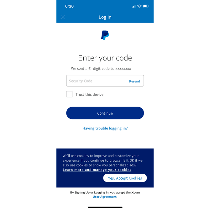
Xoom has two. The first is a six-character code sent to the user’s mobile device:
They retrieve the code from their messages and then have 10 minutes to input it into the field.
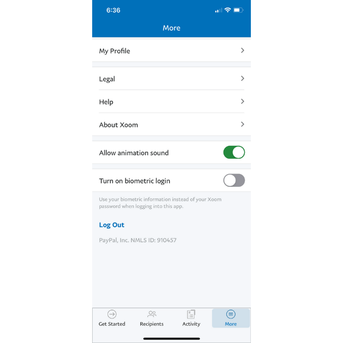
The other 2FA option is a biometric login:
This option takes the user’s biometric login from their phone—like a thumbprint or face ID—and replaces the traditional Xoom login process with it.
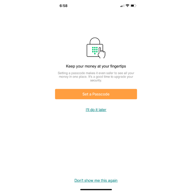
Another MFA option is the passcode. Mint offers this one to its users:
Users still have to log in as usual. However, before they’re granted access inside the app, they must provide a four- or six-digit code that they came up with themselves.
6. Enable Privacy Control
Every mobile app should have a dedicated section to security matters. That’s a given. However, if there’s a way to let your users control some of the more flexible security and privacy settings, that would certainly help bolster their trust.
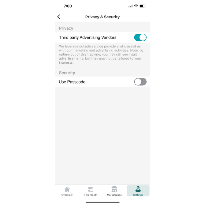
Mint, for example, includes this setting under Privacy & Security:
It’s not uncommon for mobile apps to make money by running third-party ads. However, what’s uncommon is for mobile apps to give users the ability to decide if they want to share their data so these ads may be personalized to them.
7. Notify Users About Third-party Security
Like other types of professional or productivity software, fintech apps sometimes need to connect to other platforms in order to be of value to users.
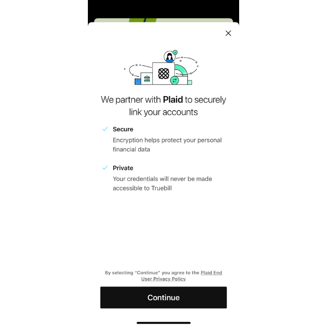
Take, for instance, Truebill:
This money-management app allows its users to connect to their financial institutions, credit card companies and other relevant services. Without this integration, users would have to manually record their financial records.
Not only does Truebill provide assurances about the safety and privacy of this data transfer, but it name-drops Plaid. This way, users can look into the company that actually handles the connection.
Anytime you can offer this level of transparency, take it. Your users will be thankful you did.
8. Include Trust Seals in Key Areas of the App
Including Plaid’s logo is a type of trust mark or seal. But there are others you might be able to include in your app.
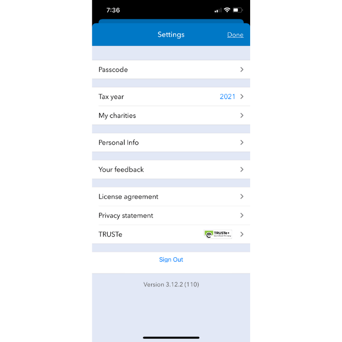
ItsDeductible—like other Intuit apps—includes a TRUSTe trust mark in the Settings area of the app:
Users can click through to learn more about the privacy certification and how it helps keep their data safe.
That’s, of course, something to keep in mind. A lot of times what we see on websites, for instance, are trust marks for products like McAfee, Norton and BBB. But they’re just logos. If you can elaborate on what exactly the trust seal stands for, it’ll have a greater impact on your users’ trust and confidence.
9. Send Trustworthy Notifications
Last but not least, configure your app to send security-related push notifications and emails. Better yet, allow your users to decide which kinds of security matters they want to hear about and where they want them delivered to.
When setting up the messaging for them, make sure it’s clear where it’s coming from and what they need to do with the message.
For instance, do they need to verify that they logged in? This PayPal email simply lets me know that an unrecognized device logged into my account:
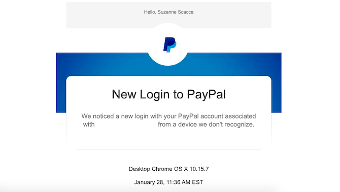
There’s no action I need to take so long as the details provided check out with my own activity. If not, PayPal helps me take next steps.
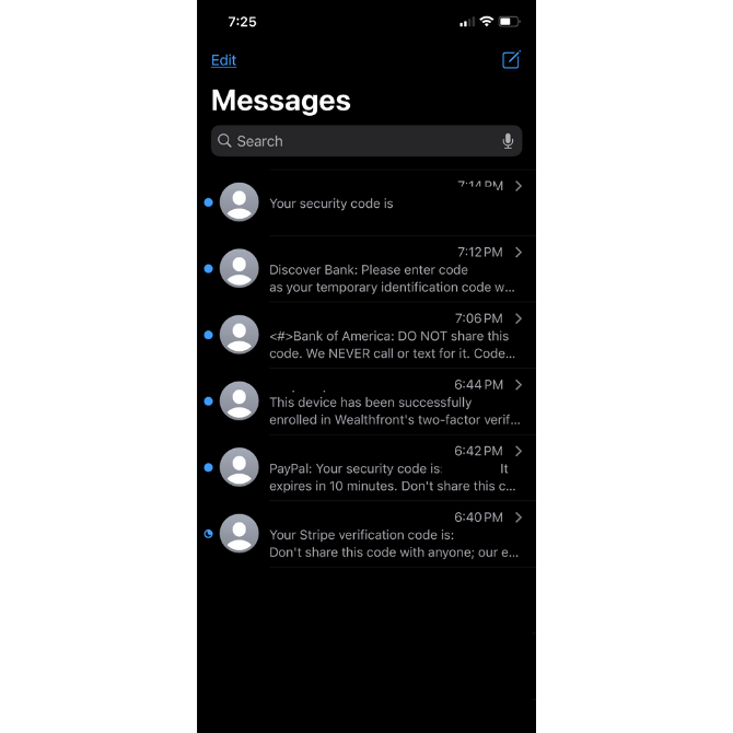
How about sending along security codes? While I was testing out apps for this article, I received a whole slew of them:
You can see the variation in push notifications I received from different apps:
- The first one came in with no identification. While I knew which app it belonged to at the time, I have no idea now that I look back at this.
- Discover Bank sent me a six-character code to confirm it was me trying to get in.
- Bank of America did as well. It also provided some useful tips on what to do with the code and when to trust it.
- Wealthfront texted me to confirm that I enabled 2FA during onboarding.
- PayPal sent me a six-character security code and gave me 10 minutes to use it.
- Stripe sent me a security code as well and reminded me not to share it.
There are clearly different ways to handle 2FA notifications. But I think that including the code along with helpful reminders will put your users at ease when using it.
Wrap-up
From the very second your users open your app, their data’s security and privacy should never cross their mind. Except maybe to think about how much safer they feel logging in with MFA than the one they used previously that didn’t have it.
It’s the company’s job to create a secure application for their users. However, you’re going to play an important role in this as well. If your design and its features can convey to users that their data is safe, they’ll feel more confident and positive about their experience within the app.

Suzanne Scacca
A former project manager and web design agency manager, Suzanne Scacca now writes about the changing landscape of design, development and software.

