What You Need to Know Before Designing Apps for Fintech

Summarize with AI:
Fintech is a booming industry, but there are vastly different approaches required for different kinds of financial apps. In this post, we’re going to review some of the differences between the most popular ones.
Gone are the days where consumers and businesses rely solely on banks, investment firms, accountants or advisors to manage their money. Financial technology (fintech) solutions have virtualized a lot of this. What’s more, fintech has empowered users to take control of their money-making decisions and actions.
While it’s certainly a cool space to get involved in, there are different kinds of fintech solutions that require vastly different design approaches and strategies. If you want to build good apps for your clients, I’d advise you to narrow your focus to a sub-category of fintech rather than try to memorize how to build each and every kind of money management app.
Before we take a look at different kinds of fintech solutions, I want to quickly go over which elements every fintech app should include.
Elements That Belong in Every Fintech App
There are certain elements that every fintech designer needs to account for:
Simplistic Design
This might seem like a no-brainer. However, it’s important to remember that finance management is a very serious matter, so you can’t afford for your design to overwhelm or cause indecisiveness.
As such, your app should include only the most necessary of features and should have a calming and stable UI.
Data Visualization
Finance apps have to provide users with a ton of data, which means a good majority of the content is in numerical form. The best way to provide them with this information is to put it into dynamic graphics.
Charts and graphs are going to be especially useful, but you’ll also need to use color (red and green mostly) to translate data into easy-to-find and digestible information.
Internationalization
Unless you’re developing a region-specific banking app, it’s safe to say that it’s going to attract users from all around the world. Using a minimal design and basic color palette will help create a universally friendly app. But there’s something else to keep in mind.
While you can provide users with a country, language, and currency switcher, your UI needs to be prepared to accommodate translated content. For instance, does your chosen typeface support Cyrillic or Asian characters? And how about the space allotted within the app? Would there be enough room, for instance, to turn $2,000.00 (USD) into ¥215488.00 (JPY)?
Monetary conversions can be problematic if you don’t initially design your app with them in mind.
Security Reassurances
It doesn’t matter what kind of financial solution it is. The second people start depositing real funds into it or integrating with their bank accounts, security becomes a huge concern. While you might not be responsible for fortifying the app, you need to communicate to users that those security measures are in place.
Once a user is subscribed, there are several ways to do this. Requiring two-factor authentication is one way. Hiding passwords and other sensitive info (like account numbers) behind asterisks is another. There should also be an entire section dedicated to security settings in the app.
Customer Support
Even if financial apps are meant to be self-service, users may eventually need help. In some cases, customer support will help them deal with bugs and errors encountered in the app. In other cases, customer service should be there for users who want to upgrade and/or take advantage of professional services.
That’s why these apps need to have a variety of support options readily available. Virtual assistant chatbots, live chat, click-to-call (or email)—whatever makes the most sense for your app.
Special Design Considerations for Fintech Apps
Fintech apps serve such a wide array of purposes, requiring special design approaches and strategies. Let’s look at some of the ways in which these apps vary and how designers account for them:
Note: Although the examples below are all mobile apps, the same tips apply to web apps.
Banking and Credit Card Apps
Even though these are two different kinds of financial products, their apps tend to be similarly designed. Part of the reason for this is because many banks offer credit card solutions, and vice versa. So, it’s easier to settle on one very simple and buttoned-up design to provide consistency between the products.
As for what you have to do differently with these apps than other fintech, here are some things to keep in mind:
Home Dashboard
Upon logging in, your users should see a very high-level overview of all their accounts (if they have more than one).
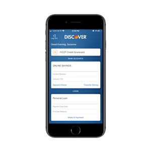
For instance, this is the first screen Discover users see:
This gives users a bird’s-eye view of what’s going on with all of their accounts. The quick-action buttons then make it easy to enter the account they want to focus on and get done what needs to be done.
Navigation
Once banking and credit card customers are inside their app, the navigation should make switching between high-priority tasks a breeze.
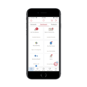
Here’s how Bank of America does it:
In the case of this app, users can do the following from the navigation:
- Check their accounts’ statuses
- Transfer money within and between accounts
- Pay their bills
- Deposit checks
The dashboard also provides a set of quick-click links to secondary actions and settings.
A Calming UI
Checking on one’s financial status isn’t always the most relaxing of experiences, so you need to ensure that your app is designed to keep users feeling calm and in control. You can do this with smart design choices.
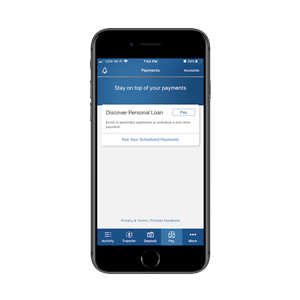
Let’s look at the Discover app once more:
There are a few lessons to take away from this design:
- The choice of blue is smart, for branding or otherwise, as it’s often associated with stability.
- Most of the buttons are “open.” When we design buttons that are big and bold and filled with color, they demand attention. So, these unfilled buttons put less pressure on users to take action, giving them a greater sense of control.
- The interface is never overwhelmed with ads or affiliate products. Discover doesn’t feel the need to fill empty spaces with promotional content.
Budgeting Apps
A budgeting app is a way for users to see all of their expenses and income in one place. As a result, they can make smarter decisions that positively affect their cash flow.
This makes the following elements essential:
Tooltips/Walkthroughs
Setting a budget isn’t something that everyone naturally knows how to do. As such, these apps need to be configured with guided walkthroughs for users.
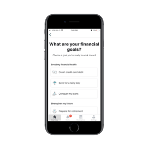
This is how Mint handles theirs:
Before users can actually set a budget, they need to know what they’re working toward. Mint has designed an easy onboarding process that allows them to choose their top priorities.
You might also decide that onboarding tooltips are necessary for introducing new users to the interface and app functionality.
Categories
Categorization of expenses is another important part of being able to budget correctly. But it’s easy to lose track of expenses if users have to do it all on their own.
That’s why these apps not only need to have categories pre-determined, but they also need to be able to auto-categorize incoming expenditures so users don’t stress over the task.
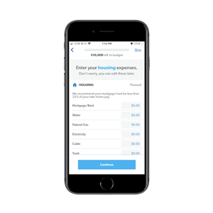
EveryDollar does a fantastic job of taking users through the creation of their budget categories:
This app has thought of everything, which will encourage users to regularly use the app to track their cash flow, amend their budget and make stronger money moves.
Account Integration
The last key element needed for budgeting apps is account integration. Specifically, budgeting apps need to sync with users’ other finance apps in order to automate the collection of income and expense data.
Even if you don’t have to set up those APIs, you do need to present this in a way so users aren’t overwhelmed with connecting their banks, credit cards and other accounts to the app.
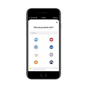
Use NerdWallet as your model for this:
In addition to ordering the banking logos by popularity, you can see that a security reminder is clearly present at all times on this page. This can be a nerve-wracking experience for users, so the security notice should help put their minds at ease about entering their account password details in the next step.
Cash Apps
As digital commerce grows ever more popular—for professional and personal purposes—cash apps have grown in number. There are a few standouts in the space, though, and it’s because they make users feel confident in exchanging money online with the following:
One-click Actions
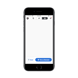
One of the reasons users choose to use these apps over exchanging money in the real world or doing so through a bank is because of how much more quickly it can happen. There’s no need to exchange routing details or set a meetup spot. It all happens with a click of a button as this example from Venmo demonstrates:
This is an oversimplification of digital commerce, but it works for the purposes of this app. Anything more than what you see in this interface, and users are bound to become overwhelmed or annoyed and bail.
Oversized Numbers
Normally, you want to use no more than two or three different sizes of fonts when designing digital interfaces. However, cash apps are an exception.
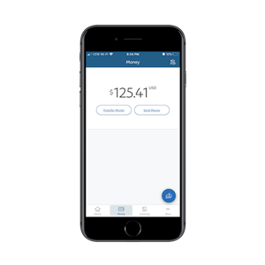
With PayPal, for instance, you can see that the labels are more or less sized similarly. However, the amount of money in the account is way oversized:
When designing your “Money” UI, approach it the way you would a calculator. The total needs to be the primary focus on the page, which means making it much larger than the rest of the details. Don’t worry. Your users have spent enough time in apps to know where all the other stuff is that they need.
Social Integration
This is a feature that’s unique to cash apps, which makes a lot of sense. In most cases, financial apps enable users to securely and privately manage their financial data on their own. However, cash apps are used so that people can quickly exchange money with friends, family, coworkers and maybe even the Facebook stranger who’s decided to buy their old sofa.
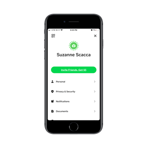
Because of this, it’s beneficial to sync a cash app with social media or even a phone’s contacts. Cash App motivates users to integrate with social with the following button:
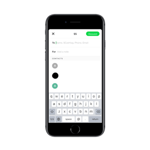
Even if users see that button and scoff at it initially, they’ll eventually realize how beneficial it is to connect to their contacts when it comes time to send or receive money:
Once the user establishes the connection between the app and their contact list, there’s no need to track down people’s email addresses or phone numbers anymore. It’s all done for them.
Wrap-Up
Accounting apps, investment apps, crypto apps, payment processing apps—there are so many different types of financial solutions out there. So, the above list obviously isn’t exhaustive. The point I wanted to make is that these apps are all so different which can make it difficult to design for all of fintech.
My recommendation? Find a category or two that you’re particularly passionate about and commit to that. You’ll be able to design much more effective experiences for your clients and their users that way.

Suzanne Scacca
A former project manager and web design agency manager, Suzanne Scacca now writes about the changing landscape of design, development and software.

