4 Ways App Designers Can Remove Friction from Their Fintech Solutions

Summarize with AI:
Here are a few ways that app designers can remove friction from their Fintech solutions—start by doing away with intrusive pop-ups, laborious onboarding, sloppy navigations and machine-like service.
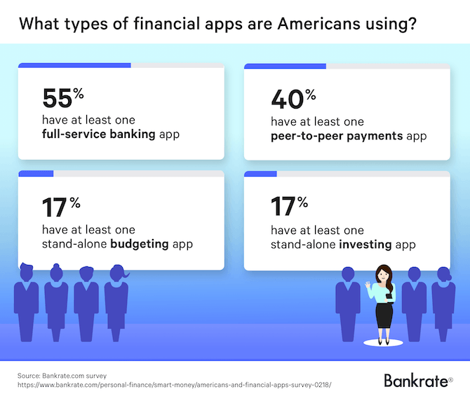
In 2018, Bankrate conducted a survey of U.S. consumers on their usage of smartphone fintech solutions. According to the report, 63% of them have at least one financial app installed on their devices. 70% of those respondents check their apps at least once a week and 16% check them every day.
They also use a variety of financial solutions on their smartphones:
Fintech has slowly but surely been gaining the trust of consumers. It’s also shaken up the financial services industry as a result.
That said, if fintech designers want their apps to continue being a viable and convenient alternative to traditional financial services, they need to remove the friction that holds 37% of users back from installing and actively using them on a regular basis.
This post is going to look at four common issues in fintech UI and UX design and what you can do to fix them.
1. Avoid Pop-up Overload Before Signup
There’s absolutely nothing wrong with pushing notifications out to mobile app users. Nor is there anything wrong with asking users to enable telephony features like geo-tracking or camera access that will improve their experience with your app.
What is a problem, however, is when you start pushing out those requests before they’re even one of your users.
Request overload makes a really bad first impression and sets a worrisome precedent with your users.
Remember: Installing an app is not a sign of commitment and can easily be undone.
So, let’s take a look at an example of how and why this can hurt your user acquisition and retention rates and then we’ll check out an example of an app that handles it responsibly.
The Discover mobile app is actually a really well-reviewed app because the content within it is thoughtfully designed and intuitive. However, it’s this entry into the app for new users that’s problematic:
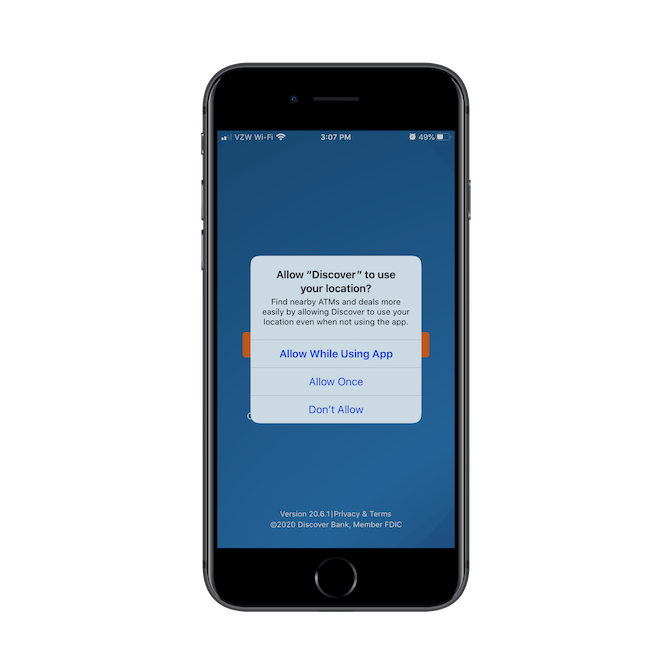
This is the first thing a user sees — before they ever see the splash screen behind it.
While most people installing this app are going to be existing Discover card or banking customers, that’s no excuse for this being the first thing they see and have to deal with. Imagine what would happen if this were a freestanding app with no brick-and-mortar presence or long-established company behind it. They most certainly couldn’t get away with this.
After the user deals with the location-tracking pop-up, this is what they see next:
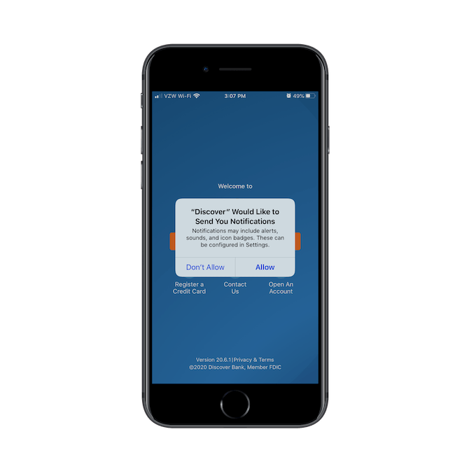
Unlike the location request, there are no real details provided on why the app is going to send push notifications. It just asks users to "Allow" or "Don’t Allow" them. Again, this pop-up keeps new users from seeing the splash screen and entering the app.
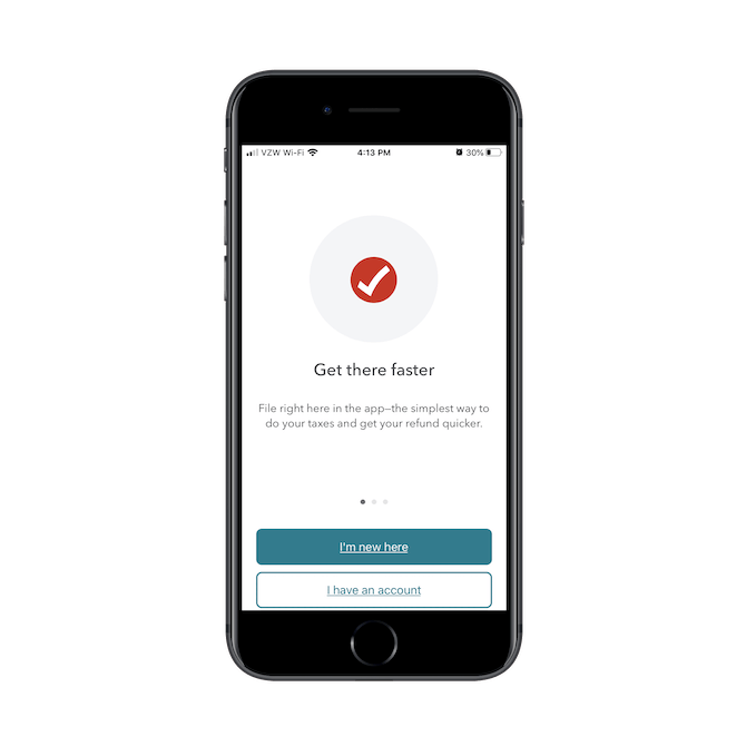
The TurboTax mobile app, on the other hand, doesn’t assume that first-time users (at least, in terms of using the mobile app) are ready to make those kinds of decisions.
This is the very first thing TurboTax users see and there are no interruptions either:
After going through the sign-up or login process, users encounter this card:
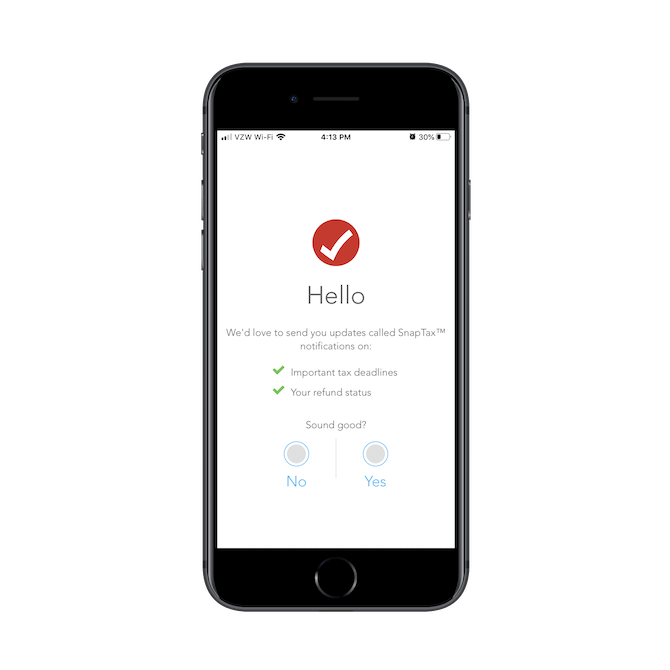
Rather than disrupt their onboarding process with a push notification pop-up, the app makes a friendly introduction to its SnapTax notifications, what they’re used for, and then asks users if that "sounds good." That’s such a great way to handle this. It takes all the pushiness and urgency out of the push notification enabling process.
It’s only when they say "Yes" that users will see the traditional push request pop-up.
If you want more users to opt-in, consider making a friendlier introduction to them with a card or banner before interrupting what they’re doing with a pop-up. And also make sure these requests appear when it’s relevant to the in-app experience. For instance, if your banking app allows users to scan checks in for deposit, only ask for camera access when they enter the scanning feature.
2. Lay Out the Onboarding Steps Before Starting Them on the Path
Unless you’ve built a simple financial calculator app or something else that doesn’t require users to sign up, you’re going to have to build out an onboarding process. The more data you collect from users at the beginning, the less you’ll have to interrupt their in-app experience. So, it’s important to get this right.
That said, many financial apps have to go pretty deep in terms of the information they ask for… which means it’s going to take some time for them to get through it. That’s something that can’t be helped.
What can be helped, however, is how they perceive the length and intensity of the process.
Look at your onboarding process as a way to get users invested in the app right from the start. By providing the right motivation, they’ll be more than happy to sit there for four or five minutes filling in the details the app needs from them.
There are a couple of ways to do this. Both use breadcrumbs (which is essential any time you have to break up a long process into multiple pages and steps), but they’ve taken two different approaches to data handling.
Let’s look at the Coinbase mobile app first:
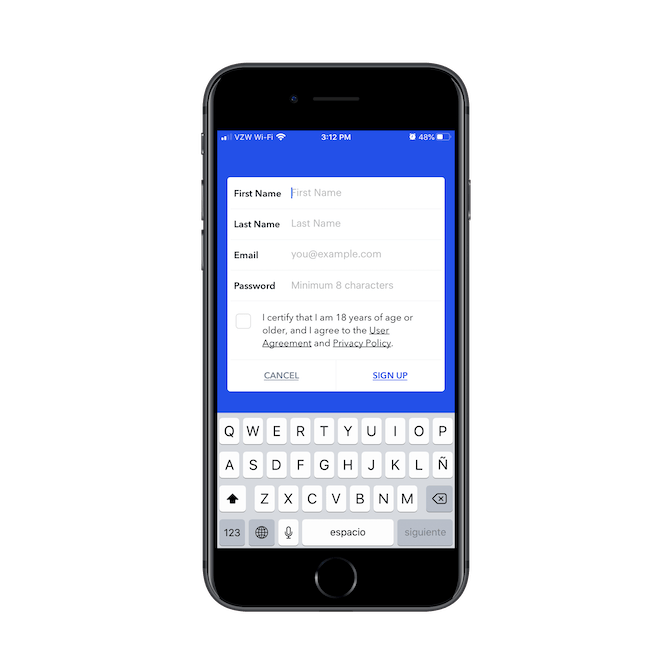
This is the first page of the signup process. As you can see, Coinbase only asks for essential personal information at this stage.
That’s step one of the boarding process. On the next page, users begin the second step:
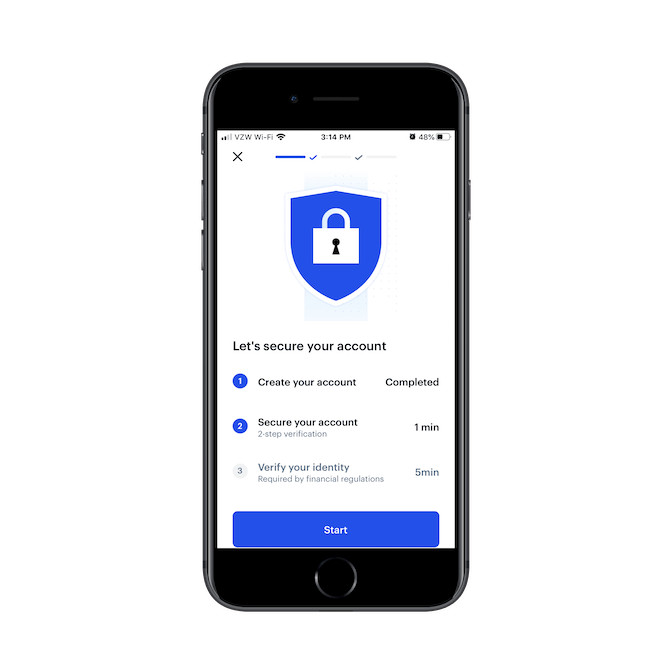
"Secure your account" is what they need to tackle next. And based on the information provided, all they’re going to do is set up two-step verification and it should only take one minute. I went through the process and can tell you it was as simple as that. I gave them my phone number, submitted the verification code, and it was all done.
In the third step, users are asked to verify their identity, which, according to the page above, is required by financial regulations and only takes five minutes to complete. All it does is ask for basic personal and contact information along with what the user’s plans are for the app. It’s as simple as that.
Another app with a great step-by-step onboarding process is QuickBooks Self-Employed. This is the first of four steps:
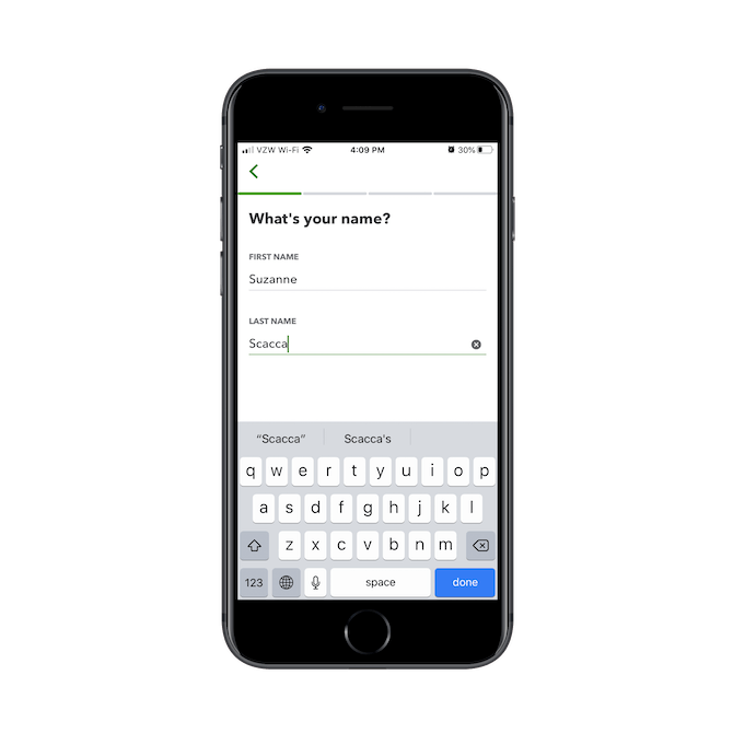
It’s a simple enough request and it sets a good tone for the rest of the onboarding process.
The next step applies the information from the first step and then asks a simple question about the user’s business:
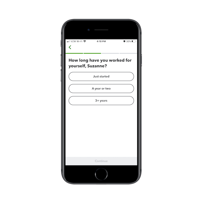
It’s nice to see how the data collected from this onboarding process is already being applied to create a more personalized experience in the app. This’ll certainly motivate users to provide more details about themselves and their businesses.
Next, QuickBooks asks how they plan on using the app:
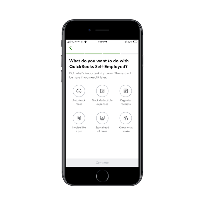
Again, answers are pre-written so new users don’t have to spend a lot of time preparing open-ended responses. Considering this might be the first time a freelancer has handled their accounting, this process should make them start to feel like a weight’s been lifted from their shoulders.
This is the final step in the onboarding process:
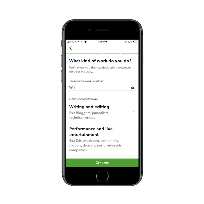
The search bar on this page is predictive, so when someone starts typing "wri" like in the example above, they’d get paired with a job like "Writing and editing". Again, it makes completing the onboarding process much easier for the user.
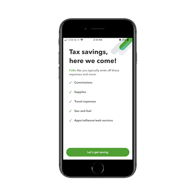
As you can see here, this short onboarding questionnaire has also enabled QuickBooks to provide a custom experience based on the business type, what the user needs the app for, as well as their experience level.
Notice the differences between how Coinbase’s and QuickBooks’ onboarding processes are handled. The cryptocurrency app’s process is mostly concerned with security and privacy. The accounting app, on the other hand, uses its onboarding process to personalize the in-app experience.
So, like I said before, while breadcrumbs are used by both, they’ve taken very different approaches to designing the process. Make sure yours sets the right tone and expectations for your app.
3. Oversimplify the Navigation
No matter how complex your financial solution is or how chock full of features it may be, the navigation is not the place to demonstrate that.
This is one of the keys to good usability in any mobile app, but I get how difficult it can be when you have so much you want your users to take advantage of within the app. But don’t worry. Most mobile app users know what a "More" menu button does and know to look for settings under the gear icon.
To be honest, I think many mobile app designers already know that the navigation needs to be greatly simplified.
What you need to be careful about, however, is not simplifying it enough… or the right way. To demonstrate what I mean by this, I’m going to contrast the PayPal Mobile Cash app with the PayPal Business mobile app.
Here’s what the UI of the mobile cash app looks like:
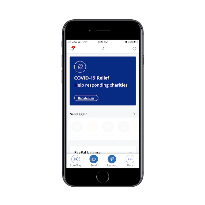
The bottom navigation is fine. It includes three common actions users take when using the app:
- Scan/Pay
- Send
- Request
It also includes a More button.
It’s nice that each of these buttons is clearly labeled, too.
However, look at the top bar. The notification ticker on the left is more of a distraction than anything. And it’s mainly used to inform users about new app features than to inform them of their account activity.
Then, there are the other two icons. The one in the middle is the user’s profile photo or icon. It links to the PayPal.Me account settings page, which is odd because that’s what the gear icon in the right does as well.
In my opinion, it’s a waste of space to have these two icons with duplicate functionality sitting up here taking space. It might also become a source of confusion if users have to stop to wonder what the other icon does, only to realize it’s the same exact thing. Any redundancies in the app (like these two account settings icons) need to go and secondary features (like company notifications or news) need to be deprioritized and moved out of the main navigation UI.
Now, let’s look at PayPal Business:
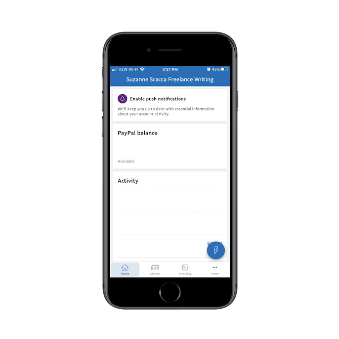
As you can see, it presents a similar experience. Only this time, there’s no top bar. The main navigation includes tabs for:
- Home: an overview of account status
- Money: the total money in the account
- Invoicing: an area to issue and receive payments
- More: for additional settings and features
If PayPal Business can place the account settings within the More pullout menu, I think that’s an even greater argument for PayPal Mobile Cash to get rid of its top menu and move its account settings there as well.
Something PayPal Business does differently is the blue "lightning" button in the bottom-right corner. It provides users with a set of quick actions:
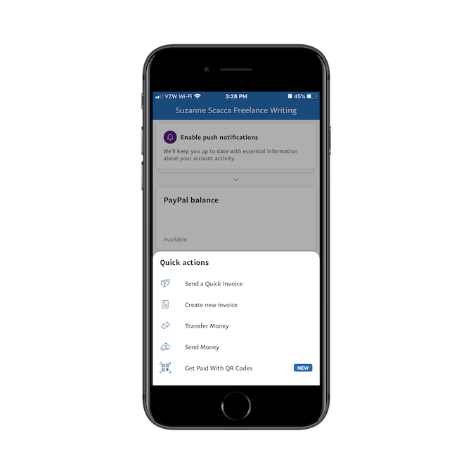
Whereas the main navigation contains mostly informational tabs, this sticky button in the thumb zone gives users an easy way to execute an action no matter where they are in the app.
So, if you feel like there are one too many things that belong in the main navigation, or you’re torn between what kinds of buttons to put there (e.g. informational vs. actions, actions vs. settings), don’t overcomplicate it. Create just one main navigation that gets users to the primary areas of the app. Then use nonintrusive elements like the action button to hide away pages or features until the user is ready to engage with them.
4. Don’t Allow It to Feel Too Much Like a Machine
One of the things that in-person financial solutions have going for them is the human touch. While it’s clear from the popularity of fintech that human representatives aren’t always wanted or needed, there certainly are times where that is the case.
And you can’t afford for your app to deprive them of that.
One way you can fix this issue is by giving the interface some friendlier and personalized touches. But that’s not enough. Think about the role that humans traditionally play in banking services or for credit card companies. Usually, they’re customer service representatives, right?
So, what you need to do is bring a bit more humanity to the support parts of your app.
The Bill.com mobile app, for instance, feels much more like a machine than the American Express app. Let’s take a look:
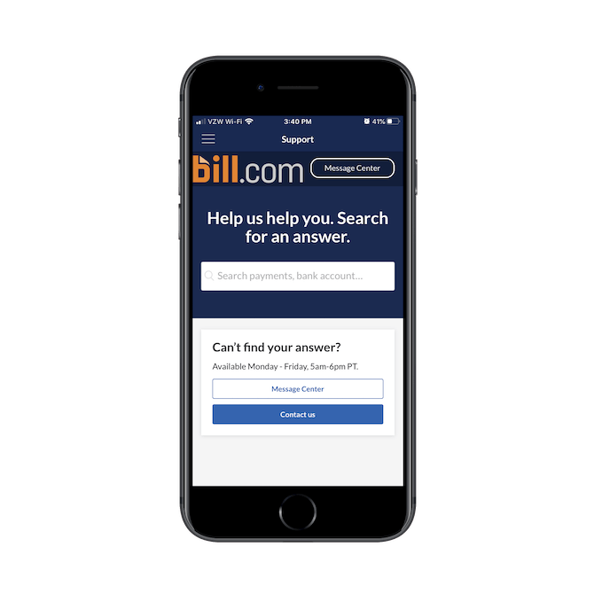
This is the "Support" page for Bill.com. Users can either search for help using the search bar (which isn’t very useful) or they can try to reach someone Monday to Friday, 5 a.m. to 6 p.m. PST.
Here’s the problem though:
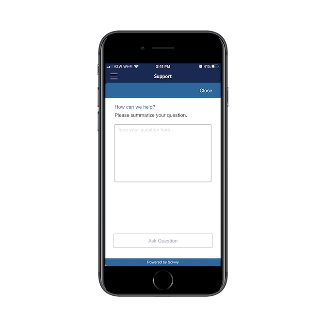
This is all they’ll find in terms of human support. The open-ended form asks them to describe what they need and then they have to wait for a response, depending on when they submit it.
When submitting support requests after hours or when there’s a backlog of requests, users then have to turn to the Message Center to check on the status of their request:
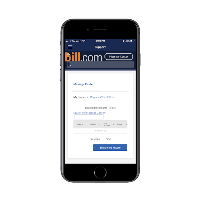
While this likely beats leaving users with a simple chatbot that can’t do much but answer simple questions, it still feels very detached and cold.
Customer service is a very important piece in financial services, whether it’s in-person banking or automated budgeting via a mobile app. When designing yours, make sure you follow the example AmEx has set instead:
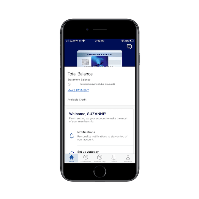
From the very get-go, users are given a warm and personal greeting before being guided through a step-by-step setup of their account so they can get the most of it. So, you can only imagine how good the customer service experience is going to be.
This is what the AmEx support center looks like:
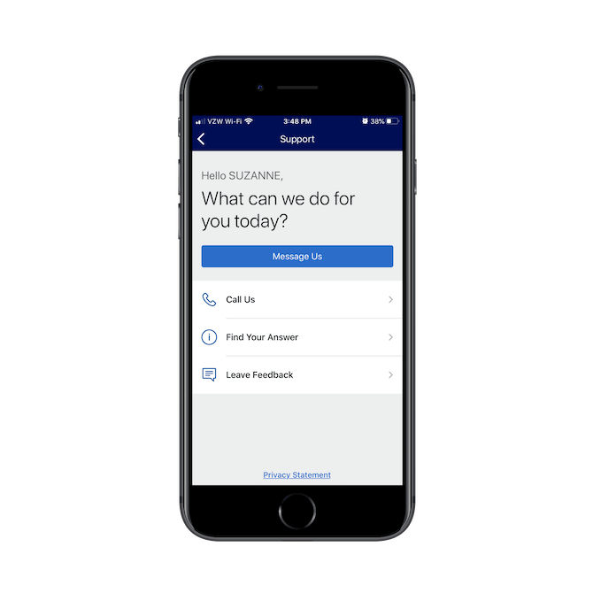
Users yet again receive a warm, personalized greeting on the support page. They’re then given a wide range of options for getting support.
The first option is "Message Us." Considering it’s in blue and at the top, I’d guess their data shows that this is the preferred contact option for users.
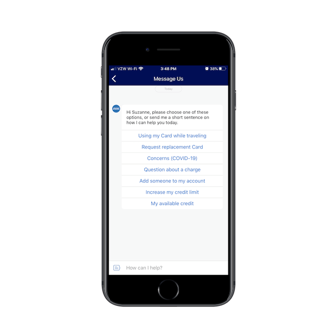
The chat begins with a helpful prompt. The app has listed out a number of popular reasons why the user might need to speak to someone in chat. They can select one of those or type in a custom response.
The "Call Us" page is also well-laid-out:
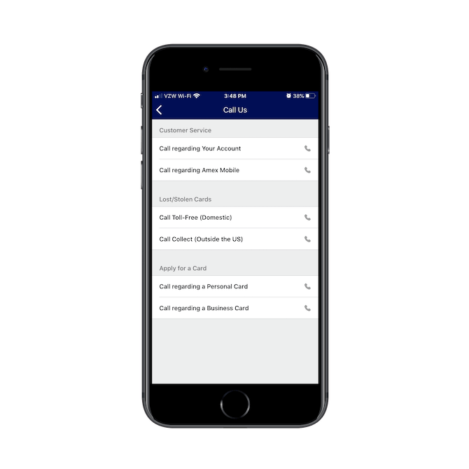
Rather than force all users to call a single number and have to go through the prompt to find the right department to speak to, American Express has provided shortcuts for customer service, lost/stolen cards, and applying for a new one. So, not only do these design and layout choices improve the user experience, it also helps AmEx funnel users to the right customer representatives based on what they need help with.
All in all, it’s just a really well-thought-out support section that makes users feel supported not just by the processes and structures within the app, but also by the people behind it.
Wrap-Up
If you can decrease the friction in your fintech solution, you’ll motivate more users to:
- Sign up or pay for your services (when applicable)
- Go through the onboarding process
- Engage with the app on a regular basis and in a meaningful way
But you have to make sure that each step of the way—even if it’s before they’ve signed up—has been carefully planned out.

Suzanne Scacca
A former project manager and web design agency manager, Suzanne Scacca now writes about the changing landscape of design, development and software.

