Is Your Fintech App Age-Agnostic?

Summarize with AI:
In this post, we’ll look at research on the elderly population and 4 ways in which you can fix the more problematic areas of your fintech app design.
COVID-19 didn’t just change how much we use our mobile devices. When it comes to fintech, it also affected who uses digital solutions to do things they once would’ve done offline.
In a Fintech Times interview, Frans Labuschagne of Entersekt explains why older generations have long been hesitant to use digital banking solutions in particular:
“The pandemic … spurred a drive in digital banking from older generations who have traditionally avoided their bank’s digital offerings, preferring to do their banking in branches. The reasons for this reluctance have long been attributed to fear, mistrust, a perceived lack of their own technical ability or a preference to speak to an actual person.”
But just because older consumers are now discovering how useful fintech can be, that doesn’t mean they’ll automatically feel secure or confident using any of these apps—especially if they were originally designed for younger, more tech-savvy users.
So, in this post, we’re going to look at some things you can do to make your fintech apps more age-agnostic.
Designing Age-Agnostic Fintech Apps
As an app designer, you’ll want to find the right balance. Because while simpler is probably better for older fintech users, you don’t want to oversimplify things to the point where other users find the app too annoying to use.
So, here are some areas to focus on:
1. Give It Some Space
Minimal design, in general, is a best practice when designing anything for a digital audience.
That said, a clean and attractive design might not be enough to help older users focus on what they need to if distractions abound.
A study on older adults and distractions from the University of Southern California found the following:
“Trying hard to complete a task increases emotional arousal, so when younger adults try hard, this should increase their ability to ignore distracting information. But for older adults, trying hard may make both what they are trying to focus on and other information stand out more.”
So, the first thing you can do to help your older users actually use your app is prioritize the most valuable features of the app both within the navigation as well as the design in each tab.
This way, secondary features like supplemental articles, analytics tracking and so on don’t distract them from using the app.
Another thing to do is build in enough open spaces to improve both focus and clickability of the most important parts of the app.
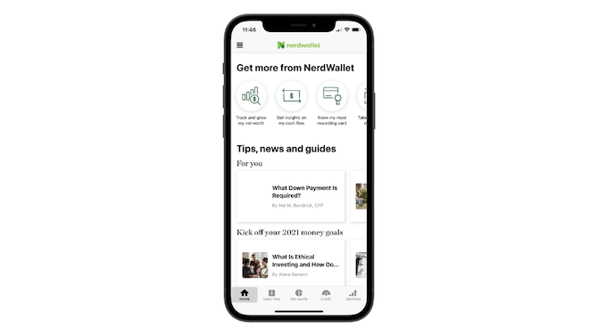
NerdWallet’s money manager and finance tracker app is an example of what not to do:
This is the first tab anyone sees when they enter the app. Rather than start using the money management and finance tracking features, users have to sift a busy interface containing ambiguous icons that point to primary and secondary features of the app as well as a ton of article links.
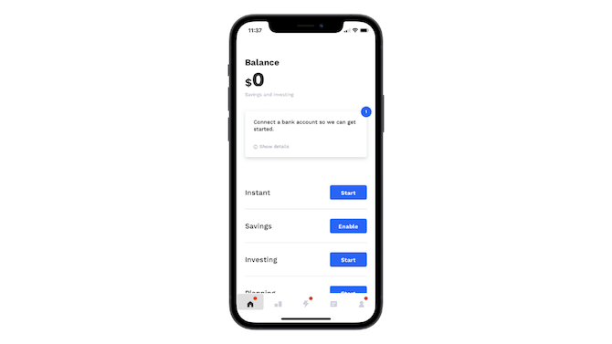
Albert, on the other hand, has a more universally user-friendly design for its fintech home tab:
Notice how this is all about taking action. And there’s tons of space around each feature, giving users ample space to consider what they want to do first and knowing where exactly to click to get started.
Unless your fintech app is purely instructional with articles and other educational resources, the main feature should be the first thing that users see. It’s already difficult enough for older users who’ve never used fintech apps to get used to what they’re seeing. By placing useless (at least for now) distractions in their way, you’re only going to make them feel more frustrated or annoyed with it.
2. Turn Off Unnecessary Animations
We’re at a point where animations mainly serve a practical function in mobile app design—transitioning users from one feature to the next or providing confirmation when users engage with the UI.
There’s one type of animation, though, that could be problematic for your older users. And it occurs early on in the fintech app experience—when the onboarding slider auto-scrolls, as it does in the Dave banking app:

Each slide appears on the screen for about three seconds. There’s way too much to read in each of these slides within a three-second period—for any user.
This type of animation serves no purpose other than to frustrate users when they miss important information about the app and its features.
Let’s look at what Dr. Joel Salina of Massachusetts General Hospital has to say about this:
“It’s normal when you’re older that your reading might be slower or that you have to occasionally read a sentence more than once to get its meaning. Your ability to read and retain information may take more effort.”
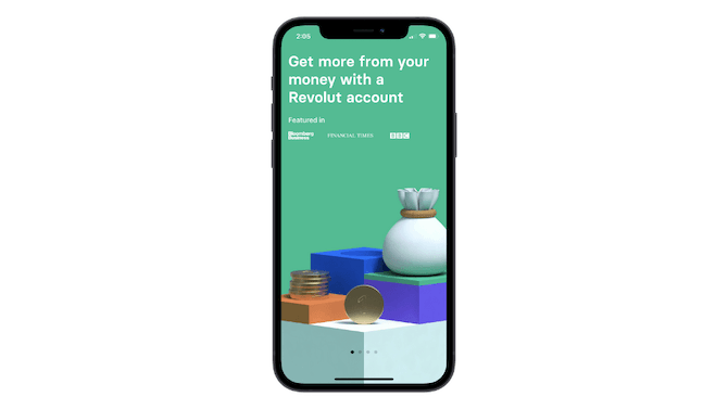
Instead, do as Revolut does:
Include navigation dots at the bottom of the slider so that users know there’s more to read. Then, ditch the auto-scrolling and enable all your users to fully control the pace of the slider experience.
3. Use Colors and Font Sizes That Improve Readability
In addition to distractions making it difficult for users to read what’s on the screen of your app, color choices and font sizes can impair readability as well.
When it comes to font sizes, you should use a 16-pixel font as your smallest size (at least for the main content in your app). This goes for any age group your app serves.
While even bigger font sizes may be useful for older users, you don’t want younger users to be turned off by an interface with oversized text. So, to solve this issue, make sure your settings include text resizing controls.
As for color, this one is a bit more complicated.
One thing you should absolutely do is use a high-contrast color palette. It’s easier for users of any age to read content when there’s a sharp contrast between the color of the text against the background.
You can check your app’s color contrast here.
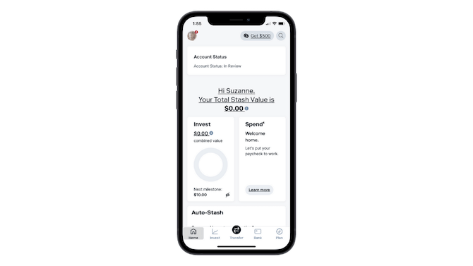
The Stash app has a good example of high-contrast colors with black-on-white:
For some older users, high-contrast dark mode may also help with readability.
The NNG dug up some research that found that older adults with cloudy vision caused by conditions like glaucoma and cataracts could read more easily in dark mode.
But this isn’t universally applicable. People who suffer from other kinds of impairments experience little difference between dark or light themes.
There is one type of dark theme that won’t work for nearly 50% of the elderly population though:
WebMD shared the results of a study on color vision in seniors. Here’s what the study’s lead author, Marilyn Schneck, found:
“Researchers have long known that color vision can deteriorate as people get older. The lenses of their eyes can become yellowish, causing them to see as if they were looking through a yellow filter. This can disrupt their so-called ‘blue-yellow’ vision, preventing them in certain situations from distinguishing blue from purple and yellow from green and yellow-green.”
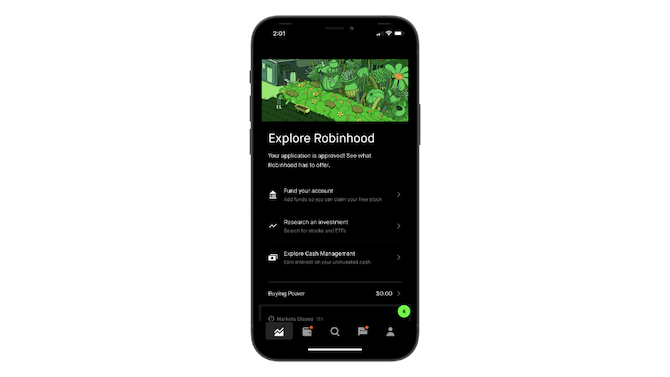
So, while a dark theme app design like Robinhood’s might be okay since all the text is white:
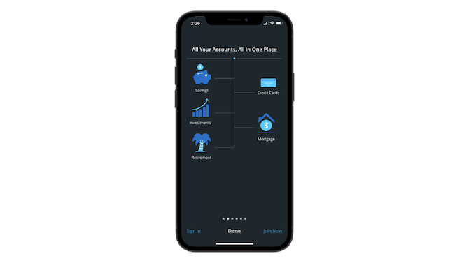
The dark theme in the Personal Capital app could cause issues for older users who suffer from this color vision issue:
Most of the text is white, with the exception of the main CTA links to “Sign In” and “Join Now.”
So, what’s the solution here? Instead of forcing your dark theme on users, it’s probably best to use a light theme with universally readable colors. You can then provide dark theme options (white text on a black background) in your settings for those who prefer it that way.
4. Label All Icons
A lack of icon labels can lead to poor navigability of a mobile app for all users. This problem will only be exacerbated for those who’re just stepping into fintech apps (or apps in general) for the first time and don’t recognize what any of the icons mean.
“To help overcome the ambiguity that almost all icons face, a text label must be present alongside an icon to clarify its meaning in that particular context. (And even if you’re using a standard icon, it’s often safer to include a label, especially if you slightly altered the icon to match your aesthetic preferences or constraints.)”
Even if your app has a simple set of features, a label-less navigation like Cash App’s just won’t fly:
Older users are already nervous about using fintech apps. Why heighten that insecurity by making the navigation a complete mystery?
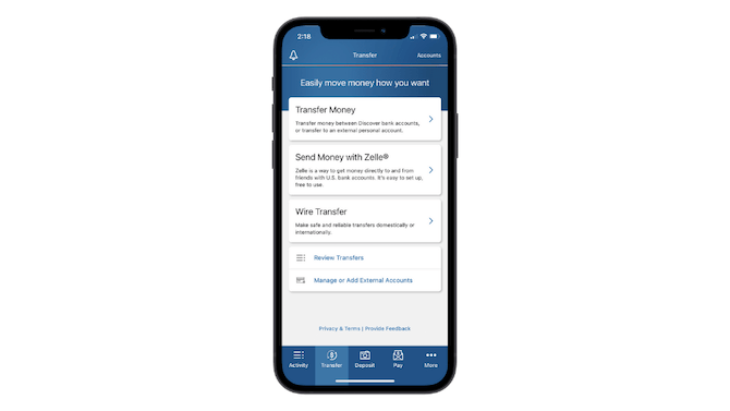
Instead, make room for both icons and properly sized text labels in your app navigation bar as Discover does:
What’s more, by keeping each label short (under eight characters), the designer is able to increase the text size a bit more than if the labels had been lengthier.
Wrap-Up
Remember: This is about designing fintech to be age-agnostic, not just senior-friendly. If you go too far in one direction, you could potentially lose users on the other end of the spectrum.
So, it’s important to find a balance between limitations older users may have and the strong preferences younger users have while designing fintech apps.

Suzanne Scacca
A former project manager and web design agency manager, Suzanne Scacca now writes about the changing landscape of design, development and software.

