App Store Optimization Tips for Fintech Designers

Summarize with AI:
App store optimization is a lot like search engine optimization. And like SEO, app store designers have a role to play in APO. In this post, we’ll look at four things you can do to increase the visibility and discoverability of your fintech products in app store search results.
Similar to SEO, app store optimization (APO) allows us to increase the visibility and discoverability of a mobile app in search results. For new fintech apps, APO is especially important as it gives these apps a chance to contend with existing frontrunners in their space.
Of course, there are many factors that contribute to how well a fintech app ranks in the stores. Quality of experience. Overall value. Number of reviews and average rating. Keyword optimization.
Assuming you’ve built a great app that’s chock full of value, what else can you do as a designer/developer to help your fintech product rank better in the app stores than others?
Today, we’ll look at four things you can do to optimize your app listing for search, increase the chances of the app getting featured and, of course, get more installs.
1. Pay Attention to How the Content Is Formatted
There are a number of areas in your app store page where important details about the app will go and that you should pay attention to as a designer/developer:
- Title & Subtitle (these are two different fields in the Apple App Store)
- Description
- What’s New
Let’s start by looking at the SoFi mobile app:
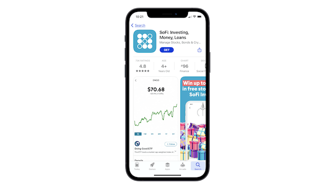
Look at the main metadata—the title and subtitle.
The title looks good. We see the app’s name (“SoFi”), along with a brief summary of what app users can do with it (“Investing, Money, Loans”).
The subtitle, however, doesn’t fit on the page, which is a problem. While users might be able to guess that the last word in the subtitle is “Crypto,” it doesn’t look good that there’s incomplete data there. Who knows if the app developer was trying to tell us something else. Right?
Whenever creating the main title and subtitle for your app store page, make sure that it:
- Fits within the word count parameters for that app store
- Includes the name of the app
- Quickly and simply sums up the purpose of the app
You can follow Acorns’ lead when formatting your own title and subtitle:
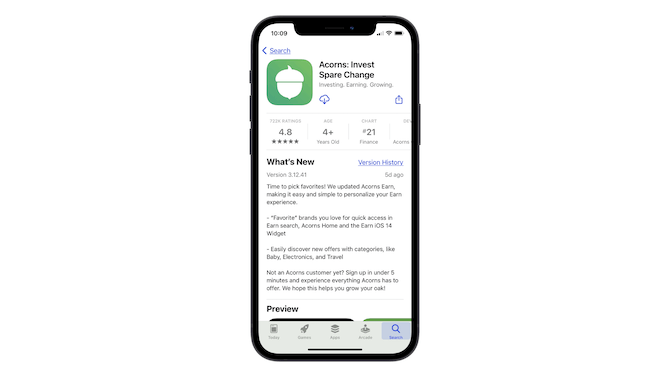
Notice how nicely all of the information fits here.
The title “Acorns: Invest Spare Change” perfectly sums up what the users are going to get out of the app.
The subtitle “Investing. Earning. Growing.” doesn’t just provide extra context for the app—it also adds an eye-catching punch to the headline.
Also have a look at the “What’s New” section in the Acorns screenshot above.
Since you have to work within the formatting rules of the app store, there’s no using bold, italics, headers or any of the other formatting you’d use to make a web page more scannable or readable. So, you have to get creative with it as Acorn has done—spaces to break up paragraphs and dashes to call attention to sub-points.
SoFi also has a creative formatting solution:
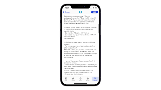
Spaces are added in between paragraphs so the description can be long, but still easy to read. A triple-dash mark (---) helps SoFi draw attention to its app features. And the bullet points break down those benefits and features even further.
You can use these kinds of formatting to your advantage in both the What’s New and Description sections of the app page. The first major benefit of doing so is to create a more readable format for interested app users. APO is another potential benefit.
Although the app stores don’t tell us what exactly is included in their ranking algorithms, I suspect it works a lot like SEO. A readable format with the right keyword density should help your app do better in search results.
2. Design an Icon That Stands Out
There are a number of things you need your app icon to do:
- Stand out when it appears in search results for a bunch of related apps
- Be recognizable no matter what size it’s viewed at on a smartphone
- Help users quickly find and open the app when it’s amongst a whole host of installed apps on their devices
Here are some tips to help you accomplish these goals:
- Avoid using a lot of text in the icon design.
- Circles and squares are the common shape that appear within these icons, so don’t be afraid to try something unexpected.
- Keep your color palette to a minimum—two colors max.
- Make the design simple; there should be only one element to focus on.
- Come up with a design that’s different from competitors’ apps as well as popular apps that people commonly have on their phones.
Let’s do a side-by-side comparison of Xero Accounting, FreshBooks Accounting and QuickBooks Self-Employed Accounting:
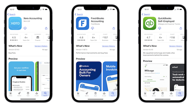
What I find interesting about these icons is that they’re all based on the name of the product. Xero uses its full name as a lettermark icon, FreshBooks uses the “F” from its name and QuickBooks uses “qb”. There’s nothing particularly original about these choices, but the designs do a great job of setting each apart.
Xero, for example, uses a really vibrant blue, which helps it stand out against the safer colors the other two use.
FreshBooks has opted for a unique shape. Like I mentioned above, circles and squares are the most common icon shapes, so to use this unique polygon is a good choice. It’ll definitely help with discoverability and memorability of this app.
QuickBooks has added depth to its design, which gives it a tactile nature. The icon looks like something you can touch or press.
One final thing I’ll add about the icons is the issue of the lettermark. With fintech apps, it can be difficult to design an icon that “sums up” what the app is about. If it’s an accounting app, what would you use? Checkboxes and checkmarks? A scale balancing stacks of money? Or how about a banking app? Or budget management app?
There’s not a whole lot of room to create a truly unique icon, so using text may be your only option. Just make sure you take a unique approach to it as the three above have done.
3. Make a Memorable Promise on the First Preview Card
Each app store is different when it comes to how many preview screenshots you can upload. Regardless of that number, it’s the first one that’s the most critical.
Think of this card like the hero image on a website. You need to make a strong impression with this card, so don’t waste it on some random feature or context-less screenshot.
For example, this is the first preview image users see when they go to the app store page for Fidelity Investments:
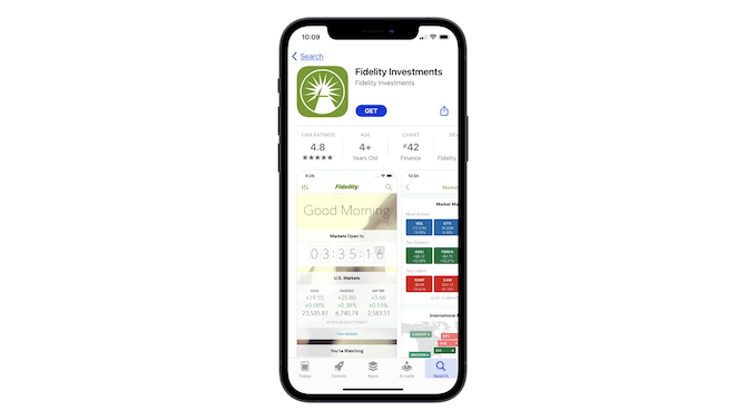
It’s great that they get to see what the app looks like … but is this really the primary purpose of the app? To log in and check on how the market overall is performing?
It might be the screen they’re greeted with each day, but it serves no value to them if they’re not actually using the app to trade on the market. So, I’d argue that this first card should actually tell users what they can do in the app. Like the app store description says:
“Trade, manage your money, deposit checks, and pay bills in just a few taps.”
Varo Bank is another one that’s made a strange choice for its first card:
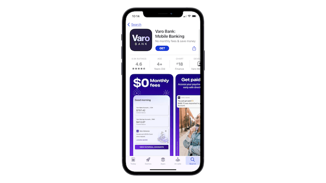
I’d argue that the very last preview card should be the first one:
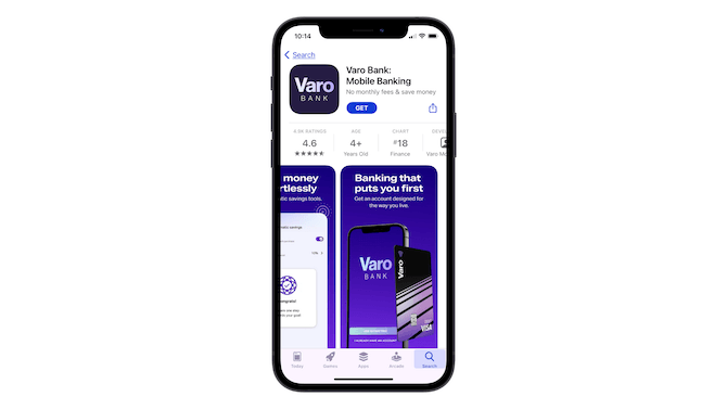
The message “Banking that puts you first” and “Get an account designed for the way you live” is a much stronger invitation to learn about the product than the $0 monthly fee. While that feature is great, it doesn’t tell users what the app itself is or does.
Just as you’d do on a website, provide a succinct summary and a strong promise first before you start touting the features on your app store page.
4. Tell a Story with Your Previews
There are a couple of fun ways you can play around with storytelling in your app store previews.
One way is to add animation to the first card. Not only does the animation show up when someone visits the app page, it also appears in search results.
Here’s how Credit Karma uses animation to quickly capture attention and succinctly tell its story:
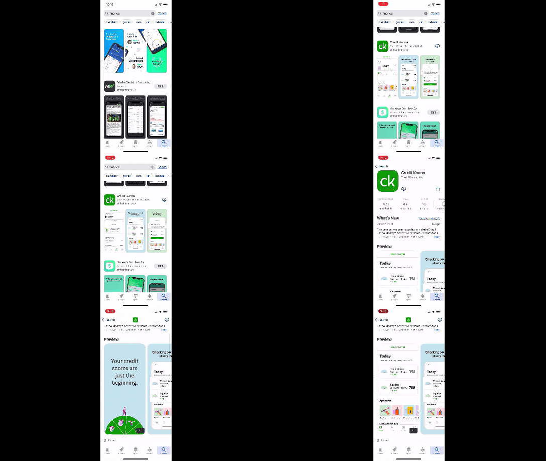
When someone scrolls to the area in search results where the Credit Karma app is, they start seeing it move. If that isn’t a great way to increase clicks and impressions, I don’t know what is.
Also, if you watch the animation, you’ll see that it’s not just a marketing animation. Users can actually see what the app experience is like.
Another way to do storytelling in the app store is to tell the story across multiple cards. Here’s how Albert does it:
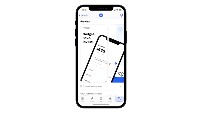
The first card makes the promise: With Albert, you can budget, save and invest. When the user scrolls right to see the rest of the cards, they’ll notice the continuation effect.
It’s also something that can be seen from a high level in app store search results:
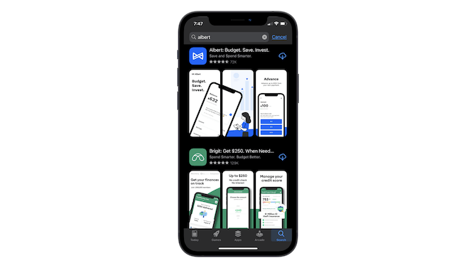
This is something that a lot of marketers do on Instagram and what it essentially does is turn your graphics into puzzle pieces that need to be viewed together or one immediately after the other. It’s a really creative way to get people to stop and take notice of your fintech app, even if it’s brand new in the app store and perhaps not as well known as the competition.
Wrap-up
Just like SEO, there’s actually quite a lot that designers can do for app store optimization. From formatting the text to telling a story with the graphics you design, the choices you make for the app store page can have a huge impact on how many people see the app and how many install it.

Suzanne Scacca
A former project manager and web design agency manager, Suzanne Scacca now writes about the changing landscape of design, development and software.

