
Exploring the BusyIndicator in .NET MAUI

Summarize with AI:
See how to use the BusyIndicator to indicate loading in your .NET MAUI app.
I’ll admit it—when I’m using an app and have no idea what’s going on, I start to get a little anxious.
As users, we truly appreciate when an app keeps us informed, especially when it’s performing a sensitive action.
Let’s take a simple example: Imagine you’re using a crypto app and you’ve just sent an important transaction. In that moment, every second without feedback can create uncertainty or even distrust.
That’s why, even if you can’t avoid the time a process takes, you can definitely improve the user experience by showing a clear visual cue that something is happening. Nothing’s worse than assuming the app froze or failed without any warning.
These types of situations are more common than you may think, which is why it’s so important to inform the user whenever there’s a background process happening in the UI. Sometimes, a simple loading indicator can make all the difference.
That’s exactly why today I’ll show you how to use the .NET MAUI BusyIndicator component from Progress Telerik to handle these scenarios in your .NET MAUI apps. Let’s improve that user experience together!
What Is the Telerik UI for .NET MAUI BusyIndicator?
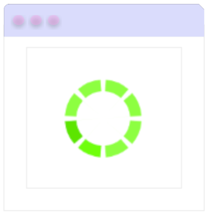
The Telerik BusyIndicator is a UI component that informs users when the app is performing a background operation. Think of it as a customizable loader that remains visible until the ongoing process is complete.
It offers various built-in animations to make your app feel more dynamic. Plus, you can easily customize these animations to match your app’s branding and style.
Here’s an example of how the default control may appear in your application:
This control is part of the Telerik UI for .NET MAUI library, which includes more than 60 professionally designed UI components to help you build powerful and modern cross-platform applications.
Let’s Implement the Busy Indicator
Now that you have a better understanding of the BusyIndicator, let me walk you through a few simple steps to implement it using the free Telerik trial.
First, make sure you have the following prerequisites ready:
- Set up your .NET MAUI application.
- Download Telerik UI for .NET MAUI.
- Install Telerik UI for .NET MAUI.
Once all the prerequisites are set, you’re ready to start! 😎
Step 1: Add the Telerik Namespace
Go to your XAML file, and add the following namespace:
xmlns:telerik="http://schemas.telerik.com/2022/xaml/maui"
Step 2: Add the BusyIndicator to the XAML
After setting up the “telerik” alias in your XAML namespace, you’re ready to add the RadBusyIndicator as you can see in the following example:
<telerik:RadBusyIndicator x:Name="BusyIndicator"
AnimationContentHeightRequest="100"
AnimationContentWidthRequest="100"
AnimationContentColor="#674bb2"
AutomationId="busyIndicator"
IsBusy="True">
    <telerik:RadBusyIndicator.Content>
	    <Label Text="This is the content of the RadBusyIndicator control displayed when the indicator is not busy." TextColor="Black" />
</telerik:RadBusyIndicator.Content>
</telerik:RadBusyIndicator>
Step 3: Register Telerik in MauiProgram.cs
Head over to your MauiProgram.cs file and, inside the CreateMauiApp method, add .UseTelerik() to enable Telerik controls. Place it right above .UseMauiApp<App>(), like this:
using Telerik.Maui.Controls.Compatibility;
public static class MauiProgram
{
    public static MauiApp CreateMauiApp()
    {
	    var builder = MauiApp.CreateBuilder();
	    builder
	    .UseTelerik()
	    .UseMauiApp<App>()
	    .ConfigureFonts(fonts =>
	    {
		    fonts.AddFont("OpenSans-Regular.ttf", "OpenSansRegular");
	    });

    return builder.Build();
    }
}
Setting the Animation to the BusyIndicator
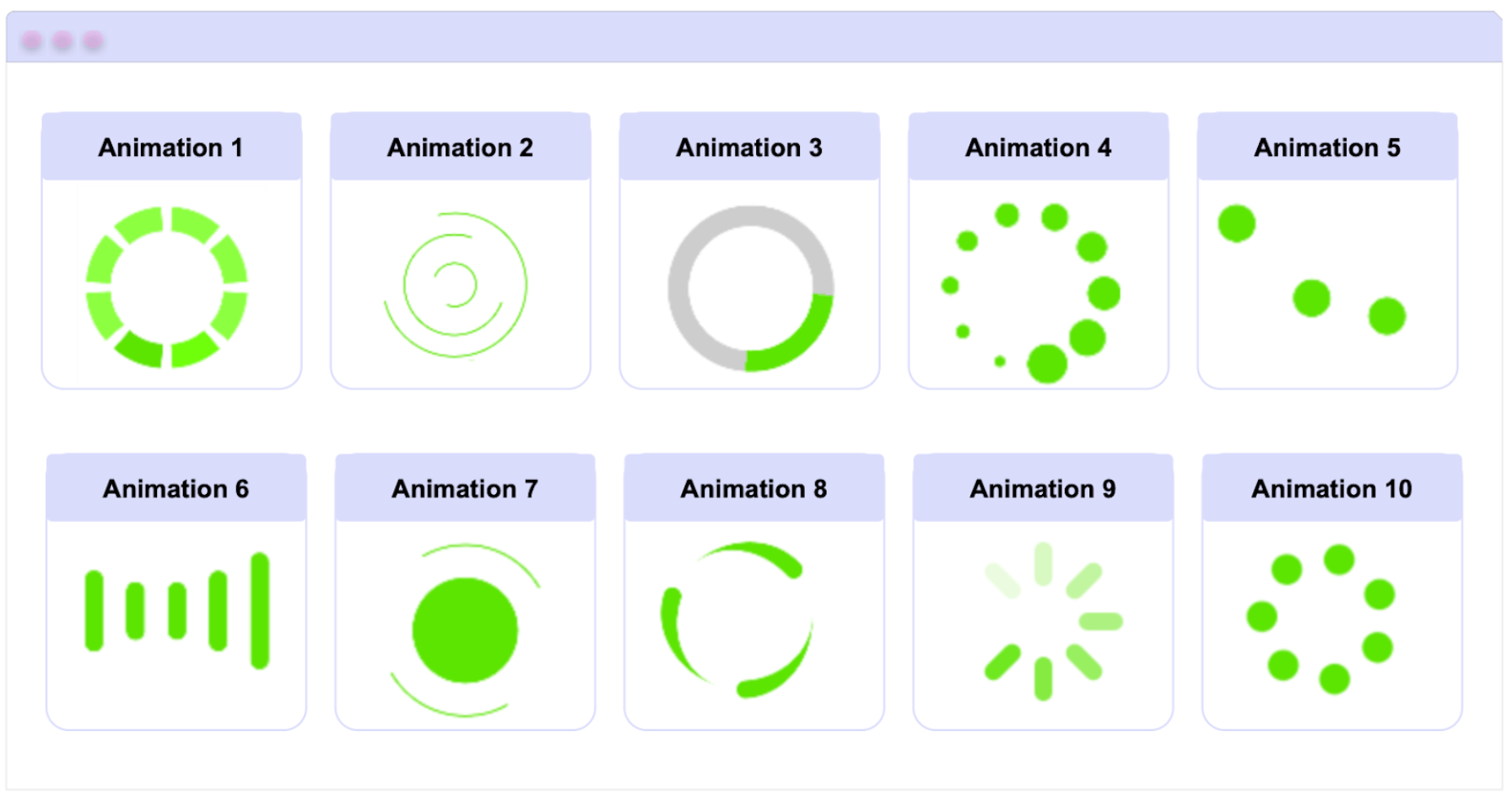
The control comes with 10 different animation styles, and that’s awesome! Typically, we’re stuck with just one, but here you have options to match your app’s personality.
To change the animation type, simply use the AnimationType property. This property accepts an enum with values ranging from Animation1, Animation2 … up to Animation10.
Now, you might be wondering: How do I know what each animation looks like?
No worries! Just check out the table below to preview them all and pick your favorite. 😎
🔍 Things to keep in mind:
- The default animation is Animation1.
- To display the control, the IsBusy property must be set to true.
Changing the Animation Color
You can also customize the animation color using the AnimationColor property. Note that this only applies to the built-in animations mentioned above and does not apply to custom animations.
Setting the Size
You can animate the size using the AnimationContentWidthRequest and AnimationContentHeightRequest properties for width and height, respectively. By default, the animation size is 25x25.
⚠️ These sizing properties, like AnimationColor, apply only to the control’s built-in animations and not to custom ones.
Translating our explanation into code, it would look like the following example:
<telerik:RadBusyIndicator x:Name="BusyIndicator"
AnimationType="Animation2"
AnimationContentColor="#2374FF"
AnimationContentHeightRequest="150"
AnimationContentWidthRequest="150"
IsBusy="True">
	    <telerik:RadBusyIndicator.Content>
	    <Label Text="This is displayed when the indicator is not busy."
	    TextColor="Black" />
    </telerik:RadBusyIndicator.Content>
</telerik:RadBusyIndicator>
Custom Animations
You can also create a custom animation by following these simple steps:
- Set the AnimationType property to Custom.
- Inside the BusyContent, add the content you want to animate.
- Add the custom animation to the Animations collection of the BusyIndicator.
You can apply these steps in your code as shown below:
<telerik:RadBusyIndicator x:Name="radBusyIndicator"
AnimationType="Custom"
IsBusy="True">
    <telerik:RadBusyIndicator.Content>
	    <Label Text="Welcome! The content is fully loaded and ready to use." />
    </telerik:RadBusyIndicator.Content>
    <telerik:RadBusyIndicator.BusyContent>
	    <Label HorizontalOptions="Center"
	    Text="Loading..."
    VerticalOptions="Center" />
    </telerik:RadBusyIndicator.BusyContent>
</telerik:RadBusyIndicator>
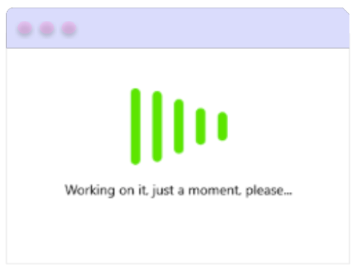
BusyIndicator Content
Using the BusyContent property, you can display additional content along with the built-in animations when the component’s IsBusy property is set to true.
For example, in the following code snippet, the Animation6 will be displayed along with a message below that says: "Working on it, just a moment, please …"
<telerik:RadBusyIndicator x:Name="BusyIndicator"
AnimationContentHeightRequest="100"
AnimationContentWidthRequest="100"
AnimationType="Animation6"
IsBusy="True">
    <telerik:RadBusyIndicator.BusyContent>
    <Label Text="Working on it, just a moment, please..." />
    </telerik:RadBusyIndicator.BusyContent>
    <telerik:RadBusyIndicator.BusyContentTemplate>
	    <ControlTemplate>
	    <Grid RowDefinition=”Auto,Auto >
		    <ContentPresenter Grid.Row="0"
		    Content="{TemplateBinding Path=AnimationContent}" />
		    <ContentPresenter Grid.Row="1"
		    Content="{TemplateBinding Path=BusyContent}"
		    HorizontalOptions="Center" />
	    </Grid>
	    </ControlTemplate>
    </telerik:RadBusyIndicator.BusyContentTemplate>
</telerik:RadBusyIndicator>
Your result will look like the following image:
Adding the BusyIndicator to a CollectionView
We know that, due to its nature, the CollectionView may take a few milliseconds to load. The good news is that we can easily integrate it with the BusyIndicator to inform users that the data is still loading.
Below is an example of how to use it alongside a CollectionView:
<Grid RowDefinitions="40, *"
RowSpacing="10">
    <telerik:RadButton Text="Load Data"
    Command="{Binding LoadDataCommand}" />
    <telerik:RadBusyIndicator x:Name="busyIndicator"
	    ContentUnderOpacity="0.4"
	    AnimationContentHeightRequest="100"
	    AnimationContentWidthRequest="100"
	    IsBusy="{Binding IsLoading}"
	    Grid.Row="1">
    <telerik:RadCollectionView ItemsSource="{Binding Source}"
DisplayMemberPath="Title" />
</telerik:RadBusyIndicator>
</Grid>
Conclusion
And done!! See how in just a few minutes you’ve learned some really interesting things about the Telerik UI for .NET MAUI BusyIndicator? From what it is to the different types of animations, how to customize it, change its color and much more!
✨ I hope this helps you keep your users informed about what’s happening in your app by integrating it into your projects from now on.
Try it for free:
If you have any questions, feel free to leave them in the comments. 💚💕
See you next time! 🙋♀️
References

Leomaris Reyes
Leomaris Reyes is a software engineer from the Dominican Republic specializing in mobile development. She is a 7-time Microsoft MVP and actively builds mobile applications while sharing practical knowledge through technical articles and developer-focused content.
Through her work, she explains programming concepts, developer tools and real-world development practices to help developers grow in their careers.
You can follow her on Instagram and TikTok at @leomarisreyes.dev, read her articles on AskXammy, and connect with her on LinkedIn, where she shares tutorials, insights and resources for developers.
Related Posts
Comments
All articles
Topics
Web MobileMobile
Desktop
Design
Productivity
People
